
WARNING!!
Do NOT copy and paste any content (including images) from ANY source directly into the wysiwyg! Ever! Under ANY circumstances!
You can, however, paste content into the Source. This strips any invisible formatting code that will break the LMS. You then add in all the required HTML tagging in the Source. The tags you use will determine how the content renders in the LMS.
What the hell is the wysiwyg?!
The wysiwyg (what you see is what you get) is the 'front-end' of the CMS and has all the automatic formatting tools you are likely familiar with from programs such as Word. You can use these buttons to format content in the 'front-end'. The buttons apply HTML tagging for you, which you can see when you switch to 'Source'.
Wysiwyg view

Source view
Note, that when you are in Source, the rest of the toolbar is greyed out.

Hint: going "full screen" using the last icon can be useful if you have lots to do.
First of all, if you are not comfortable working with HTML in the Source, don't panic! All you need to do is paste your content into the Source and switch back to the wysiwyg. You can then format your content in the wysiwyg using the preset tools.
HTML tags
HTML markup is how we tell the LMS to format the content the way we want. Every line of content has 'tags'. Depending on the formatting, the tags will be different.
The key thing to remember with HTML tags is that they are bookends. If you have a tag at one end, you need to have a closing tag to indicate where the formatting style ends. If you forget that closing tag (it's really easy to do!) the formatting will apply to everything after that point. Switch between the Source and wysiwyg views is a great way to pick up when you have missed a tag.
HTML snippets
For the more complicated formatting, such as block quotes, white boxes and accordions, there are preset snippets of code you can use, thanks to Digital Design! You can fetch the specific codes from the CMS Snippets page. Simply select the design element you want, then copy and paste the code into the Source and edit the specific content within that element.
Headings are formatted to have a different size and font compared to normal paragraph text. There are six heading levels in our LMS.
What do the heading levels look like?

This is a Heading 3
h3 headings are used as main content headings. Each main concept should start with an h3 heading.
This is a Heading 4
h4 headings are used as main content subheadings to break up large concepts into more specific focuses within the main concept.
This is a Heading 5
h5 headings are used as sub-subheadings and often as the heading level inside a white box.
This is a Heading 6
h6 headings are an emergency-only heading level.
So, what happened to heading levels 1 and 2?
Heading 1 is reserved for the topic title while heading 2 is only used for subtopic headings. They are automatically formatted when you enter the titles into the "Summary" boxes in the CMS. So, you don't need to do anything for those heading levels. Just start your heading levels at h3.
Why do we use different heading levels?
Using the heading hierarchy is helpful for both the users and developers of the platform.
Headings for students
Headings make text stand out and help people scan the content. This is sometimes called 'signposting' and helps students navigate through the content.
The different heading levels show how different chunks of content are related. An h3 heading should be used to start content about a new concept. If that concept can be broken down into smaller pieces, each with a more specific focus, you could use h4 and/or h5 headings to indicate how each important or specific each chunk of information is to the main concept.
Some other reasons why we use different heading levels include to:
- help readers figure out what to expect in an upcoming section
- draw focus to the key concept of that section
- signpost that the following section is closely related to the previous one (by using a higher level heading, such as an h5 following an h4)
- signpost that the following section is separate from the previous one (by restarting the heading hierarchy with an h3 heading)
- improve accessibility because screenreader users can:
- hear which blocks of text are headings and what level each heading occupies in the hierarchy of the page.
- skim the page by jumping from heading to heading.
Applying the hierarchy of headings well to content can help all students move through the content logically and find specific content quickly.
Headings for developers and designers of the LMS
Using the hierarchy of headings appropriately helps both the developers of the platform (such as Digital Design) and the Learning Designers do their job efficiently.
- Using HTML tags to format headings means that if Digital Design makes any changes to the look and feel of the LMS, those changes will be applied correctly across the platform in one go.
- If you try to make your own heading by using bold, underline and all caps, for example, and the platform design is updated, your 'heading' won't be.
- The preset heading levels save you time because you don't need to apply the font, size, weight, shading and borders every time you make a heading.
- You can also easily create consistent formatting from topic to topic and course to course.
Applying heading styles
It's a hierarchy, so you should apply heading styles in order. In other words, a level 4 (subheading) is a section of a 3 (heading), which is a section of a 2 (subtopic), which is a section of a 1 (topic). An h4 appearing directly after an h1 would just look weird.
For most topics, three heading levels (h3, h4 and h5) will do. However, h6 is available should you need it.
Learning Designers should always start with 'Heading 3' as the highest in the hierarchy of content heading levels.
Styling headings
You can use the wysiwyg to style a heading. Simply highlight the whole heading and choose the appropriate heading level from the drop-down menu.
The HTML tags for the heading levels are <h3>,<h4>,<h5> and <h6>
Character styles are changes to the font of specific words and phrases.
Bold
Bold text is typically a darker, thicker version of the regular font and looks like this.
Use bold in the text body to emphasise individual terms or short phrases that are key knowledge points. In other words, use bold to draw the eye to the key terms and concepts in each section. It is best practice to use bold to highlight key terms the first time they appear in each topic.
To apply bold, highlight the word/phrase and either click the B in the wysiwyg toolbar or press ctrl + b.
The HTML tag for bold is <strong>
Italic
Italic text is an angled version of the regular font and looks like this.
Use italics in the text body to emphasise individual words or short phrases, where you want to add reading emphasis, rather than knowledge emphasis. For example, “Do this before you do that.”
You should also italicise book titles, journal titles and website names in the reference list.
To apply italics, highlight the word/phrase and either click the I in the wysiwyg toolbar or press ctrl + i.
The HTML tag for italics is <em>
Superscript and subscript
Superscript text is a smaller, raised version of normal text and looks like this.Subscript text is a smaller, lowered version of normal text and looks like this.
To apply, highlight the word/phrase and click x2 for superscript or x2 for subscript in the wysiwyg toolbar.
The HTML tag for superscript is <sup>, and <sub> for subscript.
1. There are two different blockquote types for two different scenarios. The default blockquote should be used in most instances; and the compact blockquote should be used when the quote's character count is greater than 256 (or 100) characters.
2. Adding a source is optional, though strongly encouraged.
This is the default quote for short quotes(Author date, p. XX)
This is the compact quote format for over 100 characters(Author date, p. XX)
Accordions are used to let students see more information.
It is not necessairly important content, but containing details not needed on first reading.
They can also be useful to hide answers or solutions.
When using accordions, they must always be paired with opening instructions. For example.
'Click on the following headings to learn more about accordion labels'
The first part of content goes here.
This is the third lot of content with the correct size. And it is 42.
White boxes
White boxes can be used for emphasis or highlight that student activity or action is required. For example, a reading or a task.
It can also be used for extra contrast - see example below.
Activities
- For activity questions, simple instructions should help clarify what the student is being asked to do.
- Using heading 5, and the words "Knowledge check" to reiterate what this is.
- It can be helpful to call the collective activities "tasks", as some are questions and some are activities.
- To indicate to students that something needs to be actioned, highlighting in a white box can help as well.
- Finally, consistent feedback can also add to a student's learning. Try and avoid just correct/incorrect.
Knowledge check
Complete the following five (5) tasks. Click the arrows to navigate between the tasks.
Tables and white boxes
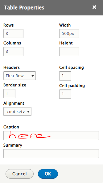
Tables are added using the editor icon

To help tables stand out in the platform, you can place them inside a white box (case study box with the italics removed from the snippet code).
For example, a 'normal' table:
| demo | column header | another header |
|---|---|---|
| content | this thing | the other thing |
| something else | some more | and some more |
Compared to a table in a white box...
| demo | column header | another header |
|---|---|---|
| content | this thing | the other thing |
| something else | some more | and some more |
And compared to this one with a "caption" as well...
| demo | column header | another header |
|---|---|---|
| content | this thing | the other thing |
| something else | some more | and some more |
Colours in tables
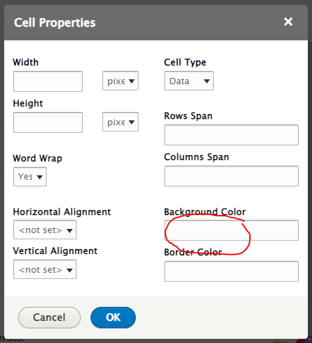
- When you create the table, click on the cell you want to change and right-click to access the cell properties.
- Type the colour hex number into the background colour box. You can get the colour hex number from Digital or Marketing if specific colours are supposed to be used.
|
white text |
||
| black text | ||
| black text | ||
Tables with atypical formating
Some tables may require more than one row/column of headings, or merged cells.
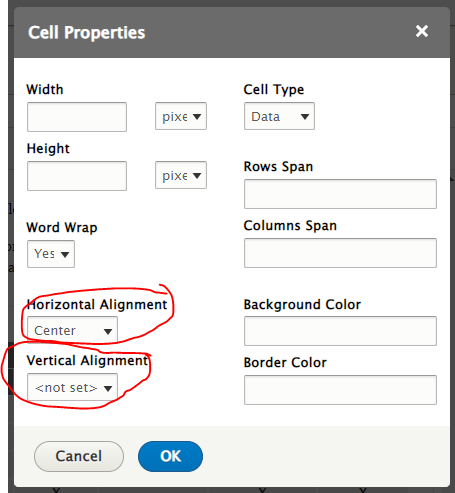
- You can centre, left or right-align the text within the cells using the horizontal alignment option in the Cell properties option box.
- You can also push the cell contents to the top, centre or bottom of the cell using the vertical alignment options. Aligning text to the top of the cell is good when different cells contain different amounts of text.
- To merge cells, right-click the cell you want to merge, then select 'merge right' or 'merge down' as appropriate. Do this as many times as you need.
- The following table has two rows of headings and one column of headings.
- The "Business entities" heading in the top row is centred across 7 merged cells.
- The header cells are coloured grey
| Business entities | |||||||
|---|---|---|---|---|---|---|---|
| Business processes | Date | Order | Customer | Product | Credit card | Warehouse | Shipping |
| Submit order | X | X | X | X | |||
| Customer pays through credit card transaction | X | X | X | X | |||
| Order sent to warehouse for shipping | X | X | X | ||||
| Shipping is scheduled and sent to the customer | X | X | X | X | |||
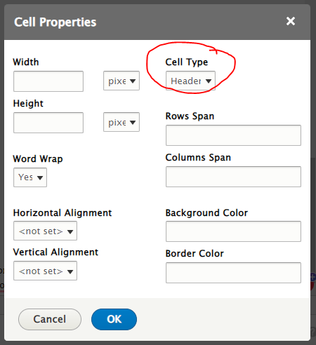
- To convert a cell into a header cell (bold text and all caps), right-click the cell and go to 'Cell properties'. Change the cell type from data to header.
Lists can be used with bullet points or numerals.
Bullet Lists
Bullet lists can be used to break up lengthy text with multiple examples, conveying key points etc.
- Bullet list
- Bullet list 2
- Bullet list 3
Bulleted lists can also be indented when adding sub-points
for example:
- Bullet list
- Bullet list 1.1
- Bullet list 2
- Bullet list 2.1
- Bullet list 3
- Bullet list 3.1
To indent the bullet, 'tab' the point you want indented. To remove the indent, press shift + tab.
Numbered lists
If the order is important, you have stipulated a number ( for example, the following three (3) points) use numbered lists. To indent the number 'tab' the point you want indented.
1 tab will render letters, two tabs will render Roman Numerals.
- Example
- Example 1a
- Example 1b
- Example 1c
- Example 1a
- Example 2
- Example 2a
- Example 2b
- Example 2 c
- Example 2a
- Example 3
- Example 3a
- Example 3b
- Example 3c
- Example 4
- Example 3a
Combinations
You can also have combinations of numbered and bulleted lists. If you are using a combination of letters and numbers, ensure you change the format using the wysiysg. Highlight the text and select whether you want a bullet list or number list.

- Example 4
- Example 4a
- Example 4b
- Example 4c
- Example 4a
Images
WARNING!!
Do NOT paste images into the editor
To add images, move your cursor to where you want the image to be positioned, and use the "add image" icon.

For example, the following image has been added.

*** Note the "footer" in "small" font stating the image was adapted and the copyright owner
Videos
Videos, for example YouTube, can be added, starting with embed code from the "share" option below the video. There are some setting that Digital prefer so the video plays correctly across different platforms.
Bespoke videos
If you record your own video, or obtain one from elsewhere, they can be loaded onto the Kaltura platform (soon to be replaced by Panopto).