Welcome to Communicate Ideas Through Applying Colour and Design Theory. In this topic, you will learn about the following:
- How to communicate ideas using colour within a final product
- Experimenting with materials, tools and equipment
- Explore and develop new ideas through the process of experimentation
- Communicating ideas using elements and principles of design.
Terminology and vocabulary reference guide
Working in an office environment, you need to be familiar with terms associated with principles and use the terms correctly (and confidently) with clients, your colleagues, and other industry professionals. You will be introduced to many terms and definitions. Add any unfamiliar terms to your vocabulary reference guide.
Activities
There are activities within this topic and an automated quiz at the end of this topic. This is not part of your assessment but will provide practical experience that will help you in your work and help you prepare for your formal assessment.
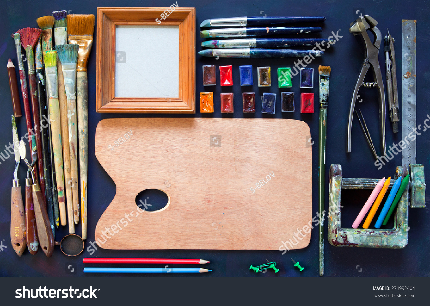
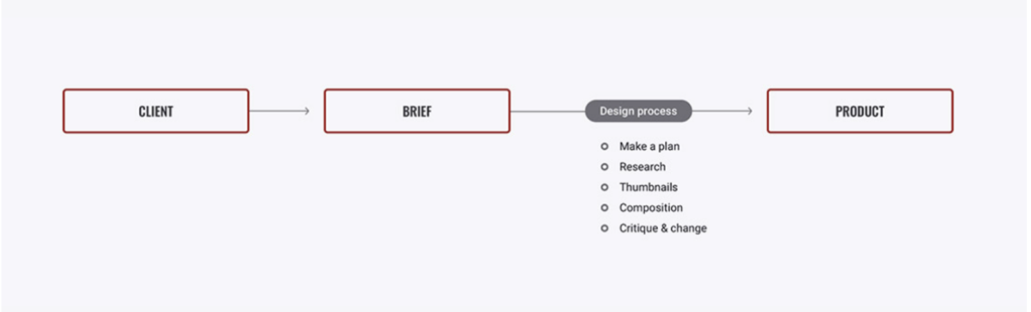
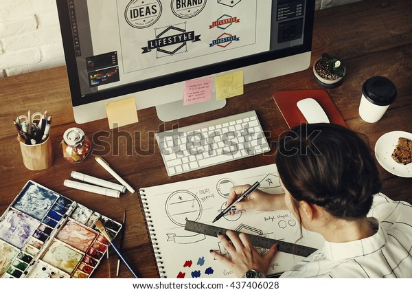
Regardless of what kind of designer you are, whether you work in fashion, textiles, or something else entirely, you must ensure that colour is consistent throughout materials and media, for instance, photography or packaging. Most designers begin by experimenting with colour palettes and observing how different colours appear on various types of material, fabric or paper. Designers will be able to explore their designs ideas more simply and precisely if they use colour references when creating their palette and working with inspiration. By using this method, they will easily. The following image depicts this process that is taken when developing the product.
Experiment with selected materials, tools, and equipment to determine new ways to integrate colour theory and design processes into a design. Through the exploration of these, new ideas can be developed.
Materials, tools and equipment list
It is important to experiment with various types of materials, tools, and equipment to produce samples of work that integrate colour theory and design processes. Some popular materials, tools and equipment that might be selected to create a design might include but are not limited to:
| Materials | |||
|---|---|---|---|
| Material | Physical Properties | Capabilities | Image |
| Chalks | A soft, porous material made of natural colours (ochre, red, black, etc.) or synthetic colours (e.g. pale pink, yellow, blue, green, purple, etc.) Natural chalk is composed of calcium carbonate, though synthetic chalks are often a mix of materials | Easily smudged and blended, and creates a ‘dusty’ effect; often, pale colours are used | 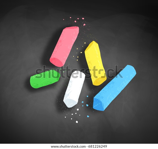 |
| Charcoal | A black, crumbly material. Made of finely-ground organic substances, including natural charcoal (burned wood), held by a gum or wax binder, and shaped into a block or a stick | Black in colour: used for sketching and shading | 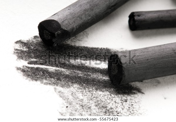 |
| Clays and plaster | Soft, loose, earthy materials comprised of fine grains of clay or plaster, respectively. Become plastic when mixed with water | Used for sculpting objects in three dimensions | 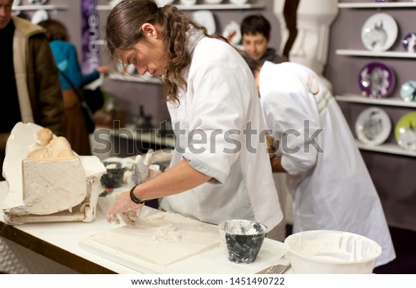 |
| Crayons | A crayon also referred to as a wax pastel, is a stick of coloured wax, usually covered in paper for ease of use. There are a huge variety of different colours, sizes and textures available to suit the artist’s needs | Used to create ‘heavier’ drawings; solvents can be used to soften/blend: colours built by layering | 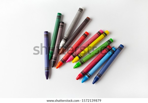 |
| Fabrics and textiles | A cloth or similar material produced by weaving or knitting fibres | Used to create upholstery, curtains, quilts, clothing, etc. | 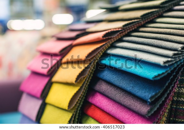 |
| Hard materials | Common hard materials include those produced by nature, such as metal, wood, stone | Often used in building, it may also be used for a variety of artistic/design purposes | 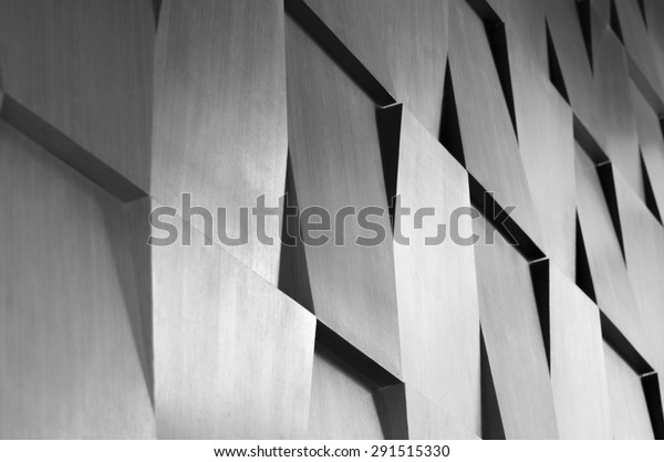 |
| Lino sheets | Lino sheets are carved into to make cuttings that can be printed by hand or press | Use to make printings that can be transferred onto paper or fabric | 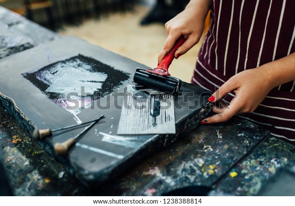 |
| Ink and wash | Ink is a coloured fluid or paste. It is often applied to heavy paper or other materials such as silk. It is often diluted and used similarly to watercolour paints (see following), with tones/shades achieved by varying the density of the ink | Often used to create single-colour, heavily toned/shaded paintings. They may also be used in calligraphy | 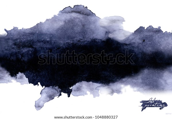 |
| Blocking ink | Block printing ink is ideal for lino and woodblock printing and transfers well to paper. It can be water or oil-based | It will give sharp, accurate prints | 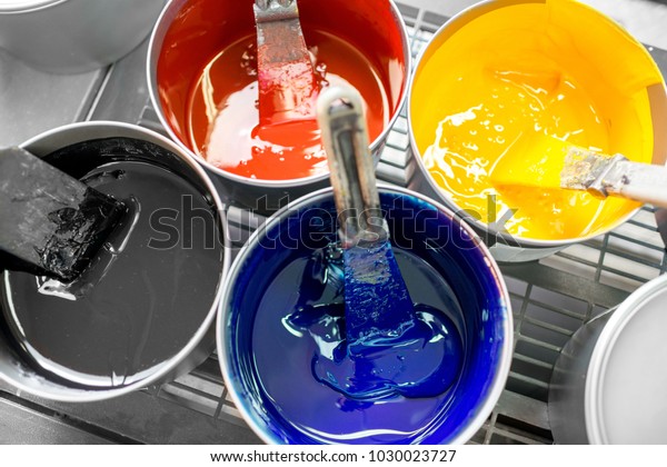 |
| Pastels | These may be ‘hard’ (powdered pigment plus a binder, with a similar composition to chalk) or ‘soft’ (with a similar composition to crayons). There are a wide variety of different colours, sizes and textures available to suit the artist’s needs | As with chalk and crayons, used to create smudged, blended drawings | 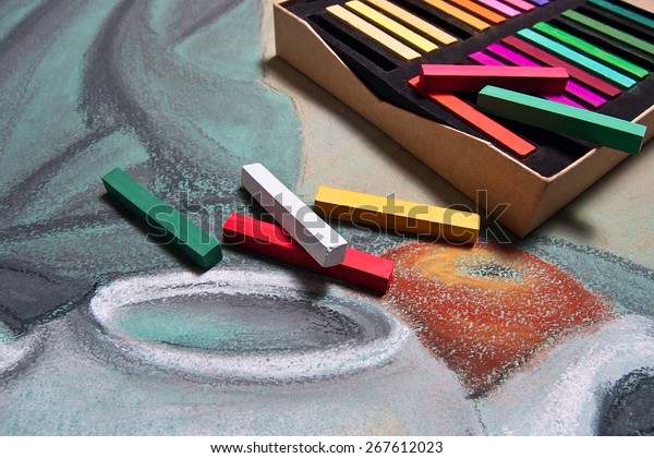 |
| Pencils |
Pencils may be ‘lead’ pencils, usually comprised of graphite, or coloured pencils, comprised of a pigment with a binder. Pencils are graded according to the ‘HB’ system, where ‘H’ means hard and ‘B’ means soft. 9H is the lightest and hardest of the graphite pencils, and 8B is the softest and darkest. Pencils must be sharpened prior to use and regularly as they are used to ensure the tip is pointed |
Used for a variety of purposes, from sketching to shading and applying block colour | 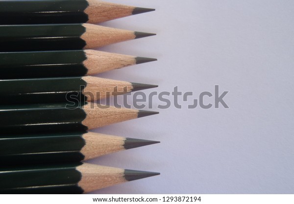 |
| Pens | An instrument used to apply ink to a surface. Some pens require a nip to be dipped in ink. Most modern pens involve a ballpoint, fountain or felt/ceramic tip to apply ink in a smooth, consistent way. There are a variety of colours, thicknesses and other effects | Usually used for sketching outlines. They may also be used for shading | 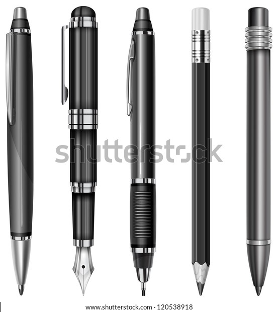 |
| Watercolours | Paints or pencils are designed to be mixed with water to create washed-out, blended art. As with ink, tones/shades are achieved by varying the density of the material | Used to create washed-out, heavily toned/shaded and well-blended art | 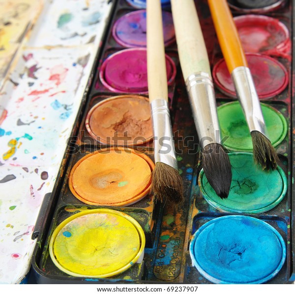 |
| Tools and equipment | |||
|---|---|---|---|
| Tool or equipment | Physical Properties | Capabilities | Images |
| Air guns | A machine that uses air pressure to apply lacquers, paints, varnishes, shellac, and other finishes | To apply paint to a surface (typically metal, wood, stone, clay, porcelain, plastic, glass, textile, etc. | 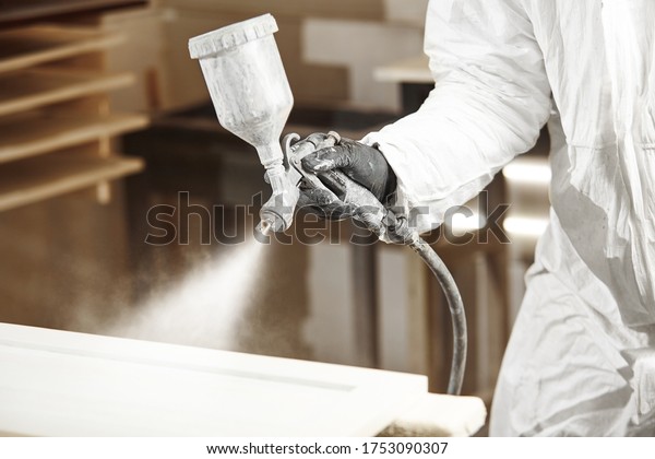 |
| Brushes | All paintbrushes consist of bristles clamped to a handle. However, there are multiple different sizes, shapes and bristle materials used for different purposes/to achieve different effects | To apply paints, inks and other liquid materials and to blend these | 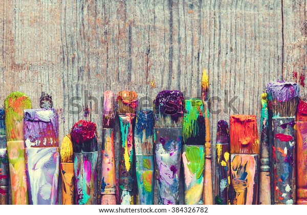 |
| Clamps | A tool that grips an object to hold it in place or to hold it against another object | Used to hold a piece of art or design work, temporarily or permanently | 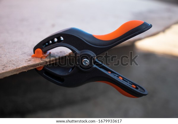 |
| Cutting blades | There are a variety of different types of cutting blades, including retractable trimming knives (where the blade retracts into the tool when not in use), and scissors | Used to cut different materials | 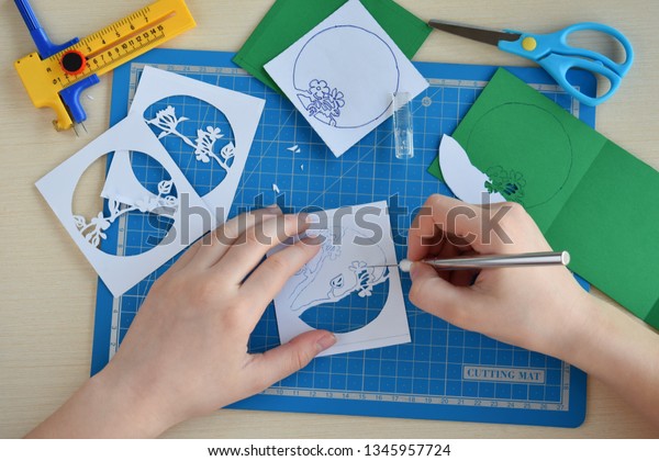 |
| Lino cutting tools | Small cutting tools with a variety of blade shapes for cutting lino sheets | A handheld device that helps to cut into lino sheets for printmaking | 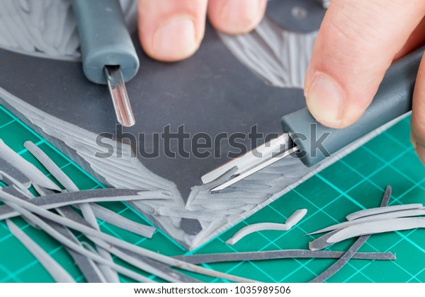 |
| Digital equipment | There are a variety of different types of electronic equipment and accessories, including various software programs, which you can use to support your drawing activities (by recording design ideas, developing draft drawings, etc.) or to create drawings | Depending on the equipment and accessories used and the artist’s skill, various effects can be achieved | |
| Papers |
There are a variety of different types of paper, comprised of different materials and with different weights, textures and colours. So regardless of your drawing needs, you will be able to find a paper to suit:
|
Drawing materials are applied to papers using various techniques | 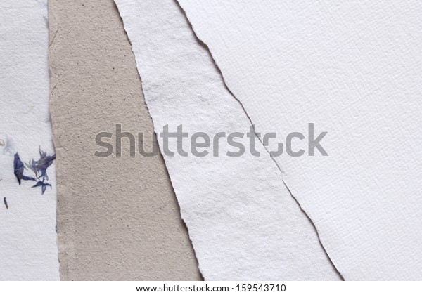 |
| Rags | A tattered piece of cloth material, often torn from a larger piece of material or reused (a second-hand shirt). The most useful rags for artists are those comprised of natural cotton or cotton-blend materials, though highly absorbent synthetic rags may be used | From wiping blending/shading to wiping away excess/waste materials and drying media | 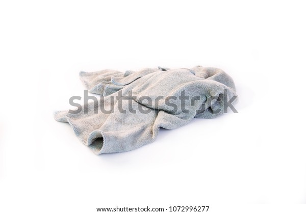 |
| Spatulas | A tool made of a flat plate with a plastic or wooden handle. The plate may be comprised of stainless steel, plastic or a similar material. There are a variety of different types, including sizes, of plates on scrapers and spatulas, to suit the artist’s needs | Use to smudge and blend materials. Additionally, it is used to remove upper layers of material and also to soften or harden lines | 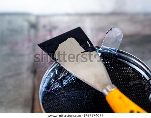 |
| Sponges | A soft, light, porous and highly absorbent material. Sponges may be natural (the fibrous skeleton of an aquatic vertebrate also known as a sponge) or synthetic (typically comprised of pulp or hemp) | Use to smudge and blend materials. It can also be used to remove excess liquid from media. | 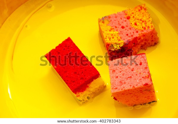 |
Exploration and experimentation aim to identify the correct materials, tools and equipment for the particular piece of work you are undertaking so that the objective of the work can be achieved. New ideas may also be developed on how integrated colour and design processes can be used effectively.
Firstly, decide on the type of artwork that is going to be created. Will it be a two-dimensional (2--d) or three-dimensional (3-d) artwork? The difference between a 2d and a 3-d design is that a 2-d design is flat and only has two dimensions, but a 3-d design has depth and rotation. These phrases, in general, distinguish between a painting and a sculpture. The majority of these shapes are used in geometry.
Designers may experiment with materials and tools that are beyond those commonly used. For instance, some designers may get creative and apply colour with natural materials such as leaves and twigs to create a different effect or use contemporary approaches with items, for instance, spray paint on large surfaces, such as a wall. Experimentation of materials and tools can be without limitations.
The capabilities of different materials, tools and equipment should be explored by using these approaches. Use a visual diary to store ideas and take time to experiment with a variety of different materials, tools and equipment. Focus on methods that are likely to be most relevant to the particular work that needs completing. The following video is an excellent example of how one artist has experimented with materials and tools creatively to integrate colour to his artwork giving a unique design each time.
The following self- taught artist demonstrates how she has experimented with polymer clays and considered the use of colour theory to combine colours to meet the needs of her project. After watching the video, use the information to experiment creatively with a small amount of white polymer clay. Become familiar on how to use and mould the clay to design your own artwork.
Insert activity here.
Some might wonder what makes a good design and how to develop visually appealing products. While this question can’t be answered in a single paragraph, a person should be aware of a few design features and concepts that can help effective management of making creative work.
The aspects that define visual work, the tools and components that are utilised to create a composition, are known as design elements. To put it simply, they are the foundation of design. On the other hand, design principles are focused on how to employ the elements to produce a picture and convey a message. These design elements and principles are a set of recommendations aimed at assisting in the creation of visually appealing products. They take into consideration colour theory, including all the aspects of colour that can be used to integrate it into the design to communicate ideas effectively.
Elements of design
Designers use the elements of design as building blocks to produce their creations. The elements of design are the components that make up a painting, drawing, or other designs. Although they can be isolated and specified in any visual design, they may be arranged and used as part of any composition.
All paintings, designs, or drawings will contain some, if not all, seven elements of design. Let us have a look at these essential elements.
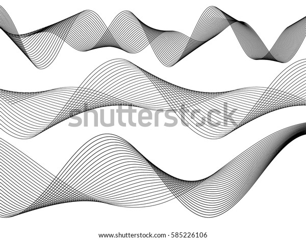
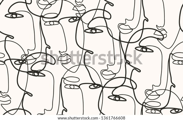
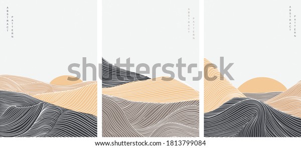
Line
This is one of the most fundamental elements of design. It is the starting place for most artistic creations. A line is a mark between two points that can be expanded into all sorts of forms. This can change shape, direction, or style. It can also create patterns, shapes, move elements, rhythm, emphasis, effects and much more.
Lines are an essential element within your design plan as they can be used as dividing points to organise and structure your layout and play a vital role in setting the mood, message, and tone of your design. They can direct the user’s eyes, create flow, emphasise specific information, create the illusion of movement and organise all design elements into form.
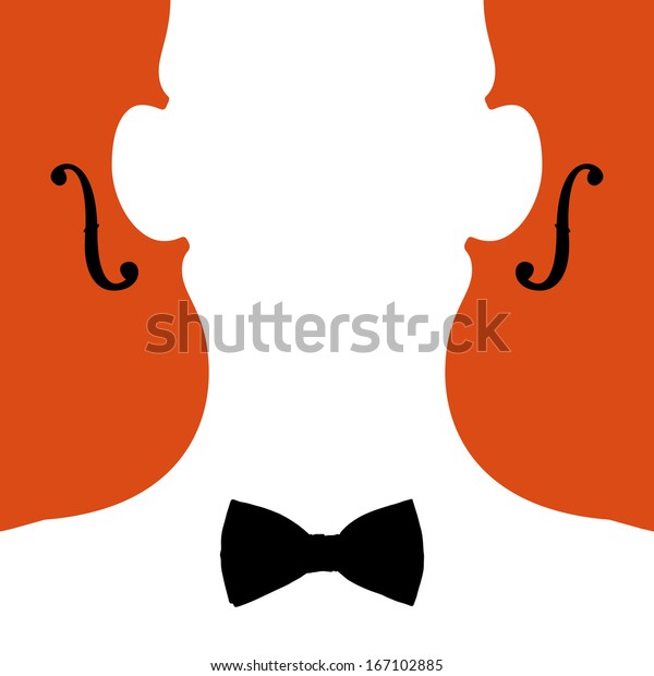
Here are two examples of how the design element "line" can portray various messages within a design piece. First, look at the lines that create movement and compare them to how the lines are used in the second image to realise abstract forms.
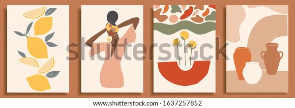
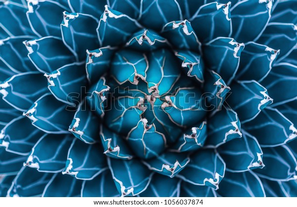
Shape
All objects are composed of shapes, and all elements of design are shapes in some way. The element of design, shape adds interest and substance to a piece of graphic work. It can be used to decorate, create patterns, textures and provide symbolic meaning. Whether a design is complex or straightforward, the relationship between shapes can trigger feelings, convey messages, engage an audience, and create movement. Shapes can be used to create two-dimensional pieces through both organic and geometric shapes. For instance:
- Geometric shapes can be drawn using a ruler, compass, or digital instrument. As a result, they feel very precise, like an architectural rendering.
- Organic shapes are found in nature or drawn by hand. They are the opposite of geometric and often feel natural or smooth. The utilisation of both is used to embed creativity and create a form within your design.
Shapes can be seen in logos, layouts, packaging, and illustrations. Here are some examples of how shapes were used in logo designs and illustrations.

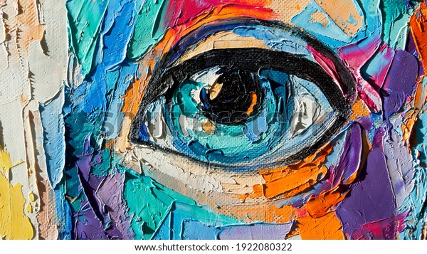
Colour
Colour is also an important element to consider when creating a design. It can help the organisation of a design and give emphasis to specific areas or actions.
Colours can connect people to objects, images and scenes as well as ignite emotions.
- Red is typically seen as a colour of passion, danger, romance, or violence.
- Green relates to nature or sickness
- Blue is linked to calm or depression
- Yellow is warm and inviting, or a warning
- Purple is connected with royalty.
Colour is one of the most challenging elements to harness and probably one of the most challenging to understand while working with all the different ranges, including all the hues, tints, shades and tones within the colour spectrum.
When creating a new design, the chosen colours can either help or harm an artwork. For instance, colour can support the communication of the message conveyed or misinterpret the design. There are amazing techniques when playing with colour. The following examples show some of these techniques.

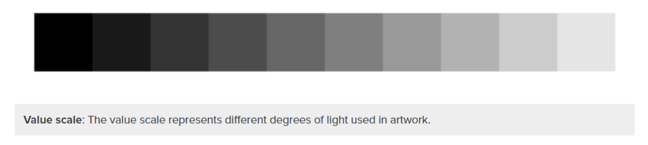
Value or Tone
The design element, value, refers to the relationship between light and dark on a surface or object. The amount of darkness or light that tonal ranges have is used to create depth, shape, and texture.
Value is also referred to as tone when talking about black and white images. It is created by a light source that shines on an object creating highlights and shadows. It also illuminates the local or actual colour of the subject.
Various techniques are used to maximise the power of value when creating a design piece. Next time, when looking at a photograph, painting or drawing, try to notice how the artist is rendering value. When creating an artwork, practice creating value scales with a variety of different mediums and hues. Tint (light colours) and shade (dark hues) are two types of value (dark hues). Value alterations are performed in a subtractive colour painting by adding black or white to the colour. Shade, which refers to more subtle manipulation of value, is another technique used by artists. The value scale is used to depict standard tonal differences. High-keyed values are those that are towards the light end of the spectrum, while low-keyed values are those that are towards the dark end.
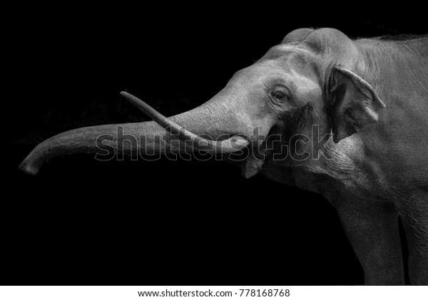
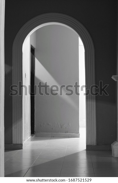
The following images are some examples of artworks that have effectively incorporated the design element "Value".
Texture
Texture is the way a surface feels or the way it is perceived to feel. It has the power to attract or detract an interest and can be applied to lines, shapes, and forms. There are two types of textures: tactile and visual.
- Tactile texture triggers feelings of sensation and touch. Wood, sandpaper, canvas, rocks, glass, granite, metal, and other natural textures are examples of genuine texture. Tactile texture is significantly different to visual texture.
- Visual textures are the textures you see in images. Regardless of how rough items appear in a photograph, the photograph's surface will always be smooth and flat to the touch.
Texture is important as it allows the viewer to use their senses to imagine how something might feel and may provide a visual illusion towards the message you want to convey. Artists can simulate or imply texture in their paintings using numerous art components such as line, shading, and colour. It's made up of lines, dots, and other shapes that are repeated to make a pattern. Other desired effects can be achieved by varying the size, density, and orientation of these marks.
Have a look at some examples of how feel or texture can be influenced throughout different art pieces.
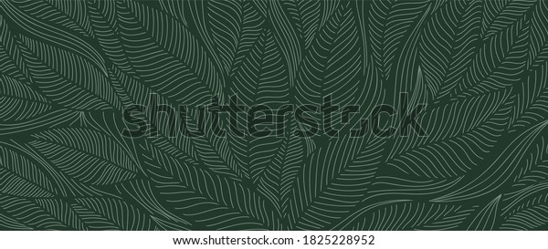
Pattern
The Visual Element of Pattern is created by repeating or echoing the elements of an artwork. In art, there are two types of patterns: natural and man-made. Patterns can be regular or irregular, organic or geometric, structural or decorative, positive or negative, and repeated in both natural and man-made patterns. When designers repeat the same pattern throughout their design, it creates harmony and continuity throughout their piece.
- Natural patterns in art are frequently inspired by patterns that appear in nature. The shape of a leaf and the branches of a tree, the structure of a crystal, the spiral of a shell, the symmetry of a snowflake, and the camouflage and signalling patterns on animals, fish, and insects are all examples of these.
- Man-made patterns are created by humans and are used in art designs for both structural and decorative purposes. An artist, for example, might create a compositional pattern of lines and shapes to plan the basic framework of an artwork. The development of the visual aspects of the composition produces a more decorative pattern of colour, tone, and texture throughout the work.
The following designs are some examples of how a pattern can draw out specific emotions and messages to the viewer.
Space
As an element of design, actual space is a 3-d volume that can be either empty or filled. It has dimensions of width, height, and depth. In a painting, space that appears 3-d is an illusion that gives the impression of actual depth.
The main objects in the work of art are identified as positive space, and the area around them are called negative space. The main subject of a photograph or artwork is referred to as positive space, while the background is referred to as negative space. Space can be used to both separate and connect elements in a design. Wider spaces separate elements from each other, and narrower spaces connect elements to reveal relationships between them.
Look at the following examples that showcase how space has been successfully used in everyday design.
Insert activity here.
Principles of design
Design principles are guidelines to follow when designing graphics and compositions. These principles are essential to designers as they provide guidance that extends well beyond most people’s mental model of design. They help establish a structure made up of rules and considerations to ensure the message being conveyed is as effective as possible. So let us dive into the design principles to learn more about how to implement them in a design.
Hierarchy
Hierarchy is one of the most fundamental design principles since it allows one to rank a design piece visually. No matter the style of a design, it is the order of importance that will determine the hierarchy. Through a good design, the eye will be guided through each region in order of priority. A homepage of a website provides a good example of this. For instance, a webpage frequently presents a navigation bar and business logo, as well as a huge header image or text that has a call to action. Naturally, through hierarchy, the eye is drawn to the most significant element on the webpage; this is typically the title. Then the eyes will navigate to the intro that will give a synopsis of the article. It won't make much sense if we read the article from bottom to top. Therefore, when implementing hierarchy, a good rule of thumb is to ensure that the most important aspects should be the most apparent.
Contrast
When two components on a page are different, this is called contrast. When someone says a design "pops," they're referring to the amount of contrast in the design. It leaps off the page and sticks in your mind. Contrast can be used in many ways depending on the design. It could, for example, be:
- Contrast in colour between the text and the background
- A large, bold, grungy font for the heading
- The difference between a large and a small graphic
- A rough texture combined with a smooth finish.
When contrast is applied, a design is not only more appealing, but the artworks’ purpose and organisation are much clearer, balanced, and eye-catching also. The heavier black-type contrasts work well with the lighter body text. Advertisements, websites, and logos are all examples of this idea in action.
Looking at the iconic iPod commercial, contrast was skillfully employed to draw the viewer's attention to the music player. Using a brightly coloured background, the commercial features a silhouette character. However, the iPod and earphones are white, which contrasts sharply with the silhouette and coloured background.

Alignment and Balance
Every element that is placed on a page has a certain amount of weight. Colour, size, and texture can all contribute to weight. All the weighty elements cannot be crammed into one section of a composition, just like all the furniture in a home would not be placed in one corner of the room. It will feel as if the viewer’s eye is sliding off the page if there is no alignment or balance.
Alignment is a design principle that relates to how text and visuals are arranged on a page. It is used, so all visual elements line up in composition. Alignment is used everywhere we look. Think about the last time you read a menu at a restaurant or entered a retail website to see their products. They have utilised the use of alignment to ensure their visual elements are in line with their text to create a balance and structure to their design piece. In design, we use alignment to organise and group elements, create balance, structure, and connections between the elements and create a sharp and clear outcome.
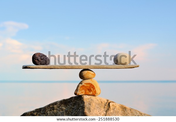
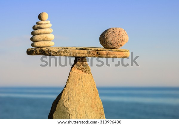
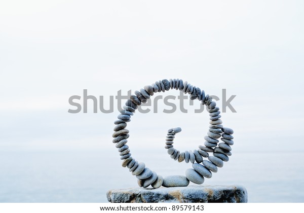
To balance a composition, positive elements and negative space must be arranged in such a way that no one section of the design dominates the others. There are three main types of balance, these are:
- Symmetrical balance
- Asymmetrical balance
- Radial balance
Symmetrical Balance
Mirror image balance is symmetrical balance. For example, if a line along the middle of the page is drawn, all the visual elements on one side of the design are reflected on the other side. They don't have to be the same, but they should be similar in terms of number, colour, shape, and scale. When the weight of visual elements is equal, they are in balance.
Asymmetrical Balance
Asymmetrical balance is the opposite of symmetrical balance in that it is not the mirror image on both sides of the centre line and it does not rely on symmetry. When multiple minor visual elements on one side are balanced by a large visual feature on the opposite side, asymmetrical balance occurs.
Radial Balance
Radial balance is the third type of balance, in which all elements radiate outward in a circular pattern from a central point. It's simple to keep a focus point in radial balance because all of the pieces point to the centre.
Repetition
The recurrence of repetition refers to the use of the same or comparable elements throughout your design. The repetition of design elements in a design creates a strong sense of unity, consistency, and cohesion. Repetition is vital in printed products. Beautiful graphic patterns are a big part of today's packaging designs. Repetition is necessary for great design. Some elements of your design should be repeated throughout the artwork. Repeating fonts, a specific type of bullet, graphical element, a shape in your logo that you then take through the rest of your design, a spatial relationship, or an interesting layout are all examples of this. Visual elements that are repeated help to unify and strengthen a piece. It's a method of tying everything together.
Proportion
The relationship between two or more elements in a design and how they compare to one another is known as proportion. When there is a correct relationship between the elements in terms of size or quantity, the proportion is said to be harmonious. For example, consider the information box at the bottom of a concert or movie ticket or a sidebar on a website or a search bar. Grouping these related topics can give them importance at a lower scale. Only if all aspects of a design are well-sized and intelligently arranged proportion can be achieved. Proportion should emerge naturally once alignment, balance, and contrast are mastered. One of the more straightforward design elements is proportion. Simply explained, it refers to the relative sizes of items. Proportion denotes what is and isn't important in a design. The larger the element, the more essential it is and the smaller the element, the less important it is. A design is considered "out of proportion" when the relative size of two elements being compared appears incorrect or unbalanced.
Movement
Flow is about movement and direction and leading the eye from one part of a composition to another in the direction the artist wants it to move. Movement can be created through visual cues such as arrows and lines to support the viewer in understanding the order of their eyes. It helps to determine where they have to look first, where their eyes should pause and how long they should linger there.
White space
White Space in design composition is same as the use of Silence in a musical composition. Without proportionate use of Silence, music is unstructured; some may call it noise. Similarly, without White Space, design is unstructured and difficult to consumePratik Hegde
Unmarked space in design is called negative space or white space. It does not mean that the space should be an empty area without any colour, it is simply the area that deals with what is not added. White space can be any colour or pattern and is an excellent guideline to apply if the artist wants to emphasise or prioritise a specific image.
How exploring colour theory and design processes can be combined for project needs
It is important to understand that no single part of the design process works in isolation. Communicating ideas using these elements and principles merged with colour theory and aspects of colour to deliver a final artwork will help create an effective design. It is necessary to carefully consider how all of these can work in tandem to communicate the intended message. Ways in which colour theory and design processes can be explored and combined to meet the needs of a project include:
- Brainstorming of ideas
- Research and analysis (including researching colour theory and principles of design)
- Combining research findings of colour theory and design process with the exploration and experimentation of equipment, tools and materials
- Recording ideas within the process to develop and bring to life.
Insert activity here.
In this topic, we focused on Communicate Ideas Through Applying Colour and Design Theory. You have learnt:
- How to communicate ideas using colour within a final product
- Experimenting with materials, tools and equipment
- Explore and develop new ideas through the process of experimentation
- Communicating ideas using elements and principles of design.