
In this topic, you will learn to use the findings from previous statistical and Pareto analyses to create more focused analytical reports that will help make operational decisions based on historical data. Therefore, you will learn how to:
- draft report on data analytics
- apply identified insights for decision-making requirements
- seek input and integrate feedback from required stakeholders
- finalise and distribute recommendations to required personnel.
Foundation skills
In this topic, you will further develop the following foundation skills.
- Technology: You should already be familiar with the basic concepts and terminology related to Power BI Desktop, as it was introduced to you in the previous topic. The practical activities in this topic will help you gain skills in using this tool more efficiently. You will learn how to draft reports/dashboards that can react to different parameters based on specific scenarios for operational decision-making. You will also use this tool to make necessary changes to reports (both functional and design) according to requests made by stakeholders.
- Numeracy: In this topic, you will learn to use complex mathematical calculations and record numerical data related to the required business metrics in reports/dashboards. You will also learn how to make required changes to previously written DAX statements as part of actioning stakeholder feedback.
- Planning and organising: The practical activities in this topic can have many steps, and processes when carrying out certain analysis tasks to support operational decision-making. These activities will help you further develop your planning and organising skills to perform these tasks more efficiently, using the correct logical sequence.
- Writing: You are already familiar with using clear, specific and industry-related terminology when representing key outcomes and recommendations from the previous topic. In the final practical activity on this topic, you will further develop this skill and learn to write recommendations to stakeholders on how the final outcomes from the analysis can be used to inform operational decision-making.
- Oral communication: Analysts will need to ask open and closed probing questions and actively listen when seeking stakeholder input and feedback. In this topic, you will be introduced to best practices and guidelines when presenting information to stakeholders.
You will put these foundation skills into practice by performing the practical tasks in this topic.
Recall the difference between traditional ‘reports’ and ‘dashboards’ discussed in Topic 3. Therefore, in this topic, any references to ‘reports’ will typically relate to dashboard-style reports or dynamic report pages that are created using business intelligence tools such as Power BI Desktop.
Report on data analytics for operational decision-making
Considerations when drafting reports
The first version of the report/dashboard page created on data analytics will typically be a ‘draft’ version. This draft version will then go through a cycle of evaluation by relevant stakeholders who will provide their input and feedback. Once all feedback has been actioned the latest version of this report then becomes the ‘Final’ version.
When drafting any type of analytic report (e.g. statistical analysis report, what-if analysis report) analysts must ensure that it meets the reporting requirements of the business, which were identified during the requirement-gathering stage of the project.
Some of the considerations when drafting a report are to ensure that:
- it clearly states the title, objectives, problem/opportunity statement and analytic themes of the report
- the correct dataset is used as the basis for the report
- the correct technology/tools are used to draft the report
- the required business metrics are captured, calculated and recorded in the report
- the correct data analytic techniques are used to obtain the required insights for operational decision-making
- the appropriate visualisation types are used to represent information in the report
- the appropriate layout, templates and brand/style guidelines are used when creating the report
- feedback is obtained from subject matter experts and relevant stakeholders
- any feedback received is integrated into the report.
Using big datasets as the basis for operational decision making
Analytic reports for operational decision-making and the accuracy of the results that they generate greatly depend on the relevance and correctness of the underlying data it is based on. The underlying data is often derived from big data sources (can be internal, external or a combination of both) and has gone through various transformation steps before a data model is created that can be used in analytic reports.
Analytic reports, when implemented correctly, will enable businesses to make operational decisions in work areas. This is highly beneficial for businesses as it helps identify trends, patterns and insights that may not have been apparent before, allowing for better decision-making and improved operational efficiency.
However, it should be noted that each analytic report must be contextualised for specific business and reporting requirements (e.g. specific work areas, specific operational processes and relevant business metrics) for the report to be useful for operational decision-making.
Applying identified insights from previous analysis
When drafting a report on data analytics to help with operational decision-making, it is important to apply previously identified insights of the data into this report.
For example, in the previous topic, you learnt how to apply the following.
- Descriptive statistics - to create a univariate analysis report.
- The Pareto (80/20) rule - to create an analysis report to gain insights on the actual percentage of inputs that causes 80% of outputs.
Findings from both the univariate analysis (such as the existence of outliers in the data) and the Pareto analysis (such as the percentage of inputs that can make the greatest impact on the output) should be applied and considered when drafting the next analytic report (e.g. what-if scenario analysis) that will specifically be used for operational decision-making.
Using what-if scenario analysis reports for operational decision making
The process for conducting a what-if scenario analysis
What-if analysis is the process of planning strategies based on how independent variables affect dependent variables in a system. What-if analysis can be used to predict the results of hypothetical situations based on the premise of asking the questions “what-if” to the system by altering variables to see what effect they have on the rest of the system.
The process for running a what-if analysis is as follows:
- A complex system, such as a business organisation, is represented by a model that consists of data collected about the business. The business and operations are represented by variables in the model.
- Scenarios are created to be used as independent variables.
- Other portions of the business that are affected by scenarios are created to act as variables that can be altered by the independent scenarios.
- Scenarios are changed, and the effect on dependent variables is presented as data.
Hypothetical scenarios are run to gain insight into how those hypothetical scenarios may eventuate if they were actually to take place. Based on what-if analysis, decisions on developing strategies to prevent or deal with hypothetical situations can be made.
Demonstration: Creating parameters for what-if scenario analysis
The following video discusses how parameters can be used in a Power BI Desktop to generate a what-if scenario analysis report. When watching the video, pay close attention to the following.
- The thinking process or methodology behind this analysis.
- The steps followed to create numerical parameters.
- The steps for implementing the DAX formula for creating scenario-related measures using the SUMX function.
Let us put into practice what you have learnt about scenario analysis.
Practical activity 1: Draft a what-if scenario analysis report
This activity will help you prepare for the demonstration tasks in your formal assessment. You will specifically learn how to:
- create a report page for the scenario analysis using the given templates and standard guidelines
- include required filters in the analysis
- create a numeric range parameter
- create the required calculated measures for the scenario analysis
- record numerical data in the dashboard
- visualise data using a variety of charts
- adjust parameters in the dashboard to support operational decision-making.
Use the same Power BI work file you created in the last practical activity and save it as ‘Demo7-What-if Scenario Analysis’.
scenario:
The management at XYZ Manufacturing wants to decide on how much of a cost reduction percentage (%) will help maintain next year’s manufacturing costs to be approximately under $175K. In this activity, we will create and use a what-if scenario analysis report to help make this decision.
Also note that:
- the management wants to apply this cost reduction scenario only to the Top N percentage of products that have the greatest effect on manufacturing costs.
- we already know the Top N percentage and the associated number of products as a result of the previously conducted Pareto Analysis.
Task 1 - Create a new report page for the what-if scenario analysis
Step 1– Create a new report page using the XYZ Manufacturing’s standard dashboard template.
Step 2 – Rename the new dashboard page as ‘Costing Scenario Analysis (Draft)’.
Step 3 – Customise the ‘Title’ of the report page as ‘Costing Scenario Analysis| Dashboard’.
Step 4 – Customise the ‘Sub-title’ of the report page to state the goal of the analysis as “GOAL: TO ANALYSE SCENARIOS FOR COST REDUCTIONS REQUIRED TO ENSURE THE TOTAL COST OF MANUFACTURING DOES NOT EXCEED 175K NEXT YEAR”.
Task 2 – Apply identified insights from previous analysis to this report
Step 1 - From the previous ‘XYZ Manufacturing Financials Overview’ page, copy and paste the following filters to this dashboard page.
- ‘Select year: ‘ – containing values from the input field ‘Year’
- ‘Top N%: ‘ – containing values from the input field ‘Top N%’
Step 2 - From the ‘XYZ Manufacturing Financials Overview’ page, copy and paste the ‘Total Cost’ card visual to this dashboard page.
Also, rename this card visual title as ‘Cost Last Year’.
Step 3 - From the ‘Top N Product Cost: Pareto Analysis’ page, copy and paste the ‘Top N Products’ card visual to this dashboard page.
Task 3 – Create a numeric range parameter
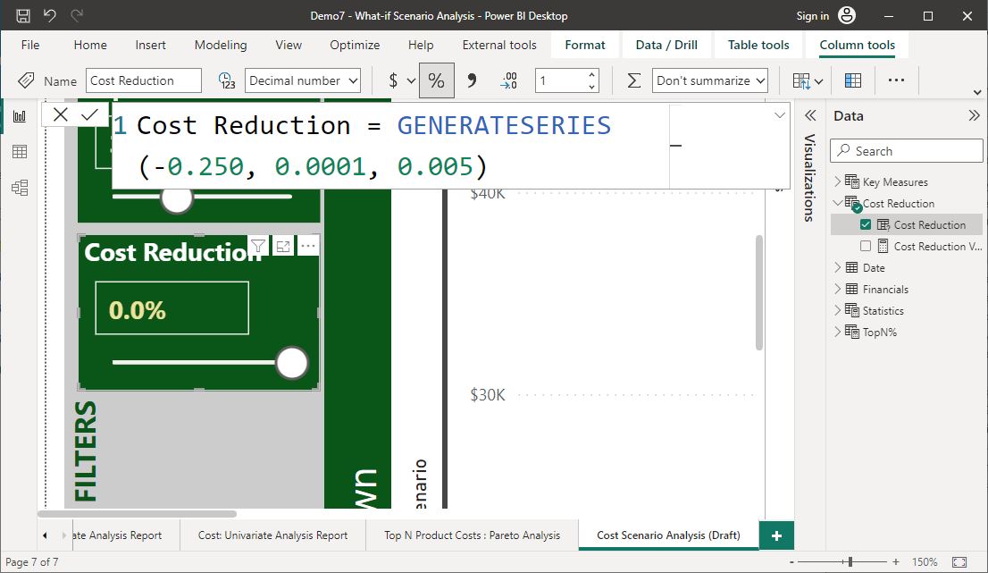
Create a numeric range parameter called ‘Cost Reduction’ according to the following procedure, specifications and formatting guidelines.
From Power BI Desktop, navigate to the ‘Modelling’ tab> ‘New parameter’ > Select ‘Numeric range’ and customise according to the following specifications.
- Name of the parameter: Cost Reduction
- Data type: Decimal Number
- Min: -0.250 (Note: this is a minus value)
- Max: 0.0001
- Increment: 0.005
- Default: 0
- Select the option to ‘Add slicer to the page’.
Configure the ‘Cost Reduction’ field as a ‘Percentage’ format with one decimal point. The correct format should be visible in the ‘Slicer’ visual. Place this visual in the ‘Filters’ section of the dashboard.
Apply the following format specifications to the parameter slicer so that it stands out from the rest of the filters.
- Visual > Slicer header: Off
- Visual > Values > Values> Font: Segoe UI, Size: 14, Style: Bold, Color: #F0E199
- Visual > Slider: On
- General > Title> On
- Text: Top N %
- Font: Segoe UI
- Size: 14
- Style: Bold
- Text colour: #FFFFFF
- General > Effects > Background > Color: #0A5619, Transparency: 0%
Task 4 – Create the required scenario measures for the analysis
Step 1 - Create a new table called ‘Scenario Measures’.
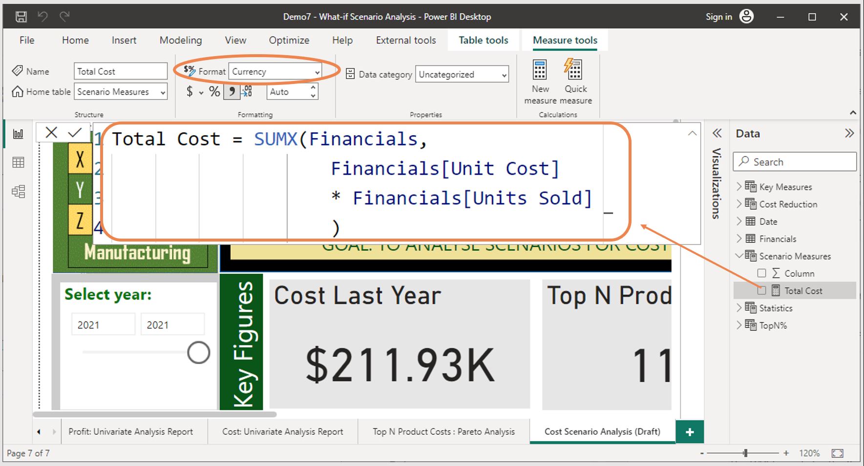
Step 2 – Create a new measure called ‘Total Cost’ within the ‘Scenario Measures' table, to calculate the sum of manufacturing costs using the ‘Unit Cost’ and ‘Units Sold’ fields from the ‘Financials’ table.
Note: Use the SUMX function when writing the DAX formula.
The DAX formula for 'Total Cost' that uses the SUMX function can be written as follows:
Total Cost = SUMX (Financials,
Financials[Unit Cost] * Financials[Units Sold]
)
Step 3 - Adjust the format of this calculated value to ‘Currency’.
The procedure to change the format of the calculated measure value is as follows:
- Select the new measure.
- Then, from the top menu of Power BI Desktop, select the ‘Measure Tools’ tab
- Select the ‘Format’ drop-down to select ‘Currency’.
The following screenshot demonstrates how the standard protocols of writing DAX statements are used to create the ‘Total Cost’ calculated measure and how the ‘Currency’ format is applied to its value.
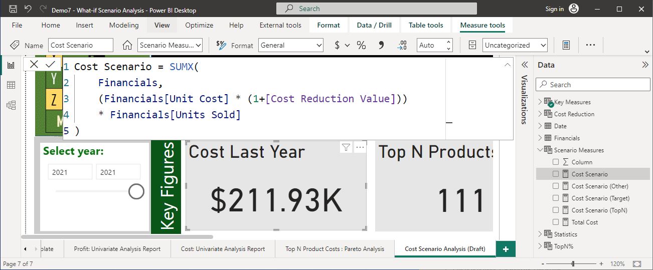
Step 4 - Create a new measure called ‘Cost Scenario’ within the ‘Scenario Measures’ table according to the given criteria
The DAX formula for the ‘Cost Scenario’ must:
- use the previously created ‘Total Cost’ measure formula using the SUMX function as a basis for this calculation
- incorporate the [Cost Reduction Value] parameter to adjust the unit cost according to the ‘Cost Reduction’ percentage selected in the report
- apply the following basic mathematical formula within the ‘SUMX’ function following the correct protocols and techniques for writing the DAX statement in Power BI.
= (Unit Cost * (1 + [Cost Reduction Value])) x [Units Sold])
The following screenshot demonstrates how the standard protocols of writing DAX statements are used to create this calculated measure.
Step 5 - Create a new measure, ‘Cost Scenario (Top N)’, within the ‘Scenario Measures’ table that applies the ‘Cost Scenario’ to the relevant ‘Top N’ portion of products.
Note: According to the scenario, we only want the cost reduction to be applied to the Top N% of products we identified from the previous analysis that contributes most to the total manufacturing cost.
Use the given DAX formula to create this measure and adjust the format of this calculated value to ‘Currency’.
Cost Scenario (TopN) =
VAR ProdNum = [No. of Selected Products from TopN%]
RETURN
 CALCULATE([Cost Scenario], // Note: This calculation is based on the ‘Cost Scenario’ measure which can change based on the adjustments on the cost reduction parameter.
    FILTER(VALUES('Financials'[Product ID]),
        RANKX(VALUES('Financials'[Product ID] ), [Total Cost], , DESC ) <= ProdNum))
Step 6 - Create a new measure, ‘Cost Scenario (Other)’, within the ‘Scenario Measures’ table for the remaining non-selected products.
Use the given DAX formula to create this measure and adjust the format of this calculated value to ‘Currency’.
Cost Scenario (Other) =
VAR ProdNum = [No. of Selected Products from TopN%]
RETURN
CALCULATE([Total Cost],
    FILTER(VALUES('Financials'[Product ID]),
        RANKX(VALUES('Financials'[Product ID] ), [Total Cost], , DESC ) > ProdNum ))
Step 7 - Create a new measure, ‘Cost Scenario (Target)’, within the ‘Scenario Measures’ table to calculate the new target cost scenario value by adding ‘Cost Scenario (Top N)’ and ‘Cost Scenario (Other)’ measures together.
Use the given DAX formula to create this measure and adjust the format of this calculated value to ‘Currency’.
Cost Scenario (Target) = [Cost Scenario (TopN)] + [Cost Scenario (Other)]
Task 5 – Visualise the key metrics required for operational decision-making
Use ‘Card’ visuals to display values from the following calculated measures:
- Cost Scenario (Top N)
- Cost Scenario (Other)
- Cost Scenario (Target)
Format the card visuals to a consistent format as other card visuals in the report. Also, ensure that the values displayed are in the ‘Currency’ format.
Task 6 – Visualise data using a variety of charts
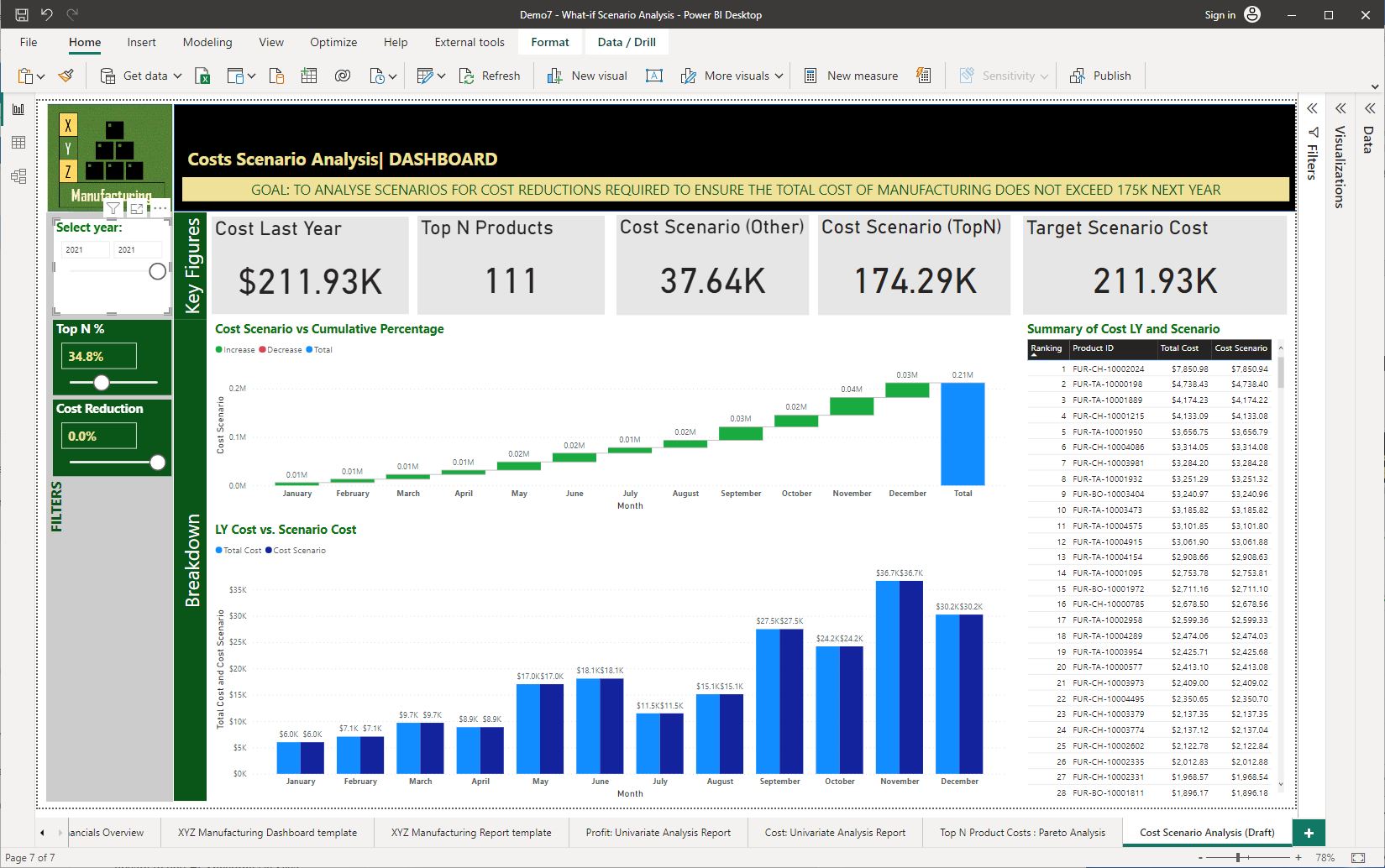
Step 1: Use a ‘Waterfall chart’ to display the ‘Cost Scenario (Target)’ vs. ‘Product-Cost Cumulative Percentage’ by ‘Month’ according to the following specifications.
- Position the visual in the appropriate section for displaying breakdowns in the report.
- Title the visual as ‘Cost Scenario vs. Cumulative Percentage’ and format the title using standard guidelines.
- Rename the ‘Cost Scenario (Target)’ field name used for this visual as ‘Cost Scenario’.
- Turn on ‘Data labels’.
- To rename the input field name, do the following:
- Within the ‘Visualisations’ pane, right-click on the required field name and then select the ‘Rename for this visual’ option. Type in the new name and press the ‘Enter’ key.
- To turn on 'Data labels', do the following:
- From the ‘Format your visual’ tab (second tab within the ‘Visualisations’ pane), you will see the ‘Data label' option which you can then turn ‘On’.
The following screenshots demonstrate how these tasks can be done.
Screenshots were taken using Power BI Desktop © Microsoft
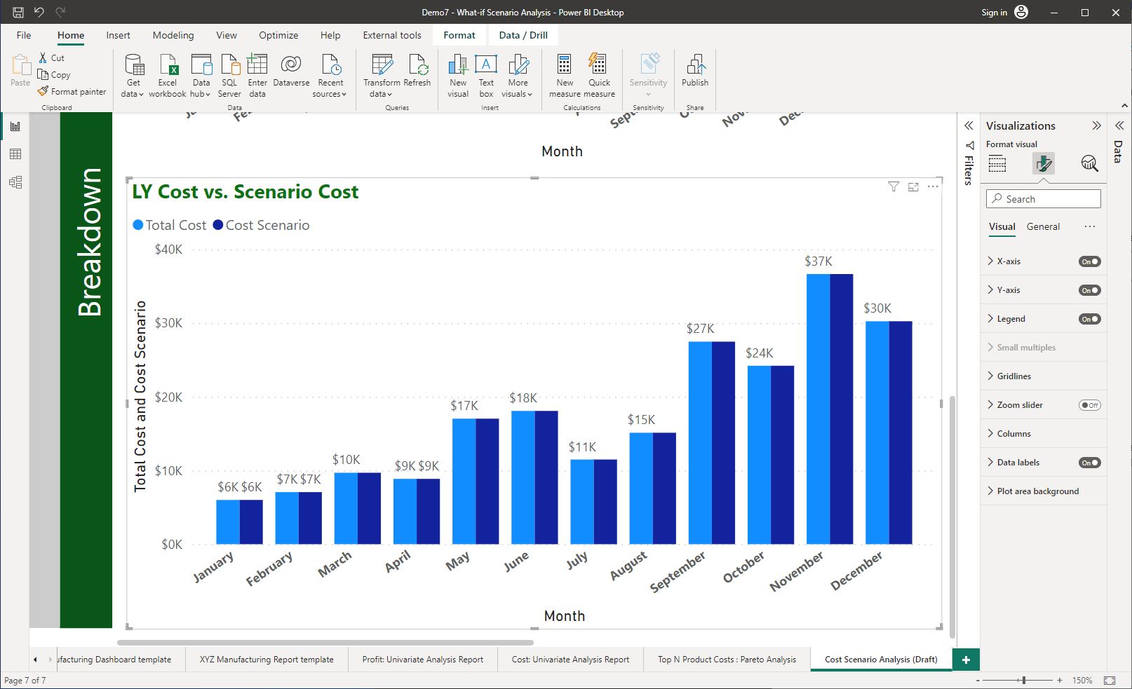
Step 2: Add a ‘Clustered column chart’ to display ‘Total Cost’ vs ‘Cost Scenario (Target)’ by ‘Month according to the following specifications.
- Position the visual in the appropriate section for displaying breakdowns in the report.
- Title the visual as ‘Cost LY vs. Scenario Cost’.
- Rename the field names used for this visual as follows:
- ‘Total Cost’ as ‘Cost LY’
- ‘Cost Scenario (Target)’ as ‘Cost Scenario’.
- Turn on ‘Data labels’.
The following screenshot shows the correctly configured ‘Clustered column chart’.
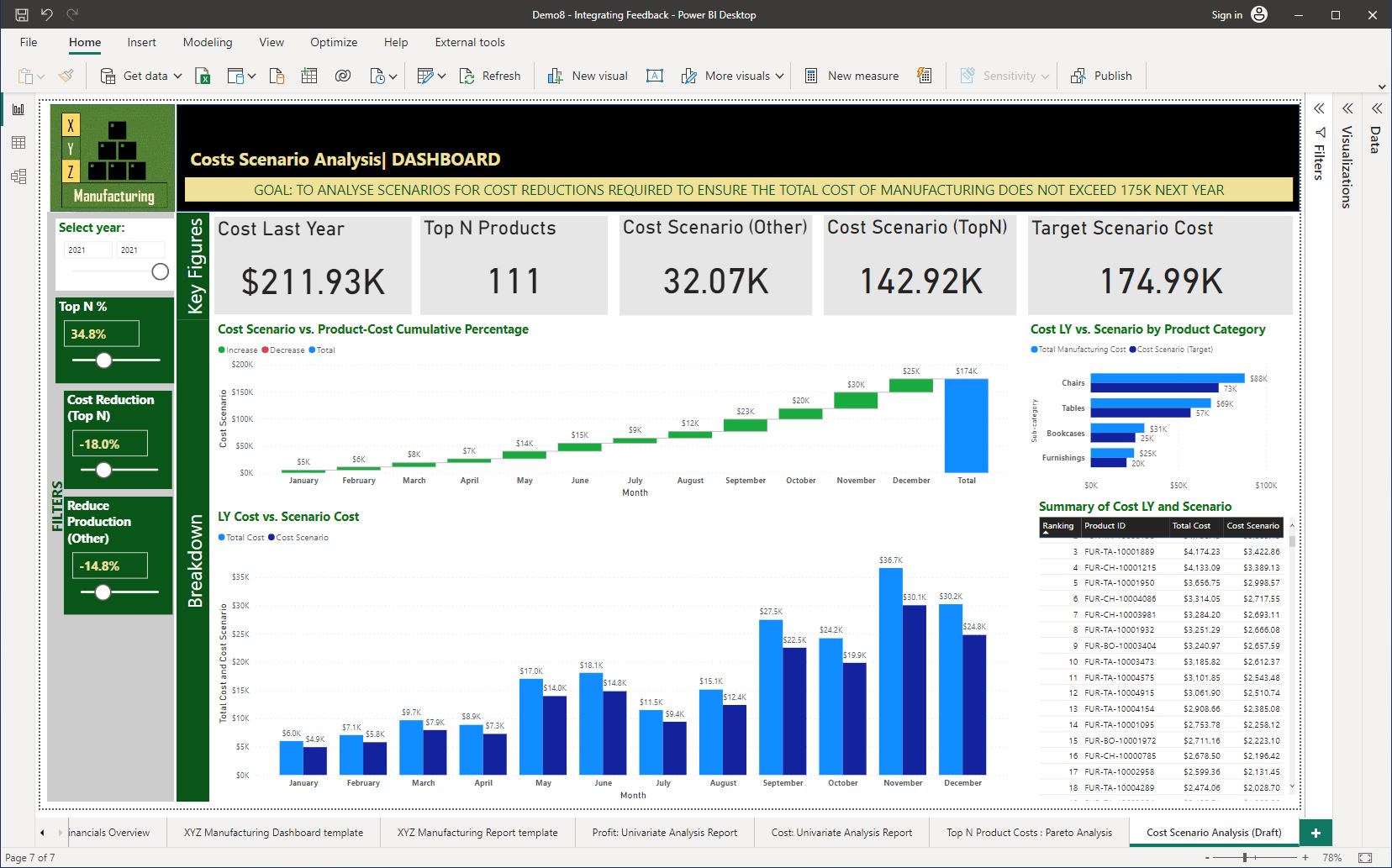
Notice that the ‘Total Cost’ and ‘Cost Scenario’ data columns are at equal heights in the chart. This is because no changes were made (or parameters applied) to the ‘Cost Scenario’ yet. Therefore, at the moment, these values are exactly the same.
Step 3: Add a ‘Table’ to display a summary of the cost from last year and the cost scenario according to the following specifications:
- Table Title: Summary of Cost LY and Scenario
- Table columns:
- ‘Key Measures’[Product Rank]
- Note: Change the name of this field for this visual as ‘Ranking’
- ‘Product’[Product ID]
- ‘Scenario Measures’[Total Cost]
- Note: Change the name of this field for this visual as ‘Cost LY’
- ‘Scenario Measures’[Cost Scenario(Target])
- Note: Change the name of this field for this visual as ‘Cost Scenario’
- ‘Key Measures’[Product Rank]
- Table format: Set the visual > Style presents to ‘Condensed’.
The following screenshot shows the correctly configured elements of the dashboard.
Notice the ‘Cost Reduction’ is set at zero (0). Therefore no parameter adjustments have been applied to this report yet. As a result of this setting, there is no difference between the ‘Cost Last Year’ and the ‘Target Scenario Cost’ values displayed in the ‘Card’ visuals.
Task 7 – Adjust the parameter value to support operational decision-making
Adjust the ‘Cost Reduction’ parameter slider to the right so that this will then be applied to calculate the ‘Target Scenario Cost’ value.
The business requirement is to reduce the cost for next year to a value below 175K. Find out which percentage (%) of ‘Cost Reduction’ will result in achieving this business requirement.
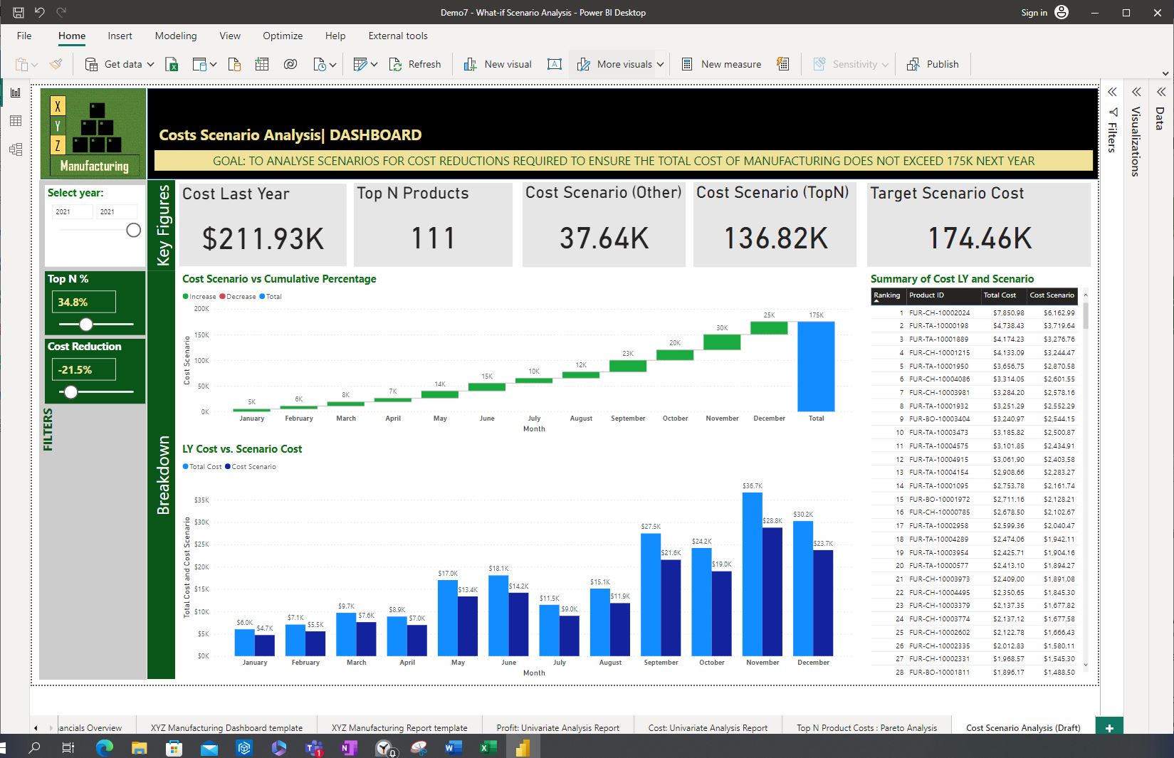
Notice:
- how the values have changed in the visualisations in the report when the ‘Cost Reduction’ parameter is moved from 0 to -21.5% which gives a Target scenario cost value of just under 175K
- the change in the ‘Total Cost’ vs. the ‘Scenario Cost’ in the clustered column chart as well as the summary table.

Seeking input from stakeholders
Once draft versions of reports/dashboards are created to support operational decision-making, it is important to seek input from stakeholders to ensure that the report:
- meets the operational decision-making requirements
- includes the required business metrics
- includes correct calculations
- displays accurate information
- accuracy of the parameter adjustment value ranges
- other design changes required to be made in the report.
Required stakeholders whom input could be sought from may include the following types of personnel.
- Clients
- Business analysts
- Data analysts
- Department heads
- Supervisors
- Area specialists
The following video explains the importance of using the correct strategies when communicating with stakeholders.
Follow organisational policies and procedures
Organisations have policies and procedures related to how stakeholder input or feedback should be gathered and the recommended communication protocols that should be used. Therefore, following these procedures according to the specific organisation’s guidelines is important.
Obtaining written feedback
For example, consider the following extracts from XYZ Manufacturing’s stakeholder feedback policy that includes procedures for obtaining written feedback from stakeholders.
XYZ Manufacturing Stakeholder feedback policy
Feedback should be obtained at various analysis report development stages as appropriate using one of the following methods.
Note: It is important to obtain feedback soon after the information is presented to the stakeholder.
Procedure for obtaining draft report feedback (written method)
This method should be used for gathering feedback from stakeholders on the key elements included in the report. The purpose of obtaining feedback is to ensure all the expected requirements are captured in the report at the draft stage.
To present the draft reports in a visual format, analysts should take clear and good-quality screenshots of the developed report page in Power BI Desktop format and send them to stakeholders via email. In the same email a copy of the ‘XYZ Manufacturing_Draft report feedback form_template.docx’ should be included for stakeholders to provide their initial feedback in writing.
How should the form be completed?
- Analysts should customise the ‘Report type/name’ of the form with the report page name as relevant for the analysis (e.g. ‘Profit Scenario Analysis (Draft)’ )
- Note: The form can be customised according to the number of report pages developed for each project and rows should be added/removed as required.
- The analysts should include a clear screenshot of each report page developed to showcase the design elements, visualisation types used and key performance indicators.
- The required stakeholders should complete the ‘Feedback, suggestions and comments’ section of the form.
A WORD document version of this template is included in the ‘XYZ Manufacturing_Draft report feedback form_template.docx’.
Practical activity 2: Seeking input from stakeholders via Email
You may send out a ‘Draft report feedback form’ including screenshots of the draft version of the report/dashboard to the relevant stakeholders via email. The email should follow the standard email guidelines of the organisation.
It is beneficial to include a short paragraph to summarise the key outcomes derived from the analysis so that stakeholders can evaluate the accuracy of these results as well.
Download and review the following sample email sent by Jenny O’Brien to XYZ Manufacturing’s key stakeholders (Adam Brown and Melani Green) to obtain their feedback.
A sample of a prepared feedback form ready to be sent to the stakeholders may look like the form included in the body of the sample email. Notice that the ‘Feedback, suggestions and comments’ section is left blank (as empty space) for the stakeholders to fill in with their input.
Obtaining feedback verbally
For example, consider the following extracts from XYZ Manufacturing’s stakeholder feedback policy that includes procedures for obtaining verbal feedback from stakeholders.
XYZ Manufacturing Stakeholder feedback policy
Procedure for obtaining dashboard/report feedback (verbally)
This method should be used for gathering dashboard/report functionality feedback from stakeholders relevant to the interactivity/operation/drill-through/page navigation details of the dashboard/report.
The functionality of the dashboards/reports should be demonstrated using the Power BI Desktop format. During or soon after the presentation, verbal questioning should be used to obtain feedback from the audience. This is the most effective method and should be used to obtain crucial feedback from stakeholders, subject matter experts and business users who will use the interactive dashboards/reports.
This method involves: asking for clarification on relevant information using asking open/close-ended questions and responding with relevant information. Active listening and paying close attention to the opinions and comments of the stakeholder is crucial to the success of any project. Therefore, one should take notes of important feedback.
General guidelines for obtaining feedback after a presentation
The following should be considered when obtaining stakeholder feedback during or after a presentation.
- Ask for clarification on relevant information using open/close-ended questions
- Respond to the stakeholder queries with relevant information
- Actively listen and pay close attention to the opinions and comments of the stakeholder. This is crucial to the success of any project. Therefore, one should take notes of important feedback.
The feedback obtained can help to document and reflect on lessons learnt from the overall project and can serve as a reference for future projects and project presentations.
Integrating feedback
What feedback can be received from stakeholders?
The feedback received from stakeholders may include:
- Functional changes – these may arise due to changed requirements, additional features and information required by the stakeholders and so on.
- Design changes – these may be requested to draw attention to important information, correct the format of the information displayed in the report/dashboard and so on.
- Other changes related to the data in the report – how data has been interpreted, decisions made using the data, and information contained in the reports.
Procedure for integrating feedback
When integrating feedback, the general procedure is as follows.
- collate the feedback
- assess the ways the feedback could be applied
- use the feedback to identify necessary changes
- make changes as required
- record the changes
- finally, confirm with the stakeholders whether the applied changes meet their expectations.
Practical activity 3: Integrating draft report feedback
The tasks in this activity will help you put into practice what you learnt about integrating feedback and will help you prepare for the demonstration tasks in your formal assessment. You will specifically learn how to:
- understand feedback received
- action each feedback in the final version of the analysis report/dashboard.
Use the same Power BI work file you created in the last practical activity and save it as ‘Demo8-Integrating Feedback’.
Scenario
Jenny received the following feedback from XYZ Manufacturing's stakeholders.
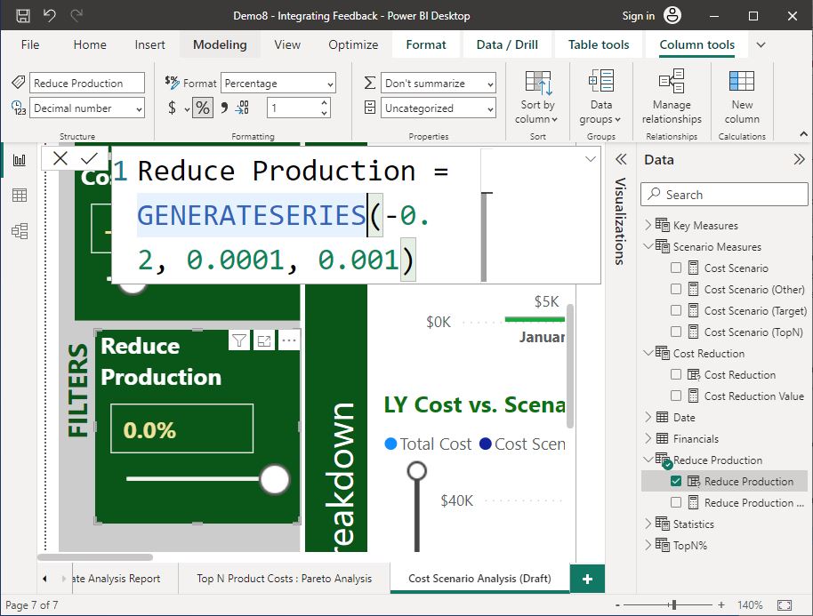
Feedback #1: Add a ‘Reduce Production’ parameter to the report in the numerical range between 0% to minus(-) 20%, with the ability to increment by 0.1% at a time.
Feedback #2: Create a ‘Reduce Production Scenario’ calculation that uses the input value from the ‘Reduce Production’ parameter that influences the quantity (units sold) of the other (non-selected) products in the analysis.’
Feedback #3: Update the measure ‘Cost Scenario (Other)’ to calculate the revenue for other (non-selected) products based on the ‘Reduce Production Scenario’ calculation.
Feedback #4: Configure the ‘Cost Reduction’ percentage value to increment by 0.1% at a time instead of -0.5%. This is because we want to see the granular effect of smaller percentage changes on the cost reduction value.
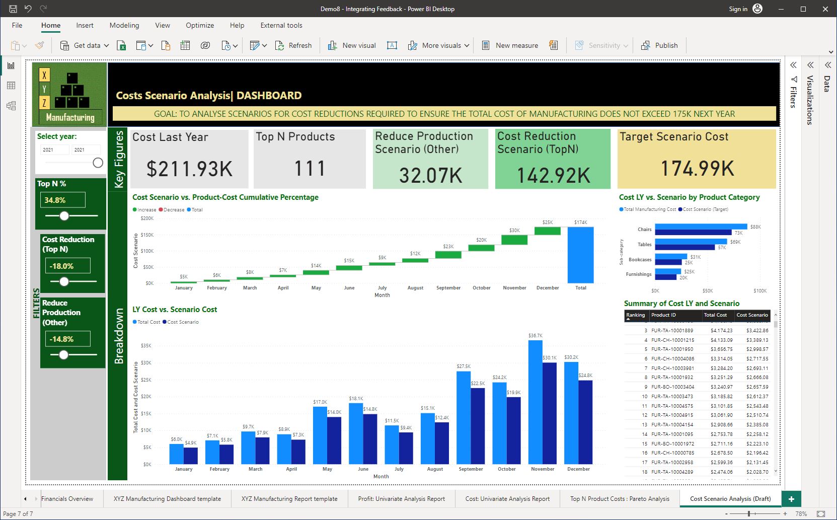
Feedback #5: Rename the numeric range parameter slicer titles to meaningful names to indicate which portion of the products (selected or non-selected) the parameter applies to. For example, rename ‘Cost Reduction’ to ‘Cost Reduction (Top N)’.
Feedback #6: Add a ‘Clustered bar chart’ to display last year’s costs vs the cost scenario target value by the product sub-categories.
Feedback #7: Adjust the ‘Cost Reduction’ and ‘Reduce Production’ parameters to their optimum values achieving the target cost value under $175K for next year.
Feedback #8: Change the background colour of the target cost scenario value to highlight and draw attention to it at first glance.
The recommended method to do this activity.
By now, you should be familiar with the configuration of various elements of reports/dashboards and their format customisations. Therefore, try to action the feedback individually by going through the following tasks without looking at the given answers.
You may refer to the 'Hint' sections to see the detailed steps on how to action each feedback as required. Finally, check your work by looking at the sample screenshots provided under the 'Checkpoint' sections.
Integrate the received feedback to the ‘Cost Scenario Analysis’ report/dashboard by completing each of the following tasks.
Task 1 –Action Feedback #1
Feedback #1: Add a ‘Reduce Production’ parameter to the report in the numerical range between 0% to minus(-) 20%, with the ability to increment by 0.1% at a time.
Procedure: From Power BI Desktop, navigate to the ‘Modelling’ tab> ‘New parameter’ > Select ‘Numeric range’ and customise according to the following specifications.
Specifications:
- Name of the parameter: Reduce Production
- Data type: Decimal Number
- Min: -0.200
- Max: 0.0001
- Increment: 0.001
- Default: 0
- Select the option to ‘Add slicer to the page’.
Field formatting and placement: Configure the ‘Reduce Production’ field as a ‘Percentage’ format with one decimal point. The correct format should be visible in the ‘Slicer’ visual. Place this visual in the ‘Filters’ section of the dashboard.
Slicer format specifications: Apply the same format as other parameter slicers in the report. Try using the ‘Format Painter’ option in Power BI Desktop. Otherwise, manually apply the following format settings.
- Visual > Slicer header: Off
- Visual > Values > Values> Font: Segoe UI, Size: 14, Style: Bold, Color: #F0E199
- Visual > Slider: On
- General > Title> On
- Text: Top N %
- Font: Segoe UI
- Size: 14
- Style: Bold
- Text colour: #FFFFFF
- General > Effects > Background > Color: #0A5619, Transparency: 0%
The following screenshot demonstrates the steps taken to action Feedback #1.
Task 2 - Action Feedback #2
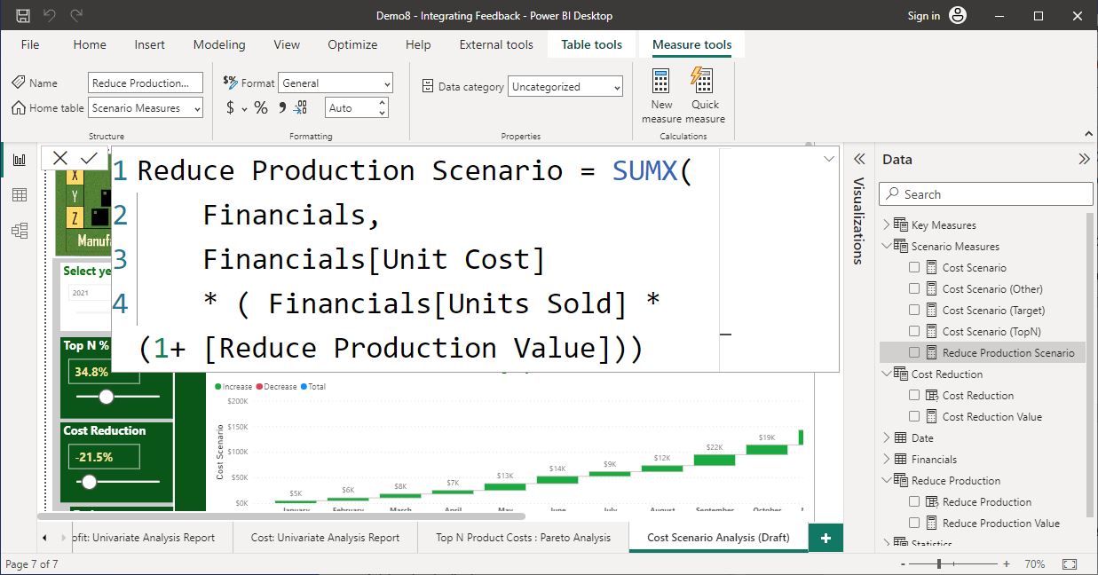
Feedback #2 - Create a ‘Reduce Production Scenario’ calculation that uses the input value from the ‘Reduce Production’ parameter that influences the quantity (units sold) of the other (non-selected) products in the analysis.’
This process is similar to how the ‘Cost Scenario’ was applied to the measure ‘Cost Scenario (Top N)’ in practical activity 1.
Therefore a new measure called ‘Reduce Production Scenario’ must be created within the ‘Scenario Measures’ table that:
- uses the previously created ‘Total Cost’ measure formula using the SUMX function as a basis for this calculation
- incorporates the [Reduce Production Value] parameter to adjust the units sold according to the ‘Reduce Production’ percentage selected in the report
- applies the following basic mathematical formula within the ‘SUMX’ function following the correct protocols and techniques for writing the DAX statement in Power BI.
= [Unit Cost] x ( [Units Sold] * (1 + [Reduce Production Value])
The following screenshot demonstrates the steps taken to action Feedback #2.
Task 3 –Action Feedback #3
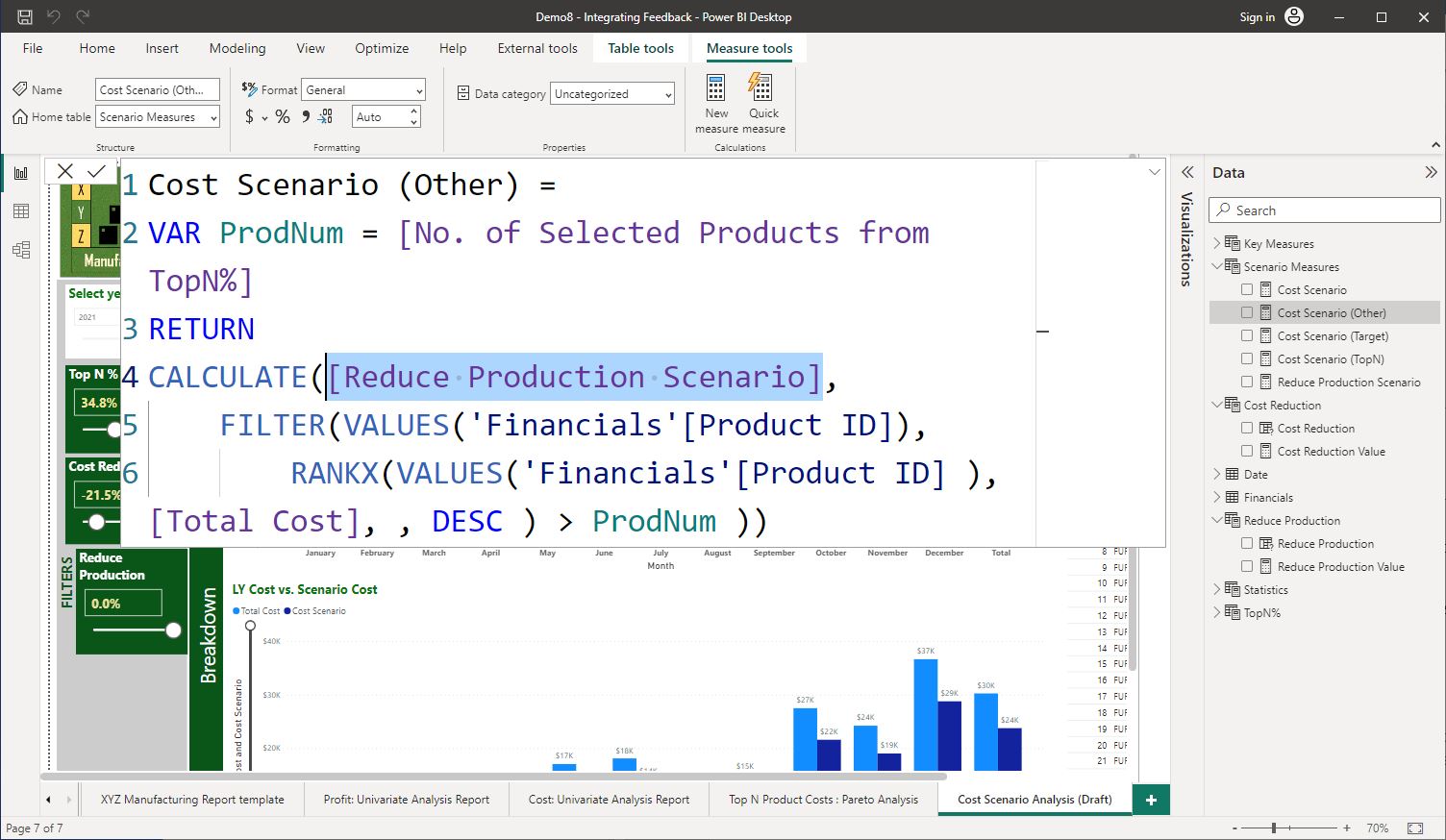
Feedback #3 - Update the measure ‘Cost Scenario (Other)’ to calculate the revenue for other (non-selected) products based on the ‘Reduce Production Scenario’ calculation.
Similar to how the ‘Cost Scenario’ is applied to the ‘Cost Scenario (Top N)’ measure in practical activity 1, you need to apply the ‘Reduce Production Scenario’ to the ‘Cost Scenario (Other)’.
Therefore, the ‘Cost Scenario (Other)’ measure needs to be adjusted so that it calculates the cost for other products based on the [Cost Reduction Scenario]. Refer to the 'Checkpoint' screenshot to see the DAX formula used.
The following screenshot demonstrates the steps taken to action Feedback #3.
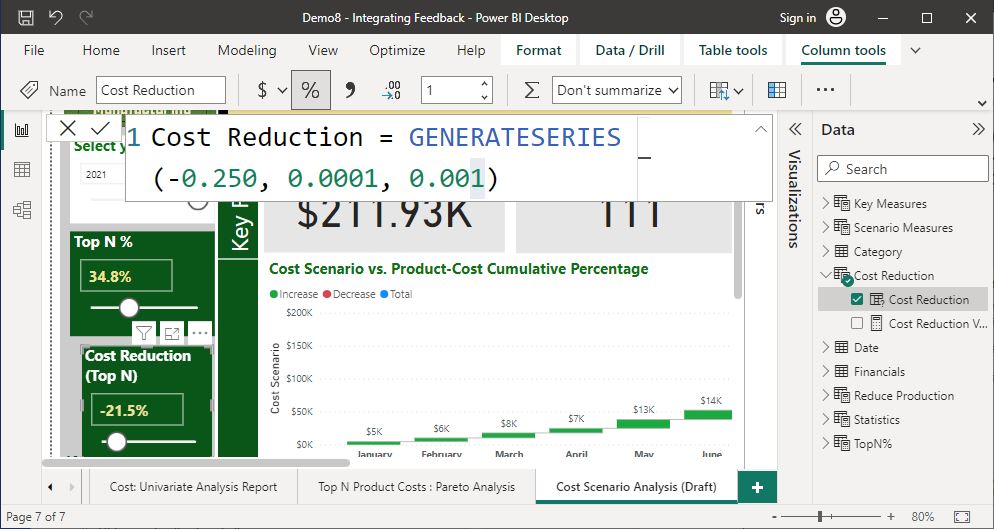
Task 4 –Action Feedback #4
Feedback #4 - Configure the ‘Cost Reduction’ percentage value to increment by 0.1% at a time instead of -0.5%. This is because the stakeholders want to see the granular effect that smaller percentage changes can make on the cost reduction value.
To do this, you can modify the values displayed on the formula bar when you select the ‘Cost Reduction’ measure. Change the third value (increment) to 0.001.
The following screenshot demonstrates the steps taken to action Feedback #4.
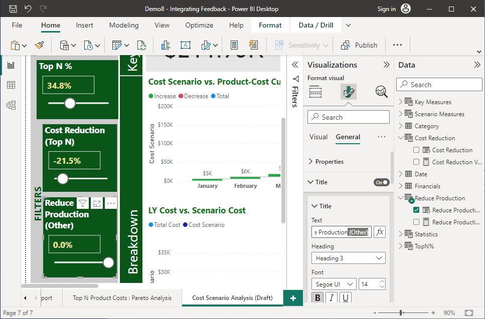
Task 5 –Action Feedback #5
Feedback #5 - Rename the numeric range parameter slicer titles to meaningful names to indicate which portion of the products (selected or non-selected) the parameter applies to. For example, rename ‘Cost Reduction’ to ‘Cost Reduction (Top N)’.
- Select the slicer visual
- Go to the ‘Visualisations’ pane, select the ‘Format your visual’ tab
- Under the ‘General’ tab, expand the ‘Title’ option and change the text.
- Similarly, rename ‘Decrease Production’ to ‘Decrease Production (Other)’.
The following screenshot demonstrates the steps taken to action Feedback #5.
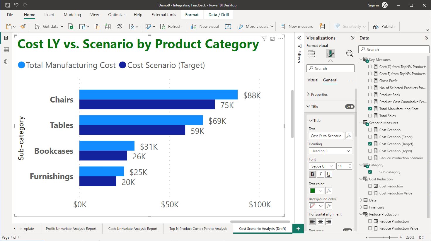
Task 6 –Action Feedback #6
Feedback #6 – Add a ‘Clustered bar chart’ to display last year’s costs vs the cost scenario target value by the product sub-categories.
- You would need to access the ‘sub-categories’ field from the ‘Product’ table in Power BI Desktop’s ‘Model’ view and ensure it is unhidden so that it would appear on the ‘Report’ view.
- Change the title of this visual to ‘Cost LY vs. Scenario by Product Category’.
- Format the title according to XYZ Manufacturing’s standard format.
The following screenshot demonstrates the steps taken to action Feedback #6.
Task 7 –Action Feedback #7
Feedback #7 - Adjust the ‘Cost Reduction’ and ‘Reduce Production’ parameters to their optimum values, achieving the target cost value under $175K for next year.
There can be a variety of combinations of these two parameters that would provide the required result from the report.
Assume that the management wants to keep the Cost Reduction (Top N) parameter to under -20% if possible. Keeping this in mind, adjust the parameter values. One such combination is shown in the screenshot provided under the ‘Checkpoint’ section.
The following screenshot demonstrates the steps taken to action Feedback #7.
Task 8 –Action Feedback #8
Feedback #8 - Change the background colour of the target cost scenario value to highlight and draw attention to it at first glance.
Change the Background Color of the ‘Target Scenario Cost’ card visual to ‘#F1E098’.
Let us also rename the card visuals that display scenario calculations to meaningful names to reflect the scenarios applied for the associated calculated measures.
- Rename the ‘Cost Scenario (Other)’ card visual title to ‘Reduce Production Scenario (Other)’ and apply the background colour as ‘#C5E6CB’.
- Rename the ‘Cost Scenario (TopN)’ card visual title to ‘Cost Reduction Scenario (TopN)’ and apply the background colour as ‘#C5E6CB’.
To change the background colour in each card visual, go to the ‘General’ tab > ‘Effects’ > ‘Background’ > ‘Color’ and apply the colour code.
The following screenshot demonstrates the steps taken to action Feedback #8.

Finalising the report and recommendations
Once the final version is completed after integrating all feedback received from the stakeholders, this should be renamed as the (Final) version.
Consider legislative requirements
Ensure that the analytic results documented in the final report do not contain any personally identifiable data of XYZ Manufacture’s customers.
Revise recommendations accordingly
Based on the final version of the analysis report, the recommendations provided along with the draft version also need to be re-evaluated. The recommendations must be finalised according to organisational and legislative requirements so that the reports are ready for distribution.
When finalising recommendations, they should be assessed and reviewed for:
- compliance with regulatory and legislative requirements
- compliance with organisational requirements for operational decision-making
- accuracy with the information that has been presented as big data insights.
After making the necessary adjustments to the final version of the recommendations, it should also be peer-reviewed to confirm its overall accuracy.
Practical activity 4: Finalise the report and recommendations
Scenario:
Jenny has actioned all feedback from stakeholders. Therefore the analysis report can now be finalised.
Use the same Power BI work file you created in the last practical activity and do the following task.
Task 1: Create the final version of the report.
To do this, rename the report's final version as ‘Cost Scenario Analysis (Final)’.
The following screenshot shows the finalised version of the report.

Task 2: Finalise recommendations
Write a paragraph outlining your recommendations to the stakeholders based on the final version of the analytic report.
Based on the finalised scenario analysis report, the 2021 data indicates that applying a cost reduction of 18% to the Top N (34.8%) of products (total of 111 items), combined with the rest of the products (with reduced production of 14.8%) results in a total manufacturing cost of below 750K (i.e. $174,990).
Distributing reports and recommendations on big data analytics
Once the report on big data analysis report and recommendations are finalised, these will need to be circulated among the relevant personnel or key stakeholders so that they can use it for operational decision-making.
The analytic reports and recommendations may be delivered using various communication channels/modes according to organisational procedures and timelines.
- Face-to-face presentations
- Collaboration tools (e.g. Teams)
- Stored and shared over a secure file system
When distributing the report and recommendations on big data analytics, analysts should ensure that:
- all organisational and legislative requirements are met (e.g. de-identification of any personal information if presented in the report)
- they are distributed to authorised personnel for whom the report was intended
- organisational policies and procedures that apply are followed in the distribution process.
Presenting data analysis and recommendations
When distributing recommendations, this may be in the form of a presentation or a written method. In either case, when presenting insights, the general guidelines to be followed are as follows.
- Be very clear on the purpose of the dashboard.
- Remember that your audience has no clue what your dashboard is showing.
- Tell an appealing story with the use cases and scenarios.
- Draw attention to the area you are discussing.
- Encourage interaction while telling the story.
- Only present what your audience needs to know and no more.
- Focus on consistency in your presentation.
The following video discusses how to present data with a framework, the importance of presentation skills and some valuable tips for presenting data.
Post-presentation Q&A
It is also important to provide stakeholders with the opportunity to ask questions soon after the presentation of data. Therefore, analysts need to be prepared to answer questions effectively.
The following video discusses some of the important aspects things to consider when preparing for post-presentation Q&A, such as:
- how to effectively answer presentation questions?
- what are possible question types?
- how to handle objections?
- when to listen?
- when to respond?
Check your understanding
Answer the following two (2) questions. Click the arrows to navigate between each question.
Topic summary
Congratulations on completing your learning for this topic Interpret big data sources and summaries and the entire unit BSBXBD404 – Use big data for operational decision making.
In this topic you learnt the following:
- Draft report on data analytics, applying identified insights to operational decision-making.
- Seek input and integrate feedback from required stakeholders.
- Finalise and distribute recommendations to required personnel.
Assessments
Now that you have completed all the knowledge and skills in this topic, you are ready to complete the following assessment events.
- Assessment 4 (Project) – Parts E to H
- Assessment 5 (Presentation)