In this lesson we'll explore composition's role in your design process. We'll also take a look at some tools that can help you manage your use of composition in Photoshop.
'Composition' is the craft of placement. Through composition, you will ensure everything is arranged and placed in a way that shapes a viewer's experience of the final design piece.
Composition is a big part of what makes a piece eye-catching and dynamic, or calm and soothing. It completes the design you are creating.
Great design stands out. It can affect our ability to make decisions and influence our choices. By nature, people like to associate with things that look good and make them feel good. People are drawn to colours, typography, art, illustrations etc. Utilising these techniques in a way that is pleasing to the eye will support you in developing a great final product.
Keeping in mind many people are not interested in reading a lengthy document about a product but instead are always happy to have a look at an image that may serve the same purpose.
For example, think of advertisements. Have you ever watched a commercial and you were suddenly convinced you needed 'that' vacuum cleaner? Perhaps a brand-new car or even a meal from a fast-food restaurant? We have all been there.
Marketers are clever when creating graphics as they work to provide a positive image of the product along with the elements and principles of design working in perfect composition.
Below are some examples of good composition. Notice how the designers have arranged elements to create compositions that are effective at communicating mood and message.


Photography helps you capture anything you feel is important to remember. One photograph is powerful enough to not only remind you of an event or detail, but can bring you right back to the feelings, sounds and even smells of the moment.
This is why composition is important – it makes a mediocre image strong. It can capture the essence of many feelings including love, happiness, serenity and movements without needing to use any typography.
Below are examples of guidelines you can use to help you achieve a more attractive composition within your photos. You may find that you already use these guidelines naturally; however, let us investigate further.
Framing
Framing shots allows you to control what information the viewer receives and how they interpret what they see. These two photos are examples of good framing—looking past and looking through other objects captures the main focus of the photo.


How can we use framing to tell a story?
Framing can be used to achieve many effects including:
- creating mystery
- withholding information so that the audience speculates on what could be happening
- giving information about what is about to happen--what may come next
- point of view framing--this is when the photos are taken from the point of view of the character they are portraying.
Rule of thirds
The rule of thirds refers to a composition being roughly divided into 3--horizontally and/or vertically--and points of interest being placed along the third lines or where horizontal and vertical thirds intersect.
The idea is to place the important features of the scene along with one or more of the lines or where the lines intersect. We have a natural tendency to want to place the main subject in the middle; however, placing it off-centre using the rule of thirds will lead to a more attractive composition.
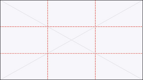
Looking at the photos below, where do you believe the rule of thirds has been applied?


Eye-level
'Eye-level' shots refer to when the level of your camera is placed at the same height as the eyes of the characters in your frame.
These can vary across (a) extreme close-up eye level, (b) close-up eye level, (c) medium close-up eye level, (d) pan right shot, (e) tilt down pan right etc.
Eye-level shots:
- dissolve the barrier between viewer and story
- help you empathise with the character and shows them in a more vulnerable state--'eyes are the gateway to the soul'
- humanise characters with a neutral camera angle
- simulate human vision and familiar composition.
Let's look at how eye-level shots are used to convey these various emotions and messages.
Extreme Close-up eye level

Medium shot

Medium close up low angle

Reflect on these pictures and ask yourself whether these eye-level shots evoke an emotion, feeling or idea from the characters. Do they help you empathise or understand the character?
By answering these questions, it is easy to understand why eye-level is important in creating an effective composition.
Focal point
The 'focal point' is the part of the image that you want the viewer to focus on. A central focal point can seem very formal whereas an asymmetrical focal point usually adds interest to the image.
The reason a focal point is important is that your eyes generally need to focus on one area within the shot. This will help your eyes find a point of interest to hold onto; without it, you may find people will simply glance at your shots with minimal interest before they move on.
Look at the photo below to see the focal point at the left of the photograph. It makes the photo much more interesting than if the subject was in the centre. It also follows the rule of thirds.

Depth of field
'Depth of field' is what happens in photography when you focus the camera on certain parts of an image:
- wide depth of field means that the image is in focus from foreground to background
- narrow depth of field means that only part of the image is in focus.
How does depth of fieldwork?
If you are photographing a landscape scene, you will likely want all of that scene to be in sharp focus. This is called 'deep depth of field' and means that the whole scene is in focus.

At other times you will want only a small portion of your overall image to be in focus. For example, in a close-up shot of a flower, you will want the flower to be in focus and everything else to be softly out of focus. This is called a 'narrow depth of field'.

Depth of field has become an important creative tool used to define subjects within a photograph.
Do you use depth of field as a compositional tool or not? If not, will you try it out?
Illustrations are not limited to drawings, sketches, painting and photography. They also relate to graphs, charts and other forms of visual representations.
Illustration shares similar composition techniques with photography, web design and graphic design as it emphasises the importance of utilising hierarchy, layout, scale, colour and contrast.
WHAT MAKES A GOOD LAYOUT
IT COMMUNICATES!
- It succeeds in delivering the message.
- It has a clear objective. Define the message before you start.
IT ATTRACTS!
- It has visual impact: grabs attention drawing the reader in.
- Needs to be noticed to communicate. Can your layout compete?
IT ORGANISES!
- It maps out a visual path to follow.
- The reader can easily read.
- It establishes Hierarchy.
Below you'll find a pdf that discusses poster design and different types of poster layouts:
![]() Use the skills that you've learnt throughout this topic to crop a photograph using the crop tools, guides and/or grids to achieve one or more compositional techniques discussed above.
Use the skills that you've learnt throughout this topic to crop a photograph using the crop tools, guides and/or grids to achieve one or more compositional techniques discussed above.
Post screenshots of the process (with guides and/or grids visible) to the Digital Image Practicals forum for discussion and feedback!
