Welcome to Topic 1
Select Focus for Research. The purpose of this topic allows you to investigate a range of research methods and skills that that will allow you to carry out your research independently. It enables you to tailor your focus for visual communication research based on your own needs and perspectives.
You will be introduced to the following topics:
- What is visual communication?
- Specific needs and perspectives of visual communication
- Information sources and the research process
- Historical and contemporary sources
- Intellectual Property requirements
You are undoubtedly familiar with the power of images and text to convey specific meanings or messages. However, have you thought about how messages are communicated merely with images? Essentially, visual communication is the practice of using visual elements to communicate information or ideas. Any medium that uses visual assets to give meaning, add content, or evoke emotion can be classed as visual communication. Visual communication is a process of exchanging information by way of images. Images can be used to represent ideas, thoughts, and feelings. They can also be used to communicate a message in an indirect way. Visual communication is important because it allows people to communicate without speaking. It can also help build relationships and foster understanding.
Visual material is processed by the brain over 60,000 times faster than text. It has also been found that using relevant visuals helps the audience remember the information more effectively. Visuals can be used to communicate ideas that words simply cannot — with psychologist Albert Mehrabian estimating that 55% of communication is visual (with 93% being non-verbal overall).1 As the saying goes, a picture paints a thousand words! There’s a good reason that the advertising industry relies heavily on visual mediums, such as image advertisements and billboards.
Watch this video about visual communication.
Visual Communication in Graphic Design
Graphic design combines both images and text to communicate ideas, and graphic designers can create the right design elements in the process of visual communication strategies. For example, typography is considered as one of the most important elements in graphic design, and it is an element in the form of visual communication. It conveys a message you want to communicate to your targeted audience and has the powerful ability to evoke a mood or emotion with its readers. Today many thousands of typefaces are available. Good typographic design enhances the communication of the text. The choice of typeface and its structure and arrangement on the page (the layout) all work seamlessly to aid comprehension. Done correctly the typographic design works so well that the reader comprehends the text without noticing the design. Good typographic design is essentially invisible to the reader.
Graphic design is now recognised as a specialisation of the communication design field and is a profession bound in complex and creative problem-solving processes, combined with visual communication. Here are some good examples of visual communication using a range of typography.2
Martin Luther King Jr Typography Art
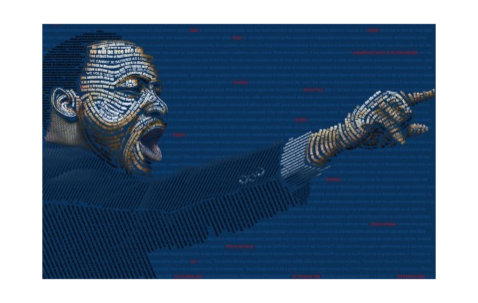
The words of the “I Have a Dream Speech” used to create a Martin Luther King portrait.
Holding Hands Typography Art
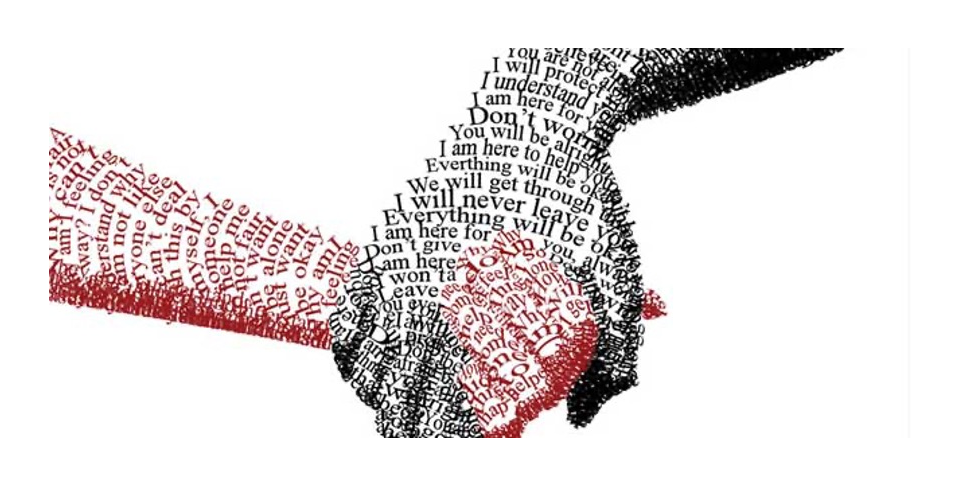
An image of holding hands designed with words of friendship.
Education / Gun Typography Art
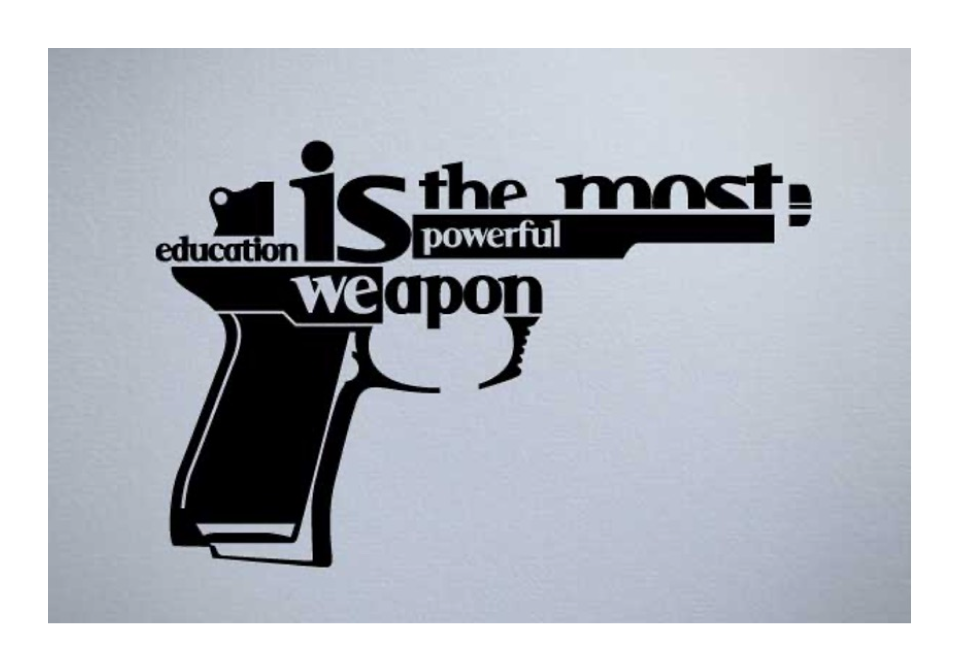
A gun formed from “Education is the most powerful weapon.”
Visual communication is often used in content marketing (creating and distributing valuable information to attract a targeted audience) to supplement blog posts, videos and so on. It is a creative process that combines the visual arts and technology to communicate ideas. It begins with a message that, in the hands of a designer, is transformed into visual communication that transcends mere words and pictures. By controlling colour, type, movement, symbols, and images, the visual communication designer creates and manages the production of visuals designed to inform, educate, persuade, and even entertain a specific audience.
The six design elements
There are a total of six (6) elements of a design that you need to be aware of when you are producing visual communication for graphic design. These are:
- Line
The lines can create different effects and visual impact. While a thick, bold line draws attention because of its visual power, the thin lines tend to go the other way. The colour has an impact too, dark colours are easier to see and draw more attention than light or pale colours. A line is a continuous dot
The IBM logo is a good example of the use of lines in graphic design.
The IBM logo

- Shape
Like lines, shapes are also associated by the human mind with different movements. For example, circles are associated with movement and nature, while squares are often seen as structured, basic designs. Just like with the lines, the colour, style, background, or texture of a shape can totally change the viewer’s perception.
The Mitsubishi logo is a good example of the use of shape in graphic design.
Mitusbishi logo

- Texture
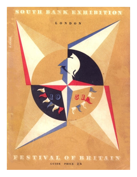
Texture styles include paper, stone, concrete, brick, fabric, and natural elements, among flat or smooth colours. Textures can also be subtle or pronounced and can be used to create a definition in the foreground or used subtlety in the background. They work with pretty much everything.
The Festival of Britain Logo is a good example of this.
The Festival of Britain Logo
- Colour
Even if you don’t realize this, colours have a clear effect on your mind.
Studies have been done and a person who lives in a red environment has a higher heartbeat and pulse than a person living in a blue environment. The human brain sees this and influences the rest of the body. Therefore, colour theory is very important to know, because not many designers can call themselves experts in this field.
The NBC logo is a great example of colour in graphic design. Also, look at the positive and negative space.
NBC logo

There are also these components that can be used in visual communication.
- Space
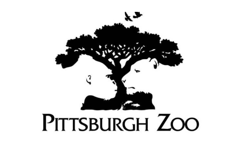
There are two types of space that are used in graphic design – positive and negative. They are terms referring to composition in art, graphic design, and visual communication. For example, in a picture of a palm tree against the sky, the shape of the tree is the positive space. The sky and the space between the branches and leaves are negative spaces.
The logo for Pittsburgh Zoo is a great example of positive and negative space being used to depict nature and animals.
Pittsburgh zoo logo
- Typography
Typography is arguably the single most important part of graphic design / visual communication. Typography can set the tone. For example, a Serif font like Times New Roman tends to evoke a more traditional and serious feeling, while a Sans Serif font like Open Sans reads as more modern. Larger font sizes, for example, catch the user’s eye first and signify a focal point on your page. When a smaller font is beneath it, the reader instinctually knows that it’s a subsection that will support the heading and perhaps provide more context or information.
The FedEx logo is recognised worldwide and features bold lettering. Look at the negative space between the E and the x for a cleverly hidden symbol.
The Fedex logo

Specific Needs and Perspectives of Visual Communication
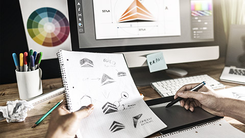
As a designer, you need to understand the needs and perspectives of visual communication and why it matters. Earlier in this topic, the purpose of visual communication was introduced, and it was reviewed in its usefulness in the practice of graphic design. The need to use visuals to communicate important messages and meanings is vitally important to a graphic designer’s skillset. Selecting a focus for research based on your specific needs and perspectives is vitally important.
You should be aware that digital platforms and apps is a huge growth area, and you only have to scroll through your own social media feed, and you are bound to find hundreds of images, videos, memes, and infographics. Infographics are visual representations of data and information. In some ways, any chart or diagram could be labelled an infographic. A map and a weather forecast are both types of infographics. In terms of presentations like infographics, visual storytelling keeps an audience engaged and provides more enticing content than any other platform that communicates vital information. Here is a good example of an infographic from visual.ly.

Undoubtedly, as a designer, you may have to ask a client a lot of questions to find out the real task of your design. You will have to undertake some independent research and analysis. This stage is important, not only because it gives you an understanding of the environment in which the client’s product or service operates, but because research is the start of the design process.
Both primary and secondary research are used to collect further data. Primary research is original research generated specifically by a company or organisation for its own ends. This can be in the form of a focus group that comprises our target audience. It could also be the commissioning of a market research company to collect specific data according to a unique formula. It can be observational research, interviews, questionnaires, photo-ethnographic studies or evaluating responses to design prototypes or mock-ups.
Secondary research is the collection and review of existing data or findings. This can be sourced from magazines, newspapers, journals, the internet, podcasts, radio, or television. This research can also be in the form of a literature review from academic journals or papers delivered at conferences.
The range of research methods includes background research, empirical research, theoretical research, and fieldwork. The sources used to acquire the research include:
- information systems (databases, the internet)
- library services (books, journals, newspapers, CD-ROMs, online services)
- public and private archives (National Film Archives, company files)
- museums and galleries (permanent, temporary, or travelling exhibitions)
- industry sources for expert knowledge and professional experience (including up-to-date information on materials, processes, production, and manufacturing)
- promotion and marketing material
- research and development information
- the community for user knowledge and local consumer needs, perceptions, and preferences.
Essentially, background research is based on historical records that include photographic, film and sound archives; books, newspapers, and journals; and official registers of information. Empirical research is based on controlled observation or experiments including surveys, focus groups, case studies and data searches. Theoretical research is based on ideas including investigations using theoretical papers or texts to analyse issues. Fieldwork is based on methodical collation and interpretation of firsthand experience including interviews, oral histories and recorded observations.3 There are two types of formal research methodologies – these are qualitative and quantitative. You may have heard about them.
Qualitative research can be defined as data derived from firsthand observation, such as interviews, questionnaires, case studies and artefacts, and quantitative research is the process of collecting and analysing numerical data Explore the table below to see the benefits of both approaches. Explore the table below to see the differences between both approaches.
Features Of Qualitative and Quantitative Research
| Qualitative Research | Quantitative Research |
|---|---|
| Exploratory | Based on testing or hypothesis |
| Loosely organised | Conclusive |
| Descriptive | Structured |
| Anecdotal | Systematic |
| Flexible | Statistical |
| Versatile | Scientific (based on disciplined experiments) |
| Casual / Informal | Formal |
| Random/selective sampling | Representative sampling |
| Opinion or observation based | Considered more objective and impartial |
| Prone to subjectivity and partiality |
A meaningful research focus is important to support visual communication practice and to your development as a graphic designer in the workplace. Explore these criteria that explain what your research should be:
Sustainable
You need to have an element of sustainability in your research to ensure the currency of information and outcomes.
This means that the bibliography and sources can be utilised in subsequent projects due to the currency of information and outcomes. Starting broad and then considering the specifics of collecting research is a sustainable method of collating information sources.
Recognising what constitutes good quality resources can save time instead of using a search engine for a general topic and can also ensure that research methodologies stay sustainable. You should be highly organised, be open to new ideas, and by developing organised and effective research methods, you’ll be able to become knowledgeable in any field that you need to write about.
Authentic
You need to be mindful that the conduct and your research are genuine and credible, and that your research sources are referenced.
You can ensure that your potential information sources are authentic by evaluating your research sources to determine if they are genuine and credible. The list of sources also needs to be referenced properly so they can be examined or referred to later if required.
The authenticity of information sources in your research can be evaluated by good practice in evaluating the process, activities and results. The more you are involved in collecting and recording information sources for each project, the authenticity of research practices improves. You can review your research effort from one project to the next, and in the process, revisit, reuse or reimagine the information sources already in evidence. You need to also become confident at referencing sources, which may be in text or a bibliography at the end of your work.
Appropriate
It is important to choose appropriate research methodologies as this will underpin your findings. There are qualitative and quantitative research methods as already discussed. You can use a combination of one or both.
You can ensure that your potential information sources are appropriate by ensuring that research methodologies are rigorous and appropriate for the tasks specified in an assignment brief for example. Research is the framework of research methods and techniques selected to answer a particular question. For example, you can use qualitative or quantitative research methodologies or a combination of both of which is also appropriate.
You also need to think carefully about what information sources are most appropriate for your task. You should consider other approaches by established authors, either in books or journals. Well-planned research helps ensure that the methods match the research aims, that you collect high-quality data, and use the right analysis to answer questions, utilising credible sources. This allows you to draw valid, trustworthy conclusions.
Rigorous
Rigour in research means that your research is valid, reliable, and authentic.
You should ensure that any potential information sources are rigorous by using best practices and appropriate methods to achieve the goals of the research project. You can measure your research through a set of standards that can be used to evaluate the quality and the value of your chosen information sources. Rigour and the relevance of information sources in your research are closely associated.
You should also be mindful, careful and simplistic when choosing research methods or how you collect information sources. The way that you research and collate information needs to be economical, timely, useful, and resourceful. The results of collecting information sources that use the previous methods ensure that research efforts stay rigorous, credible, consistent and reliable.
Meaningful
This allows you to pursue your interests, learn something new and challenge yourself in new ways.
You can ensure that your potential information sources are meaningful by ensuring that your research effort is worthwhile, valued and valuable. It is always beneficial to be excited and absorbed by your research and engage in worthwhile projects.
Logically managing research can help you to ensure that meaningful research takes place. Meaningful research may have value by being intellectually stimulating and by being practical and useful research. It can allow you to learn something new, improve problem-solving skills and challenge yourself in new and uncharted spaces. Learning life skills such as professionalism, time management and how to use online research tools all ensure that research stays meaningful.
Credibility, accuracy and suitability of a source
When evaluating a source of information, you also must consider these three factors for the researched information that has been obtained. If the acquired sources are not reliable, neither is the related information. Subsequently, this may present considerable errors in the findings and make for an inaccurate design. Let’s elaborate on how to evaluate the credibility, accuracy, and suitability of acquired sources.
Credible
For a source to be deemed as credible source, it must be of high quality and trustworthy. The credibility of any source will impact how you will use the information to make decisions. When you use a credible source, the decisions made during the planning stages become trustworthy and reliable. This will contribute to the overall outcome of your research.
A credible source will often contain information on the authors' credentials. For example, having an author that has written information on a topic where they are considered an expert in their field may provide more authentic and reliable information.
At times an author may not be listed on the acquired source, instead, the organisation takes ownership of the information provided to others. This is common among reputable newspaper and magazine organisations, art galleries, government websites, medical studies along with other trusted organisations. Places such as these will undertake a process of examination to confirm the validity of the information before it is published. This might include steps in the process such as fact-checking, proofreading, editing, peer reviewing and further research to support the information being delivered.
Authors sometimes unintentionally provide information that pertains to their own views and perspectives on topics. This might still be useful, however, to get a well-rounded understanding of a topic, it is better to obtain information from authors that can deliver information from all angles. Alternatively, gain multiple sources of credible information that look at different perspectives, therefore allowing the designer to form their own understanding.
Journal articles are a valid source of information as they undergo a thorough peer review that eliminates the chances of having an underqualified or under-experienced author as well as unbiased information.
Accuracy
There are many influencing factors that can determine the accuracy of a source. With ample information that can be retrieved from a variety of easily accessible sources, it is highly likely to find sources with conflicting information.
Simply because the information pertains to a reputable source does not necessarily mean the information is comprehensive. There may still be information missing. To get an understanding of the bigger picture, it is essential to gather as much information from multiple credible sources to best inform the designer of the knowledge needed. Any acquired information on topics will sometimes be steered towards the authors’ opinion or perspective. This means the information can be influenced and the accuracy is flawed. A good example of this is comparing news articles from two different countries. They may report on the same news topic. However, they may be delivered differently depending on if the cultures have a different perspective or view on the events or if the reported news impacts that country in a different way, (such as a financial or economic impact). In other cases, bias information is intentional. For instance, if a group or organisation with its own agenda may sponsor research or information. The sponsorship may influence the results to support their agenda.
The information that pertains to many topics can continuously adjust, update or change entirely over time. New revelations, studies, data, experiences, technologies and more can impact the accuracy of the information. Having current information means that it is more likely that the information is correct. Information can sometimes be made redundant if outdated, thereby making the information inaccurate and not ineffective for application into a design. In saying that, solely relying on the most current sources will not always be the research needed as past information might be what is suitable for the research to help inform the work.
Suitability
A credible and accurate source of information might be obtained but will be useless to a researcher if it is not fit for purpose - the source will need to be suitable. During the research process, the first step is to define the historical design theory that is needed to be researched. Suitability is just as important for the validity of the source as credibility and accuracy. In summary, the validity of a source will need to be evaluated from various angles to contribute to the research effort in a useful manner. Following this, these sources will then need to be assessed before applying any of the information to your own practice.
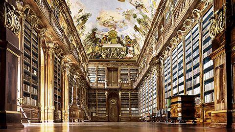
There is a German word, Zeitgeist, that does not have an English equivalent. It means “the spirit of the times” and refers to the cultural trends and tastes that are characteristic of a given era. If you understand the past, you will be better able to design effective communication through graphic design. Visual communication started with pictographs. Simple drawings that told a story or presented a message to others – Egyptian hieroglyphs are a good example of this. Pictographs still exist today most commonly in the form of signs. You see a sign and can instantly understand the message it’s trying to convey. Road signs are the perfect present day example.
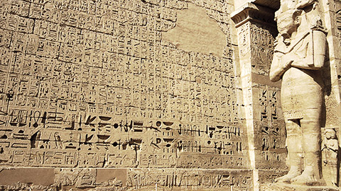
More examples of Egyptian Hieroglyphs

More examples of road signs in Australia
There are lots of references that you can use in your practice – both historical and contemporary, and the investigation into this will help you to grow as a designer and become more knowledgeable about the origins of visual communication. For example, the first printed typographic book is the Gutenberg bible, which dates from 1450, and the key to Gutenberg’s invention was the type mould used for casting individual letters.
Watch this video on how a Gutenberg printing press works.
Research Types
There are two main types of research
Historical research is defined as:
Studies the meaning of past events in an attempt to interpret the facts and explain the cause of events, and their effect in the present events.
This can take the form of primary sources (which originates from the past) and secondary sources (work that comments on the past), for example journals or original artwork from a particular period.
Contemporary research is defined as:
Research findings are considered “contemporary” when conducted within the last ten (10) years or where the continued validity of less recent findings is supported by research conducted within the last ten (10) years.
This can be a review or criticism of a literary work for example. They reveal what was written at the time of a subject and may be published or unpublished, and this could take the form of newspapers or films/audio recordings.
As a designer, you need to be aware of presenting ideas that are based on sound research methods, and this is referred to as a ‘substantiated opinion or idea’, as opposed to communicating an idea that has no foundation in research or information. Your research needs to be:
- Based on facts
- Verified by historical and contemporary sources
- Credible, which means that the sources used to verify an idea or opinion are sound. These can be either from scientific or historical journals for example.
You cannot distinguish developments in design and design history from social, cultural, and environmental contexts – there is always a reason why design and design history looks like it does. There are various art and design movements that you need to be aware of, and how they can influence your own practice as a researcher and a designer. The following table describes the three contexts in more detail.
| Social considerations | Social considerations (or factors) influence and define how people live in a society, such as economic, political, and legal systems, population density, and the natural resources of a country (for example). |
|---|---|
| Cultural considerations | Cultural considerations may include cultural preferences, languages, education, religion, rituals and ceremonies, pastimes, food, architecture, ethics and values and social organisation. |
| Political considerations | Political considerations may include economic, political, and legal systems, degree of democracy, property ownership, freedom of speech and human rights. |
Regardless of the era, the social, cultural, and political context at any point in time will affect the work of designers. For example, in the typography, colours, photography, symbols, icons and information graphics that are used in designs. And vice-versa artists, writers and others influence society, culture, and politics. Similarly, our social, cultural, and political experiences and beliefs inform many things that we do (even if we are not conscious of these influences).
Designers can shape visual communication, and with that comes the responsibility to be aware of your work's political meaning and impact. In our global world, designs that appear today will likely circulate and encounter audiences of many different cultures and languages. An image or symbol acceptable in one culture can be offensive or even harmful in the next.
Designers will use the information about historical movements to create engaging designs using those elements and aspects of the historical designs. A designer might be inspired by more than one aspect of the design's applications and merge a variety of characteristics that may work well together to achieve the project's desired outcomes. It is good practice to document the reasoning as to why the movements have influenced the work and how they have been adapted into the current design. It provides others viewing the documents with the logic that was applied to the design to satisfy a client brief for example.
Design is more complex than simply throwing together a few elements for a visual. Some of the most influential design movements that have occurred, were due to what the design was being communicated as well as the skills that were involved to create it. To truly understand design and design skills, it is imperative to first understand the history and theory of design.
Developments in Design
If you start in the 19th century (the 1800s), you see the Industrial Revolution occurring in Britain from 1760-1840, and as such, mechanisation has had a huge impact on the development of social and economic change. Although industrial innovation contributed to hardships for workers in the form of long hours in filthy conditions, the nineteenth century simultaneously saw the growth of a relatively wealthy middle class.
Handicrafts greatly diminished as the unity of design and production ended. Earlier, a craftsman designed and fabricated a chair or a pair of shoes, and a printer was involved in all aspects of his craft, from typeface design and page layout to the actual printing of books and broadsheets. Over the course of the nineteenth century, however, the specialisation of the factory system fractured graphic communications into separate design and production components.4
Explore some key developments in visual design.
19th Century Lithography
The nature of visual information was profoundly changed during the nineteenth century. The range of typographic sizes and letterform styles exploded. The invention of photography—and, later, the means of printing photographic images—expanded the meaning of visual documentation and pictorial information.
Here are some research links that expand on Nineteenth Century Lithography. They are examples of good quality research sources, which you need to get into the habit of exploring. It is recommended that you bookmark these pages. It will help you with your research effort later.
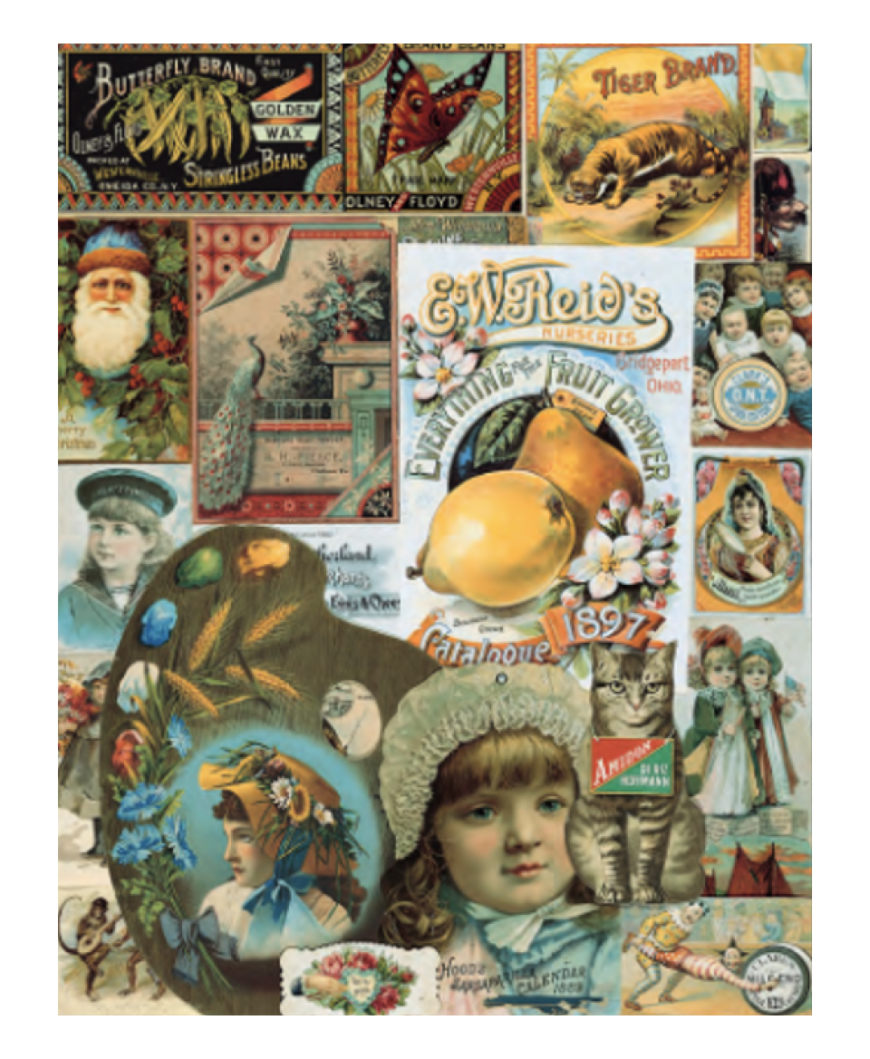
Schumacher & Ettlinger, lithographers, cover and pages from Our Navy premium booklet, 1888. Complex illusions are created by contrasting scale and perspective. 27.9 x 35.6 cm.
Arts & Crafts Movement
The leader of this movement, William Morris became deeply concerned about the problems associated with mechanisation and the mass production of goods and images. The perceived tastelessness of mass-produced goods and the lack of honest craftsmanship (which was replaced by the machine), might be addressed by a reunion of art with craft.
Morris and his group of like-minded artists, designers and architects specified that a return to the handmade – the combination of art and craft might combine to create ‘beautiful objects'. This manifesto would allow workers to find joy in their work once again, and the man-made environment—which had declined in industrial cities of squalid, dismal tenements filled with tacky manufactured goods— and this could be remedied through the establishment of the Guild or cooperative system of manufacture.
(See also the work of: Walter Crane, Arthur H. Mackmurdo, Philip Webb, and Dante Gabriel Rosetti).
They are examples of good quality research sources, which you need to get into the habit of exploring. It is recommended that you bookmark these pages. It will help you with your research effort later.
- THE VICTORIA and ALBERT MUSEUM Arts and Crafts Movement
- The Arts and Crafts Movement in America
- THE TATE Arts and Crafts Movement
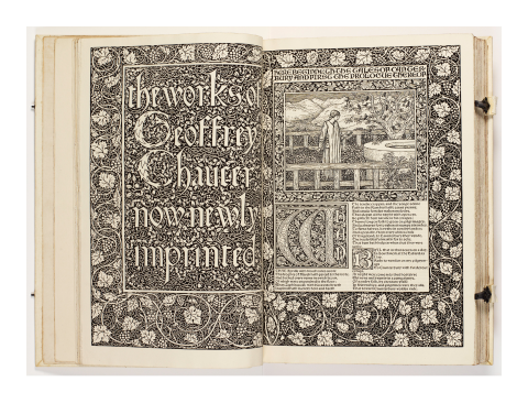
William Morris, title page spread from The Works of Geoffrey Chaucer, 1896. 42 x 28 cm.
Art Nouveau
Literally translated as ‘New Art’, this European design movement had its origins in France. Characterised by organic and flowing lines, this art and design movement is easily recognisable and dates from c.1890-1910. This was a vital period in architecture and the applied arts because it formed a bridge between Victorian clutter and modernism. Art Nouveau graphics contains organic linear movements which frequently dominate the spatial area and other visual properties, such as colour and texture.
(See also the work of: Henri de Toulouse Lautrec, Aubrey Beardsley, Alphonse Mucha, and Victor Horta).
Here are some research links that expand on the definition of Art Nouveau. They are examples of good quality research sources, which you need to get into the habit of exploring. It is recommended that you bookmark these pages. It will help you with your research effort later.
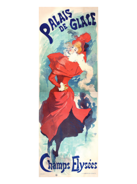
Jules Chéret, “Palais de Glace, Champs-Élysées” (Ice Palace, Champs-Élysées), 1893. The figures create a lively play of angles, linking the top and bottom lettering. As with many of Chéret’s larger posters, it was necessary to print “Palais de Glace“ in two sections.
Modernism
The first two decades of the twentieth century were a time of huge change that radically altered all aspects of the human condition with the advent of the First World War in Europe. The social, political, cultural, and economic factors were transformed. Monarchy was replaced by democracy, socialism, and communism. Think of the work of the Cubist art movement with work by Pablo Picasso, Georges Braque and Fernand Leger.
Modernist designers, architects, and artists came together in Italy, Holland, Germany, and Russia, all with specific and collective political, ideological, and cultural ideals that had the potential to transform society through their manifestos. A manifesto in this sense has two main goals. The first is to define and criticise a problem in contemporary art, culture, or society; and the second is to define a set of aesthetic values to counter this issue. Often, manifestos aspire to be works of art in their own right; for instance, many manifesto writers intend for their texts to be performed. They became known as:
Futurism – Italy
Futurism was launched when the Italian poet Filippo Marinetti (1876–1944) published his Manifesto of Futurism in the Paris newspaper Le Figaro on 20 February 1909. The manifesto voiced enthusiasm for war, the machine age, speed, and modern life. It shocked the public by proclaiming, “We will destroy museums, and libraries, and fight against moralism, feminism, and all utilitarian cowardice.”
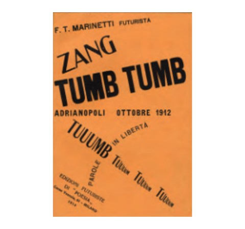
Filippo Marinetti, cover for his first book, Zang Tumb Tumb, 1914. The title is a sound poem in itself: Reflecting his experience as a reporter during the Balkan war of 1912, it typographically expresses the sounds of gunfire. 20.4 x 12.2 cm.
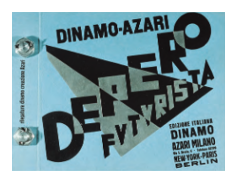
Fortunato Depero, cover for Depero futurista, 1927. Bound by massive aluminium bolts, this book expresses its status as a physical object. A gleam of light descends from the top bolt through the letters of the title. 24 x 36 cm.
De Stijl – Holland
A Dutch art movement advocating pure abstraction and simplicity where the forms were reduced to horizontals and verticals. Colour was stripped back to the primary colours, along with black and white. The main visual artist Mondrian wrote an essay titled ‘Neo-Plasticism in Pictorial Art’ in which he set out his ideas for this new restrictive philosophy of design.
De Stijl adherents believed beauty arose from the absolute purity of the work. They sought to purify art by banning naturalistic representation, external values, and subjective expression.
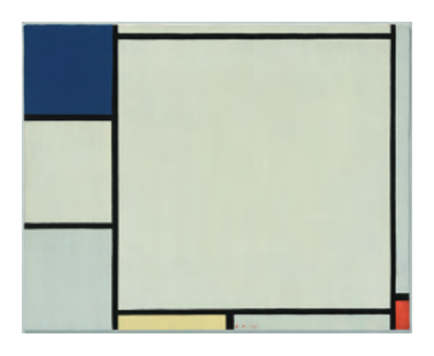
Piet Mondrian, oil on canvas, Composition with Red, Yellow, and Blue, 1927. 40 x 50.5 cm
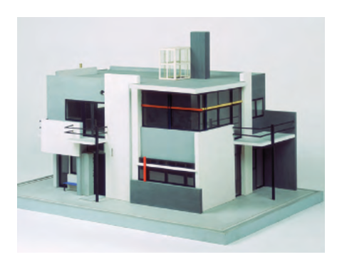
Gerrit Rietveld, model for the Schroeder House, Utrecht, 1924. A new architecture is composed of planes in a square. This house still exists today.
Bauhaus – Germany
The Bauhaus is considered the most important early 20th Century School of Art and Design. Under the direction of its first director Walter Gropius, the school tried to marry the fine arts with technology. Subsequent directors pushed the school more toward an architecture-based curriculum.
Bauhaus style is characterised by its severely economic, geometric design and by its respect for materials. Teaching at the school concentrated on functional craftsmanship and students were encouraged to design with mass-produced goods in mind. The school existed in three German cities:
- Weimar (1919 to 1925). The director of this school was Walter Gropius
- Dessau (1925 to 1932). The director of this school was Hannes Meyer
- Berlin (1932 to 1933). The director of this school was Ludwig Mies van der Rohe
Art and design education today is based on the curriculum first seen in the Bauhaus. Its influence cannot be ignored.
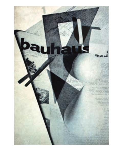
Herbert Bayer, cover for Bauhaus magazine, 1928. A page of typography joins the designer’s tools and basic geometric forms in a photographic still life. Composed before a camera instead of at a draw-ing board, this cover achieves a rare integration of type and image. 29.8 x 22 cm16–17. Laszlo Moholy-Nagy, brochure cover for the series of fourteen Bauhaus books, 1929. Two photoprints of metal type are collaged together to create an unusual spatial configuration.
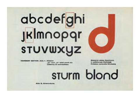
Sans-serif fonts were used almost exclusively at the Bauhaus, and Herbert Bayer designed a universal type that reduced the alphabet to clear, simple, and rationally constructed forms (1927).
Constructivism – Russia
Russian Constructivism was an artistic movement that triumphed in Russia in the 1920s. The paintings, graphic design, photography, and cinema of the time all show evidence of its influence, but it was in architecture that it found its most concrete and revolutionary application.
Following the success of the Russian Revolution, Constructivism became its official art style and the manifestation of the aesthetics of the new Socialist society. Constructivists saw the style as a tool for the revolution that could, and should, contribute to the shaping of a new social order and the dissemination of Socialist ideology.
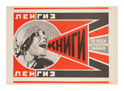
Alexander Rodchenko, Books (Please)! In All Branches of Knowledge, 1924
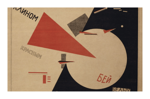
El Lissitzky, Beat the Whites with the Red Wedge, 1920
Here are some research links that expand on the definition of Modernism. They are examples of good quality research sources, which you need to get into the habit of exploring. It is recommended that you bookmark these pages. It will help you with your research effort later.
- THE TATE Constructivism
- MOMA Constructivism
- METMUSEUM The Bauhaus
- THE TATE Bauhaus
- THE TATE De Stijl
- MOMA De Stijl
- GUGGENHEIM Futurism
- TATE Futurism
Technology in Visual Communication
During the last quarter of the twentieth century and the first decades of the twenty-first century, electronic and computer technology advanced at an extraordinary pace, transforming many areas of human activity. Graphic design was irrevocably changed by digital computer hardware and software and the explosive growth of the Internet.4
Despite strong initial resistance by many designers, this new technology improved rapidly, inviting widespread acceptance. Computer users were empowered by greater control over the design and production process. Digital technology and advanced software also expanded the creative potential of graphic design by making possible unprecedented manipulation of colour, form, space, and imagery.
By providing designers with new processes and capabilities, new technology often enabled them to create unprecedented images and forms. While many designers rejected digital technology during its infancy and derided those designers who chose to explore it, many others embraced it as an innovative tool capable of expanding the scope of the field of graphic design as well as the very nature of the design process. Using a computer as a design tool enabled one to make and correct mistakes.
It is important to understand the influence of technology on visual communication, both in a historical and contemporary context. (You have already learned some of these in your learning so far).
Historical context
The computer has had a huge influence on access to information. Comprising mainly secondary sources, digitised e-books, online databases, and MP3 recordings, these are all ways that technology has influenced the understanding of visual communication in a historical context.
Contemporary context
Technological development, particularly in the digital age, has revolutionised and rationalised the processes of visual communication. Advancements in technology have opened new avenues of creativity by putting new tools into the hands of the designer or allowing them to produce work more rapidly. Websites and online social media platforms have become integral visual communication tools for designers.
Explore this website that highlights how advancements in technology have influenced the graphic design industry.

Intellectual property, often abbreviated to IP refers to creations of the mind, such as inventions; literary and artistic works; designs; and symbols, names and images. It has specific consequences if you do not properly cite your references in a research project for example. There are different types of intellectual property. These are:
- Copyright
- Patents
- Trademarks
- Designs
- Registered works
The IP Australia website is a government initiative designed to provide users with definitive resources for a range of scenarios including research.
Copyright and intellectual property (IP) are two different things. Copyright determines who has the right to use and reproduce a design. Intellectual property, on the other hand, has to do with the actual ideas, the creativity, that have gone into the design. Both come into existence automatically as soon as a design exists; however, copyright cannot be registered, it can only be assigned to a person or organisation. IP can be registered and is theoretically much easier to protect by law.3
However, the designer may only have copyright over parts of the work. If there is text involved, then the author of the text may retain copyright of the text, while a photographer may retain copyright over any images used (if they were not specifically commissioned for the job). It is a myth that a designer can take an existing design, change it by some low percentage (like 10 per cent) and then assert copyright over the modified design. If you are asked by a client to modify an existing design, ascertain who owns copyright and get permission to do so.
Good IP management:
- Upholds a researcher’s ability to publish their work
- Enables benefits for all stakeholders
- Fosters collaboration
- Reduces the risk of commercialisation.
IP and Research
Think about your research. Publications can be categorised in many ways. For example, any type of publication (book, journal article, etc), depending on its author, audience, or how you plan to use the source, could also be considered scholarly or popular, and/or a primary or secondary source. Each type of publication has a unique purpose, type of author, and target audience. As a result, finding a variety of types of publications can often enrich your understanding of a topic.
As a designer, it is industry standard to acknowledge the work belonging to others. Images, photography art and any other creation from other authors will require referencing and citations. These are copyright considerations that are required when sourcing history and theories. There are many styles of referencing that exist, an organisation may request a specific style that can be used within the report. When the referencing style is identified, this can easily be implemented into the word document of the report. The following video explains how to collect the references needed, apply intext citations after the authors work, and add them to a reference list that sits towards the end of the report in a Word document.
When looking for sources remember to ask yourself these questions:
- What type of information am I looking for?
- Who would be writing about this topic?
- When did this topic emerge?
A bibliography is a list of all the sources you have used in the process of researching your work, both written and visual, and in general, a bibliography should include:
- the authors' names (alphabetical order according to surname)
- the titles of the works
- the names and locations of the companies that published your copies of the source
- the dates your copies were published.
Watch this video on how to add citations and references using MS word, as you will need this for your assessments in this module.
As discussed, you do need to reference any sources that you use, both in quotations and in the form of a bibliography. The recommended referencing style is Chicago (16th edition), and you can find this source in MS Word under ‘References’, making sure that you choose Chicago (16th edition). It is located as specified in the following image.


Ensure that you turn on Chicago (16th edition) in the menu item as specified.

Insert a citation (source) using this button. It takes you through the stages of adding a source or a quote.
Click onto the Bibliography tab in the same menu item as previously specified and you can build your bibliography from here. Very easy to add to your bibliography by using the same method.
Key Takeouts:
- Selecting a focus for visual communication research that is based on specific needs and perspective is important at the beginning of any process
- The research process can be challenging, and takes practice
- Selecting appropriate historical and contemporary sources is beneficial to your development as a designer
- You need to be aware of intellectual property requirements, especially when it comes to research.

