The software development process involves designing, creating, and maintaining software components. It follows a structured approach known as the Software Development Life Cycle (SDLC). The SDLC consists of multiple iterative steps aimed at improving the software being developed. Key processes in the SDLC include design, development, and deployment of software products.
Design
During the design process, it is essential to determine the purpose of the script. Before starting the development, understanding why the script is needed is crucial. Most scripts serve a specific purpose, such as backing up a drive, creating a virtual machine, or standardizing configurations. It is important to identify the system administration task the script aims to solve. By precisely defining the desired outcome, the design process provides clarity on what the script intends to achieve. This clear objective becomes the foundation for coding the script effectively.
During the design process, you can work backwards from the desired outcome to determine how to achieve it. This involves specifying the necessary processes and identifying the inputs that users will need to provide in order to obtain the desired result. The design process focuses on defining the required inputs, outlining how they will be processed, and determining the expected output. The design sequence typically follows the order of output, processes, and inputs. Starting with the desired output, you establish the processes that will transform the inputs into the desired result.
By working through this design process, you ensure that all necessary inputs are identified, the necessary actions or operations are defined, and the expected output is clearly understood. This systematic approach helps in developing an effective script that can accomplish the desired task efficiently and accurately.
Design tools
The design process consists of two main parts. The first part involves determining the processes or operations that are required to accomplish the desired task. For most scripts, the processes are typically straightforward and focused on performing a single function. However, in more complex scenarios, scripts can be part of a larger suite of functions, which may require more intricate processes. It is crucial to design these processes carefully to ensure their effectiveness in all anticipated situations.
The second part of the design process revolves around defining the interfaces, which encompass the input and output aspects of the script. Interfaces provide an opportunity to gather and present information in a user-friendly manner. System administrators often rely on visual prompts to monitor and maintain the smooth operation of systems.
In the context of app development, Unified Modeling Language (UML) diagrams are commonly used. UML diagrams come in various types, but at this stage, it is important to focus on understanding the overall structure of the forms (input and/or output) and the processes involved. As you progress in software development, you can explore the different types of UML diagrams and their specific uses.
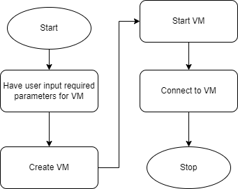
The first step in the design process is to determine what needs to happen in order to achieve the desired output. If the desired output is to have a working Virtual machine (VM) then need to workout the steps. If we say that before we can connect to it, we have to start the VM we have the final steps, but before we can start it we have to create it – and in order to create it need to know a name, how much RAM to allocate, how many CPU cores, etc. And so we arrive back at the start – before we can do anything we need to get the details for the VM to be created. This can be represented in the process below.

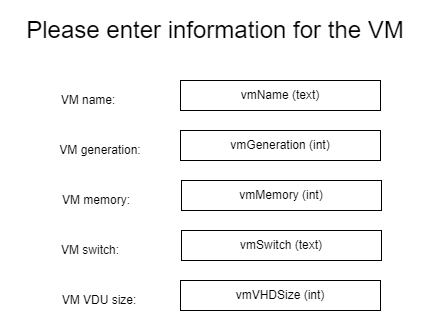
Each step or command in the process is represented by a box. While there may be multiple items of user input required, such as RAM, Storage Capacity, and so on, there is a single command that displays the form and captures all the necessary information. The subsequent stage in the process is to define the form itself, ensuring that it includes all the relevant information that needs to be captured from the user. If the information is collected through the form it will be similar to the information gathered when creating a new VM in Hyper-V using a graphical user interface (GUI).
In this form, you will notice the presence of labels, buttons, and fields where the user can enter specific information. The specific types of information, such as "text" or "Int," will be explained in more detail at a later stage. In this context, "text" refers to any input that consists of characters, while "Int" refers to whole numbers that are counted rather than measured.

We have designed a form to capture the information required to create a VM, and defined the process – so we are ready to start doing it. We need to, however, make sure that what we design is appropriate for all users.
A website is a specialised interface. It is the public face of a business and as such is used by the public to form an opinion about the business. In the same way an interface, such as a form used in a script, is how a user will see a programme. How well the interface is designed will be the basis for a user forming an opinion on how well they expect the programme to function. This section, while about website design, has the same principles that are used in all interfaces. The objective is always to make it clean, clear, and easy to follow.
A well-designed site, which includes usability and functionality. These, together with visual design, will determine success. At a restaurant they take extreme care to present food in manner that matches the taste experience. Just like food in a top restaurant has to look and taste amazing, the interface design has to match the care that went into designing the process. Both the front-end (interface) and the backend (processes) have to be well designed.
A simple looking website with exceptional usability and a good structure typically performs amazingly on Google. User views of such websites are also higher than those with poor user experience. The performance entirely depends on the effectiveness of the website.
Here is the list of 9 good design principles which will make your website aesthetic, user-friendly, effective and engaging:
Simple is best
Over-designed websites may not work as putting too many elements on the page distracts visitors from the main purpose of your website.
Simplicity always works. Clean and fresh design of your website not only makes the website appealing, but also helps users to navigate from one page to another. To load a website containing design features which do not serve the purpose may be frustrating to visitors. Keep your design as simple as possible so that the visitors find it easy-to-use and navigate through seamlessly.
Consistency
Consistency in website design matters: fonts, sizes, headings, sub-headings and button styles must be the same throughout the website. Plan everything in advance. Finalise the fonts and the right colours for your texts, buttons and so on, and stick to them throughout the development. CSS (Cascading Style Sheets) come in handy to keep the complete information about design styles and elements.
Typography and readability
No matter how good your design is, text still rules the website as it provides users with the desired information. Since search engine crawlers are very much familiar with this data, it becomes an integral part of SEO (search engine optimisation) activities. You should keep your typography visually appealing and readable for visitors, along with tricky use of keywords, meta-data and other SEO-sensitive elements.
Consider using fonts that are easier to read. Modern sans-serif fonts such as Arial and Helvetica can be used for body texts. Make proper combinations of typefaces for every design element (such as headlines, body texts and buttons).
Mobile compatibility
Keeping in mind the ever-growing usage of smartphones, tablets and phablets, web design must be effective for various screens. If your website design does not support all screen sizes, chances are that you will lose users to your competitors. Design for mobile-first and make your design responsive.

Colour palette and imagery
A perfect colour combination attracts users while a poor combination can lead to distraction. This necessitates you to select a perfect colour palette for your website to create a pleasing atmosphere and leave a good impression on visitors. Enhance UX by selecting a complementary colour palette to give a balanced look to your website design.
Remember to use white space and avoid using too many colours (3 or 4 tones for the whole website is ample to give an appealing and clear design).
Apply the same approach to selected images, keeping the overall colour palette in mind.
Easy loading
No one likes a website that takes too much time to load. Avoid this fault by optimising image sizes and combing code into a central CSS or JavaScript file (to reduce HTTP requests). Compress HTML, JavaScript and CSS for enhanced loading speed.
Easy navigation
Visitors spend more time on websites that have easy navigation. Effective navigation is assisted by creating a logical page hierarchy, using breadcrumbs and designing clickable buttons. You should follow the 'three-click rule' so that visitors can get the required information within three clicks.
Communication
Users want to get information and if your website can communicate with your visitors efficiently they will spend more time on your website. Tricks that may work to establish effortless communication with the visitors are:
- organising information by making good use of headlines and sub-headlines
- cutting the waffle
- using bullet points, rather than long sentences.8
Grid-based layout
The grid-based layout arranges content into a clean grid structure with columns, sections that line up and feel balanced and impose order and results in an aesthetically pleasing website.9
Keeping the principles of good website design, you can easily develop an aesthetically pleasing and functional website.
Activity
Reflect on a website for a computer retailer (PBTech, elive, ascent, computer lounge) using the above design principles. Write a brief summary of your reflection (100-200 words).
Go to the forum to share your response with your peers, identifying how well the site followed the principles.
Test
Software should not be put into production without testing. Developers will usually have a system available that they can test new software to verify that it works as intended without putting a production system at risk. System Administrators will often create a lab environment to test the scripts or a sandbox – an isolated and controlled environment that replicates the production or operational environment, allowing administrators to test and experiment with changes, configurations, or software without impacting the live systems.
Document
As a system administrator no job is completed until the documentation is updated. This is also true for scripting. The documentation is largely within the script to guide the reader through the purpose of the script and help them understand what is happening within the script.
Deploy
Once the script has been developed, tested, and documented it is ready to be deployed. This will be made available in the production system. It may be a script you are using or one that has been developed for other system administrators to use as well. Those who will be using need to be made aware of its existence and purpose as well as how to use it. Deployment will always have an element of training, even if it is just “hey guys, there is a new script to …. available. It is in the script Github repository” or wherever it may be.
