Barry GrantGenre movies are those commercial feature films which tell familiar stories with familiar characters in familiar situations. They also encourage expectations and experiences similar to those of films we have already seen.
Now that film could use many storytelling techniques, various movie genres came to be. The world of films today invites audiences to immerse themselves in the far-fetched and fantastical. This leads to an array of genres that cater to every audience.
Some common genres
Expand the labels below to learn more about each of these genres. This list represents a small fraction of the full complement of genres in film today. As culture changes, our entertainment moves with it, and new genres are being defined all the time!

Action and Adventure
Characteristics:
- Fast-paced
- Loud
- Exciting
- Series of climactic events
- Sense of urgency
- Clearly defined good and bad characters (protagonist and antagonist)
Examples:
- Black Panther
- The Dark Tower
- Fast and the Furious
- Alita: Battle Angel
- Divergent
- The Dark Knight Rises
- The Maze Runner
- The Avengers
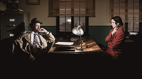
Crime
Characteristics:
- Intriguing
- Mysterious
- Action-packed
- Problem-solving
- Suspense
Examples:
- Animal Kingdom
- Paranoid Park T
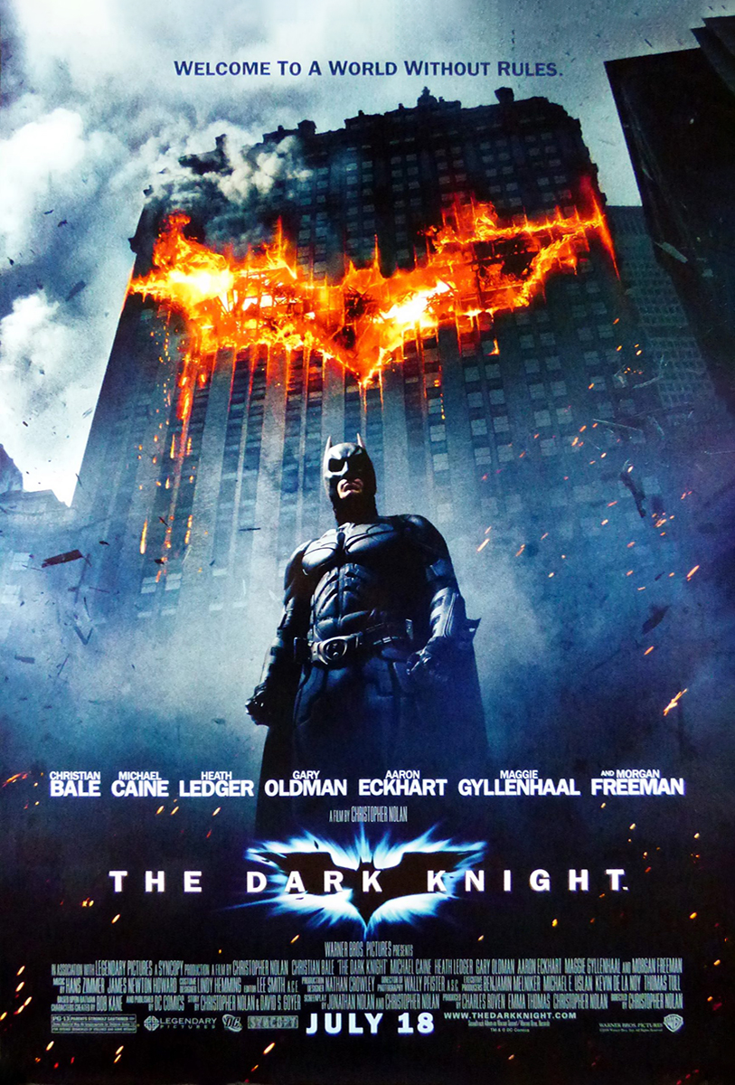
- The Dark Knight
- Looper
- Silence of the Lambs
- Fargo
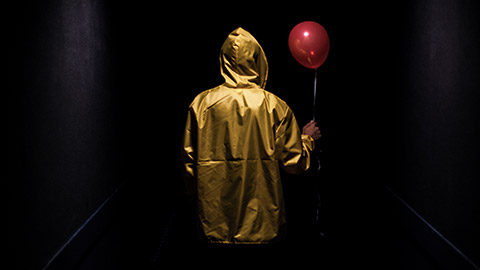
Horror
Characteristics:
- Dark
- Suspense
- Spooky music
- Fear
- Violence
- Scary and jumpy
Examples:
- The Silence of the Lambs
- It
- Get Out
- The Omen
- The Exorcism
- A Nightmare on Elm Street
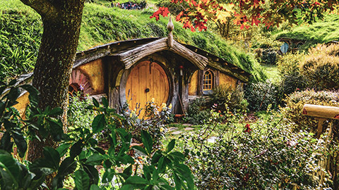
Fantasy
Characteristics:
- Wonderous
- Magical
- Inspiring
- Escapism
- Myth
- Wonder
Examples:
- Labyrinth
- Narnia
- Hobbit
- Lord of the Rings
- Harry Potter

Historical
Characteristics:
- Nostalgic
- Grandeur
- Spectacular
- Films based on true events
- Legendary
- Mythic
Examples:
- Schindler's List
- Braveheart
- Saving Private Ryan
- Lincoln
- Bonnie and Clyde
- Apollo 13
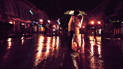
Romance and Musical
Characteristics:
- Colourful
- Cheerful
- Loving
- Love story
Examples:
- La La Land
- Footloose
- A Star is Born
- Mamma Mia! Here We Go Again
- The Greatest Showman

Science Fiction (Sci-Fi)
Characteristics:
- Futuristic
- Techy
- Often space-related (robots, spaceships, teleport, time travel)
- Scientific development
- Imaginative
- Exploration
- Fictional worlds
Examples:
- Star Wars
- Arrival
- The Martian
- Edge of Tomorrow
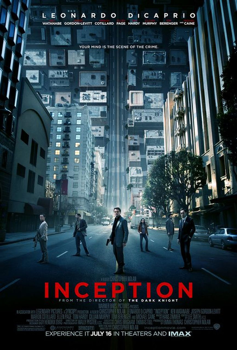
- Inception
- E.T.
- Avatar
Let's play -
Movie posters are a key element in the film industry. Why? The movie poster encompasses the whole feeling and message of the film. Let’s break down movie posters and have a look at what they involve.
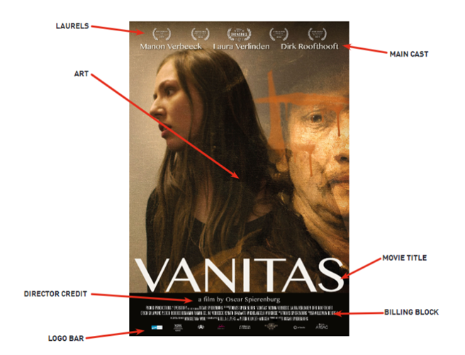
Movie title
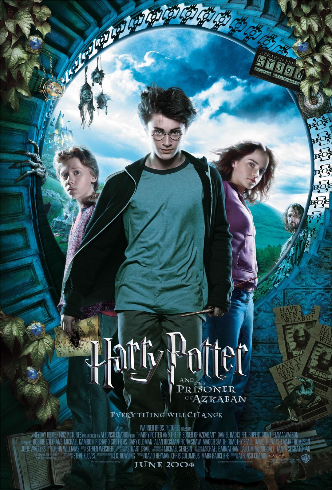
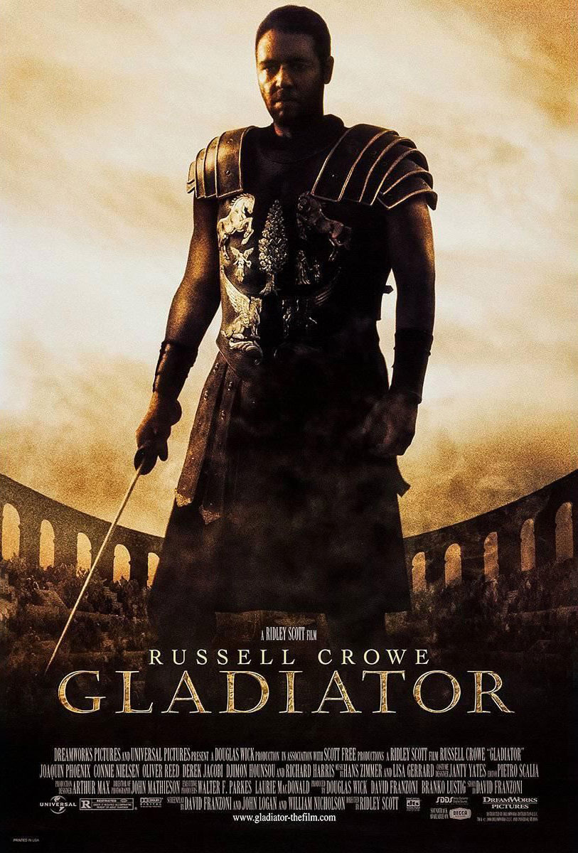
The title of the film...pretty simple. Just make sure you place it at the lower part of the bottom half of the poster. (Book covers have the title on top, and movie posters have the title on the bottom. If you are interested, check out these book covers alongside their movie poster counterparts.)
You'll want to give a lot of thought to the typeface you plan on using for the title - as that is the first thing people will look at, and it will set the tone of the movie for the audience, along with your other design and composition choices.
Looking at the images below, which differences and similarities can you point out?
In addition to the title, the movie poster contains specific information shown in a specific way:
Laurels
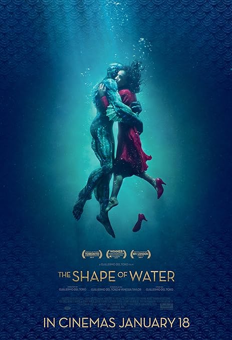
Each laurel represents an award or nomination the film has received. Usually, the festival provides the vector art of the laurel for the producers of the movie. Laurels are a great sales point and also help define your target audience - a movie that won an Oscar for Best VFX will most likely have a different audience than a movie that won the International Film Festival Rotterdam.
Logo bar and billing block
The logo bar is usually placed very near or at the bottom of the poster and will vary based on the business requirements of the movie. Logos from the studios, production companies, and key investors are often displayed in a specific order. Usually, whoever made the biggest investment goes in front.
The part of the movie poster that indicates various development information about the film is called the billing block. It will usually have the title, producers, director, cinematographer and other important roles and names.
Thanks to Haley Wilson, we can show you what a billing block normally comprises:

Director’s credit and main cast
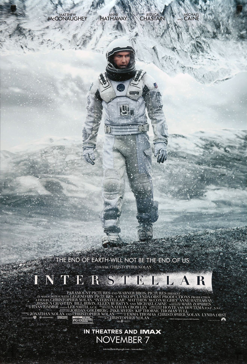
This space is dedicated to presenting the talent that plays the main roles in the story. Many times, due to contract arrangements, some actors will have their names in a bigger size than others or be placed in a specific position, either above or below the title of the movie. Also, the director will often be one of the highest selling points of a movie. Many people would be drawn towards a movie, even with a subject or genre they don't usually go out for, simply because they connect with the director's vision and storytelling techniques. These people have confidence they will enjoy the production because they trust who is at the helm of it.
Extra content
- Other lines: Some movies might use extra lines such as 'based on a true story' or have a subtitle. These are usually placed next to the title or right under the main cast line.
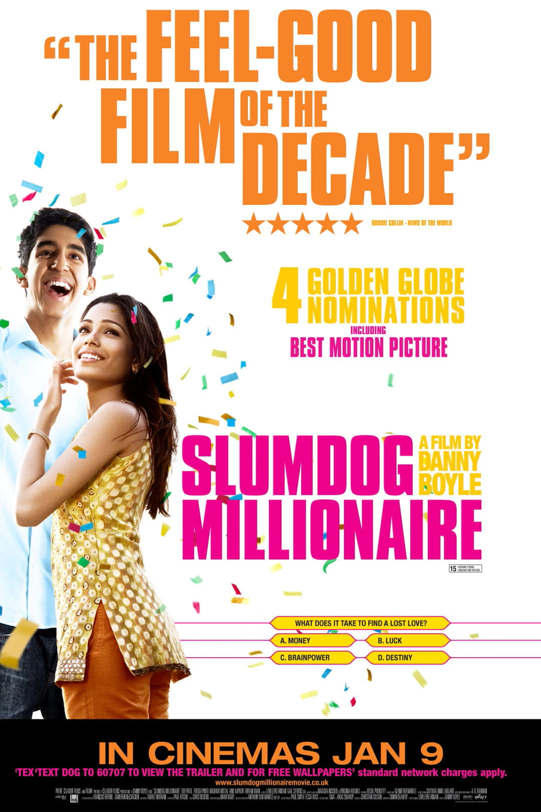
- Reviews from critics: Movies that have a good rep in the media often use the reviews they get to help sell the movie as well, such as Whiplash below.
- Tagline: This is a marketing strategy quite often used to help sell the film. The tagline is a selling point created by distribution companies that acts like a slogan for the movie, such as in the movie Barbie: "She's everything. He's just Ken." shown below.
- Opening day: The day the movie enters the circuit.


Novice Activity - Movie poster analysis
🕔 Less than an hour
Think about what goes into a movie poster. It's so much more than just showing the lead actor(s) and a movie slogan. There are cues in the poster that point your mind to the correct genre so that the poster finds its target audience.
To help you with this, read this article, Analysing a film poster, that explores movie poster development and how...
Designs, colours, and fonts are used to appropriately reflect the mood and tone of the film.
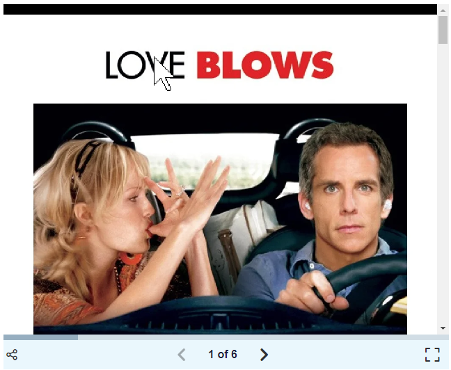
Don't miss out on the excellent activity at the bottom of the article that allows you to analyse three movie posters. Use the scrollbar on the side or arrows at the bottom of the activity to learn more about each poster. Tip - it looks like this:
Newbie Activity - Designing movie posters for the genre
🕔 About an hour
Task 1: Let's start by looking at some movie posters by doing a search online. It would be easier for us to pick the posters we want to show you as examples for discussion. Can you think of a reason why we would find that difficult?
Did you think about copyright laws? Each type of published media has its own context. We'll spend more time with copyright and attribution laws a bit later in the course. But, thanks to a Google image search, we can safely point you to the movie poster art we want to highlight.
The links below will take you to Google image searches. Can you find similar attributes among movie posters of the same genre? Make a list of the movie poster attributes that you learned from the previous article and what you notice on a gut level from each link below.
Here is a list to help you identify the attributes connecting the genres.
- Colours
- Typeface
- Composition
- Mood
- Actors' size and positions
Take note of the era or time that the movie actually takes place vs when it was made. What tricks did they use to convey historical context? Imagine if you used a bubble font for a 1940s WWII movie poster. Ensure all design elements match the era the movie is going for. This research will help you with the activities coming up.
Task 2: We're going to show you other artists' renditions of movie posters. These are done not by the studios but by fans. What can you add to your lists?
Task 3: Now you do it. Go to Google and enter the search term "minimalist movie posters". When the result comes up, select the "Images" option below the search entry box. You can enter the genre into the search term as well to do more thorough research. Can you add more items to your list? What can you see from these posters?
Newbie Activity - Movie poster composition
🕔 Less than 30 minutes
This activity will help you visualise the lines and composition that are often used in movie posters.
- Pick one poster from any of the search results and download it.
- Open it in Photoshop and create a line drawing with circles, squares, and dividing lines to show how the content is laid out. Here is an example that Dan did for you:
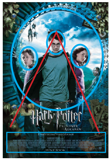
Whakamanahau. Well done! You will never look at a movie poster the same again!
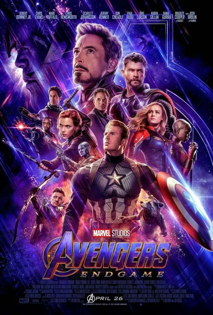
Practising Activity - Design for the genre
🕔 About an hour
For this activity, you'll need to make lists of the design considerations for the genre as if you were charged with making the poster. Write down all of the considerations you would make for your design so that it clearly exemplifies the genre. But at this point, don't make the poster. Just make a list of what themes, colours, typeface, mood, tone, etc., you would want to create.
To make this a bit more challenging, your genre will be chosen randomly! Go ahead, pick a number between 1-18. Got it in your head? Yes? Now, expand the label below or click the (+) sign to see what genre you are going to reflect on. Don't cheat and pick a different one. As a professional creative, you usually don't get to pick your subject.
- Buddy
- Action
- Western
- Musical
- Supernatural
- Sports
- Monster
- Sci-Fi
- Romance
- Comedy
- Horror
- Spy
- Drama
- Film Noir
- Historical
- Magical realism (blend of fantasy and reality)
- Political
- Disaster
With your genre in mind, create a plan of design considerations and how you might approach creating a movie poster for this genre. We recommend that you build a mood board for the genre. We aren't designing yet, just planning.
Have you done that? Great! Now, do it again. Pick a number between 1 - 18, and select the label or (+) below to find the genre assigned to the number you chose. Got your number? Go - pick!
- Road
- Mythical
- Thriller
- Fantasy
- Urban (where the city itself is almost a character)
- Dystopian
- War
- Slasher
- Saga (multiple eras)
- Satire
- Cop/Detective
- Marshal Arts
- Crime
- Heist
- Team
- Mystery
- Teen
- Adventure
With your target genre, make another list and/or mood board! It should be quite different from your previous list. This exercise drives home how much design choices can impact the reviewer.
Showing off Activity - Genre mashup movie poster
🕔 4 - 6 hours
For this activity, you will combine your genres, come up with a movie plot and title, and then make the poster! This activity is best done in stages and may take a few days of working sessions to complete. You should use Photoshop and or Illustrator to create your posters. If you are comfortable working in Adobe In Design, feel free to lay out your posters in that.
Forum post
When you are done with your poster, put it on the Forum. Along with your image, reflect on this exercise — from analysing posters to creating one.
- Did you struggle with anything?
- Did your head design more than your skill level can achieve?
- What did you like about your output, and what could have been better?
Start to do some critical analysis of your own work and share it with your peers.
Examples from past students: Can you guess the mashup?
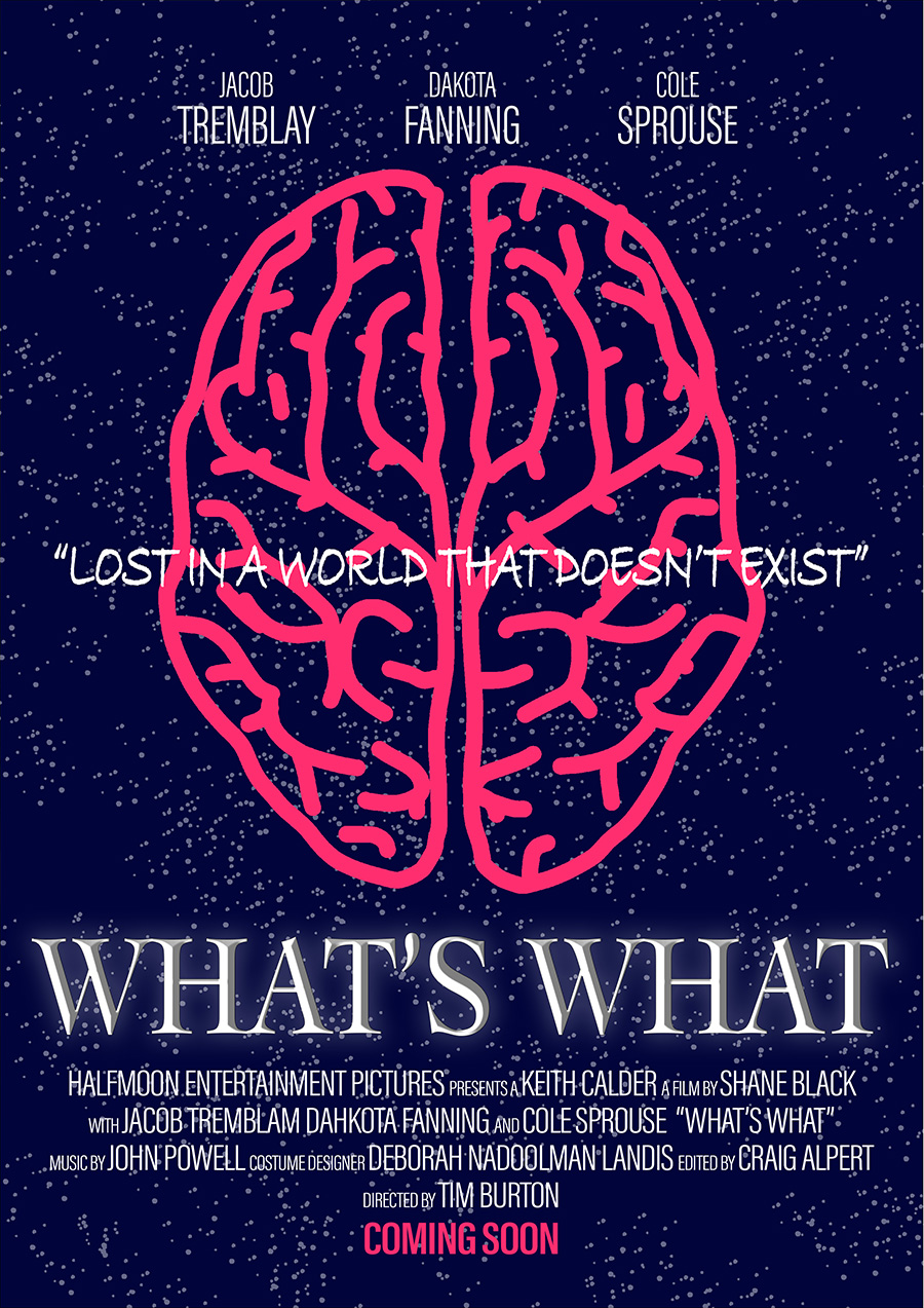 |
| Slasher/Romance | Apocalypse/Martial Arts |
| Psychological/Thriller | Political/Satire |
Autaia koe. You're a star! We hope you had fun with that activity and have something you can show off with pride.
