Welcome to Colour Theory and Design Process. In this topic, you will learn about the following:
- What is a design process?
- Identifying and accessing sources of information
- Communicating ideas using colour theory and aspects of colour
- Researching artistic approaches
- Evaluating information to integrate colour theory and design into the design process
- Legislative requirements are relevant to the design process.
Terminology and vocabulary reference guide
Working in an office environment, you need to be familiar with terms associated with principles and use the terms correctly (and confidently) with clients, your colleagues, and other industry professionals. You will be introduced to many terms and definitions. Add any unfamiliar terms to your vocabulary reference guide.
Activities
There are activities within this topic and an automated quiz at the end of this topic. This is not part of your assessment but will provide practical experience that will help you in your work and help you prepare for your formal assessment.
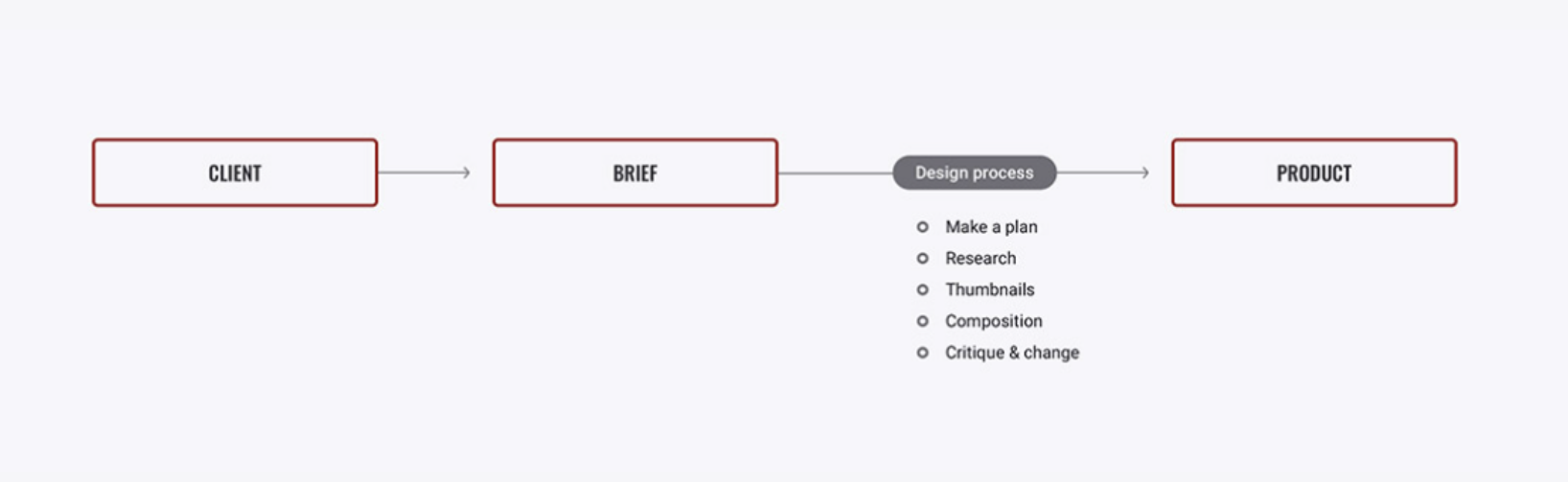
A design process is a step-by-step approach used by designers to ensure that they produce a purposeful design. The process, when performed effectively, involves several skills which are drawn upon in a variety of combinations throughout the process, skills such as:
- brainstorming
- researching
- analysing
- problem-solving
- developing ideas
- discussing
- evaluating
- refining and re-evaluating
- producing
- proofing
- presenting.
Essentially this process embodies the all the aspects required to effectively bring a project brief to life.
When starting a new project, a productive first step is to develop a detailed plan, noting down all the requirements of the project, noting milestones, resources required, essentially considering all aspects and possible hurdles that may be faced in order to ensure you effectively meet both the brief and the timeline. The first step in successful project work is creating a detailed plan.
Failing to document all steps and aspects of a project dramatically increases the chances of important project requirements being overlooked or simply forgotten about, this can have several ramifications such as going over budget, failing to meet deadline or requiring extract hours or manpower to complete the project. Ultimately, resulting in the final product being ineffective in representing the ideas you had in place from the beginning.
The following is a breakdown of steps used within the design process.
- Interpreting the brie
- Idea generation
- Planning (timeline/list)
- Research and analysis
- Concepts sketches (thumbnails)
- Development of design concepts
- Critique and evaluation of design concepts
- Refinement and re-evaluation
- Production and proofing
- Present the design.
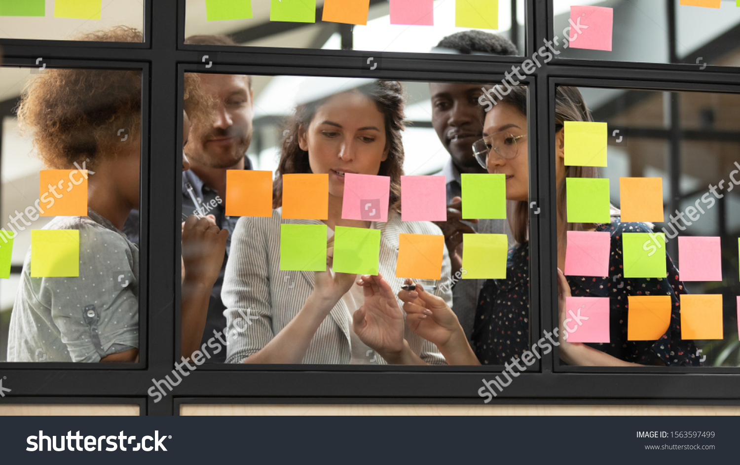
There are a variety of record-keeping tools to record the design process. Two examples of these are visual diaries and annotations. Let us look at each of these in more detail and how they will aid you in your creative journey.
Visual Diary
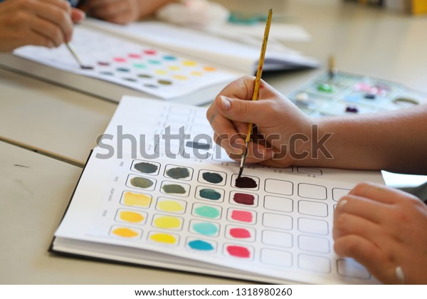
A visual diary, also referred to via interchangeable terms such as a sketchbook, visual journal, or visual notebooks, can be used to record all the steps within the design process from the initial design brief, idea generation, concept, sketching, planning, analysis, feedback, to the final product.
Visual diaries can be in the form of an online resource or developed as a hard copy. They not only serve as a repository of their project's varying phases, but also reflect an intimate glimpse of the designers' visual thinking. This could include aspects such as; experimentation of materials, tools and equipment, experimentation of colour and layout, experimentation of elements and design principles, research of artistic approaches, annotations, thoughts, inspirational imagery, and developed concepts and ideas. No two visual diaries are the same, as each designer will have their own creative thinking, researching and documenting styles and processes.
The use of a visual diary within the design process will encourage lateral thinking skills that can expand creative practices to improve skill development further. Designers use visual diaries to track their research and ideas and refine, analyse, and evaluate them before bringing a design to life. Thus, becoming an integral part of the final outcome.
The following video provides some excellent examples of how designers implement the visual diary through the design process of different designs.

Annotations
Have you ever thought you would remember a shopping list off by heart, only to get home and release you have forgotten some of the items you meant to collect? If only you had written them down, right? Annotations work the same way. When creating a design brief, a designer will often add imagery, materials, thumbnails, colours and more to their visual diary, however, how useful would this be if there are notes (annotations) as to what inspiration or idea behind it was?
Annotations can be used for:
- descriptions for ideas that are not drawn out well
- textual addendums
- sources of gained information, for instance, websites, books, magazines.
Making meaningful annotations to document thoughts, reasonings, explanations, and layouts is essential when striving to piece all the puzzle pieces together while describing the creative process.
Annotations are sometimes in the form of mind map style designs, written paragraphs, story boards, and infographics which outline a process. Annotations, whilst providing information relating to the design project at hand, can, in the future, serve as an excellent reflective piece that can be interpreted by anyone that views it. For this to be possible however, it is essential that all annotations are clear and legible for all.
When creating annotations about images or objects used in a design which are in your environment, it is helpful to comment on your personal reactions. When creating meaningful annotations, is it useful to ask yourself some key questions and attempt to analyse these and describe your answer. Consider the following:
- What features are appealing?
- What is inspiring to you about the object or image?
- What materials have been used?
- How does the image/object make you feel?
- How can it be improved?
The following links provide examples of annotations designers have used within their visual diaries for different designs. Pay close attention to how each is either descriptive or analytical whilst not distracting from their documented inspiration.
Once a client brief has been received and a plan for the design has been documented, the next steps would be to identify the type of sources that are both available and supportive to the implementation of the design, along with ensuring these are accessible to all. This can sometimes involve a little digging and researching to find something that meets the needs of the brief and reflects the ideas well.
Sources of information on colour theory and design processes
Researching and accessing relevant sources of information on colour theory and design processes serves not only to confirm or convey ideas and theories but this stage of the project journey also stimulates the creative juices to flow, gathering information, inspirations and ideas to integrate into the design work. Remember, the design will need to meet the brief therefor there will likely be some direction provided already however if there is scope for flexibility, or, you are working on your own designs, there might be more room to flex the design muscle when determining the approach of colour theory and design processes. When identifying and accessing appropriate sources of information, consider the following options:
- The art and design work created by other artists/designers
- Books, magazines, websites and scientific texts
- Manufactured structures, natural and architectural forms
- Optics (the branch of physics that studies the behaviour and properties of light)
- Personal observation
- Software programs for art and design work.
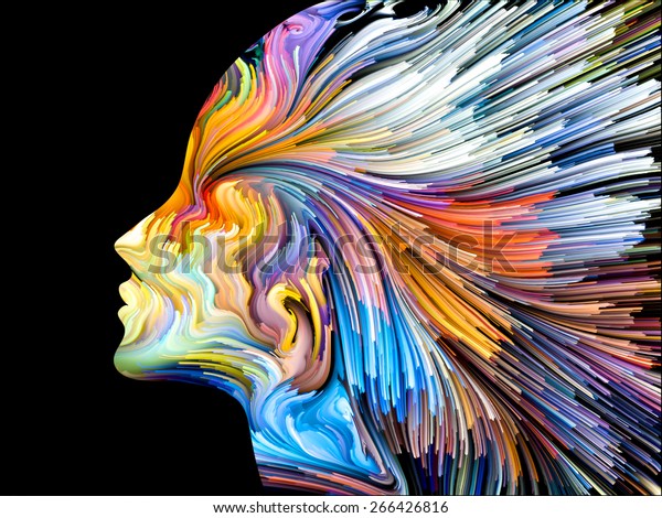
Colour theory refers to the science and art behind the use of colour. It explains how humans perceive colour along with the visual effects of how colours mix, match or contrast with each other. Colour theory also involves the messages that colours communicate (or those that humans perceive) and the methods used to replicate colour in design.1 Having this knowledge will allow any designer to appropriately and effectively integrate the many aspects of colour into their work whilst communicating their intended message clearly and effectively. To effectively integrate colour theory, the following aspects of colour must be understood:
- Rigid colour application
- The colour wheel
- Cools and warm colours
- Hues, shades, tints and tones
- Colour harmony
- Colour models
- Colour meaning and emotions.
In some instances, colour theory may require research and understanding to develop your own ideas and application of colour. But, equally as important, is an understanding of how many artists have done this throughout history. This knowledge can assist in expanding inhibitions and the use of colour in design work.
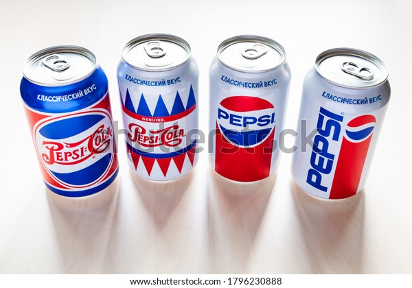
Rigid application of colour theory
The term ridged implies to the lack of flexibility or inability to adapt or change. A rigid application of colour can be seen often with design in branding. Often a logo of a brand will evolve over time to stay current. However, if the design changes too much, it can lose meaning, perception, and credibility, therefore, some companies choose to integrate a rigid application of colour theory to their brand’s logo. This enables the brand to remain recognisable and avoid losing the connection to its audience important. factor when attempting to deliver a consistent message. For example, let us look at Pepsi, they have changed their branding and logo progressively over time, however, with a rigid application of colour, they remain recognisable with an unchanged connection to their audience.
Opting to implement a rigid application of colour theory into a design processes can have a number of important project outcomes, such as:
- quickly communicates the message behind a design
- helps to convey feelings and emotions associated with the design and brand
- aids in communicating the personality and identity of a business, product or brand
- enables the audiences to distinguish a business/product/brand from competitors
- attracts, interests, and engages audiences in the design or the business/product/brand.
Insert activity here.

Understanding both historical and contemporary approaches to colour and design is of great value to any designer as these will be called upon in any given design brief. Research must be conducted on the accessed sources of information in relation to colour theory and design processes to better understand how historical and contemporary approaches could be considered for the design work. Let us look closer at both the historical and contemporary colour and design approach.
Historical approaches to colour and design
As early as 40,000 years ago, humans created a basic colour pallet consisting of the following five colours.
- Yellow
- Brown
- Red
- Black
- White
These first pigments were invented using natural resources such as soil, burnt charcoal, and chalk and have been combined with animal fat that has also helped preserve the artwork. Common elements used within cave paintings included the use of:
- Ochre, a clay earth pigment composed of ferric oxide and differing proportions of clay and sand. Ochre ranges in colour from yellow to deep orange or brown
- charcoal and soot were derived to create a black pigment
- kaolin clay, burnt shells and calcite were used to apply a white pigment.
Colour throughout history has since been explored, scientifically advanced and experimented with. Artists and designers progressively are discovering new ways to understand, access and implement colour.
New pigments accompanied the development of art history’s greatest movements from Renaissance to Impressionism, as artists continually experimented with colours never seen before. These historical benchmarks continue to inspire an evolution, whether building upon earlier creative efforts or defying the work of one’s predecessor. One of these historical benchmarks that artists still rely on today is the colour wheel.2 Have a look at the following links to begin your research journey on the history of colour.
- Windsor and Newton- History of pigments
- Jackson’s Art- Overview of the book, Chromatopia
- Sara Paxton Artworks- History of Colour.
Fun fact
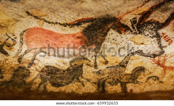
Some of the world’s most elaborate prehistoric art can be found in France within the ancient and secret caves of Lascaux and Chauvet. Lascaux cave has over 600 cave paintings adorning the interior walls and ceilings, many images of animals look incredibly sophisticated considering they are prehistoric. France has worked hard at preserving these caves and has created exact replicas that have attracted the interest of many tourists from around the world.
Contemporary approaches to colour and design
A contemporary approach within a design will focus on the fundamental use of the colour wheel and how to use its’ colours in a variety of ways to integrate them into a design work. In addition, the colour wheel can be used to experiment and apply an arrangement of colours to a design. These include:
- Cools and warm colours
- Hues, shades, tints and tones
- Colour harmony
- Colour models.
Before understanding how colour can be integrated into a design, let us first understand the colour wheel.
The colour wheel
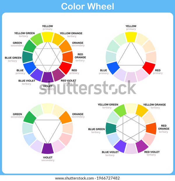
The renowned mathematician Sir Isaac Newton invented the first colour wheel. While studying white light reflecting off prisms, he noticed that the light reflected a spectrum of colours. Noting down the different hues (colours), he believed the rainbow of colours shared a harmonious relationship. Following that train of thought, he compared the hues to music to discover the harmonious relationship between each hue. He identified each hue with a corresponding musical note. They then arranged those musical notes into a square and then finally placed the colours on a rotating disk to see how they interact with each other visually. And that’s the story of the ideation behind the first colour wheel.3
Have a go at making your own colour wheel, spin the colour wheel to see the colours vanish before your eyes. The following video demonstrates how to create this experiment that shows how the human eye will only see white as the colour on the colour wheel as it rapidly spins.
The colour wheel shows what colours contrast each other and what colours that are nearby will create colour harmony. Colour harmony is when two, or sometimes more, colours combine to create a very aesthetically pleasing effect. An example of this is the combinations of yellow and purple, which can work in a variety of tones. The colour wheel easily shows the opposite colours, also called “complementary colours”, which are directly opposite to each other and can sometimes be used together to create a high contrast image.
Insert activity here.
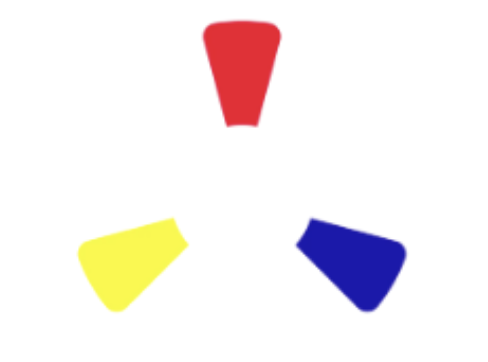
The colour wheel can be divided into primary, secondary and tertiary colours.
 |
 |
 |
| The primary colours (yellow, red, blue) | The secondary colours (colours created when primary colours are mixed) | The tertiary colours (colours made from primary and secondary colours) |
Colours that are not on the colour wheel, such as black, white, brown, ivory and cream, are known as neutral colours. These colours generally work well as a backdrop for other colours.
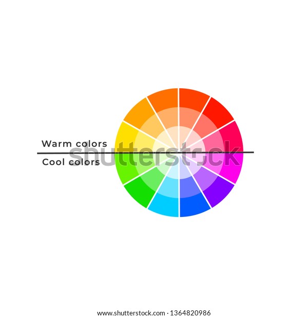
Cool and warm colours
Throughout time, our understanding of colour and design has evolved considerably. Today, we recognise that there are two broad groups of colours:
- cool colours
- warm colours.
These two categories split the colour wheel directly in the middle, separating the cool colours from the warm. As a result, the cool colours are more subdued and are perceived as more relaxing, whilst the warm colours are energetic and engaging. Have a look at the following image that illustrates this separation, notice that the blue is the only primary colour found on the cool end of the colour wheel.
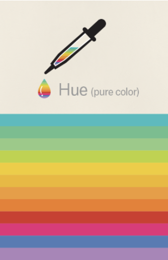
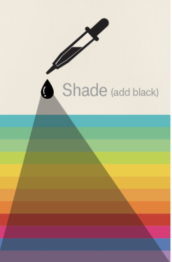
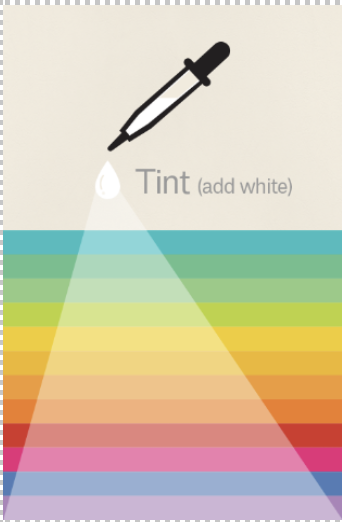
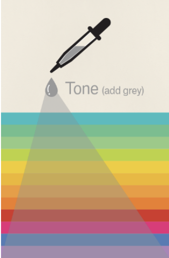
Hues, shades, tints, tones
Tints, tones, and shades are variations of hues (colours), on the colour wheel.
- A tint is a hue to which white has been added. For example, red + white = pink.
- A shade is a hue to which black has been added. For example, red + black = burgundy.
- A tone is a colour to which black and white (or grey) have been added. This darkens the hue while making it appear more subtle and less intense.
Designers and artists recognise that colours can exist in these different hues, shades, tints and tones. The following image shows the addition of each to see how it impacts the original hue.
 |
 |
 |
 |
| Hue: the pure colour | Shade: the hue plus black | Tint: the hue plus white | Tone: the hue plus grey |
Colour harmony
There is now a better understanding of how colours interact with each other. These interactions are otherwise known as colour harmonies, where it considers the following methods of integrating the varying colours in the colour wheel with a design.
- Complimentary colours
- Analogous colours
- Triadic colours.
Let us look at these colour harmonies in more detail.
Complimentary colours
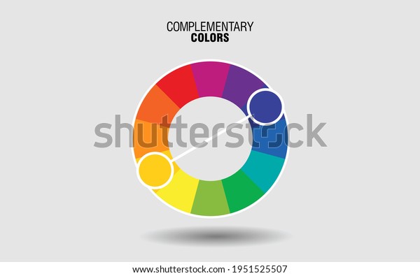
Complementary colours provide a high contrast/ high impact colour combination which is useful when attempting to make imagery “pop”. They can be found on opposing sides of the colour when, for example, pairs such as red-green, blue-orange, yellow-violet. These can provide a high aesthetic value however it is important to note that while using them can provide great benefits, overusing these can just as easily detract any benefits.
The following images provides a great example of how this colour harmony is integrated in a comic book style design.

Analogous colours
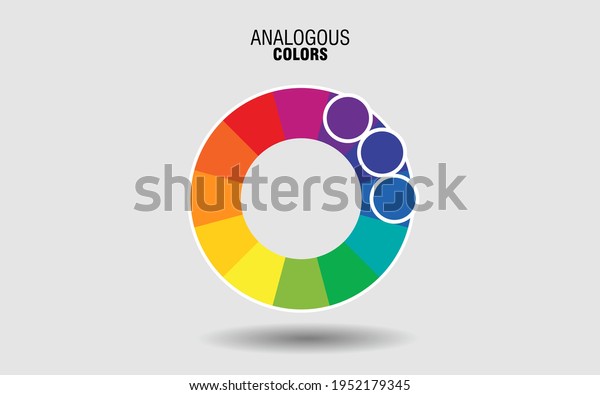
Analogous colours refers to groups of three colours which sit next to each other on the colour wheel. One such example would be red, orange and red-orange. One colour will dominate, one will support, and another will accent. The use of analogous colour schemes can create arts which is pleasing to the eye. This approach has been used by impressionist artists such as Monet and Picasso.
The following images demonstrates the use of analogous colours on the colour wheel, providing an example of how this colour harmony is integrated in a comic book style design.
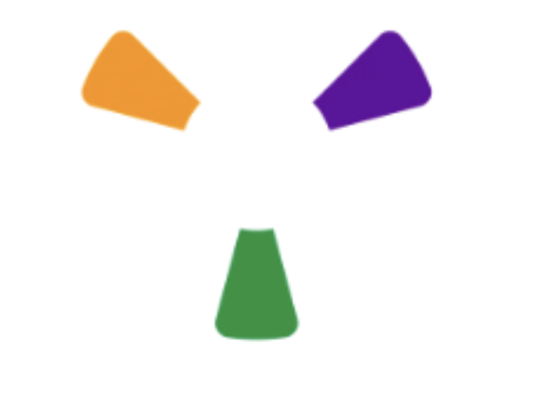
Triadic colours
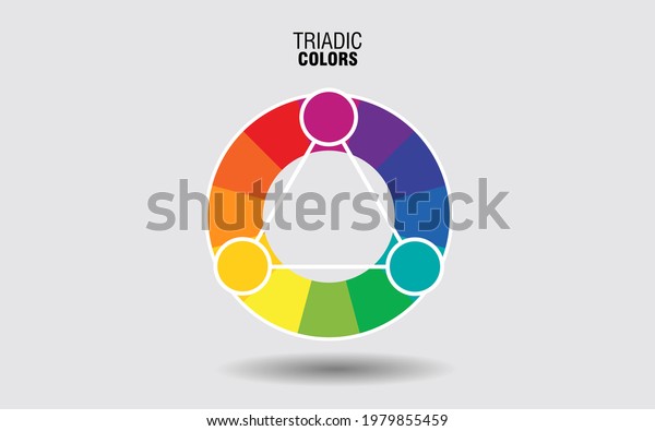
Triadic colours, those which are used or associated as a trio, are evenly spaced around the colour wheel and are very bright and dynamic.
The following image illustrates the use of a triadic colour scheme and how this trio creates visual contrast and harmony simultaneously, making each item stand out while making the overall image “pop”.
![]()
The following video provides a great overview and engaging summary of colour basics and demonstrates the use of colour within a digital platform.
Colour models
A colour model simply describes how colour will appear on a computer screen or on paper. Two popular colour models that are used by designers and artists include CMYK (cyan, magenta, yellow, key/black) and RGB (red, green, blue). Let us look at each of these.
CMYK
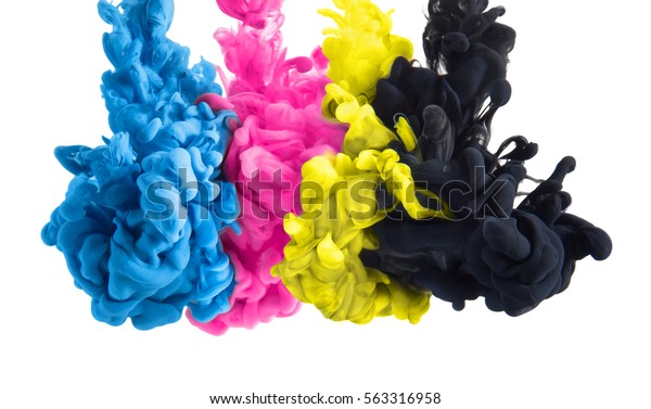
The CMYK model, also known as a subtractive colour model, is used within four-colour process printing. The term “subtractive” simply refers to the fact that you subtract the white from the paper by adding more colour. For example, the paper starts off white, and as you add layers of each colour, different colours can be developed.
These four colours can be used in varying combinations with each other to make all the colours that are commonly seen on printed materials such as paper, signage, packaging, newspapers, and magazines. Traditionally, the primary colours used in the subtractive process were red, yellow, and blue, as these were the colours painters mixed to create all other hues. As colour printing emerged, they were subsequently replaced with cyan, magenta, yellow and key (CMYK), as this colour combinations enables printers to produce a wider variety of colours on paper.4
RGB
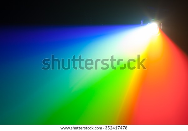
The RGB model, also known as the additive colour model, consists of combining light sources of red, green and blue (RGB). When these are combined in various intensities, they will create all other colours, and when all three of these lights are combined evenly, it will result in pure white light.
The following video explains both additive and subtractive colour models. Notice the many colours that are created during each demonstration of mixing RGB lighting and CMYK inks.
Colour meaning and emotions
It has been increasingly recognised that colours are associated with meanings and emotions. Using colour effectively in a design, will require an understanding of how colour can be interpreted by others. However, it is of equal importance to be mindful that these meanings or emotions are subjective to the individual, and their perception can also be influenced by culture and even the design the colour is applied to.
Watch the following video on how colour has different psychological effects on individuals.
Differences in individual perception and choice within the design process
Every designer and artist will have their individual views on how colour communicates within their design. This will significantly influence the choice of colour integration within the design process. Both the application and combination of colours can influence the feelings and perceptions of a design. The same colours used in different designs will communicate differently. Take for instance, the use of colour red in high heels versus with the use of the colour red in a warning symbol, does this create the same or a different feeling? Colour choice will create a different impact, impression, and communication for different individuals.
Here is a fun exercise that will help you understand how perception and choice can influence the design outcome. Consider the following images, each has the same colour of clothing however, does each give the same feeling or perception?


When people perceive and interpret the use of black in these design, they may feel the following:
- The woman in the black dress is seen as confident, slender, elegant.
- The man in the black-suited tie may appear confident, successful, and powerful.
- Gothic/rock style clothing might give off a more subversive or brooding impression.
Were your impressions similar? Do you think use of black for each design has achieved effective communication? This example also demonstrates how a colour can be perceived either positively or negatively.
Positive and negative influences of colour
All colours can be viewed as positive or negative, thus providing each viewer their own unique perception of the design. The following table demonstrates how the use of colour can influence either a positive, or negative interpretation upon the final outcome of the design.
| Colour used in Design Process | Positive Influences on Final Outcome | Negative Influences on Final Outcome |
|---|---|---|
| Black |
|
|
| White |
|
|
| Red | Causes people to feel passionate, powerful, attractive, sexual | Can convey danger, alertness, awareness |
| Yellow |
|
|
| Blue |
|
|
| Green |
|
|
How artists and designers have applied colour theory and design to their work
Artists and designers apply colour theory to their designs to convey messages and emotions that help communicate the personality and identity of a business product or brand, whilst attracting interest and engaging the viewer. The choice of colour theory is not by accident, and there is always an underlying intention and purpose to why artists select and integrate colour theory in their design.
The following examples show how artists and designers have applied colour theory in their artwork.
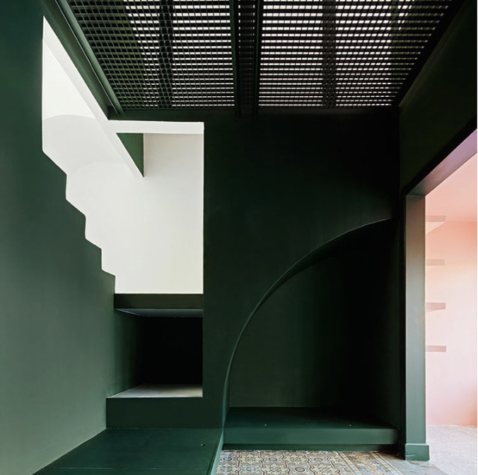
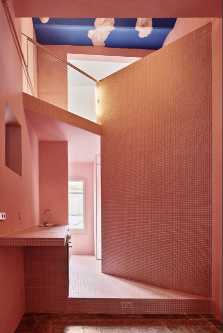
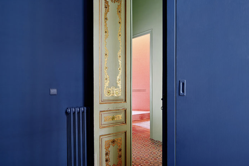
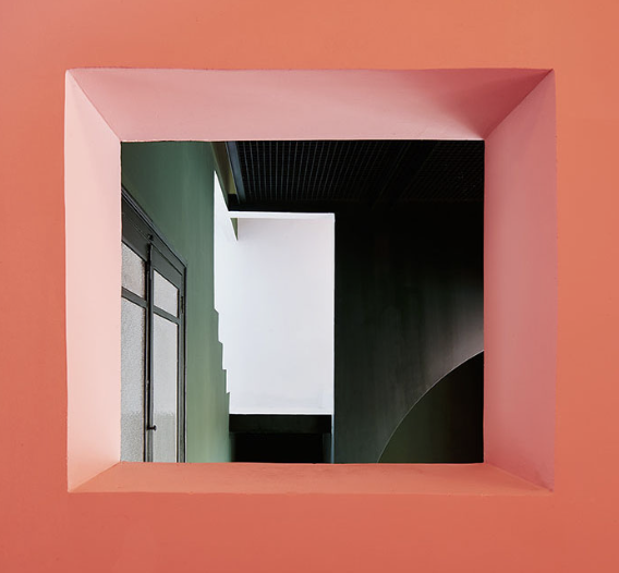
Guillermo Santomà
An interior designer created the unique project on his own home in Barcelona named Casa Horta. Santomà renovated a 1920s house in Barcelona, cleverly playing with colour and natural light to create space, continuity between rooms and originally designed narrow spaces. Santomà’s transformed his home into an artwork with his interior design, creating shadows, shapes and reflections integrating bright tones to period details in the home.
I think of colour as a material, an additional object within the space. It’s modified by the light, which is both separate from it and part of it.Guillermo Santomà
Have a look into his home and design and notice the room in Pepto-Bismol pink that has a sky painted on its’ ceiling. The photographs also how light plays a big role in integrating the colour into the geometric shapes and cut-outs of his home.
Pablo Picasso
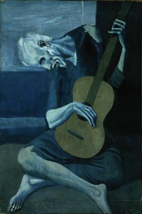
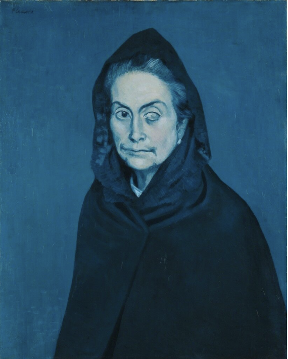
Pablo Picasso was a Spanish artist and designer. One defining moment in his career was known as “the Blue Period” (1901-1904), which was said to have been inspired by his emotional turmoil when losing a close friend to suicide along with having financial struggles. Picasso used colour effectively to communicate his sadness and despair, and as the name of this period portrays, he used many monochromatic tones of blue. It is fascinating how he used a colour that will generally ignite different emotions, such as calming, to use it in such a chilling and depressing way to interpret his gloomy state of mind correctly. During this period in his life is where he created some of his most memorable pieces. Have a look at some artwork that Picasso created during “The Blue Period”.

Vincent Van Gogh
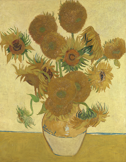
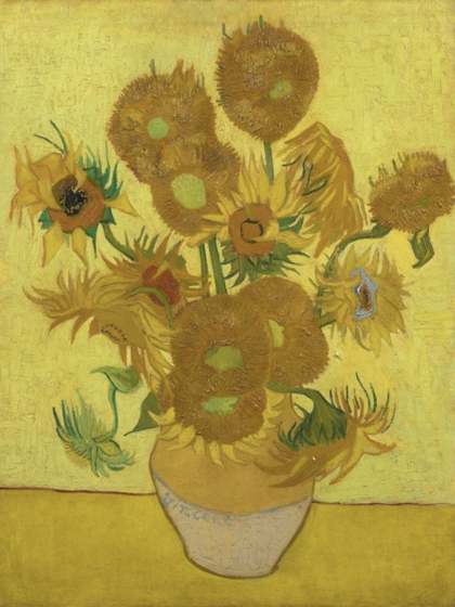
Vincent Van Gogh started experimenting with colour and because paintings with flowers sold well, he started painting an array of flowers. After practising with different flowers, he chose a specific kind, the sunflower. Friends of his critique that they were coarse and unrefined. However, Van Gogh continued to paint them and became renowned for sunflowers, in particular, a specific set of paintings of sunflowers in a vase became famous due to its use of one single colour, yellow. The sunflowers in a vase used shades of yellow on fifteen sunflowers to communicate “gratitude”. It was recognised for the use of vivid and warm yellows to create energy and feelings of hope and joy. Some say that he used different shades of yellow in his sunflowers to spark hope and joy into his own lonely life. If this is the case, he had a good understanding of how colour affected emotions. It was said that he had kept three of his paintings in his own home.
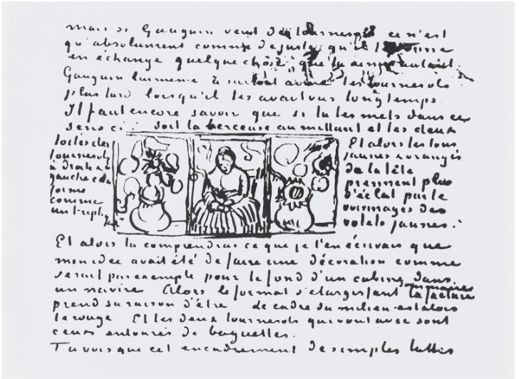
The paintings of flowers in a vase were considered by Van Gogh to create a triptych, placing the painting, “La Berceuse” (Woman Rocking a Cradle; Augustine-Alix Pellicot Roulin, 1851–1930) in the centre and the sunflowers on either side. He painted five of these same paintings, one that was lost during World War II, others can be found in museums around the world, some have only 12 sunflowers in a vase as opposed to 15.
Van Gogh took the sunflower as his own personal artistic signature and was once quoted to say, "the sunflower is mine." At his funeral, people that mourned his death adorned his coffin with yellow sunflowers to pay tribute to his life as an artist.
The following images include the triptych idea that Van Gog had planned and an example of what that may have looked like.
Chuck Anderson
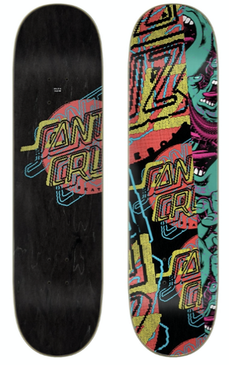
Chuck Anderson is a self-taught designer who started out as a young, carefree risk-taker, determined to make a career out of his creativeness and skills. At the young age of 24, he collaborated with Microsoft and a Marketing agency, Landor, to design the globally launched logo for Windows 7. Since opening his own studio, “NoPattern”, at the age of 18, Anderson has worked with iconic clients such as ESPN, Santa Cruz, Nike and many more. The reason for naming his studio “NoPattern” was because he didn’t want to be stuck in one style or form of artistic approaches, however, he is known for his vivid and surreal designs. Anderson is a very versatile artist who has evolved to develop his own favourite colour palettes in his work and is unafraid to use his own creative expressions of vibrant colours for his clients’ briefs. He continues to reinvent himself and his capabilities. Anderson’s signature colours you would see in his designs frequently include blue, green, yellow, red and magenta-purple, but he overall enjoys creating strong contrasts between elements and unexpected colours. Have a look at some examples of Anderson’s artwork.

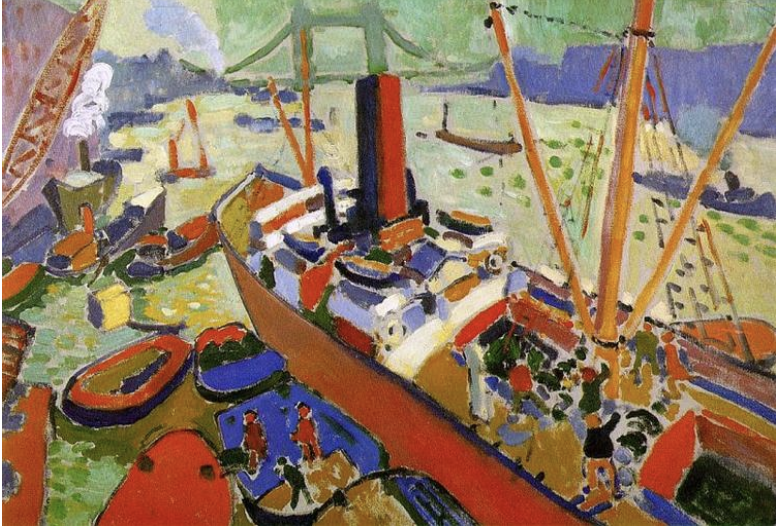
André Derain
André Derain was an artist who belonged to a group of like-minded artists nicknamed "Les Fauves" (the wild beasts). This group could be seen as a rebellious group, as they managed to offend other artistic establishments by their untamed use of colour. As an insult from a critic who was unimpressed with their unsophisticated use of colour, they gained this name. 'Les Fauves' believed and understood that colour could affect one’s emotions, and therefore would use strong colours to communicate the emotions of their artwork. They would use colour not to communicate the images illustrated, rather their individual feelings about the illustrations they painted. Colour was their form of expression and these great ideas enabled other future artists to be brave and bold in their experimentation and selection of colours. This movement and style of painting are now known as Fauvism.
Derain used this technique and belief to develop “The Pool of London”. The painting had the view of the Thames from London Bridge showing the river. Derain uses the clash between contrasting warm and cool colours to express the noise and activity of this busy dockyard. He creates the illusion of depth in the painting by using warmer colours in the foreground which gradually become cooler towards the background. This organised arrangement of colours in a landscape is called Aerial Perspective.6 See the image of “The Pool of London” and notice the use of strong colours that have been applied with fierce brushwork.
Researching not only serves to understand how colour has been integrated into designs, but also how it can be integrated in future designs. Evaluating researched information will assist in applying colour to a design to appropriately meet the needs of the design brief. The process of researching and evaluating is an important skill, regularly used by designers for inspiration to mimic or evolve the use of colour. A designer and artist will always be “re-inventing the wheel”, within a creative role, the sky is the limit.
Every industry has legislative requirements that need to be considered. The following three legislative requirements can impact and play a role in the design process when conducting research and planning out the design. These include:
- Intellectual property and copyright issues
- Environmental issues
- Work Health and Safety requirements
Let us briefly explore each of the requirements that need to be considered within the design process.
Intellectual property issues and legislation
When integrating colour theory and design processes, it is necessary to confirm intellectual property (IP) and other relevant legislative requirements are met. To do this effectively, it is necessary to explain intellectual property issues and other legislation relevant to design.
Intellectual property (IP)

It is important to be aware of intellectual property and copyright issues and legislation relevant to the designs created. See the following terms and definitions.
Intellectual property (IP)
This refers to ‘creations of the mind’, such as inventions, literary and artistic works, and designs, symbols and names used in commerce and others alike. Thus, IP can relate to any new idea that is created and the application of ideas, particularly for commercial purposes.
Copyright
This is one type of intellectual property. Copyright protects drawings, art, literature, music, film, broadcasts, computer programs and similar creations. It acts to protect the original expression of an idea, but not the idea itself.
The Australian Copyright Council can give current information on what is and what is not protected by copyright; you should refer to the Council’s website. In general, ‘artistic works’, which include drawings, are protected by copyright in Australia. However, this is only if they are original: “the work isn’t a mere copy, a requisite level of skill and effort has been exercised in its creation”.7
IP can be protected if it is registered with the Australian government or an international equivalent, for example, via a patent, trademark, design registration or copyright arrangement, etc. This registration prevents others, by law, from copying the idea for commercial gain, for a period of time. This provides the IP owners with the time needed to develop and commercialise their creation without others using the idea unfairly. In addition, IP laws allow the creators or owners of the patent, trademark, design registration or copyright to benefit from their work or investment in the creation.
The Copyright Act 1968 (Cth) states that (1) copyright applies to any original material, and (2) copyright lasts for the life of the creator plus 70 years or 70 years after the material is first published. Therefore, designers and artists are required to obtain copyright clearance for the use of any material which is non-original (that is, any material that has been created by somebody else) and which is still under copyright. However, there may not be a requirement to obtain copyright clearance if the use of copyright material is deemed to be ‘fair’. Read the following about the ‘fair’ use of copyright:
Fair use is a defence against copyright infringement. It essentially asks of any particular use, ‘is this fair?’ This is determined on a case-by-case basis. The statute does not define what is fair. However, in deciding whether a use is fair, a number of criteria, ‘fairness factors’ are considered. These fairness factors are set out in the fair use statutory provision.
A particular use does not have to fall into one of these categories to be fair. Also, just because a use falls into one of the categories of illustrative purpose, does not mean that such a use will necessarily be fair. It does not even create a presumption that the use is fair. In every case, the fairness factors must be ‘explored, and the results weighed.8
Generally, any copyright material reproduced for purposes such as criticism, comment, news reporting, teaching, scholarship or research is not considered a breach of copyright under the Copyright Act 1968 (Cth). However, when deciding whether the use of copyright is ‘fair’ a number of factors are taken into consideration – such as the purpose and character of the use of the material (including whether it is for commercial purposes), the nature of the original material, the amount of material used and the potential impacts of the use of the material on its marketability and value, etc.
Where there is a failure to obtain copyright clearance and/or use copyright material unfairly, obligations under the Copyright Act 1968 (Cth) are breached. This is referred to as an infringement. When creating drawings, always aim to avoid infringement and consider the need to protect own work from infringement, where required. Seek advice about protecting IP/copyright, if required.
Environmental sustainability

Business activities may have a considerable impact on the environment, for example: by releasing pollutants into ecosystems, consuming non-renewable resources, creating non-recyclable waste and disturbing environments, etc. Environmental issues associated with design work include:
- The use of non-renewable resources in the manufacture of paper/pencils/inks. Resources used should be kept to a minimal.
- This impacts the design due to wastage of these resources, therefore, be the usage of these resources should be minimised where possible.
- The creation of waste, any waste should be recycled, wherever possible.
- The use of electricity which, in most cases, requires the burning of fossil fuels; eco-friendly options should be sought and used wherever possible.
The procedures in how work is conducted will be impacted with these considerations and environmentally friendly habits that are adopted when working.
All organisations have a legal responsibility under the Environment Protection and Biodiversity Conservation Act 1999 (EPBC Act) to minimise their impact on the environment. Organisations should have an environmental plan; often, this will focus on sustainability practices. ‘Sustainability means meeting our needs without compromising the ability of future generations to meet theirs.9
Sustainability is a particularly important concept in Australia because we have an environment, society and economy which are particularly exposed to the negative effects of environmental degradation. By adopting sustainability practices in our day-to-day work, we can help to mitigate these negative effects. Environmental and sustainability requirements may relate to:10
- reducing, reusing and recycling waste wherever possible
- reducing consumption of non-renewable resources such as water.
- minimising disturbance to natural ecosystems (land and vegetation)
- reducing the use of chemicals, including pesticides and vermin poisons
- using well-maintained, energy-efficient equipment and machines
- selecting eco-efficient lighting, ventilation and water usage options.
Environmental and sustainability requirements will also be outlined in codes of practice. For example, the Environmental Protection Agency (EPA) in each state/territory has a general code of practice.
Work health and safety (WHS)
Work health and safety (WHS), sometimes referred to as occupational health and safety (OHS), outlines the tasks we undertake to protect the health and safety of all people present in a workplace. All people have the right to a healthy and safe environment, including at work. State/territory legislation and regulations outline the WHS responsibilities of employers/supervisors/employees:11
| ACT | Work Health and Safety Act 2011 (ACT) | Work Health and Safety Regulation 2011 (ACT) |
| NSW | Work Health and Safety Act 2011 (NSW) | Work Health and Safety Regulation 2017 (NSW) |
| NT | Work Health and Safety (National Uniform Legislation) Act 2011 (NT) | Work Health and Safety (National Uniform Legislation) Regulations (NT) |
| QLD | Work Health and Safety Act 2011 (QLD) | Work Health and Safety Regulation 2011 (WLS) |
| SA | Work Health and Safety Act 2012 (SA) | Work Health and Safety Regulation 2012 (SA) |
| TAS | Work Health and Safety Act 2012 (TAS) | Work Health and Safety Regulation 2012 (TAS) |
| VIC | Occupational Health and Safety Act 2004 (VIC) | Occupational Health and Safety Regulations 2017 (VIC) |
| WA | Occupational Safety and Health Act 1984 (WA) | Occupational Safety and Health Regulations 1996 (WA) |
It is important to emphasise that all people in a workplace, including employers, supervisors, and employees, have WHS roles and responsibilities. All people must:
- take reasonable care of their health and safety
- follow reasonable health and safety instructions from a responsible person
- ask if they are unsure how to perform a work-related task safely
- use personal protective equipment (PPE) as they were trained and instructed to
- report injuries and unsafe and unhealthy situations.12
A ‘duty holder’, specifically an employer or a supervisor, also has additional roles and responsibilities associated with WHS. For example, duty-holders must also:
- Provide a working environment that is reasonably healthy and safe
- Acquire and maintain up-to-date knowledge of WHS matters
- Ensure they thoroughly understand the nature of the operations of the organisation, and the WHS hazards and risks associated with those operations
- Ensure appropriate resources are used to identify hazards and manage risks Ensure processes are in place to collect and respond to WHS information/data
- Consult with employees on WHS issues, including risk management strategies
- Provide employees with training on WHS matters, where this is required
- Ensure the organisation complies with reporting and investigating WHS issues.13
At all times, a designer must comply with the WHS requirements, including when integrating colour theory and design processes. These help fulfil the legal and ethical responsibility that keep all people safe in the workplace.
When going through the design process, consider these examples of WHS issues associated with the tools and materials used for design. Then, read and see the strategies that can be implemented to manage them:
| Strain on muscles |
Prolonged sitting at a desk can result in strain on muscles, particularly in the back/neck/arms. To minimise this risk, adjust the workstation so that:
Regularly change postures between sitting, standing and moving, and avoid lengthy periods at the workstation.14 |
| Strain on eyes | Staring at a page can result in significant strain on the eyes. It is important to ensure that a bright white light appropriately lights the work. It is suggested to look away from work frequently and take regular breaks to rest eyes. If glasses are being worn, their prescription must be current and correct. |
| Use of sharp materials | Take care when using and moving sharp materials, such as sharpened graphite pencils. For example: never carry sharpened pencils with their tips exposed. If an injury is sustained from a sharp material, wash the area thoroughly and seek medical advice. |
| Exposure to toxic materials | Most of the materials used when creating freehand sketches will be non-toxic. However, it is important to acknowledge that some inks can have toxic effects if a person is exposed to them in high concentrations or ingest them. Inks should be kept out of reach of children/pets. Exposure to potentially toxic materials should be minimised. If exposure occurs, seek advice. |
Insert activity here.
In this topic, we focused on Colour Theory and Design Processes. You have learnt:
- What is a design process?
- Identifying and accessing sources of information
- Communicating ideas using colour theory and aspects of colour
- Researching artistic approaches
- Evaluating information to integrate colour theory and design into the design process
- Legislative requirements are relevant to the design process.