In this topic we will cover the following:
- What gamification is and consider Duolingo as an example of effective gamification
- Motivation
- Gamification mechanics
- Ethical and moral concerns.

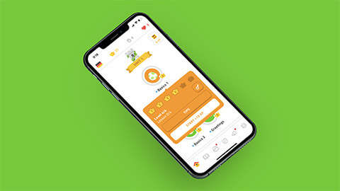
Gamification is ‘the use of game design elements in non-game contexts’ (Deterding et al. 2011). In user interface design, gamification is when we apply game mechanics like badges and rewards to websites and mobile apps where the primary purpose is not game play. For example, in Duolingo the primary purpose is to learn a language. However, game mechanics are an integral part of Duolingo. These game mechanics include:
| Points | Earn XP (experience points) for completing lessons, skills practice, and tests. |
| Risk | Hearts which you lose if you answer incorrectly too often. |
| Progression indicators | Levelling up in the form of Crown and Skill levels. |
| Rewards | Gems and Lingots which users earn for completing lessons and can use as virtual currency for in app/web purchases. |
| Competition | Leagues with other Duolingo users around the world. |
| Social | Connect with friends and followers. |
| Delightful interactions | Words of encouragement and fun animations from Duo – the little, green, owl mascot – and other characters. |
| Avatars | Abstract representation of users. |
Duolingo uses gamification to the point that it blurs the line between an education product and game. The game mechanics are well-thought out and consistently applied. These elements motivate users to spend more time on the app, complete lessons, and improve their language skills. Which of course, means more time viewing ads or paying for a premium, ad-free version therefore increasing Duolingo's revenue.
Gamification is not limited to educational websites and mobile apps. As you will see as you progress through this topic, gamification can be used in e-commerce, social media, health and lifestyle, and even project management software. When used successfully, gamification can be employed to influence a user's behaviour. Why do simple game mechanics have such an effect? To understand why gamification works, we first need to understand what motivates behaviour and causes us to take a particular course of action.

Motivation is the reason we do something. It is what inspires us to behave a particular way or to make a specific decision. There are two types of motivation – intrinsic and extrinsic.
Extrinsic motivation is when we are motivated by external forces such as rewards or punishment. You may have heard this referred to as the carrot and stick approach. The phrase comes from the idea of getting a donkey to move forward by either dangling a carrot in front of it or hitting it with a stick if it does not move. The donkey is motivated to behave a particular way because it either thinks it will be rewarded (with a carrot) or for fear of punishment (the stick) depending on what approach is taken – sometimes both.
Extrinsic rewards today would include things such as money, praise from others, promotions, good grades, and awards. Whereas extrinsic punishments could include negative performance reviews, demotions, losing privileges, social isolation (time-outs), poor grades.
In contrast, intrinsic motivation is doing something purely for the enjoyment or interest in the activity.
Let us consider your approach to study. If you are only motivated to complete a module so you can get a good grade on an assessment, receive praise from your tutor, graduate, and get a well-paid job, we could say you are extrinsically motivated. However, if you are motivated to complete a module because you enjoy learning and developing your skills, find the topic interesting, and get enjoyment and a sense of fulfilment from what you create, we could say you are intrinsically motivated. One is not better than the other, in fact, you will probably find that you are sometimes motivated extrinsically and sometimes intrinsically. A combination is likely the best.
Gamification attempts to tap into what motivates users. Typically, when we think of game mechanics we think of extrinsic motivators. Medals, leaderboards, rewards, and losing a streak are all mostly extrinsic. Certainly, it is easier to gamify a user interface with predominately extrinsic motivators. However, we can borrow other game mechanics such as compelling themes, rich narratives, challenges, and delightful interactions to influence intrinsic motivation and make using our product a pleasurable experience for the user.

Gamification mechanics may also be referred to as game mechanics, gamification elements, and game design elements. There are many varied gamification mechanics the designers may use in UI design. We will consider the most common.
Delightful interactions and instant gratification
Delightful interactions are little pieces of joy dispersed throughout a user interface that are not worth anything concrete but bring a small burst of happiness when they appear. They are fun without any other purpose. Often this makes them seem superfluous to the design. However, they can be instrumental in building a positive, happy user experience. When used effectively, delightful interactions may even help to distract and diminish negative feelings when a necessary task is dull or frustrating.
Example: Google Chrome displays a static dinosaur when there is no internet connection. If a user clicks the dinosaur or enters the space bar, they can play a simple game hopefully providing some light relief rather than despairing that there is no internet connection.
Example: Twitter heart animation when a user likes a tweet.

Micro-credentials
In gaming, badges and medals are a way to conceptualise rewards and acknowledge goals and quests which have been fulfilled. Digital badges are a form of micro-credentials which provide a visual representation of achievement to the user and others using a platform. Micro-credentials validate the user's evidence of achievement. They provide users with immediate visual feedback which encourages them to keep going and stay engaged.
Micro-credentials can be overused as it is perceived to be an easy extrinsic motivator to implement. Arbitrary micro-credentials that are not linked to meaningful accomplishments do not guarantee user engagement.
Example: NZQA offer micro-credentials to certify achievement of skills and knowledge where there is need by employers, industry, iwi and/or the community but that is not catered for in regulated tertiary education system.
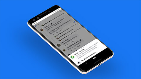
Example: Facebook uses badges on groups and pages to communicate a variety of things.
| Membership type | Admin, moderator, new member, and founding member. |
| Highlight and reward contributors in a group | Conversation starter, conversation booster, rising star, visual storyteller, valued responder, link curator, and greeter. |
| Highlight and reward contributors on a page | Top fan, valued commenter, anniversary follower, and milestone follower. |

Rewards and points
Rewards and points are similar to micro-credentials but applied immediately. Once you reach a certain number of rewards and points, you may be rewarded with a micro-credential. The user gets immediate feedback and encouragement.
Rewards and points can appear in a typical gaming fashion as a number count or coins, but may also be conceptualised as reaction, comments and followers counts, common in social media. Users chase high reaction counts and this results in users revisiting a post often to check reactions or changing how and when they post in the hopes of getting a high number of reactions. Users are notified of post engagement and reminded of popular posts to further drive the importance of these counts.
Example: Instagram counts and displays followers, comments, views, and likes. Users have the option of hiding like and view counts. The ability to hide likes and views was rolled out in 2019 in an effort to minimise users' anxiety as a result of comparing counts with others. However, after two years Instagram found it did not help in reducing social media pressure. Counts returned as the default but the feature to hide them remained, and the user was given the choice whether to hide or not.
Progression indicators
Progression indicators such as levelling up or progression bars provide context to the user about how they are progressing with a task. It can provide motivation to complete a task as the user nears the end and reminds them how far they have come. Terms that may be used in relation to progression indicators include;
- Progression bars
- Levels and levelling up
- Percentages
- Quests
- Experience points (XP).
Micro-credentials can also operate as progression indicators if they are assigned to a particular level of achievement. Progression indicators help users with goal setting as they see where they are on their journey and what they need to do to progress.
Often progression indicators work in conjunction with other game mechanics including rewards, points, and micro-credentials. E-commerce provides a great example of this. Customers can earn loyalty points by making purchases and completing other tasks such as engaging with the brand on social media platforms or referring friends. Loyalty points are translated into supporter levels (micro-credentials and progression indicators) and customers receive rewards (discounts, freebies) depending on which level they reach.
Example: MECCA Beauty Loop assigns levels to customer spend. Customers move up levels the more they spend. Each level has greater rewards associated with it and customers are periodically reminded of which level they are at, what rewards they qualify for, and how to move up via the website and marketing emails.

Competition and social elements
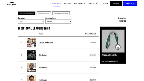
Micro-credentials, rewards, points, and progression indicators can be private, only viewed by the user, or made viewable to a range of users which introduces competition and social elements. When users are ranked on a leaderboard, competition is introduced. Leaderboards should be used with some caution. They can be motivating and effective for those that are competitive and winning (but not winning too easily). However, for those that are losing, they may be de-motivating and contribute to low self-esteem. For non-competitive users, leaderboards may have no impact.
Example: Leaderboards in fundraising drives such as Movember. Players either compete as teams or individuals. Often there is a friendly rivalry between businesses trying to out-do each other to take the podium. This can result in greater fundraising efforts.

Tutorials
Just as most players are unlikely to read a game manual in its entirety (if at all) before jumping into gameplay, users do not want to read a user manual to complete a task on a user interface. In game design, rules and instructions are communicated via in-game tutorials, often with a trial problem for the player to solve with guidance. Players have the option of skipping a tutorial, therefore avoiding any frustration at lack of decision making. Those players who do complete the tutorial will hopefully feel they have more skills and can complete the game more effectively and efficiently, or are at least rewarded with Easter eggs.
With UI design the goal should be for users to be able to navigate and complete tasks unassisted. However, guided tutorials can encourage users to explore and interact with a website or mobile app in more depth than they would otherwise. It can also assist users to acquire new skills, shortcuts, and learn about different features providing users with a sense of mastery.
Example: When user's first sign up to Trello, a task management tool, they are prompted with a series of questions that guide them through the system. This process highlights features by showing rather than telling the user what is possible.
From Trello's Interactive Walkthrough by J Daniels, 2021, userpilot.com, © 2021 Userpilot
Narrative and theme
UI design can borrow the concept of rich storytelling and theme from game design to create an experience that is interesting, cohesive, and that will hook users. It will not always be appropriate, but it can be a fun way to create an immersive experience and help users emotionally connect with a website or mobile app.
Storytelling is a great way to tap into intrinsic motivation. The goal is that users find the storytelling compelling and the challenges rewarding, so much so that they have a sense of joy and accomplishment when they engage with the product.
Example: The Conqueror Virtual Fitness Challenge Series is designed to motivate users to run, walk, or cycle using timed virtual challenges. The product aims to create a full experience for the user with challenges around the world featuring avatars, street view, and postcards. The Conqueror takes the theme beyond a screen and posts physical medals to competitors on completion of a challenge.
Risk
Risk is an inherent part of gameplay. In a game the risk of your character dying or not completing a task within a time period results in the player failing their mission. Risk and failure are extrinsic punishments (like the stick in the donkey analogy). When applied to a user interface it can provide some motivation and excitement however, it may also frustrate and annoy the user if they are constantly punished or notified about a superficial risk.
Example: Snapchat users are prompted to keep a Snapstreak going by sending a Snap to the friend within a 24-hour period. If they fail to send a Snap, they lose their Snapstreak and the little lit fire icon next to their friend's name.

Gamification is attractive because when used well, it can hook users and improve metrics including;
- Percentage of users who return to the website or mobile app (rate of retention and attrition)
- Number of interactions or engagement per session
- Frequency and number of sessions per user
- Total time spent on page.
Game mechanics are designed to be immersive and addictive. As designers, we need to question whether gamification is necessary for the product we are designing. Gamification may motivate users to spend hours on an app and spend money on in-app purchases, but is it ethical to do so? How are our users affected emotionally, mentally, and physically?
Reflect on the game mechanics designers have used in mobile apps on your device. You may wish to check digital wellbeing tools, often available in your phone's settings. You may even discover game mechanics at play in the wellbeing tools. Do you think gamification has contributed to your engagement with these apps?
Gamification is applying game mechanics in non-game contexts. Common game mechanics used in gamification include:
- Delightful interactions and instant gratification
- Micro-credentials
- Rewards and points
- Progression indicators
- Competition and social elements
- Tutorials
- Narrative and theme
- Risk.
These gamification mechanics can be seen in a wide range of websites and mobile apps. E-commerce often uses rewards and points to encourage brand loyalty, as well as progression indicators when completing a transaction or to encourage greater spend levels. Delightful interactions, instant gratification, micro-credentials, and points are all mainstays of social media apps and websites.
Gamification is popular because it can be used to increase motivation and therefore, influence user behaviour. This creates an ethical concern as designers can manipulate user behaviour to achieve business goals at the expense of the user’s best interests.
Check your knowledge of gamification by answering the following questions.
Additional resources
Here are some links to help you learn more about this topic.
It is expected that you should complete 12 hours (FT) or 6 hours (PT) of student-directed learning each week. These resources will make up part of your own student-directed learning hours.

