
In this topic we will cover the following:
- Ethics
- Dark patterns
- Accessibility
- Tools to help build accessible user interfaces.
As designers, we will often need to navigate the competing interests of business pressures, UI design principles, and our own beliefs of what is just and fair. Ethics are the moral principles that determine a person's behaviour or how they conduct an activity. As a designer you will be exposed to or affected by business decisions that are commonly driven by profit, return on investment (ROI), and meeting key performance indicators (KPI). These can conflict with the user's best interest, and thus the ethical dilemma begins.
Good UI design seeks to empower the user and build a trustworthy product. It relies on the designer being mindful of:
| User autonomy | The freedom to determine one's own actions and behaviour. For example, the ability to opt in and out of a mailing list, deliberate choices, and customising settings. |
| Transparency | Users need to clearly know what they are signing up for and how their data will be used. |
| Safety | No harm to the user's physical, mental, and emotional wellbeing. |
Therefore, we need to champion usability, clarity, empathetic design, and be sensitive to diversity. Think about an interface that is purposely confusing with the intent to make the user subscribe or purchase something they did not intend to. The business has achieved its goal in the short term, but the user does not feel empowered nor necessarily happy with their choice. Do you think they will be repeat user?
Ethical design is about consciously making design decisions that do not harm the user. Think about all elements of a user's safety including physical harm, their right to privacy, emotional wellbeing, and inclusion in society. Harm could be intentional or accidental so we must attempt to predict all outcomes of our design decisions.
For example, Twitter can be great for connecting with a wide range of voices outside our normal social circle. We can follow celebrities, experts in different fields, and random users that have hot takes. However, the anonymity of profiles and lack of serious reporting tools can make it possible for cyberbullying and doxing to thrive. Doxing is publishing private or identifying information about someone with malicious intent. Cyberbullying and doxing may lead to low self-esteem and self-harm. Twitter is developing anti-abuse tools such as controls over @mention features, greater transparency with reporting, and algorithms that prevent flagged and abusive users from creating multiple new accounts.
The video in the following accordion deals with the topics of cyberbullying and suicide. It is not compulsory to watch. A list of helplines and support is available on the Mental Health Foundation website. Click on the accordion header or plus icon to expand and view the video.
Predicting moral and ethical concerns in UI
It can be challenging to predict all the ways our designs can be used, particularly if we are used to thinking with a positive mindset. Fortunately, there are frameworks we can use. Design Ethically has created a toolkit to help designers make ethical design decisions in technology. We are going to practice one of the recommended activities – dichotomy mapping – now.

Dichotomy is division into two opposed groups or parts. For example, good and bad, tall and short, loud and quiet. When we use dichotomy mapping, we list all the beneficial and harmful aspects of our product's features.
Our scenario is that we are developing a new social media app. Features of our app include:
- Users will be able to have anonymous profiles.
- Facial recognition technology will be used to automatically tag people in photos.
- An algorithm will be used to ensure users newsfeeds show them relevant and popular posts.
For each of our features, we consider potential harmful and beneficial aspects. Have a go writing down possibilities and when you are ready, click on the header or plus icon in the accordion to see some potential harmful and beneficial aspects. Did you come up with anything additional?

| Harmful | Beneficial |
|---|---|
| Cyberbullying, abusive posts. | Protects users’ data and privacy. |
| Violent posts as no fear of repercussions. | Encourages meaningful dialogue as no fear of repercussions. |

| Harmful | Beneficial |
|---|---|
| Lack of privacy. | Improves photo organisation and search. |
| Possible data breaches and fraud opportunities. | Users save time as they do not need to manually tag friends. |
| Racism in algorithm (intentional or unintentional bias). |

| Harmful | Beneficial |
|---|---|
| Bias in media and articles. | Targeted ads. |
| Create an echo chamber, reinforce opinions. | Reduce noise of irrelevant content. |
| Spread of fake news. |
It may be difficult to create a UI with features that have absolutely zero harmful outcomes. However, considering them in the design process allows you to identify ethical and moral concerns early, and either mitigate or minimise the harm.
Fortunately, there is a trend towards pro-privacy, pro-user control, and anti-deceptive design. Data protection scandals such as Cambridge Analytica, the LinkedIn data breach of 700 million users (July 2021), and Facebook data breach of 533 million users (April 2019) have increased public awareness. Regulation and legal challenges are hoping to financially and publicly discourage unethical UX practices.
Dark patterns are deception and dishonesty by design. Let us unpack this.
Design is a persuasive technique. The same techniques that are used to enhance the user experience, can be intentionally used to manipulate the user to do something that benefits a commercial interest. When business interests are favoured at the expense of the user experience and design decisions are made to purposely deceive the user; we can refer to this as dark patterns.
There are seven persuasive design techniques that can be used to influence how someone perceives a product. You will find them commonplace in design and marketing. They are not inherently morally wrong. Nevertheless, they can be used to create powerful dark patterns so we should be mindful of our ethical obligations to the user when employing these techniques.
| Tailoring | Highlight features that will appeal to the individual user. Have personalised recommendations. |
| Tunnelling | Guide the user where you want them to go by blurring the variables around the path. |
| Suggestion | Introduce new information at critical moments to an engaged user. |
| Conditioning | Use design to encourage and reinforce desirable behaviour. |
| Reduction | Remove any unnecessary or undesirable features and information. Reduce choice for the user to eliminate them becoming overwhelmed with too many options. |
| Surveillance | Data collection and possibly revealing that information to other users to motivate via competition. |
| Self-monitoring | Real-time feedback to the user about their progress on a task. |
Watch the video and reflect on how persuasive design techniques were used for the benefit of the business at the disservice of the user.
In the video we saw examples from Amazon, LinkedIn, Booking.com and others. Can you recall a time when you struggled to unsubscribe or delete an account? How about a time when you felt tricked into purchasing something?
Harry Brignull and others have catalogued many types of dark patterns, but they can often be categorised into five dark pattern principles.

Nagging
A user's task is interrupted by other tasks that do not directly relate to what they are trying to achieve such as pop-ups that block the interface.

Obstruction
A task is made more difficult than it needs to be with the intention of making the user give up on the task.
Includes: Brignull "Roach Motel", "Price Comparison Prevention", and Intermediate Currency.

Sneaking
Information that is important to the user is hidden, disguised, or not divulged until late in the process.
Includes: Brignull "Forced Continuity", "Hidden costs", "Sneak into Basket", and "Bait and Switch".

Interface Interference
The interface is designed to direct users to certain actions over others, often which benefit the business but which are not what the user intended to do.
Includes: Hidden Information, Preselection, Aesthetic Manipulation, Toying with Emotion, False Hierarchy, Brignull "Disguised Ad" and "Trick Questions"

Forced Action
The user is required to do something that may be undesirable in order to access the desired function.
Includes: Social Pyramid, Brignull "Privacy Zuckering" and Gamification
Dark patterns perform well in testing because they result in more conversions than informed decision making. However, long-term they build anger and mistrust which impacts brand loyalty and reputation.

‘Web accessibility is about inclusion — making sure everyone, including disabled people and those using assistive technologies, can access online information and services.’ (Digital Government and New Zealand Crown 2021 CC BY 4.0)
It is important to ensure accessibility in UI design because:
- Great UI design relies on usability, visual aesthetic, and accessibility. Designing with accessibility in mind helps create positive user experiences for all and enables people with disabilities to access information and participate.
- We have an ethical obligation to ensure design is inclusive. For many people with disabilities, technology and the internet have been transformational tools allowing them to feel connected and participate in society.
- We have a legal obligation to create accessible design. Multiple articles in the United Nations Convention on the Rights of Persons with Disabilities set out requirements for accessible online content.
- Article 4: General obligations
- Article 9: Accessibility
- Article 21: Freedom of expression and opinion, and access to information.
Watch the following video and reflect on the different ways people access online content. Think about the ways in which we can create inclusive websites and mobile apps.
Universal design principles
Ronald Mace and his team developed seven universal design principles in 1997. These design principles help ensure we design products for all abilities.
| Principle | Definition | Example | |
|---|---|---|---|
| 1 | Equitable use | The design is useful and marketable to people with diverse abilities. | Images have alt text so users that are blind and vision impaired can use screen reader technologies. |
| 2 | Flexible use | The design accommodates a wide range of individual preferences and abilities. | Audio visual media has options for closed captions, sign language, and transcripts. |
| 3 | Simple, intuitive use | Use of the design is easy to understand, regardless of the user's experience, knowledge, language skills, or current concentration level. | Headings and page titles are meaningful. |
| 4 | Perceptible information | The design communicates necessary information effectively to the user, regardless of ambient conditions or the user's sensory abilities. | Icons and text are used together. |
| 5 | Tolerance for error | The design minimises hazards and the adverse consequences of accidental or unintended actions. | Data validation to ensure users cannot book reservations in the future. |
| 6 | Low physical effort | The design can be used efficiently and comfortably and with a minimum of fatigue. | Keyboard shortcuts. |
| 7 | Size and space for approach and use | Appropriate size and space is provided for approach, reach, manipulation, and use regardless of user's body size, posture, or mobility. | Buttons are large and appropriately spaced out. |
Disabilities
The following is not an exhaustive list but provides some context around accessibility that some users may experience and actions you can take to improve accessibility.
Vision
Low vision is reduced vision which cannot be corrected with surgery, glasses, or medicine. People with blindness or low vision may use adaptive technologies to engage with a UI.
Adaptive technologies include:
| Screen readers | Read aloud what is on the screen including menu and folder information, text content, alt text, and captions. |
| Screen magnifiers | Enlarge the size of everything on screen and can customise the colour and contrast of what is displayed. |
| Electronic braille devices | These can be attached to a computer or via Bluetooth to a mobile device. The device converts text to tactile braille allowing the user to read the contents of the screen using braille. |
| Smart speaker | Amazon Echo, Google Assistant, Alexa, Siri, and others can search, action, and read content aloud. |
Adaptive technologies and in-built functions like browser zoom or screen magnifiers such as ZoomText, may magnify everything on screen and impact layout. Selecting an appropriately sized font during the design process, means layout is not compromised.
Screen readers will read out everything on a screen and rely on correctly coded data. Set and use font styles (for example; normal, heading 1, title, emphasis) rather than manually formatting. This saves you time, ensures consistency, and importantly it is read aloud by the screen reader concisely. Likewise, all graphics should be formatted with alt text or captions which are read by the screen reader.
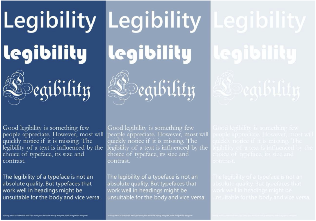
Typography choice is important for accessibility for those with vision impairment. Use legible typography and avoid graphic fonts, be mindful of colour contrast (colour blindness affects 8% of men in New Zealand) and use realistic font size.
Compare the fonts and colours used in the following image.
Hyperlinks must be underlined and have strong colour contrast. This is also helpful to avoid falling into dark pattern design. Regardless of vision, users will often scan and if a link is not obvious, it will be easily missed.
Specific learning differences
Specific learning disabilities (SLD) is a term for unexpected learning difficulties that significantly interfere with an individual's activities. SLDs include dyslexia and Attention Deficit Hyperactivity Disorder (ADHD).
We can help people with dyslexia by making mindful typography choices including using sans serif font, avoiding justified text, and avoiding black text on white background as this can create a blurred effect. Use colour and spacing to distinguish blocks of text content. Apply universal design principle 4 – perceptible information – and use icons to reiterate purpose.
Hearing
Users with hearing loss, hearing impairment, or deafness are either totally or partially unable to hear sounds. It is important to consider those with hearing impairments whenever we use audio or video media. Ensure all audio and video media have closed captions, transcripts, or New Zealand Sign Language (NZSL) available. Following the universal design principle for flexible use, it is ideal to include a combination of these as some users may prefer to read captions, while others prefer to see the content translated into NZSL.

Closed captions and transcripts also help non-native speakers, those not fluent in the local colloquialisms (slang), or have other language and cognitive difficulties. Some users just prefer the sound off – perhaps they are watching on public transport or just do not like to be bombarded with too many stimuli.
Movement
Some users may not be able to use a mouse or keyboard easily or at all. Design user interfaces to respond to keyboard shortcuts as well as mouse actions. This is an example of flexible use and low physical effort. Large buttons that are well spaced out and easy-to-use navigation ensure users do not accidentally select something they did not intend to. Consider the length of content. Where more than three scrolls are required to view the information, consider splitting the information across multiple pages.

Cognition
Remember that we are trying to empower our users with good UI. We want the information to be easily understood and transparent so users can make informed decisions. This is particularly important for those with reduced cognitive abilities. Keep in mind cognition starts to decline from about age 45 – that is a lot of users!
Keep navigation consistent and use meaningful headings and links. "Click here" is vague – it tells the users nothing about where they are going or if the content is relevant. Links should be specific, sincere, succinct, and make sense without any other context. Use descriptive and informative page titles. Page headings, labels for forms, and interactive controls should be informative. This helps users with limited short-term memory, low vision, or difficulty reading text. Users can see only a few words at a time and know the purpose of each section. A combination of text, colour, and graphical objects can be used to specify important information.
Avoid drastic changes in animation and special effects which may confuse and overwhelm users. This can help users with low vision or cognitive disabilities giving them adequate time to perceive additional content appearing on hover and to view the trigger content with less distraction.
Do not provide instructions that rely solely on one sensory characteristic of components such as shape, colour, size, visual location, orientation or sound — use a combination.
There is a growing focus on accessible UI design, and this has resulted in some excellent tools to help designers. The following is just a small selection of some of the free tools available.
Adobe Color Wheel
The Adobe Color Wheel has a tab dedicated to accessibility tools including Contrast Checker and Color Blind Safe.
The Contrast Checker allows designers to enter text and background colours. The tool will calculate the contrast ratio and indicate whether the contrast is adequate or not. It will also make suggestions for improved contrast.

The Color Blind Safe will assess potential colour conflicts in a colour palette and display what the colour palette will look like for people that have different forms of colour blindness (deuteranopia, protanopia, and tritanopia.)

Microsoft Office
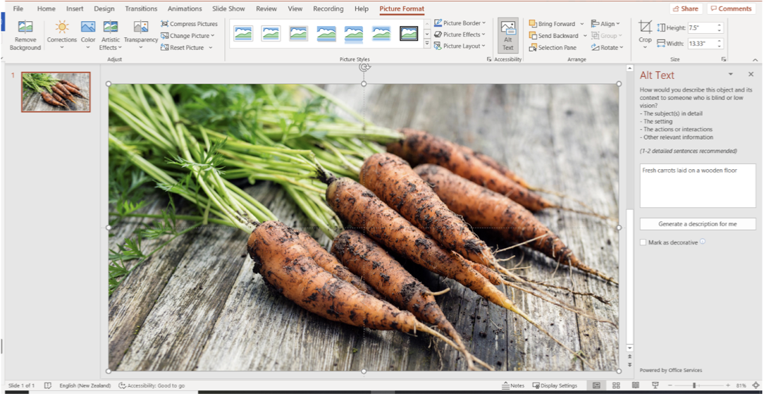
Microsoft Office has an in-built Accessibility Checker and an Alt Text feature.
The Accessibility Checker is available in the Review ribbon on Windows, macOS, and Web. It provides options to check accessibility of the document, create alt text, and reorder the reading order.
Alt text is automatically generated in Microsoft 365 however, it is still best practice to review and edit to ensure the alt text is accurate, as well as remove comments such as “Description generated with high confidence”. While alt text is not automatically applied in Office 2019, you can select “Generate a description for me” in the Alt Text pane.
Not all alt text is created equal. Let us take a quick moment to have a closer look at alt text and how to write it well.
Guidelines for writing good alt text
There is no need to start with “image of...” or “picture of...” This information is redundant and gets repetitive for those using screen readers. However, it can be useful to describe the type of image. For example; chart, illustration, close-up shot, and bird’s-eye view.
Be concise and specific. Describe the content exactly as is without making assumptions about what is happening out of shot or what the subject is thinking. Some screen readers may limit alt text to 125 characters.
Alt text can improve Search Engine Optimisation (SEO). If you can legitimately use a keyword, do so, but do not load alt text with keywords just to increase SEO at the expense of writing good alt text for its intended purpose – to improve accessibility.
If the image has text such as a quote, include the text in the alt text unless its repetition.
If the information is already included in an adjacent caption or heading, you do not need to include it as alt text.
Decorative items such as borders and lines do not need alt text added. Microsoft Office has an option to mark these items as decorative, but you can simply omit alt text and screen readers will skim over it.
Ethics are the moral principles that determine a person's behaviour or how they conduct an activity. It is a measure of the "goodness" of a behaviour or outcome.
Good user interface design seeks to empower the user and build a trustworthy product. An ethical designer considers user autonomy, transparency, and user safety in all their design decisions. Ethical design champions usability, clarity, empathetic design, and is sensitive to diversity. Ethical design is a growing area of interest in the industry. Tools and models, such as Design Ethically, are available to help designers predict moral and ethical concerns in UI design.
Dark patterns are examples of unethical design. Dark patterns put business needs ahead of empowering the user and building a trustworthy product. Nagging, obstruction, sneaking, interface interference, and forced action are all examples of dark patterns.
Accessible design is essential to user autonomy and empowerment. Apply universal design principles to ensure accessible design.
- Equitable use
- Flexible use
- Simple, intuitive use
- Perceptible information
- Tolerance for error
- Low physical effort
- Size and space for approach and use
Features like alt text, closed captions or transcripts, and heading hierarchy are non-negotiable in creating accessible design. There are many tools available to assist in creating accessible UI design including Adobe Color Wheel and Microsoft Office.
Check your knowledge of ethics and accessibility by answering the following questions.
Additional resources
Here are some links to help you learn more about this topic.
It is expected that you should complete 12 hours (FT) or 6 hours (PT) of student-directed learning each week. These resources will make up part of your own student-directed learning hours.