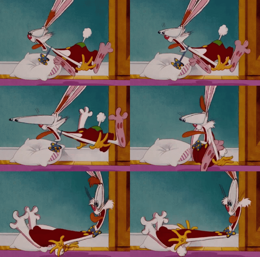
Exaggeration is an important principle used in animation as it allows animators to increase the level of impact that is presented to the viewers through every action or pose.
It is all about overstating certain movements in a way that helps evoke a point, but doesn’t ruin the believability of the scene.
The aim is to make the character's expressions more apparent--pushing it to the next level for clarity of the story through ensuring the expression or action of the character is clear to the audience and they are aware of what is going on.
This is used instead of sticking to realism, as this can sometimes lack engagement with the audience and may cause confusion with what may be going on. Exaggeration helps them understand the essence behind each idea. This is evident in many Disney films.


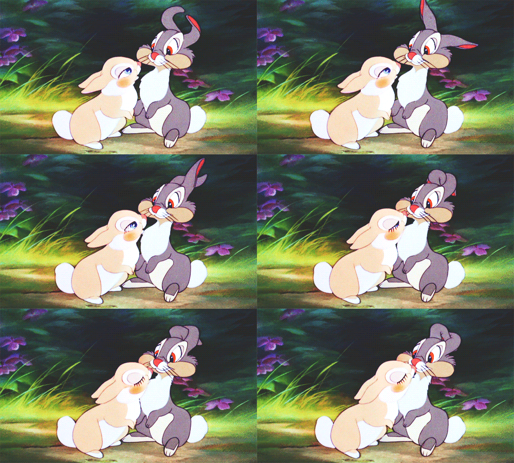
Characters that you animate should be somewhat appealing to look at. This does not mean they need to be beautiful or handsome, it simply means they need to have an aspect to them that is charismatic, charming, mysterious, funny or magnetic. This will help give a sense of likeability for each character--both the hero and villain.
Have you ever watched a movie and somehow related to the villain? This is due to the principle of appeal. All characters are made to seem appealing to the audience, which helps them stick around for the remainder of the story!
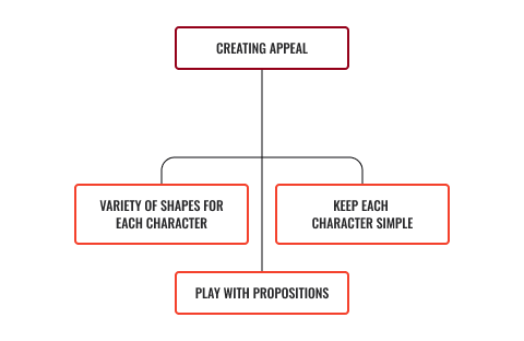
To create appeal, it is recommended you follow these steps.

- Variety of shapes for each character. By creating various shapes for each character, animators can make them unique and eye-catching to the audience.
- Play with propositions. Magnifying specific features in characters helps them to stand out. Animators often use this by enlarging the head, the eyes or even the nose.
- Keep each character simple. Do not overcrowd the appearance of each character. Sometimes when this is done, it can overwhelm the audience. This, however, does not mean that drawings should be weak--a balance needs to be considered to enhance appeal.


'Staging' is the presentation of animation so that the messages and ideas being portrayed are completely and unmistakably clear to the audience.
Animators ensure staging is effective through the use of timing, camera angles, shot types, positioning and characters. They work to make sure all are balanced with clear intentions being set for the viewers.
To stage an idea clearly, the audience's eye must be led to exactly where it needs to be at the right moment.
Picture a character crossing the road. The animators will lead your eye over to the character, followed by the road, then draw you over to the car that may be driving past, then finally back to the character crossing the road.
Ultimately, they want to say, 'Look at this... Now, look at this...' If characters have to compete for stage presence, this will take the attention away from the main point as well as confuse the viewers by not knowing where they need to look.
You want to control where the audience is looking and the path you wish them to follow through with.
An action is staged so that it is understood; a personality so that it is recognisable; an expression so that it can be seen; and a mood so that it will affect the audience.

'Solid drawing' is about animators understanding drawing and creating visuals that become 3-dimensional on a 2-dimensional surface when creating storylines with their characters.
Drawing characters that have a sense of volume, weight and balance is what animators aim to achieve when creating a solid drawing.
Drawing the form of the character or object whilst thinking about staging, animators need to ask themselves if the silhouette makes sense for the action and whether it is believable as a solid object.
'Secondary action' is an action that results directly from the previous action. Secondary actions are important when heightening the interest of viewers and creating a real complexity to the animations and storyline.
This principle deals with actions that happen in addition to the character's primary action, reinforcing and adding more of a dimension to the main action.
As you can see below, the leaf begins to move as the frog jumps off. The leaf moving is the secondary action that results from the frog's action.

Another example is a character walking down the street. The action of walking would be primary. If that same character raises an arm to wave at someone while they are walking, the arm movement and wave is the secondary action. The secondary action usually always works to support the primary action.
We have previously investigated the principle of anticipation and how it prepares the audience for an action being delivered by the character.
Anticipation is before the action is completed, while follow through occurs once the action has been completed. Specific parts of the character continue moving even after the character has stopped.
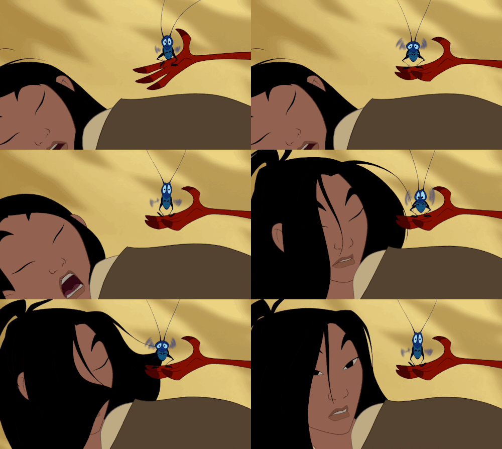
Just as a character needs to anticipate a jump, they need to follow through with the landing. This is the term for animation that is applied to items that are attached to a character, but that do not move independently. If a character is running, it would look unnatural if their clothing and hair remained stiff. The follow through will ensure a secondary action is in place to make the movement natural. This will mean that the hair will continue to move even after the character has stopped running.
See an example below of Mulan--after she had turned her head (primary action), her hair is still in motion (secondary action/follow through).

Follow through
Follow through refers to parts of the character moving still even after the character has stopped.
Overlapping
The action is the delayed off-set from the character (like it is trying to catch up with it).
The overlapping action, when used ensures that there is a continuous flow between each action. This helps makes each movement seem more natural as an action should never be brought to a complete stop before starting another action. Overlapping is effective as it maintains a continual flow between all sequences of actions.
See how many principles you can identify
Now that you have become familiar with the 12 principles of animation, let's try an activity!
Attempt to identify the animation principles shown in the following video. (Keep a close watch as there may be some that are not so obvious!)
Once you have identified them, share these with your classmates.

A picture is worth a thousand words.Henrik Ibsen
If you are having fun exploring these animation principles, here is an activity you may like.
Let's dive deeper into the animation principle of exaggeration.
Feel free to choose an image or take a selfie to complete this activity. Once you have chosen an image, use the liquify tool in Photoshop to exaggerate your image. For example, you may want to make your character sad: add red eyes with overflowing tears. If you would like to show your character with strength, add muscles and have their veins 'pop out' to show extreme strength.
There is no wrong or right. Just have fun and get creative!

