Before joining Apple, Donald Norman wrote a book titled, 'The Design of Everyday Things'. That book is now considered a significant resource for UX designers.
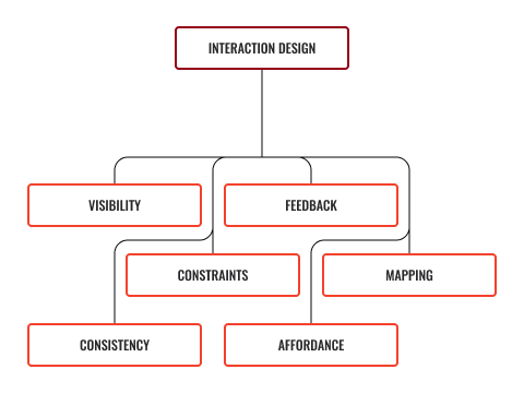
In his book, Norman defines his 6 principles of interaction design:

Visibility
The more visible something is, the more likely it is that we will know about it and how to use it.
Applying this principle means thinking about what will be most important to the user and prioritising it. It may not be possible for everything to be visible at once, so establish a hierarchy and make it clear where to go next.
Feedback
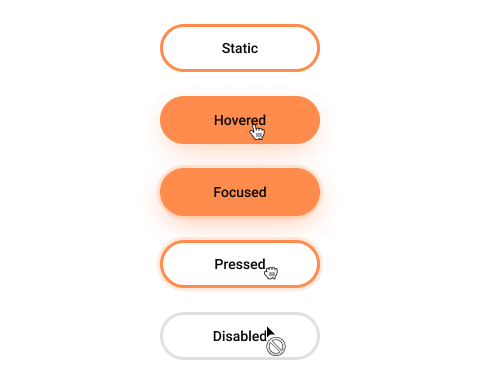
Providing feedback is important! Users need to know that their action has been registered and something is happening.
There are lots of great ways to give feedback: changing colour, making a sound, vibrating, animation.
How do you know a web page is loading?
How does the browser give you feedback?
Constraints
Limit the number of possibilities to reduce confusion and clarify the intention. Presenting too many options can overwhelm users.
Implementing this principle is about reducing complexity. Do not force the user to make too many decisions or interact with too many elements.
Look at the way modern apps handle signing up. You are often only asked for an email address or name. During each stage in the process, you only need to provide the information necessary to continue.
This is the same for a lot of shopping sites. You very rarely enter all your information and payment details in one single screen. It is more likely to be broken down into stages.
Mapping
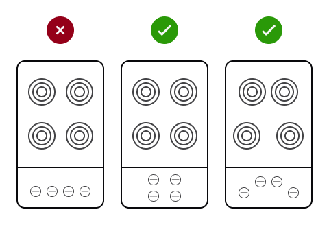
The controls of a product should have a clear relationship to its output.
This principle is about matching the controls to an outcome. The classic example for good mapping is often given as the arrangement of controls on a stovetop.

The position indicator in a web page slider is another example of how mapping can aid the user.

Mapping has been included in Te Papa’s Design Language System.
Consistency
Similar actions should have similar results. Your users will expect similar-looking elements on a page or screen to do a similar task or behave in a similar way.
Imagine if all the light switches in your house flicked in different directions to turn the lights on, or if some of the switches were buttons. This is an example of inconsistency. Users learn how an interface works by using it--if you change the behaviour of an element, it becomes confusing and difficult to re-learn and remember.
Did you know you can use the volume buttons on an iPhone to take photos and video when using the camera app?
Do you think this is an example of consistency?
Affordance
We shall cover this in more detail in the following subtopic.
As mentioned in the earlier topic, UX doesn’t just apply to user interface design and a notable example of where bad UX results in a poor experience is the Norman Door.
Norman Doors are named after Donald Norman. Put simply, they are any door that is confusing or difficult to use.
Have you ever pushed a door that can only be pulled, or pulled on a door that is meant to slide? In most cases, we tend to blame ourselves; however, there is a good chance that you were following an affordance that was presented incorrectly.
Affordance
'Affordance' is a design aspect of an object that suggests how it should be used--it gives us a clue. When we see a doorknob, we assume that its circular appearance will allow us to rotate it to unlatch and pull to open. A door without a handle, we can assume, is to push. Look at the following example image.

A door becomes a Norman Door when its affordance does not match what it is intended to do.
Do you know of any Norman Doors?
This same principle applies to digital products and services such as apps and websites. Elements and objects on the screen have affordance and, as users, we instinctively know what to expect from them.
When we see a rounded corner object with a slight drop shadow, we recognise it as a button. We know it can be clicked. We might expect it to change slightly if we hover over it and if we click it, we expect it to do something.


