In this module so far, you have been introduced to the concept of UX, the principles of UX design and to key components or features of UX design.
The UX Design process starts with understanding business objectives of the client (or the business you work for), and how it seeks to best serve its ‘customers’ or target audience. You have already learnt that a positive and memorable user experience is achieved by having comprehension of the user's needs and through the application of UX principles. Through the UX design process you conceive, create, and produce a product that achieves both the business objectives and a positive, memorable experience for the end users.
In this section we will consider the user experience design process. Firstly, you will be introduced to the concept of ‘design thinking.’ Secondly, the UX design process will be covered, and you discover how design thinking is embedded within the UX design process, as an essential feature of the process.
Design Thinking is a problem-solving approach but is more creative that traditional problem-solving approaches It is beneficial to address complex, unclear, or unknown issues by understanding the human requirements involved, re-framing the issue in human-centred ways, generating many ideas during the brainstorming workshops, and using a hands-on approach to prototyping and testing. It is sometimes referred to as human-centred design, co-design, or participatory design
The NZ Department of the Prime Minister and Cabinet (DPMC) (2017) some cogent points about design thinking. It is written with respect to the creation of government policy, but the tenets are valid for design thinking in UX. The points have been amended to reflect that:
“Design thinking focuses on solutions, starting with the goal of a better future rather than a problem to solve.
Design thinking is a creative process to build up ideas. It is a different mind-set to analytical thinking which is used to break down ideas. Design thinking is more creative than traditional problem-solving approaches.
As a process, design thinking can help [UX designers] get closer to customers, uncover their unmet needs, and develop innovative products and services to meet those needs. It is particularly useful for addressing ‘wicked’ problems, for being more person-centric and for encouraging innovation.”1
It is an iterative process. Iterative means the process is non-linear (step by step, but rather it is a cyclical process which allows for multiple opportunities for revisiting ideas and reflect critical on their implications and impact. “Designers focus on understanding the user, defining the issues, and identifying new creative solutions through a process of creating and testing a hypothesis. …... Each phase can run in parallel to others and be repeated several times throughout the process. Also, by definition, the process requires collaboration with people in other disciplines and specialties who will contribute insights from their unique perspective and experience.”2

A Design Thinking Mindset
Having a mindset for design thinking is important. The DPMC have outlined some points on what a design mindset ‘looks like’:
- “takes a human-centred rather than a system-led approach. The focus is on human values and needs. Design thinking requires you to have empathy for the people affected, seek user feedback, and reflect it back into design.
- makes experimentation an integral part of the design process. Expect to explore ideas, develop lo-fidelity prototypes, communicate through meaningful items, and test ideas and thinking rather than jumping to solutions. The aim is to fail fast and early to create more relevant and durable solutions.
- involves the design team collaborating with people from various backgrounds and respects different viewpoints. There is an expectation that insights and solutions will emerge from the diverse perspective.
- is curious and optimistic. Design thinking is integrated and holistic, looking at the bigger context for the customer.
- embraces ambiguity, exploring the issues with a beginner’s mind-set rather than an expert mind-set. It takes time to ensure you focus on the right questions and not what you assume them to be.”3
Principles of Design Thinking
Meinel & Leifer of the Hasso-Plattner Institute of Design (Stanford University, California) outlined four principles of design thinking, that underpin the design thinking process. The Four Principles of Design Thinking are4:
- The Human Rule - All design activity is social in nature
- The Ambiguity Rule - Ambiguity is inevitable – experiment at the limits of your knowledge!
- All Design is Redesign - While technology and social circumstances may change, basic needs remain changed. We essentially only redesign the means of fulfilling these needs or reaching desired outcomes
- The Tangibility Rule - Prototypes help to make ideas tangible, enabling designers to communicate them effectively
The Phases of Design Thinking
As you can see from the above image the design process comprises of five stages or phase. Career Foundry (Stevens, 2021)5 provide very clear descriptions of each phase (click on the links for further information):
Empathise
Empathy provides the critical starting point for Design Thinking. The first stage of the process is spent getting to know the user and understanding their wants, needs and objectives. This means observing and engaging with people in order to understand them on a psychological and emotional level. During this phase, the designer seeks to set aside their assumptions and gather real insights about the user. Learn all about key empathy-building methods here.
Define
The second stage in the Design Thinking process is dedicated to defining the problem. You will gather all your findings from the empathise phase and start to make sense of them: what difficulties and barriers are your users coming up against? What patterns do you observe? What is the big user problem that your team needs to solve? By the end of the define phase, you will have a clear problem statement. The key here is to frame the problem in a user-centred way; rather than saying “We need to…,” frame it in terms of your user: “Retirees in the [Point Chevalier] area need…

Ideate
With a solid understanding of your users and a clear problem statement in mind, it’s time to start working on potential solutions. The third phase in the Design Thinking process is where the creativity happens, and it’s crucial to point out that the ideation stage is a judgement-free zone! Designers will hold ideation sessions in order to come up with as many new angles and ideas as possible. There are many different types of ideation technique that designers might use, from brainstorming and mind mapping to bodystorming (roleplay scenarios) and provocation — an extreme lateral-thinking technique that gets the designer to challenge established beliefs and explore new options and alternatives. Towards the end of the ideation phase, you’ll narrow it down to a few ideas with which to move forward. You can learn about all the most important ideation techniques here.
Prototype
The fourth step in the Design Thinking process is all about experimentation and turning ideas into tangible products. A prototype is basically a scaled-down version of the product which incorporates the potential solutions identified in the previous stages. This step is key in putting each solution to the test and highlighting any constraints and flaws. Throughout the prototype stage, the proposed solutions may be accepted, improved, redesigned, or rejected depending on how they fare in prototype form. You can read all about the prototyping stage of Design Thinking in this in-depth guide.
Test
After prototyping comes user testing, but it’s important to note that this is rarely the end of the Design Thinking process. In reality, the results of the testing phase will often lead you back to a previous step, providing the insights you need to redefine the original problem statement or to come up with new ideas you hadn’t thought of before. Learn all about user testing in this guide.
The following video clip ‘The Design Thinking Process – An Introduction’ provides a good overview of the concept and gives some examples of design thinking in action.
Identify the correct phase of Design Thinking to each clue

Throughout this module we have returned to the point that the user experience, UX, is about how a user feels when they use a product or application, and good UX design is about creating a positive experience for users. The experience is created by anticipating, confirming, and fulfilling their needs.
Before we dig down and look at the detail of the UX design process check out the video below for an overview of the design process.
Good user design follows a process. In this section we will consider the UX Design Process. As you work through the process take time to note the links with phases of design thinking. The important thing to note is that like the iterative design thinking process, the same apply to the UX Design process – researching, iterating, and testing.
The UX design process can be divided into four key phases:
User Research
User research is the starting point to the UX design process. It teaches you about the users, their behaviours, goal, motivations and needs. A good UX designer must also investigate, explore, and understand the product domain, marketplace, and competition.
To understand user research and why you should do it click on this link to read Mortensen’s article at the Interactive Design Foundation6.
Mortensen, D. H. (2021) User Research: What it is and Why You Should Do It.
The research stage can be quite varied between projects. It depends on the complexity of the product, timing, and the resources available. The kinds of research undertaken can include:
- 1:1 in-depth interview: “A great product experience starts with a good understanding of the users. In-depth interviews provide qualitative data about the target audience, such as their needs, wants, fears, motivations, and behaviour.”7 Click here to read on how to conduct user interviews
- Surveys: These are often conducted online and are a questionnaire of precise questions that are sent to a sample of your proposed user group (the target audience). “The length and format of an online survey can vary from project to project, but irrespective of the length or design of the form, the data is compiled in a database to be reviewed at a later date by the UX designer or the UX design team.”8Survey Monkey is a site where you can create, edit, and send surveys
- Personas: Persona interviews help you to understand the users more fully. This can assist in the creation of your survey questions. Personas are fictional characters that represent the different types of users that might use your product or service. The creation of personas helps you to understand the needs, experiences, behaviours, and goals of the user. For a cogent description of personas and why they are useful, click here
- Card Sorting: This quantitative research tool is helpful for understanding how people interpret and categorise information. One of the purposes of Information Architecture is develop and provide a way for users to navigate around a website. “Card sorting creates a foundation for robust information architecture (IA), and strong IA allows for the creation of a navigation system that matches users’ expectations.”9 The website navigation system is referred as a sitemap. For further information on the card sorting technique click on the link and review Career Foundry’s guide to card sorting in UX design.
This is by no means an exhaustive list of user research strategies. You should undertake your own research on research techniques and strategies. You may find the following links quite useful:
Design
“When users’ wants, needs, and expectations from a product are clear, product designers move to the design phase. At this step, product teams work on various activities, from creating information architecture (IA) to the actual UI [user interface] design. An effective design phase is both highly collaborative (it requires active participation from all team players involved in product design) and iterative (meaning that it cycles back upon itself to validate ideas).”10
Types of activities that occur in the design phase are:
Sketching
Rojas (2021) states “Sketching is a distinctive form of drawing which we designers use to propose, explore, refine and communicate our ideas. As a UX designer, you too can use sketching as your first line of attack to crack a design problem.” His article ‘Etch A Sketch: How to use Sketching in User Experience Design’ gives a cogent overview of the role of sketching in the design process, the advantages of sketching, and sketching methods. Click on the link to view.
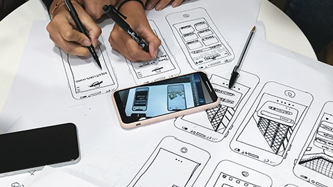
Wireframing
Wireframes are a way of creating mockups of products and provide a foundation for the creation of prototypes. It is a “a process where designers draw overviews of interactive products to establish the structure and flow of possible design solutions. These outlines reflect user and business needs. Paper or software-rendered wireframes help teams and stakeholders ideate toward optimal, user-focused prototypes and products”11
Wireframes are two-dimensional skeletal outline of the proposed webpage or app. It can be either low-fidelity or high-fidelity. For more detailed information about wireframing in UX design, how to wireframe, and some examples of wireframes click on the links below:
- Hannah, J. (December 16, 2021) What Exactly Is Wireframing? A Comprehensive Guide. Career Foundry
- Adobe XD Ideas (2021) Wireframing. Adobe
There are a number of tools available to help you create wireframes quickly and easily. You will be introduced to some of these tools in your workshop sessions.
Prototyping
This activity turns the design ideas and vision into a tangible artifact that is used to test your product with real users. “While wireframes are mostly about structure and visual hierarchy (the look), prototypes are about the actual interaction experience (the look and feel). A prototype is like a simulation of the product and may be low-fidelity (clickable wireframes) to high-fidelity (coded prototypes).”12 For further information on prototyping check out the resources at the Interaction Design Foundation.
Testing
Validation is another term that is used in the testing phase. Testing helps you understand and see if the vision and design works for users in the way it is meant to and provides a positive user experience. It allows you to “improve upon the original product or site design and to see if the changes they made during the ‘design’ phase stand up to scrutiny. It’s a great way to eliminate problems or user difficulties that were unforeseen in the design phase before getting started on the implementation phase”13
This validation phase “may include the following activities:
- “Eat your own dogfood.” Once the design team has iterated the product to the point where it’s usable, it’s time to test the product in-house. Team members should try using the product on a regular basis, completing routine operations to uncover any major usability flaws.
- Testing sessions. User testing sessions with people who represent your target audience are very important. There are many different formats to try, including moderated/unmoderated usability testing, focus groups, beta testing, and A/B testing.
- Surveys. Surveys are a great tool for capturing both quantitative and qualitative information from real-world users. UX designers can add open-ended questions like “What part of the product you dislike?” to get user opinions on specific features.
- Analytics. Quantitative data (clicks, navigation time, search queries, etc.) from an analytics tool can be very helpful to uncover how users interact with your product.”14
Implementation
Once the product has been tested (the iterative design process means testing could occur more than once) the final product is released to the market and made available to all potential users. Feedback is received from users via generated error reporting, site analytics, and surveys. The results of this research can lead to ongoing improvements in the products. For example, you will be very familiar with how often you receive updates for your computer or phone’s operating systems and software and app updates. This is an example of the iterative design and development process in action.
It is important to emphasise that you need to take a human-centred approach to design. The first step is by taking into account human characteristics and activities. Designers use research methods to further understand and identify these.
Interviews
One of the most effective ways of finding out what people want and what problems they have at the moment is to talk to them. Interviews with all the various stakeholders in the domain are vital for gathering stories.
Designers enjoy a range of different styles of interviews, from a wholly structured survey to a general conversation.
- Structured interview
The structured interview uses questions that are developed beforehand. The interviewer follows the wording exactly.
Public opinion polls (for example, the type produced in great numbers before elections) are based on structured interviews.- They are easy to carry out due to pre-structuring.
- They limit people to restricted replies.
- It is difficult for the interviewer to follow-up on any unexpected responses.
- Semi-structured interview
Sometimes the interviewer is armed with prepared questions but can reword these as appropriate and explore new topics as they arise. Often an interviewer prepares a checklist with prompts.- This form of interview is slightly more demanding on the interviewer.
- The style of questions allows the interviewer to obtain specific data.
- Unexpected responses are able to be explored.
- Unstructured interview
Unstructured interviews are sometimes used where it is essential to minimise designers’ preconceptions or when there is very little background information available beforehand. There are no pre-set questions or topics beyond the general subject of the project in question.
Stories, scenarios and early prototyping interview
Scenarios and stories are helpful aids in understanding activities and avoiding people 'imagining' situations.
The first step is understanding what the new technology might do and discussing a scenario that will highlight many issues--from naming individual functions to changes in the work practice.
Prototypes: anything from paper sketches to semi-functioning products are often used to embody scenarios in possible technology.
Whether or not a prototype is used, the analyst and the customer ‘walk through’ the scenario while the analyst probes for comments, problems, possible alternatives and suggestions in general.
Observe the video below. The interviewer asks questions to a potential user for his new app development.
Observations
If asking users to perform in a website or app, for example, the following steps might be followed to allow observation:
- Give users some questions or ask them to find something on the website. For example, write down the business's working hours, phone number or email.
- Watch how many clicks users take to find the answer.
- Watch users' eyeball movements to feel how difficult or easy for them to find answers from the website/app.
- Note down how many seconds users take to read the question and find the answer.
- The observer would have another person assist by noting down details.

Your design activities and deliverables will be driven by these requirements and rationale, from UI design and copywriting to customer journeys and beyond.
The logic of the framework provided in the diagram below is to help you assess:
- What am I designing and why?
- What information am I not sure about that is holding me back from making informed design decisions?
- What questions can I ask that will help me find that information?
- Who do I need to ask these questions, and how do I do that?
After completing the 10 steps, you will have a document that can be used to brief your team, the project stakeholders, your research colleagues or a third-party agency on your research plan.
Project background
This step is about providing a contextual background to the research activities you want to carry out in terms of the scale and type of project the design activity you are researching for sits within.
What project does your research activity relate to?
Give a brief summary of the project, including the aims, objectives and teams involved. Provide links (or titles) to related design briefs if available.
What research or other design activities have already taken place within this project?
Having a project background helps give context to the work that has been done before and where the design activity is going.
Design objectives
This step articulates the motivation behind the design work you want to inform with research.
What is the design activity trying to achieve?
Be explicit and avoid non-specific expressions like ‘to make X better’.
Example:
The design activity is focused on updating the web UI to reduce confusion and cognitive load for first-time buyers during the online mortgage application process.
How does this align with current business objectives?
Explain whether this design activity is part of a larger collection of related design work or if it stands alone. Are there specific business Key Performance Indicators (KPIs) that the design activity is intended to achieve?
Research rationale
This step determines why research needs to happen to aid the design activity. How will it help you, and why are you doing it?
What do we NOT know that prevents us from making firm design decisions?
State the problems that are preventing you from making informed design choices.
How will undertaking research move the design process forward?
Explain your rationale for carrying out research. Is it required to explore and validate ideas with current customers, test design ideas for their ability to produce a desired or intended result, or something else?
Insight objectives
This step is about specifying the insights required from the data gathered to resolve uncertainties in the design decisions that stop the design activities from progressing.
What do you hope to know after the research that you do not know now?
What information do you need to move the design forward?
List the required insights this research needs to deliver to help fulfil the design objective. Be explicit.
Confirm the insight knowledge gap
This step confirms the unknown information that supports the insight objectives identified in Step 4. Also, that you are certain the information to fill the knowledge gap is not obtainable via desktop research methods (such as searching internal repositories or previous research studies).
Has relevant research been carried out before?
Include a reference to any previous related research (summary of author, date, project, output, findings) that is relevant or may help but does not close the knowledge gap. This research could have been carried out internally or externally. Also, include the resources you have searched for but failed to find relevant prior work.
Research questions
This step is about determining what high-level questions will bridge the knowledge gap and support the insight objectives outlined in Step 4.
What questions do we need to answer to bridge the knowledge gap and fulfil the insight objectives?
Be explicit and consider the format of data that answers the questions. These questions will lead to a list of sub-questions you will put to your research participants during the actual study (you don’t need to list those sub-questions here).
Participants
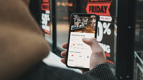
This step is about determining who may help you gather the data required to bridge your knowledge gap. Often, this will be existing customers or competitor customers, but remember, other people can help, such as subject experts.
Who do you need to recruit to take part in the research?
Focus on describing what demographic variables are important and which are unimportant (e.g. age, occupation, experience, income).
What needs to be included in a participant screener?
A 'participant screener' defines who should NOT participate in the study and why. It screens the study for participants who may not be appropriate for reasons like their background, job or experience.
Include specifics about any demographic variables that may bias the data gathered and skew the analysis, like ‘works in finance’ or ‘expert user of mobile technologies’.
Explain why you think this will impact the data.
Research materials
This step is about determining what research materials need to be given to your participants to help them provide the data that will answer your research questions.
What materials need to be provided to be able to gather the appropriate data?
Specify what materials you need to give the participant to help them answer the research questions and generate the required data (e.g. a slide deck introducing the project work, visual representations of design ideas, an interactive prototype).
What fidelity of research material is required and why?
Think along with the high, medium or low fidelity lines and provide your rationale. Do you need a fully realised design, or will more simple representations be enough to get the data you need?
Research data
This step specifies the anticipated data output that the research activities will generate.
What type of data is expected or needed?
Be clear about the data format you need to answer your research questions successfully. Is it qualitative, quantitative or a combination of both? For example, quotes from users (qualitative) and time to complete tasks (quantitative).
What is your rationale for this type of data?
Briefly assess the benefits of why you require this type of data to inform your research questions best and therefore support your insight objectives.
Research deliverables and outputs
This step is about making sure the agency or research team members are clear about:
- What data is needed.
- Why it is needed and how it is relevant to the design.
- How the data and analysis should be shared and curated.
- Who should receive the data, analysis and insights.
How should the data generated and the analysis carried out be reported?
Define the formats you will be sharing the information in. This helps manage and align expectations about what will be delivered and by whom.
Example: an analysis document plus a spreadsheet of raw data.
What is the research project timeline?
Establish and articulate a timeline for the research activity that includes the following milestones and anticipated durations:
- Participant recruitment (if needed)
- Data collection
- Data analysis
- Analysis reporting
- Analysis and insight distribution. 1

A persona is a document to help us design from another person’s point of view. They are controversial but are a standard tool to make sense of accumulated user insights. Ideally, they are a design tool to act as a point of focus, not an output in themselves.
Let’s begin by watching the video below on how to choose the scope of your persona.
To create a persona based on your research, you will be building up a profile of your user’s attitudes and behaviours.
Why create personas?
Personas are a way for you to share information about the people you have researched. Research must inform the creation of your persona because research will challenge your assumptions and biases about who your users are.
Preparation
As a user researcher, you will be applying the insights you have gained from user research. Invite any other team members who attended user research to join you in creating your persona.
How to create user profiles
Your persona will represent the shared experiences of a group of users.
You should bring together:
- user attitudes
- user behaviours
- demographic information.
You can present your user personas in various ways using content relevant to the project.
A user characteristics gauge (concerning the product or service)
Depending on the nature of the project you are working on, you may include a 'characteristics gauge'. This will allow you to easily see the variations between your different profiles. The gauge can be a simple line that rates a participant from low to high. You can add the characteristics depending on what is relevant to your project.
Here are a few examples:
- knowledge or expertise
- level of interest
- context of interest
- breadth of usage
- experience in related task
- digital literacy/format preference.
Build on your persona profile by answering questions about the following aspects.
Needs/tasks
What does the user need to do or find? What tasks do they do which are relevant to your project? The need will be goals that are aligned to an outcome.
Pain points
What are the obstacles that prevent them from being able to do the task? Are they being informed well enough? What other factors are preventing them from getting the task done?
Risks
What could go wrong if they can not do the task or find the information? What is the impact of any implication–personal, financial etc.?
Motivation
Why does the user want to complete the task? How is successful completion of the task going to affect them?
Communicate your user profiles with the team. Profiles are valuable to ensure that what you are building or designing meets a user need. They are a reminder to your team and to stakeholders of exactly who you are designing for.
Personas are one part of the toolkit that you can use to communicate your design. You should ensure that you research any design decisions you make based on your profiles. Also use other methods to do this, such as concept testing and usability testing.
Persona tools
There are many paid and free tools that can be used to build a persona. Here are the free persona builder tools. Click the names below to explore their offerings:
Adobe Creative Cloud gives access to persona templates that you can customise. To access:
- Login to Creative Cloud
- Click on Templates
- Type 'User Persona'
- For a more specific selection filter, type 'UX'.
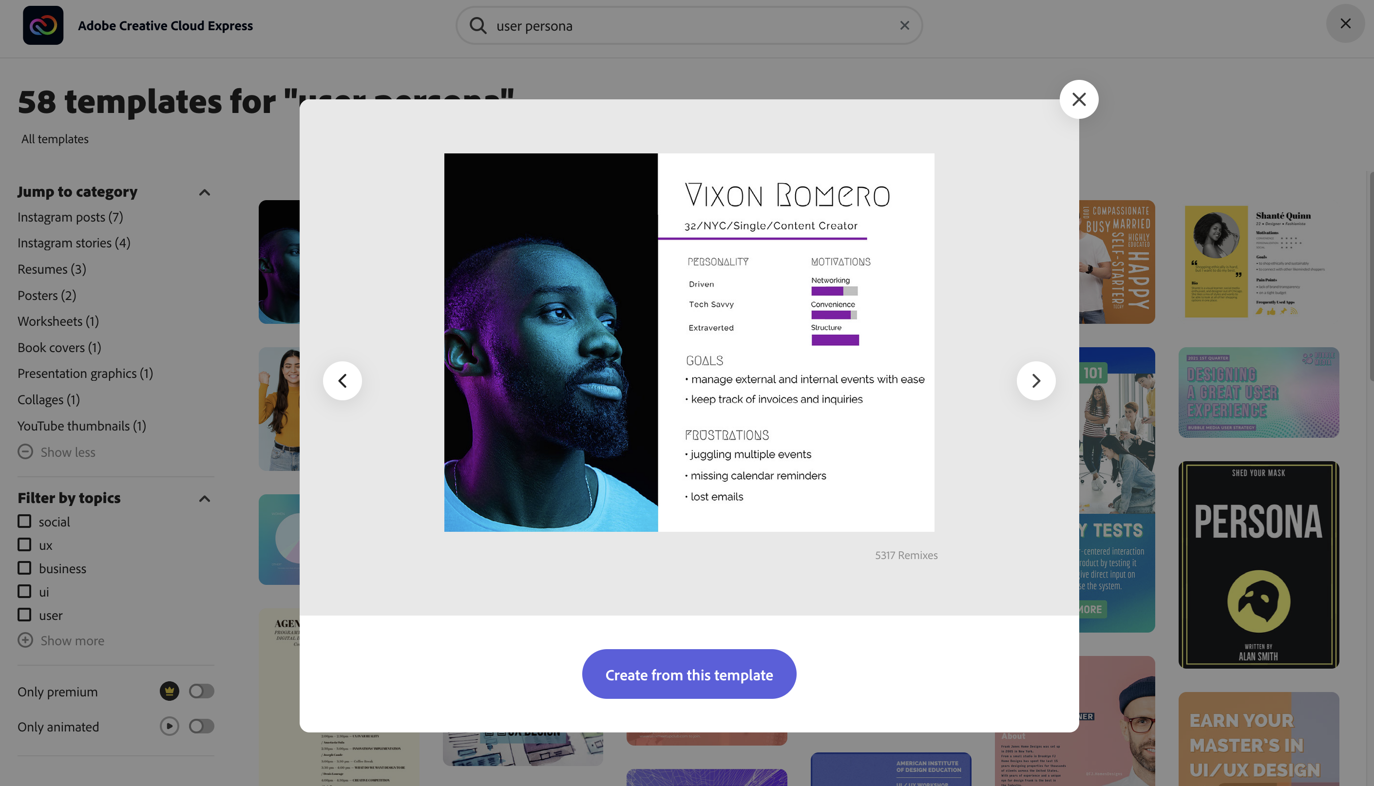
Here are some more example personas.
User journeys
"A 'user journey' is a path a user may take to reach their goal when using a particular website. User journeys are used in designing websites to identify the different ways to enable users to achieve their goals as quickly and easily as possible." 2
For user journeys we plan out, we will state the assumption in the form of a statement. We usually put them in a format like this (based on the assumption declaration used in the Lean UX methodology):
- We believe that [doing this/building this feature/creating this experience],
- for [these people/personas],
- will achieve [this outcome],
- because [this assumption].
- We will know this to be true when we see [this feedback/quantitative measure/qualitative insight].
Journey map
Designers use a 'journey map' to document a user journey. There are 8 steps to creating a journey map.
- Choose a scope
The level of detail in a user journey map depends on the project's scope. You can make it a high-level map that shows end-to-end experience or a more detailed map focusing on only one interaction. - Create a user persona
The journey map is focused on the user persona who experiences the journey. This step is influenced by the research you gathered about your target audience in the user research step. - Define scenario and user expectations
This section describes the situation that the journey map addresses. It can be real or anticipated and it defines the expectations the user persona has about the interaction. For example, a scenario can be–ordering a taxi using a mobile app with expectations to get the car in 5 minutes or less. - Create a list of touchpoints
'Touchpoints' are user actions and interactions with the product/business.- Identify all channels and touchpoints associated with each touchpoint.
- Take user intention into account
There is a difference between a browsing user and a user who came to accomplish a specific task (for example, purchasing a product).
For each user journey, you must understand:- motivation
- channels
- actions
- pain points.
- Sketch the journey
Here you put together all the information you have and sketch a journey in a format of step-by-step interaction.
Each step demonstrates the persona's experience with a service/product or another person.
There are storyboard software options that help you put together the user's journey; such as:- FrameForge
- Storyboarder
- Boords
- Plot
- MakeStoryboard
- StudioBinder
- Visme.
- Consider a user’s emotional state during each step of interaction
The product you are designing needs to mirror the user's state of mind.
Being aware of the user's emotional state helps connect with the user on a human level.
An 'empathy map' is an essential tool to help you understand how the users feel. - Validate and refine user journey
The user journey needs to be literal, not 'what you would like it to be'.
Use information from the research phase, usability testing and analytics to be sure that the information in your user journey is accurate.
This process is an ongoing one that needs to be reviewed and tweaked.3
Types of journey maps
Katryna Balboni from userinterviews.com, provides examples of journey maps.4 They can be as simple or as detailed as you choose.
There are different types of journey maps that you can create based on the information you need to find from your user.
| Current state customer journey map | This map helps you visualise a user’s experience as it is today. These journey maps are fact-based, creating an accurate demonstration of the current state. This map is used when your goal is to identify existing pain points. |
| Future state customer journey maps | This map focuses on what customers' future state can and should look like. These maps also focus on what your customer or user would hope and want to feel in the future. This map is helpful if your objective is to explore possible customer expectations and to create new experiences and value. |
| Day in the life customer journey map | This map creates a visualisation of your current customer's/user's daily routine. This includes interactions, travel methods, meetings when lunch is scheduled etc. This map is for when you need context and insights into customer/user pain points. |
| Circular customer journey maps | SaaS companies and other businesses may find it useful to view the journey as a circle. This reinforces the importance of retention and advocacy for companies that rely strongly on recurring revenue. |
| Empathy map | An empathy map is a standard UX map used to create a shared understanding of a particular type of user's wants, needs, thoughts and actions. |
| Customer experience map | This map is used to understand human behaviour in relation to a certain topic or experience. This is without the expectation of a specific business or product in mind. Customer experience maps provide contextual, anthropological insights. |
Let’s recap what user research covers in the video below.
Looking at the strengths and weaknesses of existing websites is a great way to understand how information can be presented, and problems can be solved.
Tasks
-
Choose three websites that can be grouped into one theme or industry.
For example:
- Airbnb.com, airnewzealand.co.nz, and avis.co.nz, are all websites that are related to travel.
- Uber.com, airbnb.com, and kickstarter.com are all website that are part of the sharing economy.
- Myfoodbag.co.nz, countdown.co.nz, and ubereats.com are all websites that are related to food.
-
For each website, consider the strengths and weaknesses of the following.
- The navigational structure (Links, buttons, breadcrumbs, etc…)
- Readability of content (colour, contrast, text size, etc…)
- Useful features (Maps, contact forms, shopping carts, etc…).
Show me the data
Quantitative data is collected by asking for, or analysing numerical information like the number of clicks, a user's age, the frequency of use, or preferred colour. If the response can be collected using a tick box, radio button, dropdown, or single line input field, or the information can be graphed, then the information you are collecting is likely to be quantitative.
Qualitative data is collected by asking open questions that require users to express their feeling and observations. Qualitative data is often unstructured and requires greater analysis to interpret.
Tasks
Considering one of the websites from the previous activity. Construct twelve survey questions to collect information in relation to the perceived weaknesses.
- Six of the questions are to be Quantitative
- Six of the questions are to be Qualitative.
Referencing the data you have collected, suggest three changes that could be made to the design of the website that may positively impact the user experience.

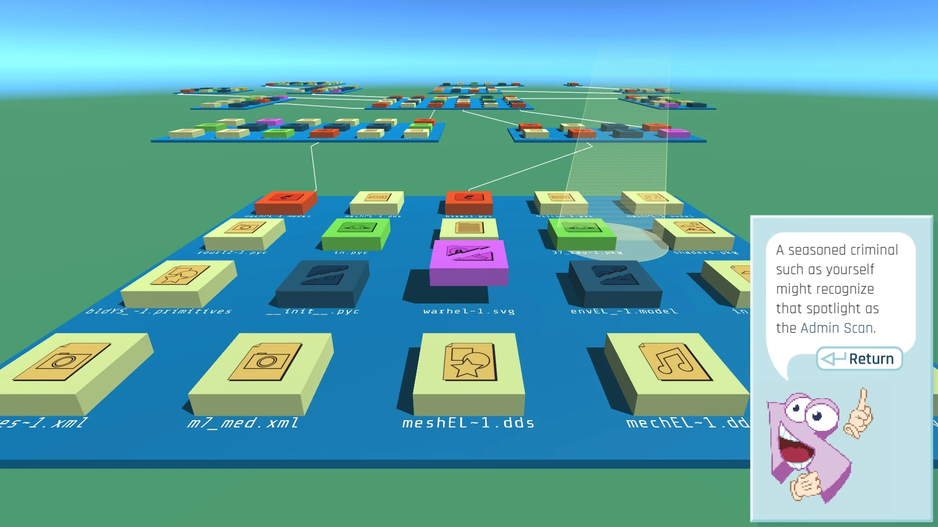
In the 1993 sci-fi film, Jurassic Park, one of the scenes shows a character take control of a compromised security system, eventually rebooting it and bringing the survivors to safety. The park's security system components are briefly shown on the monitor and we are privy to a 3D diagram indicating scattered hubs connected by nodes. While the simplified depiction of computer hacking has aged poorly, this scene is a great example of how systems and processes are dependent on each other.
The hubs on the diagram represent individual functions within the park, such as the electrical system, security gate and fences, and transport system. The nodes connect their individual functions. When they work in harmony, the singular function of security is achieved. That diagram provides a blueprint of how that all works together.
The diagram is created to explain what is happening within the system and is part of a universal language known as the Unified Modelling Language or UML.
The primary authors of UML were part of the Object Management Group (OMG), which originally had its competing methods way back in 1997. The OMG released the UML to provide the development community with a stable and common design language that could be used to develop and build computer applications.
UML brought forth a unified standard modelling notation that IT professionals had wanted for years. Using UML, IT professionals could now read and disseminate system structure and design plans, just as construction workers have been doing with blueprints of buildings for years.
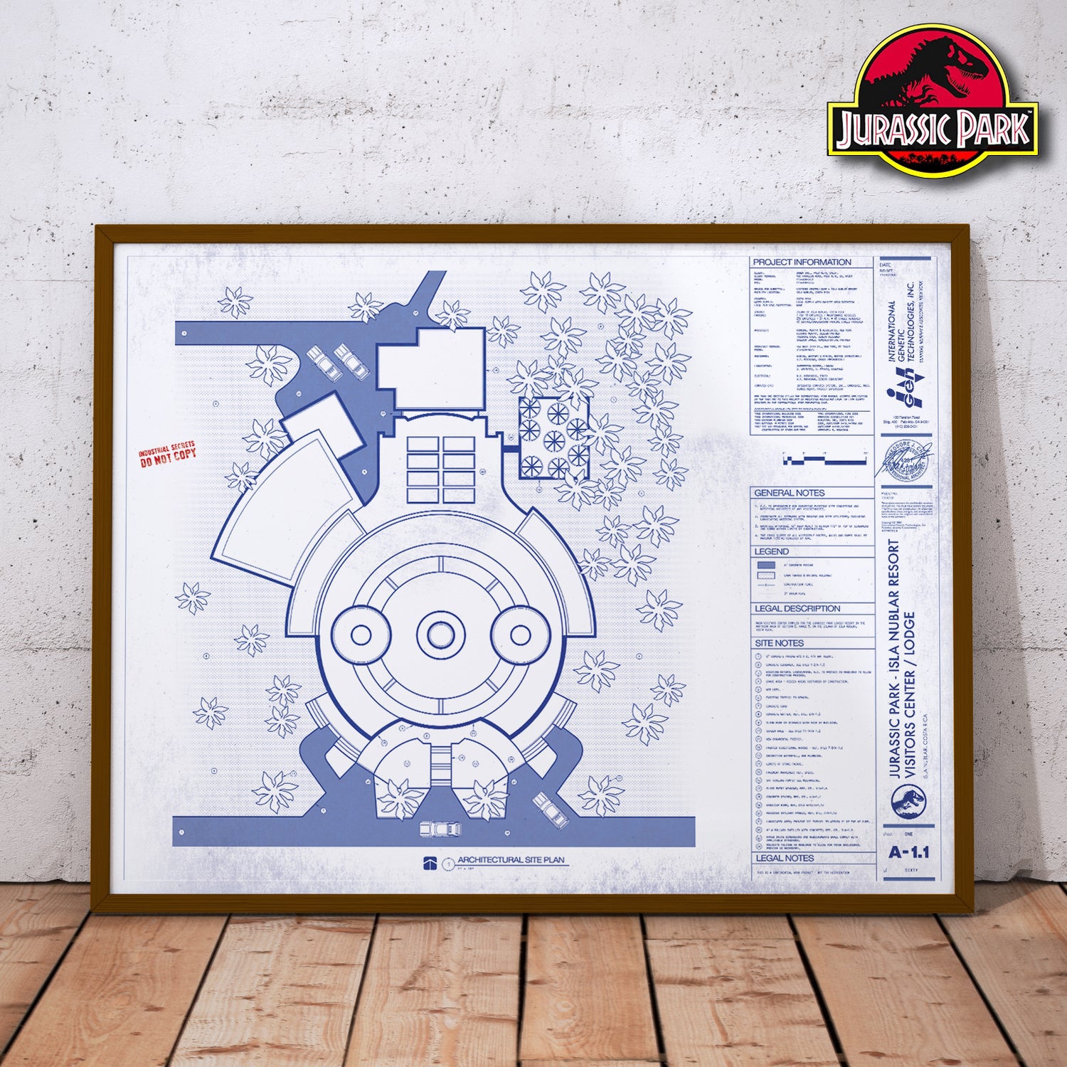
UML was meant to be a unifying language enabling IT professionals to model computer applications. UML has become a standard modelling language because it is programming-language independent.
Also, the UML notation set is a language and not a methodology. This is important because a language, as opposed to a methodology, can easily fit into any company's way of conducting business without requiring change. Since UML is not a methodology, it does not require any formal work products.
Yet it does provide several types of diagrams that, when used within a given methodology, increase the ease of understanding an application under development. There is more to UML than these diagrams; however, as an introduction, the diagrams offer a good introduction to the language and the principles behind its use.
The following video looks at a brief overview of what UML is.
The complexity of UML diagrams
There are different types of UML diagrams; the main categories of UML diagrams are the Structural and Behavioural UML diagrams.
Structural diagrams show the static structure of the systems, whereas behavioural diagrams show the dynamic behaviour or changes between objects in the system.
The following image shows the 14 sub-types of the UML Diagram, and each one of them has a different purpose.
Diagrams can be as simple as a hand-drawn version or refined, created with one of the many drawing or diagramming tools available. These applications include Adobe Illustrator, LucidChart, EDrawSoft, Miro, etc.
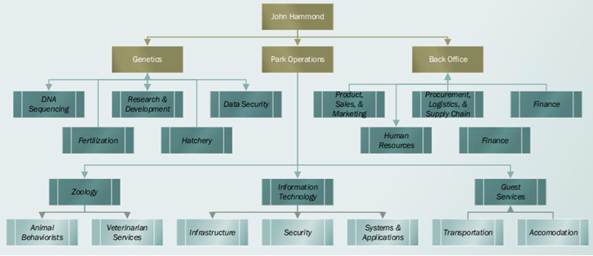
Let's look at the relationship between John Hammond, the owner of Jurassic Park and the departments. The diagram below is a fairly simple structural diagram with single arrows showing its relationship with each department.
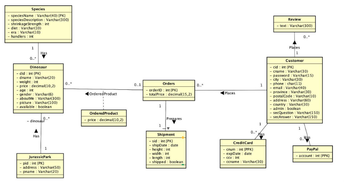
UML diagram can also be more complex and refined, as shown in this fictional SQL database Jurassic Park online shop, complete with Product, Order, Payment, Shipment details, etc.
Use Case and Activity Diagrams
We will have a closer look at two of the original behavioural sub diagrams:
- Use Case Diagram
- Activity Diagram
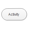
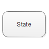
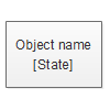
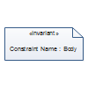
In all of the diagrams, you will find specialised symbols, notations, and relationship lines to indicate processes such as starting, ending, merging, etc.
| Activity | State | Object in State |
|---|---|---|
 |
 |
 |
| Decision activity | Actor | Control flow |
 |
 |
 |
| Control flow 2 | Object flow | Object flow 2 |
 |
 |
 |
| Horizontal synchronisation bar | Vertical synchronisation bar | Initial state |
 |
 |
 |
| Final state | Swim lane | Multiple trigger |
 |
 |
 |
| Symbol - and | Constraint | Note |
 |
 |
 |
Use Case Diagram
Use Case Diagram is used to analyse the functionality (the use cases) and the interactions with different types of agents (actors) of a system.
In business cases, enterprises may use such diagrams to check out the customer order system by monitoring the stock, product quality, etc. In daily life cases, use case diagrams could illustrate a process of how you would interact with a website.
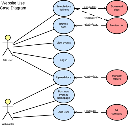
In the previous diagram, you can identify the use of the following symbols:
 |
The Actors Stick figures that represent the people employing the use cases. |
 |
Use case |
| Associations A line between actors and use cases. It is important to know which actors are associated with which use cases in complex diagrams. |
|
| System boundary boxes A box that sets a system scope to use cases. All use cases outside the box would be considered outside the scope of that system. |
|
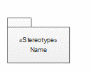 |
Packages (This symbol is not used in the example.) A shape that allows you to put different elements into groups. Just as with component diagrams, these groupings are represented as file folders. |
The following video looks at an introduction to creating a Use Case Diagram; jump on to 01:44 sec to get straight to the tutorial.
Activity Diagram
Activity diagrams help people on the business and development sides of an organisation come together to understand the same process and behaviour.
Activity diagrams illustrate the interconnected flow of different activities and actions (both in sequential form or in parallel type) in a system and display the steps involved in the execution of a use case. This type of UML diagram is widely used in business modelling and software development.
In the previous diagram, you can identify the use of the following symbols:
|
|
Start symbol Represents the beginning of a process or workflow in an activity diagram. It can be used by itself or with a note symbol that explains the starting point. |
|
|
Activity symbol Indicates the activities that make up a modelled process. These symbols, which include short descriptions within the shape, are the main building blocks of an activity diagram. |
|
|
Connector symbol Shows the directional flow, or control flow, of the activity. An incoming arrow starts a step of an activity; once the step is completed, the flow continues with the outgoing arrow. |
|
|
Decision symbol Represents a decision and always has at least two paths branching out with condition text to allow users to view options. This symbol represents the branching or merging of various flows, with the symbol acting as a frame or container. |
|
|
End symbol Marks the end state of activity and represents the completion of all process flows. |
The following video looks at an introduction to creating an activity diagram.
Download this best practice document from YOOBEE to help remember the points of UML.
References
- UML basics: An introduction to the Unified Modelling Language, Bell, Donald 2003, www.nyu.edu
- www.edrawsoft.com/what-is-uml-diagram.html
- cmps-people.ok.ubc.ca/rlawrenc/teaching/304/Project/Samples/2018/2018_final_5.pdf
- eapj.org/wp-content/uploads/2018/11 chrome-extension://efaidnbmnnnibpcajp/Can-Enterprise-Architecture-Save-the-Dinosaurs.pdf
- www.lucidchart.com/pages/uml-activity-diagram
