In this lesson, we'll look at some ways to use Illustrator and Photoshop effectively together. We'll also take a look at Shape Language – something to help guide your use of shapes in your logo design.
Branding
Logo: your logo is the face of your company and is arguably the single most important branding you’ll do for your business. Think about who you are as a brand and how you want to be perceived by your target market. Use that to drive your marketing strategy.
Website: designing a website is also a key. Your website is your brand’s digital real estate and when your customers browse, it should be visually interesting, easy to use, and most important of all a reflection of who you are as a brand.
Shape language
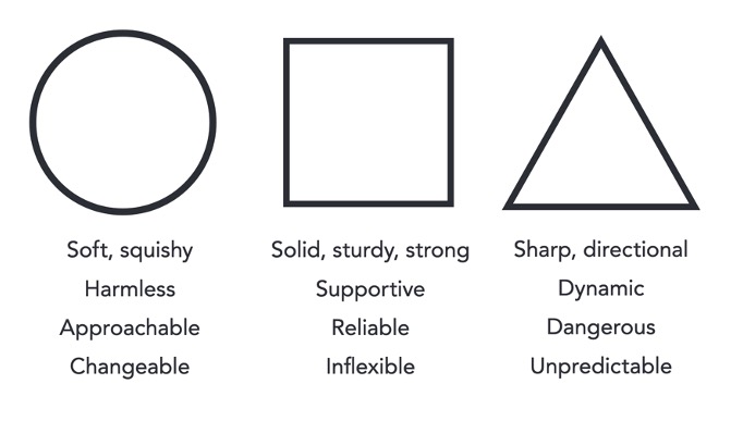
Shape language is a concept used in branding, marketing, design, art, film and animation to communicate meaning based on shapes that we are familiar with. When used in character, object, and background design, shapes can tell a story, show personality, and create an emotional response in the viewer or target market without using words.

Circles and ovals are perfect to use for friendly faces. You can also try using them in different parts of the body, clothes, and hair to show the same feeling. Circles are organic and natural shapes. Round out edges and add curves to evoke a warm and welcoming feeling.
Square off things like jaws and shoulders. They not only feel strong but can feel difficult to move. Using squares and rectangles to block in certain aspects of a drawing can give the sense of weight and how grounded or balanced it is. Make sure the shapes are planted flat to ensure the feeling of sturdiness.
Triangles are sharp. Exaggerating the size and length of triangle shapes can heighten fear and transform how menacing the character is. When using triangles, the key part is the point. How you use these points in terms of direction and quantity will suggest its functionality.
These are general guidelines. Circles, squares, and triangles don’t always mean one thing. There might be times when shapes are used to disguise the purpose or character or a person, object or location.
![]() Use the skills and techniques that you've learnt throughout this topic to experiment with the perspective grid tools, the 3D and Materials panel, and image tracing (converting pixel art to vector). Use the topic video resources or your own photos or stock photos, you don't need to do a realistic trace, use any of the image trace features. Either combine these skills into one document, or multiple documents of your choice!
Use the skills and techniques that you've learnt throughout this topic to experiment with the perspective grid tools, the 3D and Materials panel, and image tracing (converting pixel art to vector). Use the topic video resources or your own photos or stock photos, you don't need to do a realistic trace, use any of the image trace features. Either combine these skills into one document, or multiple documents of your choice!
Post your activity work to the Vector Graphics Practicals forum for discussion and feedback!
