A mockup is an essential stage of any marketing campaign. It is important to understand exactly what a mockup is, where it fits into the design process, and how it is used. 6
You can find mockup examples in marketing and branding everywhere around you. Essentially, a mockup is a high-quality representation of your finished product or service, presented in a way that appeals to your audience. Mockups are created at the end of the design process.7

Mock-ups can be created as part of final marketing and advertising materials, appearing in anything from TV commercials to billboards to the product page of your website, or they can be utilised internally to show to key stakeholders for approval. 7
The secret to an excellent mock-up is to demonstrate not just the product but also how users may use it or should interact with it. Designers go all out to give their mock-ups flair and originality because they recognise the immense potential of effective mock-ups. However, even if you've never attempted it before, you may still produce effective mock-ups.7
A mockup:
- Is a static design of a marketing campaign that features many of its final design elements but is not functional yet
- Is not as polished as a live page or full-sized poster/billboard and typically includes some placeholder dat
- May include placeholder copy (think “lorem ipsum”) or images
- Provides a good idea of what the campaign will look like, though not what it will act like.6
What is the purpose of mockups?
An application or web page mockup ultimately acts as a visual preview of the final product. It is designed to give life to a concept or wireframe and enables a designer to examine how different visual components interact.
Stakeholders have the chance to preview how the page will appear while suggesting changes thanks to mockups. Making a second version of the mockup will allow you to see how a campaign will appear utilising a secondary colour.6
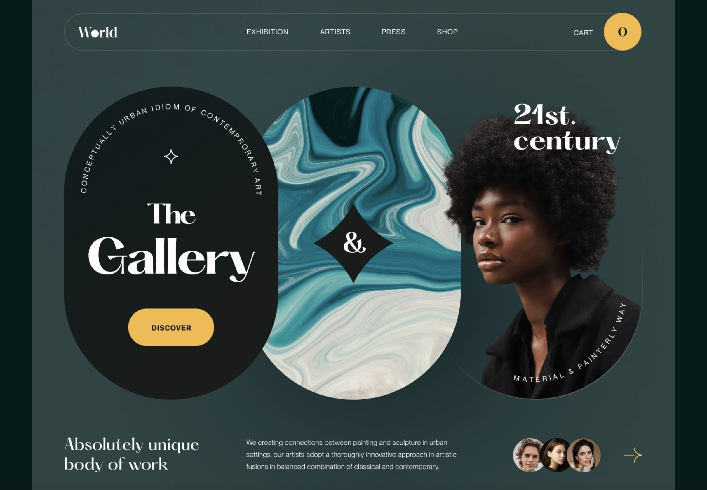
A page should be made with a specific objective in mind and for a specified purpose. With the use of mockups, the team can understand how the layout produced by a UI designer using a wireframe may achieve that goal and how their brand guidelines and creative visuals can be used to bring that layout to life.6
Where do mockups come into the web design process?
Think of the design process in four stages: 7
- Ideation or concept creation: this is where you come up with the initial idea
- Wireframe: the skeleton of the project. From your initial idea, you create a simplistic, often hand-drawn outline of how your marketing campaign will come together.
- Mockup: this is where branding, colours, typography, stock photography and the general feel of the product are brought to life.
- Prototype: this illustrates how the product will function including navigation. In a marketing campaign, this step may not be needed, depending on how complex the campaign is.
Creating a rough layout for the page is the main purpose of the wireframing stage. Design theory is used to develop a campaign that will achieve the goal. This layout is strengthened and made more realistic using the mockup.
After stakeholders agree on the visual aspects of the mockup comes the prototyping stage, where development is required to transform a mockup into an almost functioning version of the page. Naturally, all of this takes place before a page is tested with actual users or visitors and made live.6
What is the difference between a mockup and a wireframe?
A mockup comes after a wireframe in the design process, and it builds upon the design of the wireframe. Mockups, obviously, are more robust and closer to a finished product than a wireframe.6
There are some important differences that can help you keep wireframes and mockups straight:
| Wireframe | Mockup |
|---|---|
| Black and white | Colour |
| Shows functionality | Shows visuals |
| Simple elements of a campaign | Provides substance |
If a wireframe is a blueprint of a house, the mockup is the 2D rendering in colour. 6
So why bother with a wireframe?
You could skip this step and go straight to mockups, presenting multiple full designs to clients. This is not necessarily wrong, but it could waste yours and the client’s time and resources.8
‘A wireframe should take just a fraction of the amount of time that a full design takes — something like 15–25% of the total design work. The other 75–85% is done after the wireframe is approved, totalling a 100% complete design.
However, presenting 3 fully designed concepts is 300% of the total design work. And since the client did not have a basic wireframe to give feedback on first, edits to that full design will take additional time. Requesting changes on a wireframe — before the full design ever happens — means no “wasted time” scrapping or modifying already-completed design work.’ 8
Understanding what a mockup is and its function is one thing. It is a whole other challenge to create a mockup that is useful in the development process.
You will need to use software of some sort to create the mockup. What type and what product will vary based on what tools you already use, what your budget is, who else needs to access the mockup and more. 6
A general graphic design tool is a good place to start creating mockups. Adobe InDesign is typically the tool you will use to create them.
Adobe InDesign is a layout and page design software for print and digital media. It allows you to create graphic designs with typography and imagery from Adobe Stock; and share content and feedback in PDF. Adobe Experience Manager enables you to manage production. InDesign can be used to create and publish books, digital magazines, eBooks, posters, interactive PDFs and more.9
Photoshop is another great tool for creating mockups.
- To begin the process, choose your background shot, which can be a stock photograph or image you have created yourself.7
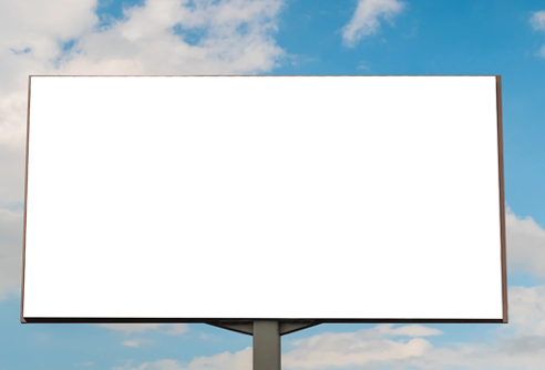
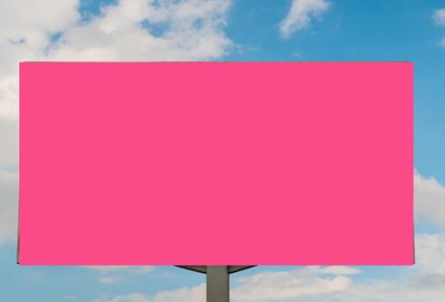
- Decide where your widget will sit in the background. Then, draw a basic shape that will cover the area in that place. 7
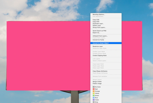
- Right-click the shape you have drawn and select “Convert to Smart Object.” 7
- Now use the Free Transform Tool to shape your newly formed Smart Object so that it fits perfectly within the background image. You can also perform simple adjustments by heading to Edit > Transform > Distort. 7
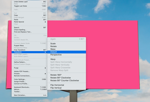
- Now for the magic. Double-click on the Smart Object icon in the Layers panel to open the layer in a new tab. Drag and drop your widget image onto the layer and make sure it covers the shape you created. Click, Save and close the window. 7
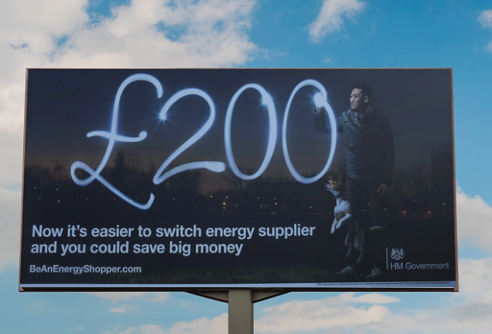
Taking it to the next level
Here are some more tools and techniques to develop your mockups even further. 7
Drop shadows
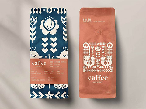
Use drop shadows to add realism and depth.
Give your mockups a sense of depth with an artfully placed shadow. However watch out, as drop shadows can be overdone, making the product look fake.
Freeform transform tool
The free transform tool lets you alter your images easily.
You can use this tool to manipulate any aspect of an image’s dimensions into any angles. This feature lets you create interesting perspectives.
Gradients
Reflections, shadows, and more have the power to make your mockup more realistic.
Whether you want to add reflections, texture, sheens, or shadows, gradients are a great feature for giving your mockups an extra dimension. 7
And if all else fails?
Not everybody has the time or the patience to go through that process for creating their mockups. You can cheat a little by using some ready-made mockup files. These simply require you to place your own image within the file, and it will do the rest in terms of shaping, sizing, and adding shadows and effects. These are available on Shutterstock.
Video tools
It may not be an image you are creating. Some marketing campaigns use videos, for example on Instagram or other social media. Adobe AfterEffects is a great tool to use for editing your videos. It is the best alternative for Motion Graphics and Kinetic Typography.
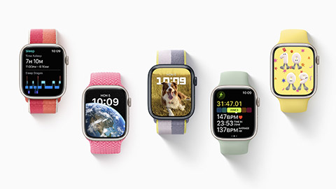
Apple uses mockups in their keynote presentations to show off new products and services that they intend to launch.
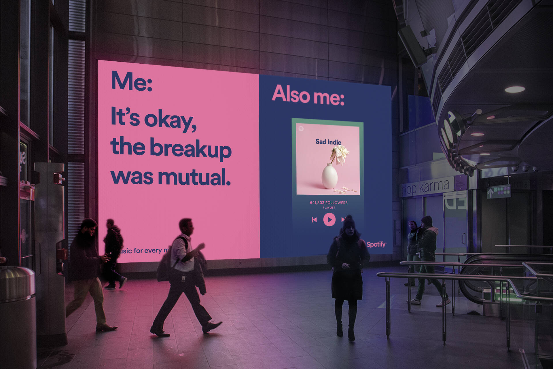
Spotify will showcase new music and features via mockups in their posters and social media marketing. Notice the meme-style irony they use in their adverts.
Some tips for top-tier mockups
You must be well familiar with the product and its target market in order to produce a flawless mock-up. Presenting your campaign in the wrong context is going to do more harm than good. So, make sure you are clear on what those things are before going ahead. Mock-ups sometimes appear flat or out of place since the fundamentals of the product or its users weren't carefully taken into account. 7
Context
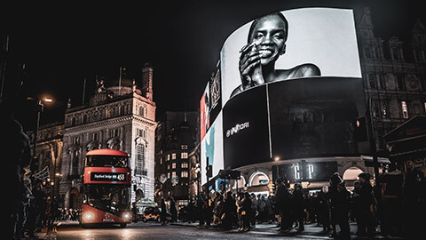
Think about where your product will be presented in real life. The best mockups are shown in an environment where you would realistically find them. Think billboard posters, table menus, or an app on a phone screen. If you have a smaller budget, do not be afraid to use stock photography. 7
Colour
Learn about the basics of colour theory, or colour psychology. Combine stock with colour theory, and you are halfway there. Remember, you are aiming to showcase your campaign in a setting that looks believable, so understand the colours that make up your campaign and ensure that the surroundings complement it. 7
Perspective
Try new angles with your mockups. The enemy of all mockups is a lack of perspective—show off the edges! Even with software, which is innately flat, find ways to express it from an interesting angle. Looking at something face-on may not be the most appealing angle. Show it off from multiple vantage points using a combination of macro shots and wide angles to give a feeling of depth. 7
Materials
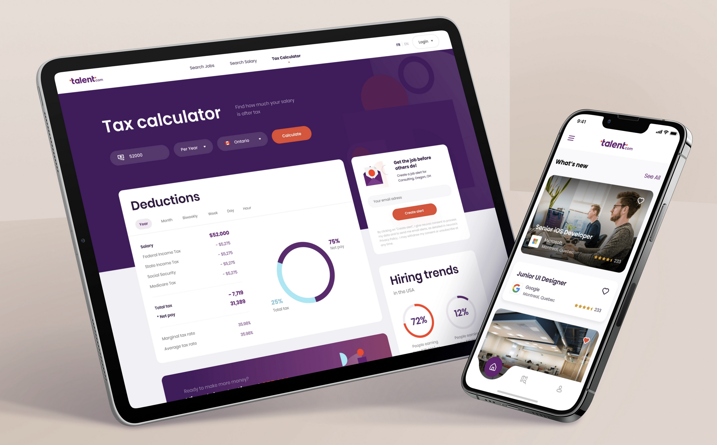
When designing mockups, consider the materials that the ad will be made from, where the light source is and how that light would interact with those materials in the real world. For example, an app mocked up on a phone is likely to cast a shadow on its surroundings. Light will likely rebound off the screen, causing reflections or areas that appear lighter than others. Understand how that happens in practice so that your mockups feel just as convincing. 7
The human touch
Finally, humanise your mockup designs. Mockups can sometimes look a little lost without some form of human connection. Make it more personal with some direct human interaction with the marketing materials and your mockup will automatically level up. 7
In contrast to wireframing and prototyping, the mockup step of website development is one that is occasionally skipped. Even still, separating mockup production into its own stage has great benefits for any development team.
A team is able to be deliberate about the design decisions it makes for a particular product by creating mockups and revising the designs that have been generated. It enables stakeholders in various roles to examine the campaign’s aesthetics, provide input, and improve on it as much as possible. 6
You may use a video as part of a marketing campaign; for example on Facebook, Instagram, Tiktok, Youtube or as a TV commercial.
A storyboard is a graphic organizer that plans a narrative. Storyboards are a powerful way to visually present information; the linear direction of the cells is perfect for storytelling, explaining a process, and showing the passage of time. At their core, storyboards are a set of sequential drawings to tell a story.
A storyboard is a guide to how a film is going to look. It is a way to visualise all the shots in a film before you actually go out and start filming your project. A storyboard is an illustration of how the shots in the footage/film will look and everything that will be in the camera frame when that shot is finally filmed.
Shot list
If you are working on a film/motion graphic and breaking it down shot by shot, create what is called a shot list. For each shot on the list, you'll need to think about the shot's composition and other details involving how it will actually be filmed/created.
Make it work for you - if it is easier to make a shot list first to get organised then do it!
The storyboard for me is the way to visualise the entire movie in advanceMartin Scorsese
A good storyboard is one that you can watch, you can experience!
Storyboarding can save you a lot of money, it allows you to see what works, and what doesn’t before you even get on set.
For Lord of the Rings, Peter Jackson hired voice actors so he could watch the whole movie before they started filming.
What is included in a Storyboard?
Each image in a storyboard captures a number of important details:
- The scene – location, cast, props
- Camera movement
- Shot size
- Lighting.
The scene
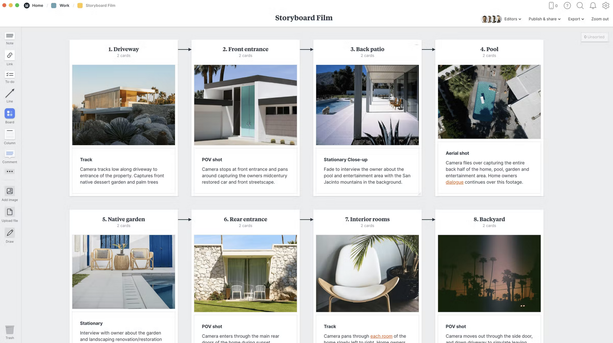
By emphasising significant beats such as actions, settings, wardrobe, staging, narrative arcs, and crucial plot moments, you may mark the important sections of the story. This will help in creating the storyboard's frames and determining how you will transition from one scene to the next.
Camera movement
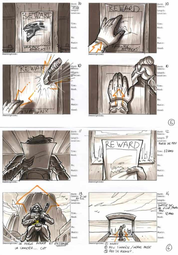
More information or directions regarding the scene can be added to the panel. The following storyboard demonstrates how arrows are also used to indicate camera movement.
Shot size
The size of the shot is determined by how much of the scene or topic is visible in a particular frame of a video, still image, or animation. In film or video, several camera angles convey various narrative values and are merged in post-production to tell a story. You can learn more about different shots in the following video.
There are three main shot size options for online videos when photographing people or animals.
- Your face and a tiny portion of your body are shown in the close-up (CU).
- Head and shoulders are captured in a medium close-up (MCU).
- Additionally, there is the medium shot (MS), which extends all the way to your waist.
Your mobile audience will squint to view your subject if the shot is any broader than a wide shot.
Lighting
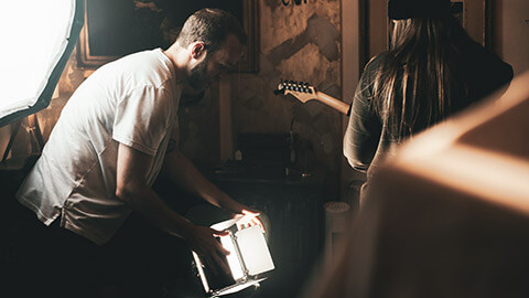
Lighting styles and techniques vary as widely as the stories they assist in telling. No lighting setup or style works for everything when it comes to video marketing.
So, when deciding how you’re going to light your scene, consider the script.
- What emotion are you wanting to evoke in this scene?
- How do you show the audience that feeling?
Time to create your own mockups!
Choose one of your favourite brands. Use one of the tools discussed in this module to create your own mockups.
Try to include three different renderings, using different materials, angles, or perspectives to form part of the same campaign.
Share your mockups with your peers in the forum.

