Welcome to topic 3 – Develop ideas for typographic solutions. This topic allows you to experiment with different ideas and propose solutions based on typography and chosen fonts suitable for the design brief.
You will be introduced to the following themes:
- Typographic options and sources
- Fonts, faces and styles
- Hand-drawing techniques and visual representations
- Production issues associated with typographic approaches.
The best typographic solutions depend on your project goals, target audience, and desired message. You should not be afraid to experiment, have fun, and iterate on your ideas to achieve visually impactful and clear communication through type. As already discussed, the clarifications of the client brief are crucial to developing your design concepts. What might be appropriate creative solutions for one client will not be the same as another.
You need to communicate specific ideas when developing typographic solutions. These include.
- Assess typographic sources in the context of the brief
- Concept and messages
- Visual hierarchy and layout
- Font selection and customisation
- Material and printing techniques
Your choice of font should strike a balance between aesthetics and functionality. It should be visually appealing while ensuring clear communication of your message. Don't be afraid to experiment with different fonts and combinations to find the perfect fit for your project. With careful assessment and exploration, you can select typographic sources that elevate your design and leave a lasting impression.
Your chosen typeface should resonate with your target audience and support the project's goals. For example, a whimsical font might work for a children's book but not for a legal document where clarity and professionalism are paramount. You need to consider the overall aesthetic you're aiming for. Bold, geometric fonts might suit a modern website, while elegant serifs could enhance a classic brand identity.
Regarding legibility, you have to evaluate the font. It should be easily read at different sizes and on various screens or printed materials. You must know that small details or overly condensed letters can hinder readability on smaller screens. The letter spacing, kerning, and overall character design should promote smooth reading flow. Avoid fonts with awkward spacing or unclear letterforms. Consider using a versatile font that offers headlines, body text, and accents flexibility.
Ensure the chosen font has a license suitable for your project's usage. Some fonts are free for commercial use, while others require paid licenses. For example, would the font in the necessary file formats (e.g., .otf, .ttf) be compatible with your design software? Consider web font formats and potential loading times for different browsers if using the font on a website. Some complex fonts might take longer to load.
It is recommended that you:
- Assess typographic options in the context of the brief
- Identify and access sources of information and ideas about type to inform work
- Test different font options within your design mockups to see how they perform visually. This allows you to assess their legibility and overall impact in context.
- Explore pairing a main typeface with a contrasting or complementary secondary font for headings, subheadings, or body text. This creates a visual hierarchy and avoids monotony.
- Review Resources: Look for inspiration and font reviews online. Websites like Font Squirrel offer free fonts with clear licensing information, while Typewolf provides in-depth typeface reviews and analysis.
Typographic elements are the building blocks that create visually appealing and readable text in your design projects. Mastering these elements allows you to craft clear and impactful messages through typography to expand on your initial thoughts.
The term “typeface” is often interchangeable with "font.” However, a typeface is the overall design style of a set of characters, and it encompasses unique letterforms, including shapes, weight (thickness), proportions, and details like serifs (decorative flourishes at the ends of strokes). Examples of typefaces include Times New Roman, Helvetica, or Arial, but there are many more.
A font is a specific variation of a typeface. It refers to a particular set of characters with a specific weight (e.g., regular, bold), style (e.g., italic), and size. For instance, Times New Roman Bold 12pt is a font, part of the Times New Roman typeface family.
Understanding letterform anatomy helps you analyse and appreciate the details of typefaces. You need to familiarise yourself with key terms, which include:
- Baseline: The invisible line upon which most letters sit
- Ascender: The part of a lowercase letter that extends above the baseline (e.g., the top of "h" or "f")
- Descender: The part of a lowercase letter that extends below the baseline (e.g., the bottom of "y" or "p")
- Cap Height: The height of uppercase letters
- X-Height: The height of lowercase letters without ascenders or descenders (e.g., "x," "a," "o")
- Serifs: Decorative flourishes at the ends of strokes, present in serif fonts but absent in sans-serif fonts.
This is evident in the following image.
Typefaces can be broadly categorised based on their visual characteristics. Which include:
- Serif: Fonts with serifs, such as Times New Roman or Garamond, convey a sense of tradition, formality, and elegance
- Sans-serif: Fonts without serifs, like Helvetica or Arial, project a clean, modern, and minimalist aesthetic
- Script: Fonts that resemble handwritten calligraphy, adding a personal or decorative touch
- Decorative: Highly stylised fonts for specific purposes or to create a unique visual impact.
Key Typography Properties influence the readability and visual appeal of your text. Familiarise yourself with these key terms, which include:
- Font Size: The size of the typeface measured in points (pt)
- Line Length: The width of a line of text, affecting readability and visual flow
- Line Spacing (Leading): The vertical space between baselines of consecutive lines
- Letter Spacing: The horizontal space between individual letters within a word
- Kerning: The adjustment of spacing between specific letter combinations to improve readability and aesthetics (e.g., preventing letters from appearing visually too close)
- Alignment: How lines of text are positioned horizontally (left, right, centre, justified)
- Colour: The colour of the text impacts contrast and readability
- Leading: The amount of space between the lines of text. You can measure leading by obtaining the distance between two baselines. Leading is called line height in CSS.
This is evident in the following image.
Too much leading can cause continuity problems, as the eyes of the reader are required to travel a greater distance between lines of text. Look at the examples below. All are set in the same typeface, weight, and measure.
However, each one has different leading values.
- Example 1 is set to a negative value (a value that is smaller than the type size). You can see the ascenders colliding with descenders and its effects on readability and aesthetics.
- Example 2 is set at an often-recommended value of 120% of the type size. If your font size is 10pt, the leading should be 12pt.
- Example 3 is set to 200% of the type size. You will notice the disruption in the pace and flow of reading the text.
All the above contributes to creating a visual hierarchy with typography that guides the reader's eye through your design. Use font size, weight, colour, and style to differentiate elements like headings, subheadings, and body text.
Employing contrast between text and background ensures readability. For example, dark text on a light background is easier to read than light text on a dark background. Understanding and effectively using these typographic elements allows you to create clear, visually compelling, impactful messages in your design projects.
Watch this video
It is about the power of typography. (12:46)
Fonts, faces and styles
As you know, typography is the art of giving a voice to words, transforming the mundane into the extraordinary, and creating designs that communicate meanings and messages for the consumer to engage. Key principles and techniques associated with fonts, faces, and styles should be used appropriately and innovatively, and an understanding of such is needed to answer client briefs creatively.
Consider the following techniques:
| Techniques | Consequence |
|---|---|
| Contrast |
It can be prominent in font weight, size, colour, or style variations. Pair a bold headline with a lighter body text or use complementary colours to create visual impact. |
| Size and scale |
Make keywords or phrases larger than the surrounding text to grab attention and create a focal point. Experiment with oversized typography or mixing different scales within your design to create visual interest. |
| Negative space |
Avoid cluttered designs that can distract from the main message. By giving your typography room to breathe, you create a sense of balance and allow the typography to stand out. |
| Typography effects | Techniques like shadows, outlines, gradients or textures can add depth and dimension to your typography, making it more visually appealing and attention-grabbing. |
| Colour |
Choose high-contrast colours, or use vibrant, bold colours to make your typography pop. Contrast the typography colour against the background to ensure readability and visual impact. Experiment with colour combinations to create eye-catching and dynamic designs. |
| Unconventional placement |
Instead of aligning everything to the centre or edges, try placing text at different angles, curving it, or integrating it into the overall composition in unique ways. This can create a visually intriguing and stunning design. |
| Typography styles |
Explore different typography styles and experiment with fonts to find one that suits your message and evokes the desired emotions. Consider using customer or hand-lettered typography to add a unique and distinctive touch to your design. |
A wealth of resources can be used to manipulate fonts digitally. You are familiar with the Adobe suite of products, but there are more. These have been particularly evaluated regarding their resourcefulness to the production of typography. Click on the headings to explore more.
Adobe InDesign is a professional desktop publishing software for creating print and digital media layouts.
Pros:
- Extensive typographic controls and advanced layout features
- Integration with other Adobe Creative Cloud applications
- Support for handling large and complex documents
- Many export options for print and digital media
Cons:
- Harder to learn compared to simpler design tools
- Subscription-based pricing may be expensive for some users
- Can be resource-intensive and requires powerful hardware for smooth performance
Adobe Photoshop is a powerful image editing and graphic design software. While it is not primarily a typography tool, it offers various text manipulation features and is widely used for creating typographic designs and editing typography within images.
Pros:
- A big choice of text manipulation tools
- Powerful image editing capabilities combined with typography features
- Big user community and availability of online resources
- Works with other Adobe Creative Cloud applications
Cons:
- Not specifically designed for typography, lacks some advanced features
- Hard to learn, especially for complex text effects
- May not be as efficient for large-scale typography projects compared to dedicated typography tools
Adobe Illustrator is a vector graphics editor for creating scalable artwork and illustrations. It offers many typography tools and is commonly used for creating logos, branding materials, and typographic designs that require precise control over letterforms.
Pros:
- A library of typographic controls and vector editing capabilities
- Sharing content with other Adobe Creative Cloud applications
- Ability to create scalable artwork suitable for print and digital media
- Wide range of export options for various formats
Cons:
- Takes longer to become proficient in, especially for complex typographic designs
- Subscription pricing can be expensive for some users
- Lacks some advanced layout features
Scribus is an open-source desktop publishing software suitable for creating professional-looking layouts.
Pros:
- Free and open-source software
- Suitable for basic typographic designs and layout creation
- Cross-platform compatibility (available for Windows, macOS, and Linux)
Cons:
- Limited range of advanced typography features compared to commercial software
- The user interface and workflow may not be as intuitive as other tools
- Smaller user community and fewer online resources than popular commercial software
CorelDRAW is a vector graphics editor that provides various design tools, including typography features.
Pros:
- Great typography and vector editing capabilities
- Design tools suitable for creating complex typographic designs
- Available as a perpetual license, making it a cost-effective option for long-term use
- Supports a variety of file formats and offers good compatibility
Cons:
- Higher learning complexity, especially for beginners
- The user interface and workflow are not as intuitive as some other tools
- Lacks some advanced features found in competing software like Adobe Illustrator
Sketch is a vector-based design tool primarily used for creating user interfaces (UI) and web designs. While it may not have as extensive typography features as dedicated typography tools, it offers basic text manipulation tools and is popular among UI/UX designers.
Pros:
- Optimised for UI/UX design with a focus on simplicity and speed
- Intuitive user interface and streamlined workflow
- Large library of plugins
Cons:
- Limited typography features compared to specialised typography tools
- Primarily geared towards UI/UX design, it may not offer advanced print design capabilities
- Available only for macOS, which limits accessibility for Windows and Linux users
SummitSoft Graphic Design Studio is a software that provides tools for creating graphics, logos, and typographic designs.
Pros:
- An affordable option for basic graphic and typographic design
- User-friendly interface, suitable for beginners
- Comes with pre-designed templates and artwork for quick design creation
Cons:
- Limited range of advanced typography features compared to professional-grade software
- Not as widely recognised or supported as some other design tools
- Lacks advanced editing capabilities found in more potent software
Affinity Designer is a vector graphics editor that offers comprehensive design tools, including typography features. It is known for its affordability and professional-grade capabilities, making it a popular alternative to Adobe Illustrator.
Pros:
- Advanced typography and vector editing capabilities
- Affordable pricing with no subscription model
- Smooth performance and efficient workflow
- Good compatibility with various file formats
Cons:
- Small user community and fewer online resources compared to industry-leading software
- More challenging to learn if you want to create complex typographic designs
- Does not offer as many advanced features as, for example, Adobe Illustrator
Eagle is a font management software that helps users organise, view, and manage their font collections. It offers features such as font preview, activation, and organisation tools, making working with large font libraries easier.
Pros:
- Efficient font management and organisation capabilities
- Font preview and activation tools for easy font selection
- Customisable font categorisation and tagging options
Cons:
- Limited design and editing features compared to full-fledged design software
- Primarily focused on font management, it may not offer extensive typography design capabilities
- Availability of advanced features may vary depending on the version or edition
Fontlab Studio is a professional font editing software for creating and modifying fonts. It offers a comprehensive set of tools for designing, kerning, and refining typefaces, making it suitable for professional typographers and font designers.
Pros:
- Advanced font editing capabilities with precise control over letterforms
- Extensive kerning and spacing tools for precise typography adjustments
- Support for a wide range of font formats
Cons:
- A steep learning curve, especially for beginners or non-specialists
- Higher price point compared to some other font editing software
- Limited features for graphic design and layout creation
FontCreator is a font editing software that allows users to create and customise fonts. It offers tools for designing, editing, and converting fonts, making it suitable for beginners and experienced font designers.
Pros:
- User-friendly interface with intuitive font editing tools
- Support for a wide range of font formats
- Affordable pricing
Cons:
- Lacks some advanced features found in high-end font editing software
- Limited typographic design capabilities compared to full-fledged design software
- Not as widely recognised or supported as some other font editing tools
Explore
Here are two (2) resources that are resourceful for checking and identifying fonts.
Discover new fonts and font combinations in the following table. Click on each website link and subscribe or bookmark the links on your computer.
| Resource | Benefit | Website Link |
|---|---|---|
| Typewolf |
It is a website and resource platform that highlights and analyses typography in web design. It provides inspiration, recommendations, and insights into various fonts and typefaces. |
|
| Hoefler & Co |
It is a renowned type foundry that offers high-quality fonts. They specialise in creating elegant and sophisticated typefaces widely used in branding, editorial design, and other professional applications. |
|
| Font Squirrel |
It is a popular online platform that provides a vast collection of free fonts for personal and commercial use. It offers a selection of high-quality fonts from various sources, ensuring that designers can access diverse typography options. |
|
| FontPair |
It is a website that offers font pairing recommendations for designers. It suggests combinations of fonts that complement each other aesthetically. |
|
| Flipping Typical |
It is an online tool that allows users to preview and compare different fonts. It offers flipping, scaling, and rotating fonts to visualise their appearance in unique styles and orientations. |
|
| Modular Scale |
It is a tool and methodology that assists designers in creating harmonious and balanced typographic scales. It provides a systematic approach to determining font sizes based on ratios and proportions across various design elements. |
|
| FontJoy |
It is a web-based tool that generates font combinations based on user preferences. It uses artificial intelligence algorithms to suggest font pairings that complement each other, allowing designers to quickly find typography options for their projects. |
Inspiration can come from various sources. Explore blogs, websites, and online communities dedicated to typography, where you can discover new fonts, study exceptional typographic designs, and engage with fellow typography enthusiasts.
Take the time to analyse and deconstruct impactful typographic work, understanding the choices made by designers and the emotions they evoke.
Here are some examples:
It is a community-driven platform focusing on design work in various fields, including typography. You can browse through the curated collection of typographic designs, explore assorted styles, and discover innovative approaches to typography. You can also engage with other designers, participate in challenges, and receive feedback.
It is a visual discovery platform where users can find and save images and ideas for various interests, including typography. Designers can create mood boards, collect, and organise typographic examples, and explore several styles, techniques, and typographic applications shared by other users.
The online platform curates and highlights creative work across various design disciplines. It features diverse visual content, including typography, graphic design, photography, and illustration, serving as inspiration for designers.
The website documents real-world examples of fonts used in various contexts, such as signage, packaging, advertising, and branding. It allows users to explore how different typefaces are applied in practical design applications.
It is a platform that recognises and celebrates the best in web design and development. It highlights award-winning websites, provides industry insights, and promotes excellence in digital design through competitions and events. It serves as a source of inspiration and recognition for designers and agencies.
It is a type foundry known for its contemporary typefaces. They offer a range of high-quality fonts designed with precision and attention to detail, inspiring typography designers.
The website features new and noteworthy typefaces from various foundries and designers. It provides a platform for discovering and exploring fresh and unique typography options.
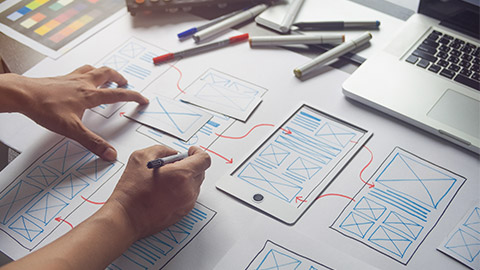
Recording typographic solutions effectively depends on the stage of your design process and your personal preferences. Sketches have been used as a design method for a long time. The typography design projects have adopted thumbnail sketches as the beginning of organising ideas as tools or skills needed in the design process.
As a tool or skill, sketching has its role in the design process. That role will vary depending on the product being created, the size and scope of the project, your individual designer's style, experience, workflow, and the client's expectations. Sketching is an excellent way to explore concepts quickly. You can sketch for one or two hours and find multiple workable solutions to the design problem. This is an essential step in the design process.
Showing sketched thumbnails or compositions will save you time before getting thumbnail approvals for the projects, as it is also a common part of the illustration process. Roughly sketch your layout ideas and write notes about the desired fonts, sizes, and styles. This is a quick and loose way to capture initial ideas. You can also create a physical or digital mood board that incorporates typography examples that inspire you. This can help visualise the overall aesthetic direction.
When producing typography thumbnails, you must consider type weight, size, and colour to determine which text stands out. Try not to use many different fonts, as this is meant to be a wealth of ideas suitable for your client’s requirements. Design small squares or rectangles highlighting different font combinations, sizes, and colours. This allows for easy comparison and selection.
Here is a good example of a typography project that has used thumbnail sketches to explore potential design solutions:
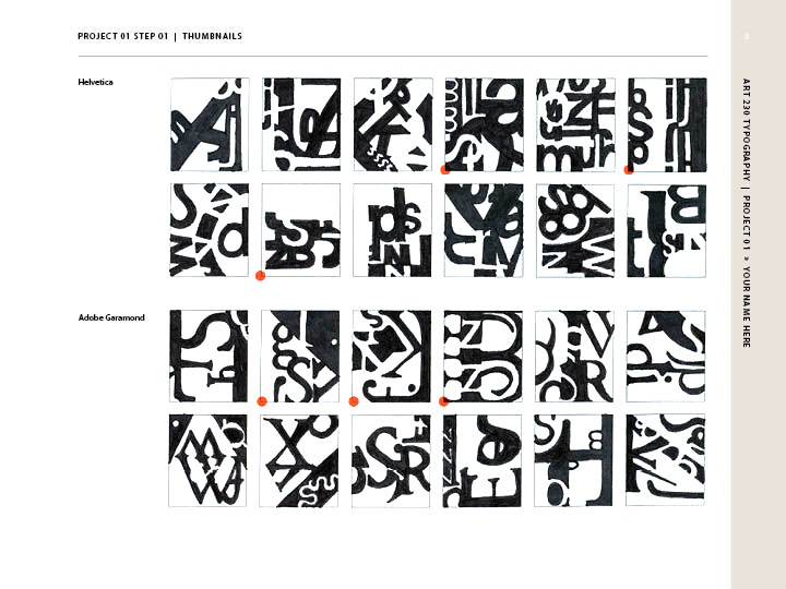
Image: Typography thumbnail sketches
Source: https://courses.byui.edu/ART230/art230-L01.html
Watch this video
It is how to do a thumbnail sketch. (14:47)
Once you have completed the thumbnail sketches, it now comes to refining the ones that you feel are most appropriate through feedback and constructive comments. This developing of concepts can take the form of using design software (Adobe Illustrator) to create digital mockups with basic font placeholders. You must experiment with different typefaces and styles to see how they work within your layout.
Once you have chosen your fonts, utilise your design software's typography features to refine your layout. This includes setting font sizes, line spacing, kerning, and alignment.
Important
There are specific recommendations that you need to follow when designing typography. These are.
1. Create a style guide or design documentation that specifies the exact fonts, sizes, weights, and colours used in your project. This ensures consistency across all design elements.
2. Capture screenshots of your typography choices at various stages of the design process. Use clear naming conventions to keep track of different iterations.
3. Use version control systems to track changes made to typography throughout the design process.
4. Capture screenshots of your typography choices at various stages of the design process. Use clear naming conventions to keep track of different iterations.
5. Explore online font sample libraries like Google Fonts or Adobe Fonts to experiment with different fonts and create mood boards or style tile mockups.
The best method for recording typographic solutions depends on your workflow and project needs. Experiment and find the best system for you, ensuring clear communication and a well-documented design process.
Click on the cards to learn more.

Effectively organising content within a design so that it is easy to understand and consume is one of your most important jobs. And since much of the content you will work with is text-based, creating an effective typographic hierarchy is one of the most important things you can learn. The term, typographic hierarchy is key to understanding the impact of your decisions about including typography in your work.
Initially, some designers underestimate the necessity of using a hierarchy of typography. Text styling, including different text sizes and weights, can help create a visual hierarchy. Visual hierarchy is when text has different visual prominence on the screen or page according to its importance or the sequence that should be read. This helps to create a clear, logical order in which the users can consume the content.
The image below highlights the importance of applying text styling to create a hierarchy. The example on the left (with uniform text styling) has little or no visual hierarchy, meaning the reader's eye will wander, and they may quickly lose interest. In the example on the right, text weight and size are varied to emphasise the heading, sub-headings, keywords, and links. This gives the content a clear reading order, making it easier to read and comprehend.
The same information is being conveyed on both sides, yet it is impossible to tell that there is a header, subheader, and body text on the left. On the right, it is immediately apparent that there is a hierarchy to the information being provided. The typographic hierarchy shows the reader which information to focus on—which is most important, and which is simply supporting the main points.
A variety of things make up typographic hierarchy on the web. Click on the headings to explore more:
Size is the first thing new designers turn to when creating a typographic hierarchy. And for good reason: It is immediately easily identifiable by readers. Bigger = more important, smaller = less important. However, size can become a crutch when many other options exist to create a hierarchy.
Making a typeface bolder or thinner is another easily recognisable way to create a hierarchy easily identifiable even by non-designers.
Colour is often overlooked to create a hierarchy, but it is a fantastic option. Even lighter and darker shades of a given colour can create a more distinct hierarchy. Creating more contrast between the type and its background can add to the typographic hierarchy.
Beyond contrasting colours, the contrast between different type sizes, weights, and styles is also key to creating a typographic hierarchy. A difference of only one or two points in type size will not create enough contrast to make the hierarchy apparent to most users. Instead, designers should use easily distinguishable sizes, weights, and styles to create contrast between things like headers or body text.
While capitalising body text is not a promising idea from a readability perspective, using uppercase characters in headings or subheadings can help differentiate different headings or another type.
The positioning of headings and subheadings, along with other types that a designer wants to stand out, can have a lot of impact on where type falls within a hierarchy. Centring type, for instance, tends to make it stand out. Setting a type outside of the regular margins of a page can also make that type stand out within the page hierarchy.
Leading Issues
Congested lines can affect legibility, making the copy too bunched up and difficult to read. Similarly, too much line spacing or loose lines can ruin the connection between the lines of type. As such, there is no fixed rule when it comes to leading, but logically, the legibility of the text can be used to make aesthetic decisions. The image below illustrates this.
Tracking Crowd
Designers make use of tracking to fit in type so that it is set along a particular line length flawlessly with some adjustments here and there. But remember, too much tracking can harm the legibility and readability of the copy. A rule of thumb can be to leave tracking at its default value to give a perfect look to a specific font. If you are using a font for the headline or a display face, it is normal to lower the tracking to a value of up to -20 to make it appear heavier and more like a headline rather than leaving it to its usual value. The image below illustrates this.
Tracking vs Kerning
Designers use tracking to fit in type so that it is set along a particular line length flawlessly, with some adjustments here and there. But remember, too much tracking can harm the legibility and readability of the copy. A rule of thumb can be to leave tracking at its default value to give a perfect look to a specific font. If you use a font for the headline or a display face, it is normal to lower the tracking to a value of up to -20 to make it appear heavier and more like a headline rather than leaving it to its usual value. The image below illustrates this.
Poor Scaling
One is to keep the proportion in mind when scaling a textbox up or down. Distinctive design programs support different shortcuts for this measure. For example, Canva has automated adjustments when you drag the corner of a text box or any other object. In Photoshop and Illustrator, you must hold the Shift key as you drag the corner of your text box. The image below illustrates this.
Giving Readability a Miss
Legibility hurdles can come in various forms, such as font being too small, font and background colours not fitting well, transparency effects harming the visibility of the text, etc. Long passages of text require special attention in the context of readability. Instead of focusing on capturing the reader’s eyes, make sure the passage is clear and simple to read. This can be done by placing the text quickly to navigate and further by working on other aspects such as tracking, leading, font size, etc. The image below illustrates this.
Full Stop Spaces
Going for two spaces after a full stop has become a common error. This is not the designer’s fault, but it is worth mentioning here as these tend to cause trouble in production. The double-space after a full stop is a curse from the past, typically from the days of typewriters, and was used to avoid placing the character too near to the period. Modern software, desktop publishing tools, and web browsers oversee this correction, making the designers safe from the old-school practices of the bygone era. The image below illustrates this.
Not Considering Hierarchy
In the context of typography, hierarchy is used to distinguish between various textual elements to highlight their order and importance. A clear picture can be understood from a newspaper article's headline, sub-headline, and body copy. The headline is of supreme importance and is the largest, in bold or capital letters, as it is meant to be read first. The image below illustrates this.
Watch this video
It is about understanding typography. (11:21)
