Welcome to topic 2-Develop and refine layout ideas. This topic analyses the elements required for layout design.
You will be introduced to the following themes:
- Research layout ideas
- Graphic ideas and technologies
- Designing visual representation of layouts
- Evaluate design approaches
- Produce and present design ideas.
The layout is how text and images are arranged. When these elements are combined effectively, the memorability of your content, its visual impact, and the viewer’s experience will be heightened exponentially. Media such as books, websites, advertisements, and museum walls all use layouts in different forms. To understand the different effects of various layouts, it’s vital to be familiar with the universal principles of design and your philosophy surrounding it.
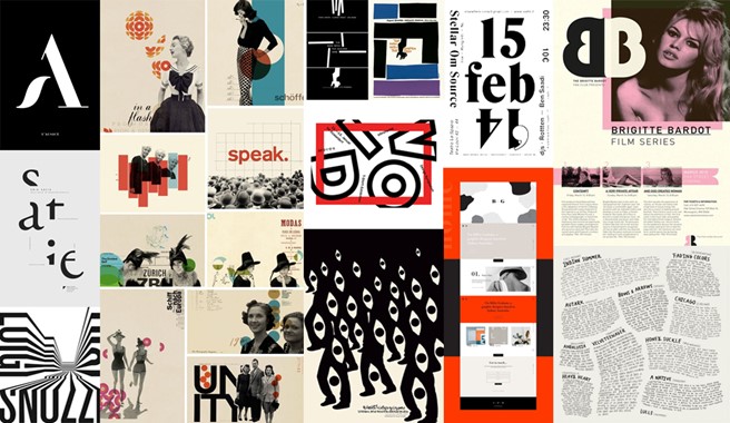
Before you begin a creative project, it’s essential to understand your place in the more significant history of art and design. Never stop researching and learning about historical and contemporary styles, movements, and aesthetics. Drawing upon your education and paying attention to what speaks to you personally will help you develop a unique but relevant voice that will allow you to reference the work you admire most.
When starting a new project, refer back to mood boards you’ve created and images you’ve saved over time. If you don’t have a mood board that feels relevant to your current project, make a new one and take the time to understand the historical relevance of the direction.
By following these steps and conducting thorough research, you can generate innovative and effective layout ideas that meet the needs of your design projects.
- Understand the Project Requirements: Start by thoroughly understanding the requirements, including the target audience, objectives, content, and branding guidelines. You can use various methods to gather this information, such as interviews, surveys, research, brainstorming, or analysis. The problem statement should be clear, concise, and specific and guide the rest of the project requirements. This will provide context for your layout research.
- Gather Inspiration: Explore a variety of sources for inspiration, including design websites, blogs, social media platforms, design magazines, books, and portfolios of other designers. Design-related magazines – in print and online – are fantastic for visual inspiration. Keep a file or scrapbook that you can easily refer to. Look for layouts that resonate with the project’s goals and aesthetic preferences.
Explore
Follow this link to find inspiration in graphic design.
https://passionates.com/top-sources-for-design-inspiration/
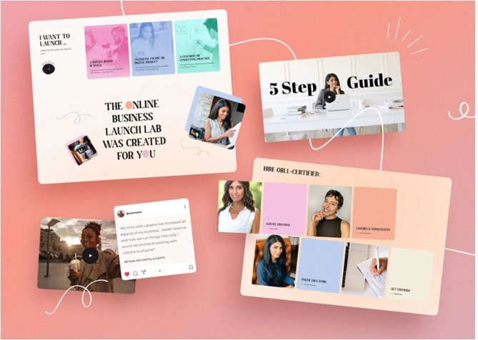
- Analyse Competitors: Research competitors or similar organisations to see how they approach layout design. Identify trends, common design elements, and areas for differentiation. One of the main benefits of conducting a competitive analysis is that it helps you identify gaps and opportunities in the market and your design approach. By analysing what your competitors are doing well and what they are missing, you can find ways to fill those gaps and offer something unique and valuable to your target audience. Pay attention to what works well and consider how to adapt or improve existing layouts.
- Study Design Principles: Review fundamental design principles such as hierarchy, balance, contrast, alignment, and repetition. Understand how these principles influence layout composition and organisation. Consider applying these principles creatively to enhance your layouts' visual appeal and effectiveness.
- Explore Typography: Investigate different styles, fonts, and typographic treatments that complement the project’s branding and content. Experiment with font pairings, font sizes, line spacing, and typography hierarchy to create visually engaging and readable layouts.
Explore
Look at Smashing Magazine online and view the many examples of creative print typography layouts.
https://www.smashingmagazine.com/2009/04/creative-print-typography-layouts/
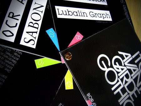
- Examine Colour Palettes: Explore colour theory and examine colour palettes that evoke the desired mood or convey specific messages. Consider the psychological effects of different colours and how they can enhance the visual impact of your layouts while maintaining brand consistency.
Explore
This website is valuable as it has palette generators for graphic designers, as shown at the following link.
https://dribbble.com/stories/2019/01/25/6-handy-color-palette-picking-tools
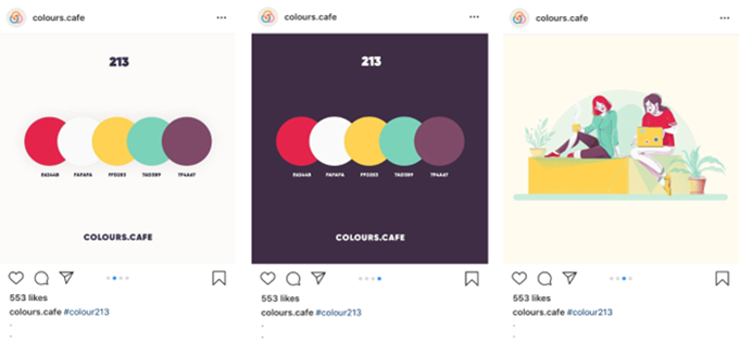
- Consider User Experience (UX): Consider user experience when researching layout ideas. Study UX principles and best practices for digital and print design. Consider how users interact with the layout, navigate content, and access information—Prioritise clarity, simplicity, and usability in your layout designs.
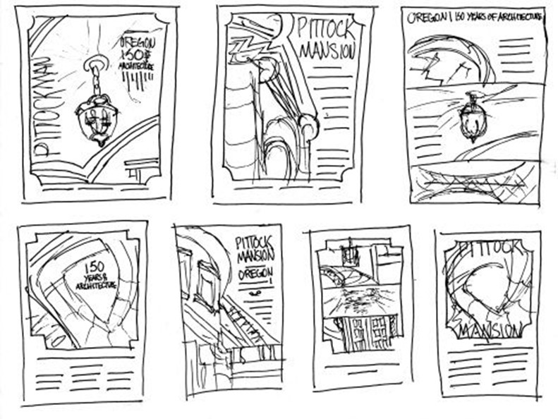
- Experiment and Iterate: Once you’ve gathered inspiration and insights from your research, begin experimenting with layout ideas. Sketch rough drafts, create wireframes, or use design software to explore different layout compositions. Iterate your designs based on feedback and usability testing.
Explore
This website explains how to produce a layout, from thumbnail sketches to the final layout.
https://pavilion.dinfos.edu/How-To/Article/2231754/how-to-produce-a-layout-in-graphic-design/
- Seek Feedback: Share your layout ideas with colleagues, clients, or stakeholders to gather feedback and insights. Be open to constructive criticism and use feedback to refine and improve layouts.
Explore
In a 10-minute read, this website explains how feedback can be optimised to receive meaningful comments.
https://designlab.com/blog/how-to-ask-for-design-feedback-10-top-tips
- Stay Updated: Stay informed about emerging design trends, technologies, and best practices by engaging in design communities, attending workshops or conferences, and consuming design-related content.
In summary, when approaching layout design, remember to research and understand the universal principles of design. In the words of Picasso, “Learn the rules like a pro so that you can break them like an artist".
Important
Click on the link to explore how to improve composition and creative layouts.
https://yesimadesigner.com/how-to-get-better-at-composition-and-creative-layouts/
Watch this video
20 ways to become a better designer and more creative. (7:00)
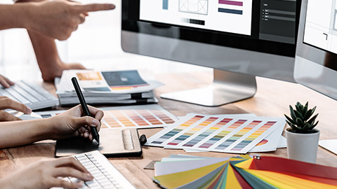
Graphic design evolved drastically over time, thanks to technology. Easels and canvases have made way for computer screens and design tools in today's art - graphic design and technology always progressed together. Analysing different graphic techniques and technologies involves understanding their strengths, limitations, and applications in various design contexts.
Here is an overview of graphic techniques and technologies to consider:
- Raster Graphics: Raster graphics are pixels arranged in a grid suitable for detailed, complex imagery like photographs. Standard raster graphic formats include JPEG, PNG, and GIF. However, raster graphics can lose quality when scaled up, and they are not ideal for designs requiring sharp, scalable graphics.
- Vector Graphics: Vector graphics are mathematical paths defined by points and lines. They are scalable and maintain quality regardless of size, making them ideal for logos, icons, and illustrations. Adobe Illustrator and SVG (Scalable Vector Graphics) are popular vector graphic formats.
- Typography: Typography refers to the art and technique of arranging typefaces to make language visible. It plays a crucial role in design, influencing readability, visual hierarchy, and brand identity. Techniques such as kerning, leading, tracking, and font pairing enhance typographic designs.
- Colour Theory: Colour theory explores the principles and guidelines for combining colours effectively in design. Techniques such as colour harmony, contrast, saturation, and temperature create visually appealing compositions—colour tools like Adobe Colour and Pantone Colour Guides aid designers in selecting and managing colour palettes.
- Image Editing Software: Image editing software such as Adobe Photoshop, GIMP, and Affinity Photo allows designers to manipulate and enhance raster images. These tools offer features for adjusting colours, applying filters, retouching images, and creating complex compositions.
- Page Layout Software: Page layout software like Adobe InDesign, QuarkXPress, and Affinity Publisher designs and arranges visual elements on printed or digital pages. These tools offer advanced layout features, typography controls, and integration with other design software.
- Digital Illustration Tools: Digital illustration tools like Adobe Illustrator, CorelDRAW, and Affinity Designer are used to create vector-based illustrations, icons, and graphics. These tools offer drawing tools, shape manipulation features, and advanced vector editing capabilities.
- Motion Graphics Software: Motion graphics software such as Adobe After Effects, Blender, and Cinema 4D enables designers to create animated graphics, visual effects, and interactive media. These tools combine animation, video editing, and compositing capabilities to produce dynamic visual content.
- Responsive Design Techniques: Responsive design techniques ensure digital content adapts to various screen sizes and devices. Techniques such as fluid grids, flexible images, and media queries create designs that provide optimal viewing experiences across desktops, tablets, and smartphones.
- Prototyping and Wireframing Tools: Prototyping and wireframing tools like Adobe XD, Sketch, and Figma create interactive prototypes and wireframes for digital interfaces. These tools facilitate user testing, collaboration, and iteration during design.
These are the main components of contemporary graphic technologies in more detail.
Adobe

The emergence of design-specific software has been a game-changer. Applications such as Adobe© Photoshop, Illustrator, and InDesign have become industry standards, offering tools that simulate traditional techniques like painting, drawing, and typesetting with digital efficiency. The ability to undo and redo, to experiment without the fear of permanent mistakes, has unleashed a wave of creativity and experimentation among designers.
Adobe© has been at the forefront of the software revolution in graphic design. The introduction of Photoshop in 1990 was a watershed moment, allowing designers to manipulate images in previously unimaginable ways. Photoshop’s layers, filters, and effects have become tools of the trade for photo editing and complex image creation. Adobe© Illustrator has transformed how designers work with vector graphics, providing precision and scalability essential for logo design and typographic work. InDesign has become the standard for layout design, enabling the seamless assembly of text and images for print and digital publications.
Hardware developments
The evolution of graphic design tools is not limited to software. Hardware advancements have played an equally important role. High-resolution monitors have allowed designers to see the finest details of their work, while graphic tablets and styluses have replicated the hand-eye coordination of drawing on paper.
3D printers have opened up new possibilities in product design, allowing for rapid prototyping and creating complex shapes that would be difficult or impossible to achieve with traditional manufacturing methods. The rise of the internet has introduced a new medium for graphic design. No longer confined to print, designers now create an ever-changing digital landscape. The web has become a dynamic space where design can interact and respond to user behaviour.
The increasing power of computers has also played a crucial role in developing graphic design. High-performance computing, with advanced CPUs and GPUs, allows designers to work on complex projects with multiple layers and high-resolution assets without experiencing lag or crashes. This reliability is essential for professionals working efficiently and meeting tight deadlines.
Innovative developments
Virtual Reality (VR) and Augmented Reality (AR) technologies are beginning to influence the graphic design industry. VR allows designers to create and explore 3D environments, offering a new perspective on space and composition. AR, on the other hand, overlays digital information in the real world, opening up innovative ways to create and present designs.
Artificial Intelligence (AI) and machine learning are set to redefine the creative process in graphic design. With tools that can analyse trends, suggest design elements, and even generate basic layouts, designers are finding new ways to augment their creativity and streamline workflows.
With the advent of the internet, graphic design extended its reach from print to digital. Websites, online advertisements, and social media platforms became new canvases for designers. This shift required a new understanding of design principles, where user experience (UX) and user interface (UI) design have become as important as aesthetic appeal.
Social media has had a profound impact on graphic design. Platforms like Instagram, Pinterest, and Facebook have become showcases for visual content, where design can go viral and reach a global audience instantly. The demand for eye-catching graphics that stand out in a crowded social media feed has led to the rise of motion graphics and interactive designs that engage users.
The impact of technology on graphic design is a testament to the resilience and adaptability of creative expression. As designers navigate the digital age, the fusion of technology and design will undoubtedly lead to new artistic horizons and redefine the canvas of our shared visual culture.
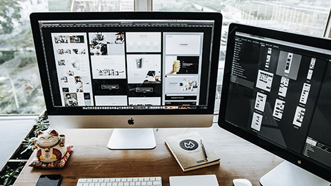
You need to follow several elements to design a layout, which should include:
- Alignment is the position of a design’s elements in relation to each other. It also refers to placing design elements along a page's top, bottom, sides, or middle. How you align your elements determines the success of your design’s composition.
- Focal point takes its inspiration from photography. The focal point rule of composition in design also called the emphasis, is strongly intertwined with visual hierarchy. When designing, ask yourself where you want your audience to look first.
- Visual hierarchy refers to arranging elements from most important to least important. The most essential element in your design will instantly grab your audience’s attention. These include, but are not limited to:
- Changing text and media sizes
- Altering colour contrasts
- Placement on the page
- Changing the relationship to other elements in the design
- Colour contrast can lead a viewer’s eye to specific parts of the layout. By boosting or reducing your elements' colour contrast, you can highlight or hide them. The best way to do this is to take a step back and look at your work.
Complementary design elements should work together as a cohesive composition. There are several ways to do that, which include:
To assess the elements required for a layout's overall design effectively, consider the following components. Click on each heading to explore more.
Understand the purpose and goals of the design project. What message or information needs to be communicated? What action do you want the audience to take? Align the layout elements with the project objectives.
Consider the target audience's characteristics, preferences, and needs. Tailor the design elements to resonate with the intended audience and effectively communicate the message.
Evaluate the content included in the layout, such as text, images, videos, or interactive elements. Ensure that the content is relevant, engaging, and well-suited to the audience and objectives of the project.
Establish a clear hierarchy and organisation of information within the layout. Visual cues like size, colour, typography, and spatial arrangement guide the audience's attention and prioritise essential elements. For this reason, your layout design must consistently communicate the most important message first. Structuring the text and imagery of your layout with this hierarchy in mind will provide you with the necessary parameters when considering format, grid, and alignment.
A grid will help you position your elements based on a sequence of columns and rows. Grids allow you to align your work with precision and are integral to completing your layout design. When considering the alignment of your layout, keep these principles in mind:
- The Golden Ratio: a unique number approximately equal to 1.618 that appears many times in geometry, art, architecture, and other areas. It can create pleasing, natural-looking compositions for your design work.
- Rhythm and consistency
- Balance and/or tension
- Deviation from alignment or “breaking the grid” (when it enhances your concept).
Reading
Explore more about using grids in Adobe Creative Cloud in the following link.
https://creativecloud.adobe.com/discover/article/make-it-then-break-it-layout-design-with-grids
Select appropriate typefaces, font sizes, styles, and spacing to enhance readability and convey the tone and personality of the content. Ensure consistency in typography throughout the layout for a cohesive and polished look. Choosing the best typefaces for your layout can be daunting because there are so many options. After all, the aesthetics of typography are subjective. This is where your knowledge of typeface and the history of various fonts will come in handy.
- The readability of a font should take precedence over aesthetics.
- To ensure readability, consider your text alignment and the typeface(s) leading and kerning. Minor adjustments to spacing can make a big difference.
Choose a harmonious colour scheme that complements the content, reinforces the brand identity, and evokes the desired emotions or associations. Use colour strategically to create visual interest, highlight key elements, and establish a visual hierarchy. You must also be able to understand colour theory, which includes:
- The colour wheel
- Colour harmony and psychology
- Choose a colour palette suitable for your client’s needs
- Apply the 60/30/10 rule (dominant, secondary and accent colours
- Consider print and or digital platforms.
Integrate visual elements such as images, illustrations, icons, graphics, or multimedia content to enhance the visual appeal and effectiveness of the layout. Ensure that visual elements are relevant, high-quality, and support the overall message.
Integrate visual elements such as images, illustrations, icons, graphics, or multimedia content to enhance the visual appeal and effectiveness of the layout. Ensure that visual elements are relevant, high-quality, and support the overall message.
Consider the navigation and interaction design for digital layouts to provide a seamless user experience. Design intuitive navigation systems, interactive elements, and clear calls-to-action to guide users through the content and encourage engagement.
Maintain consistency with the brand identity guidelines, including logo usage, colours, fonts, and visual style. Ensure the layout reflects the brand's personality, values, and aesthetic to strengthen brand recognition and affinity.
Ensure that the layout is accessible to users with disabilities by following accessibility standards and guidelines. Consider colour contrast, text legibility, keyboard navigation, and screen reader compatibility to make the layout inclusive for all users.
Design adaptable and responsive layouts for different screen sizes, devices, and contexts. Employ responsive design techniques and flexible layouts to ensure optimal viewing experiences across a range of devices and platforms.
By assessing these elements holistically, designers can create well-crafted layouts that effectively communicate the intended message, engage the audience, and achieve the desired outcomes of the design project. Your aim should be to produce as many relevant layouts as possible so that you feel you have researched and produced an appropriate number from which to choose.
Different projects require wildly different approaches. Determining the best way to communicate your message to your audience is up to you. Being able to edit and modify your layout design is crucial to the creative process. It takes practice, patience, and the ability to differentiate between constructive and aesthetic criticism. You can ask yourself:
- Am I communicating precisely what I want? Will my audience understand my concept?
- Is there a rhythm and consistency to my layout and design?
- Do I have enough contrast? If I squint, is my eye still drawn to the main message?
- Is everything evenly spaced, and does the hierarchy feel balanced?
- Are the design rules I am breaking necessary?
- Do I need to edit or remove text or imagery that feels redundant?
Watch this video
It is the six (6) golden rules of layout design. (11:24)
Create and refine ideas
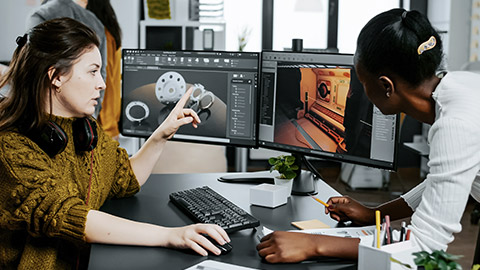
After generating your layout design ideas, you must evaluate and select the best ones for further development and testing. The key is to be objective and constructive and to consider the strengths and weaknesses of each layout design idea. By evaluating and selecting the best ideas, you will narrow your options and focus on your project's most promising and effective layout design concepts. By iterating and improving your ideas, you will enhance the quality and usability of your layout design concepts and achieve the best results for your project and client.
Here are some tips for refining your layout design.
- If you have a design brief, check it often. If it’s thorough, it’s a great way to stay focused by providing a clear vision or guidelines of what is expected.
- Refer to the initial thoughts (thumbnails, for example) to see if you stay true to the idea. This can organise or reorganise your thoughts.
- Writing notes, doodles, or just using a pen or pencil on paper helps us remember things better and make connections between disparate ideas. Use annotation as you go to help clarify your design process and decisions.
- Working on a screen to produce a printed piece can be an obstacle to seeing how the actual layout will work. Once we print it, you will see the relationships between the different elements and how they are. Do this early, for instance, when making a wireframe or template of a printed layout, to ensure your decisions will translate.
- Photograph your design work as you go. Seeing it on a screen will help to clarify your thought process and refine your ideas. Taking a break to reset your vision can reset your spatial awareness and help you see the design by changing what else is in your field of view. Also, some details can meld together in a close-up. Stepping or rolling back can help you see whether you need to worry about working at that fine level.
- Finished, refined designs are work that doesn’t make you want to pick it apart. You’ve removed all that doesn’t serve the design and included helpful elements highlighting the message or concept. These tips will help you get there and, more importantly, help you develop your processes to execute your best ideas.
- The most essential step in layout design is deciding on your design concept. After reviewing your content, ask yourself the following questions:
- Have I addressed the brief?
- How do I want the audience to feel?
By following these steps and embracing a creative and iterative approach, you can effectively create and refine ideas and options for layouts that meet the needs and objectives of your design projects.
Watch this video
It is how to get better at composition and creative layouts. (31:19)
Evaluate design approaches
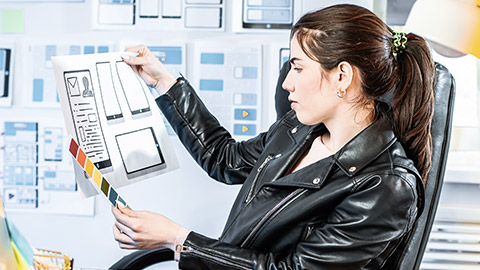
Design work is a vital part of any project, and it’s often essential to evaluate the quality of a design before moving forward. But how can you tell if a design is good or bad? It can be not easy to judge, especially when you don’t have much experience in the field or if you’re trying to assess the work of others. Following these guidelines ensures that your projects meet their full potential and provide your clients with the best design solutions.
- Is it usable?
First, usability is the most crucial factor when evaluating design quality. Make sure the design works in practice, not just on paper. If a design isn’t usable and doesn’t meet the basic utility requirements for the task you want it to complete, it needs to be refined.
- Does it have visual appeal?
Your design should be aesthetically pleasing and make a good impression. Consider things like the following:
- Colour: Does the design use colour to create a pleasing look?
- Typography: Is the typography straightforward to read?
- Layout: Is the layout well-structured and organised?
- Images: Are the images relevant to the content?
- Does it all work together to create a unified look?
Does the design use visual elements practically?
- Is the chosen colour scheme appropriate?
Colours can evoke certain emotions, so using them wisely is essential. Ensure the colours are appropriate for the project and don’t clash. It would help if you also thought about accessibility. Does your design meet WCAG guidelines for people with visual impairments? Likewise, do the colour choices match the company’s brand guidelines?
- Is the design consistent?
Consistency is a must. Ensure the design elements are consistent throughout the project, from navigation to page layout and typography. This helps users understand where and what they’re looking at, making for a more effortless, smoother experience overall.
- Is it easy to understand?
Make sure the design is easy to understand. Does it communicate the required information? It’s essential to get these basics right to create a successful design. Likewise, it would help if you also considered the context of your design. Is it appropriate for the audience you are targeting? Does it make sense in their world?
- Is the design concept interesting?
Your design should have a unique concept that stands out. Think about adding something special to your work to make it more memorable. Consider the project’s purpose and goals, then use this as inspiration for a creative concept that will take your design to the next level. Additionally, creative concepts can help to ensure the design has a strong story behind it. It should be thought-provoking, visually captivating, and make an impact on its audience.
- Does it meet the brand guidelines?
Make sure the design meets brand guidelines. Does it reflect the company’s values and ethos? Does it use the right fonts, colours, images, and other elements? Remembering these things when creating a design that will represent a brand well is essential.
- Does it fulfil the project’s goals?
Make sure the design fulfils the project’s goals. Does it meet all the objectives? Is it solving user problems and helping to reach business targets? Analyse the project’s goals and make sure your design addresses them.
Evaluate your layout design to get feedback from others, such as your clients, colleagues, friends, or target audience. Feedback can help you identify the strengths and weaknesses of your layout, as well as any potential issues or improvements. You can ask for feedback through various methods, such as surveys, interviews, focus groups or online platforms. When asking for feedback, be specific, open-minded, and respectful, and try to incorporate relevant and constructive suggestions into your layout.
Another way to evaluate your layout design is to test it on different devices and formats, such as desktops, laptops, tablets, smartphones, printers, or projectors. Testing can help ensure your layout is responsive, adaptable, and consistent across various screen sizes, resolutions, and orientations. You can use tools like browser emulators, device simulators or print previews to test your layout and adjust as needed. For example, this is especially relevant if your design is on a client’s website.
https://www.canva.com/presentations/

Creativity doesn’t stop at design; you must bring your vision to life to impress every time. Presentations don’t have to be complicated. They act as a platform where you share your work, the process, and the outcome. Creating compelling design ideas involves considering aesthetics, functionality, and user experience.
One of the most essential components you need to remember is the client objectives specified in the design brief. Keep reminding yourself of its aims, objectives, and budget. Each creative decision you make will have a reason behind it; this is your chance to show that in your design solutions. Make notes about what has led you to make these design choices. This will help the client understand the logic and strategy behind your work in the context of their wanted outcome.
As a creative, you’ll likely end up with multiple iterations of any design brief. But your client doesn’t need to see an overwhelming amount of choices.
Review the fundamental needs of your client throughout your design process. Here are a few steps and concepts you need to refer back to:
- Specific Requirements
- Objective: Remember the original purpose of the design.
- Audience: Have you addressed the target audience?
- Constraints: Ensure your design proposals adhere to limitations in terms of budget, materials, technology, or time.
- Research and Inspiration
- Market Research: Make sure you have looked at competitors and similar projects to understand the current trends and standards.
- Mood Boards: Remember to make a visual collection of images, colours, textures, and typography that have inspired your design.
- Concept Development
- Sketches: You should have started with rough sketches to explore different ideas quickly.
- Design Elements
- Colour Scheme: Ensure the chosen colours convey the right mood and suit the client's brand.
- Typography: The fonts you selected enhance readability and complement the overall design.
- Imagery: You should have used images and graphics that are relevant and high-quality.
- Layout: Ensure that you have arranged elements in a way that is balanced and easy to navigate.
Following these steps, you can effectively produce and present visual representations of your design ideas, fostering understanding, collaboration, and alignment among stakeholders throughout the design process.
Important
Design, present, and inspire with Canva presentations. Click on the following link to explore more.
To evaluate your design approaches effectively, click on the following steps.
Organise your visual representations into presentations or slideshows for easy sharing and presentation. Use presentation software like Microsoft PowerPoint, Keynote, or Google Slides to arrange your visuals in a logical sequence and add supporting text or narration.
Rehearse your presentation to ensure you can communicate your design ideas confidently and clearly. Practice articulating the rationale behind your design decisions and be prepared to address questions or feedback from your audience.
Present your visual representations to clients, stakeholders, or team members in a clear, engaging, and professional manner. Use visual aids, gestures, and storytelling techniques to captivate your audience and convey the value of your design ideas.
Encourage feedback and collaboration by inviting questions, comments, and suggestions from your audience. Foster an open dialogue to gather insights, address concerns, and refine your design ideas based on feedback received.
Use feedback from the presentation to iterate and refine your design ideas. Incorporate constructive criticism, explore alternative approaches, and adjust and improve your designs' overall quality and effectiveness.
Document the visual representations of your design ideas, feedback received, and decisions made during the presentation. Keep thorough records to track the evolution of your designs and facilitate future iterations or revisions.
Reading
Click on the link to explore how to evaluate the quality of your design.
Finally, click on each question to check your knowledge of this topic.
