Welcome to topic 4-Evaluate design work. This topic allows you to assess your work against the design objectives. You will be introduced to the following themes:
- Functional and aesthetic perspectives
- Responding to feedback
- Identifying future work opportunities.
Creativity is considered to significantly impact the design process and its outcomes, while aesthetics and functionality are considered critical characteristics of products. Therefore, a relationship between creativity, aesthetics, and functionality is often assumed.
Aesthetics is a core design principle that defines a design’s pleasing qualities. In visual terms, aesthetics includes balance, colour, movement, pattern, scale, shape, and visual weight. Designers use aesthetics to complement their usability and enhance functionality with attractive layouts. Functionality is often used to describe the performance of a product or a design.
Design is the method of putting form and content together. Design, just as art, has multiple definitions; there is no single definition. Design can be art. Design can be aesthetics. Design is so simple, that’s why it is so complicated.Paul Rand, Art director & graphic designer famous for logos such as IBM
To critique a layout from functional and aesthetic perspectives in the context of the design objective, you need to consider the
following aspects:
- Alignment and organisation: Assess how well the layout aligns with the design objective regarding organisation and structure. Look for a clear visual hierarchy, logical flow of information, and effective grouping of elements. Ensure that important content is prominently featured and easy to find.
- Readability and clarity: Evaluate the readability and clarity of the layout, considering factors such as font choice, size, spacing, and contrast. Ensure that text is legible and easy to read in terms of content hierarchy and overall comprehension. Check for sufficient contrast between text and background colours to enhance readability.
- Visual appeal and aesthetics: Examine the layout's overall visual appeal and aesthetics. Assess the use of colour, imagery, typography, and white space to create a visually engaging composition. Consider whether the design elements align with the desired aesthetic and brand identity while appealing to the target audience.
- Consistency and branding: Review the consistency of design elements and branding throughout the layout. Ensure that fonts, colours, imagery, and other visual components align with brand guidelines and reinforce brand identity. Look for consistency across different pages or sections of the layout.
- Functionality and usability: Consider the functionality and usability of interactive elements, if applicable. Evaluate the effectiveness of navigation systems, interactive features, and user interface design in facilitating user interaction and engagement. Ensure the layout is intuitive and easy for the target audience.
- Accessibility: Assess the accessibility of the layout to ensure inclusivity and compliance with accessibility standards. Check for features such as alt text for images, proper heading structure, and keyboard navigation options to support disabled users. Ensure the layout is accessible to all users, including those with visual or cognitive impairments.
- Call-to-Action (CTA): Evaluate the effectiveness of any call-to-action (CTA) elements in prompting desired user actions. Assess the clarity, prominence, and persuasive nature of CTAs in driving user engagement and conversions. Ensure that CTAs are strategically placed and visually distinct from other content.
- Technical considerations: Consider any technical constraints or requirements related to the layout design objective, such as print specifications, file formats, or digital platform compatibility. Ensure the layout meets technical requirements and can be implemented effectively within the intended context.
By critiquing the layout from functional and aesthetic perspectives in the context of the design objective, you can identify strengths, weaknesses, and areas for improvement to enhance the overall effectiveness and impact of the design.
Evaluate the quality of your design
Evaluating design quality can be subjective, and the criteria can change depending on the type or purpose of the design itself. But at the end of the day, designs are created to communicate a message and achieve specific outcomes. Looks are an important factor in this, but they alone won’t tell you if the design is effective.
Questions you could ask are:
Does the design fulfil its purpose?
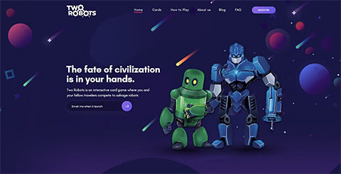
What does the design need to achieve? If it’s a logo or poster design, it needs to represent and communicate a brand’s name. For example, the purpose of the landing page design above is lead generation and brand awareness. It includes links to all relevant information about the upcoming product, with the most visual emphasis on capturing potential clients’ emails. It’s simple, and effective, and solves the problem of engaging users by capturing their emails before the product launches. If a design achieves its most basic goal, then it’s an effective one.

Source: https://99designs.com/blog/tips/evaluate-design-quality/
Is the message easy to understand?
A great design will ensure your message is instantly readable by guiding your audience’s eyes through the content. The visual hierarchy of a design determines which elements they should be looking at in what order. Most cultures read from the top of a page from left to right. Above all else, your text needs to be legible, with well-executed design principles and typography to ensure your viewers can read it quickly and easily. In this digital age, our attention spans are shorter than ever, and most people will stop looking at a design if they have to work too hard to find the information they need.
Typography mistakes, like using too many fonts, poor visual hierarchy, bad typeface choice and not including enough white space, will make your design look less professional and harder to read.
Source: https://99designs.com/blog/tips/evaluate-design-quality/
Is it aesthetically pleasing?
This is probably the most subjective part of evaluating graphic design. What is appealing to one person might be hideously ugly to another. However, you generally want your designs to look beautiful to help them make a more professional and credible impression on an audience. Good design should be timeless, but taking advantage of a trendy look in more temporary designs like posters or flyers can be useful. If it’s a logo design, you want it to be long-lasting, avoid overused trends, and not look dated in a year. At the end of the day, aesthetic trends will come and go no matter what you do but don’t get so lost in vying for a certain look that you lose focus on differentiating yourself and communicating your brand.
Source: https://99designs.com/blog/tips/evaluate-design-quality/
Is the style appropriate for your audience?
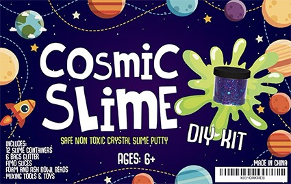
Most of the time, you’re not designing for yourself—you’re hoping to create a design that will appeal to a specific audience. They won’t always be able to explain why a design resonates with them, but they’ll have certain expectations for how a design should look. A rainbow-coloured palette wouldn’t be appropriate for a finance website because most clients are looking for a consultant who is reassuring, by-the-book and trustworthy. Conversely, research shows that children prefer bright colours, so it makes more sense to appeal to them with more colourful designs.

Source: https://99designs.com/blog/tips/evaluate-design-quality/
Is the design original?
While nothing is truly original, it’s important to avoid copyright infringement, strive for creativity and make your brand stand out from the competition. The meaning of “originality” depends on the type of design you’re dealing with. If it’s a logo design, you better make sure it’s as unique as possible because you need to be able to trademark it and your trademark application will get rejected if you use a copied design or one that looks too similar to an existing design. Even big companies like Airbnb have had to deal with coincidental trademark similarities like that.
It’s difficult to create a brilliantly simple and distinct logo design that doesn’t look similar to any other existing designs because so many ideas have already been taken and registered as trademarks. If a designer creates a logo that looks similar to an existing design, it’s not necessarily because they copied it—it’s because some logo concepts are really common and possible to arrive at independently of seeing those designs. This is why you need to research other designs in your market and avoid overly generic designs.

Source: https://99designs.com/blog/tips/evaluate-design-quality/

Seeking feedback from others is crucial for improving the quality and effectiveness of your design work. Here's how you can effectively solicit feedback from colleagues, clients, or stakeholders:
- Identify key stakeholders: Determine who the relevant stakeholders are for the project, including clients, colleagues, supervisors, or end users. Consider their expertise, perspectives, and roles in providing valuable feedback.
- Establish clear objectives: Communicate the purpose and objectives of seeking feedback. Define what aspects of the design you're seeking feedback on, whether overall layout, visual elements, usability, or specific design elements.
- Select feedback method: Choose the most appropriate method for collecting feedback based on the nature of the project and the stakeholders involved. Options include in-person meetings, written surveys, email communication, virtual presentations, or online collaboration tools.
- Provide context: Provide context for the design work being presented, including background information, project goals, target audience, and any constraints or requirements. Help stakeholders understand the rationale behind design decisions and the design's intended purpose.
- Present design work: Present your design work to stakeholders in person or through digital means. Clearly articulate key features, design choices, and areas where feedback is needed. Use visual aids, prototypes, or mockups to illustrate design concepts effectively.
- Encourage specific feedback: Stakeholders should provide specific, actionable feedback rather than general comments. Ask targeted questions about aspects of the design you're particularly interested in improving or refining.
- Listen actively: Listen attentively to the feedback provided by stakeholders, being open to different perspectives and suggestions. Instead, avoid becoming defensive or dismissive of criticism and focus on understanding stakeholders' viewpoints and concerns.
- Ask for clarification: If feedback is unclear or ambiguous, ask stakeholders to clarify their comments or provide additional context. Seek to fully understand the reasoning behind their feedback to inform your design decisions.
- Document feedback: Document the feedback received, including positive comments and improvement areas—Organise feedback by theme or category to identify patterns and prioritise areas for action.
- Implement changes: Use feedback to improve and refine your design work iteratively. Incorporate constructive feedback into subsequent design iterations, adjusting as necessary to address stakeholders' concerns and preferences.
- Follow-up: Follow up with stakeholders after implementing changes to the design to ensure that their feedback has been addressed satisfactorily. Thank them for their input and demonstrate how their feedback has influenced the final design outcome.
By actively seeking feedback from others and incorporating their input into your design process, you can gain valuable insights, improve the quality of your work, and foster collaborative relationships with stakeholders.
Being receptive to feedback, however, is its challenge. Personal thought processes and creativity are up for critique by fellow designers as well as laymen. However, to be effective, you need to learn not to take any reasonable design critique personally. For it to be useful, you must be able to interpret, assess, and apply it strategically to their process.
Explore
Read more about what to do if you receive negative feedback on your design.
Preparing for design feedback
Getting quality design feedback is essential to the collaborative, iterative design process. Moreover, the best way to ensure that the feedback is useful is to start with a design review presentation. A confusing or ambiguous detail can derail a meeting and spark a long, tangential discussion that has nothing to do with the design or the issue at hand. When soliciting design feedback on a particular solution, or trying to cultivate a meaningful discussion about an element of a design, the presentation sets the stage. An excellent presentation not only illustrates the solution but also connects the audience to the process that was used to get there. If the audience is asked to weigh in on several choices or to offer fresh ideas, the presentation should present the problem that needs solving, as well as cover the journey so far.
When presenting to a client, try to anticipate their point of view. Typically, a client will have a vaguely formed idea that they find difficult to express in design terms; they have entrusted you with realising their vision and shepherding it through the many pitfalls and challenges facing any production. Their response will be informed by many factors, including the product vision and hard reality of their business goals; they will be weighing not only the strength of the design but how well it aligns with these other factors. It is critical the presentation shows these factors have been considered and comprehensively explains how the design will achieve the client’s goals.
Feedback from designers

Fellow designers, developers, and other members of the team will, quite naturally, have different concerns. Other designers will be considering the success of the solution and offering critiques to help strengthen it. The project manager will want to understand how the solution fits within the project’s requirements and scope. Be thorough with the walkthrough, be sure to highlight areas where the intended audience may have concerns and the project will be well ahead of the game.
Design critiques can be intimidating at first. If feeling a bit uncertain, Facebook’s team documented and shared a full critique of a design solution to give insight into the process and discussion.
Reading
Read the following article which is a peek inside a Facebook design critique.
https://medium.com/designatmeta/peek-inside-a-facebook-design-critique-c4833efda26e
Keep calm and take notes
To avoid getting flustered or losing a critical point in the response, jot down a few notes as the audience is giving feedback. A side bonus to taking notes is that it will mitigate the impulse to interrupt. If presenting remotely, take advantage of a design feedback tool that captures the audience’s comments. Highlighting key takeaways from the discussion will not only help organize how to respond in turn but will help to strategize and apply the feedback to the next design iteration.
Positive design feedback doesn’t always mean a solution cannot be improved, and negative feedback doesn’t mean the presented ideas are terrible. Whatever the audience’s reaction, it is important to be open to their feedback without losing confidence in the original approach.
Careful preparation and focused attention on receiving input that will be most useful to the design process sets the stage for quality design critiques. Showing that the edge cases and implications of the design have been considered will foster confidence in the team’s process. If a designer can take the harshest criticism professionally, everyone involved can be confident in their process to iterate and evolve a solution efficiently.
Aspiration leads to success (and adversity). Success creates its adversity (and, hopefully, new ambitions). And adversity leads to aspiration and more success. It's an endless loop.Ryan Holiday, Ego Is the Enemy

Identifying future work opportunities in graphic design involves a combination of networking, continuous learning, and staying informed about industry trends. Here are some strategies to help you identify and secure future work opportunities:
- Build a strong online presence-portfolio website: Create a professional portfolio website showcasing your best work. Platforms like Behance, Dribbble, and Adobe Portfolio are excellent for this. Social Media: Use social media platforms like Instagram, LinkedIn, and Twitter to share your work, follow industry leaders, and connect with potential clients.
- Network within the industry-networking events: Attend industry conferences, workshops, and meetups. Events like AIGA conferences, Adobe MAX, and local design meetups can be valuable. Online Communities: Join online communities and forums such as Reddit’s r/graphic_design, Design Facebook groups, or LinkedIn groups related to graphic design.
- Freelance platforms-marketplaces: Register on freelance marketplaces like Upwork, Fiverr, and Freelancer. These platforms can help you find clients looking for graphic designers. Job Boards: Regularly check design job boards like We Work Remotely, Authentic Jobs, and Design Jobs Board.
- Stay updated with industry trends-blogs and magazines: Follow graphic design blogs and magazines like Smashing Magazine, Creative Bloq, and AIGA Eye on Design. Podcasts and Webinars: Listen to design-focused podcasts and attend webinars to stay current with new tools, techniques, and trends.
- Continuous learning courses and certifications: Enrol in courses on platforms like Coursera, Udemy, or Skillshare to learn new skills and software. Workshops: Participate in workshops that focus on new design trends and technologies.
- Specialise in niche markets: Consider specialising in a niche market such as web design, UX/UI design, branding, or motion graphics. This can make you more attractive to specific clients. Industry Focus: Focus on industries that are growing and often need design work, such as tech, e-commerce, and digital marketing.
- Collaborative partnerships: Partner with other professionals such as developers, marketers, or photographers to offer comprehensive services. Agencies: Work with design agencies or studios as a freelancer. This can lead to steady work and valuable industry connections.
- Client referrals-excellent service: Provide excellent service to your current clients to encourage repeat business and referrals. Ask for Referrals: Don’t hesitate to ask satisfied clients for referrals or testimonials.
- Personal projects and competitions Personal Projects: Work on personal projects to showcase your creativity and skills. These can also be added to your portfolio.
- Design competitions: Participate in design competitions. Winning or even participating can increase your visibility.
- Market yourself: Optimise your website for search engines to attract potential clients searching for graphic designers. Email Marketing: Use email marketing to stay in touch with past clients and inform them about your services and new projects.
- Tools and resources: Job Search Websites: Websites like Indeed, Glassdoor, and LinkedIn are good for finding both freelance and full-time graphic design positions.
- Newsletters: Subscribe to newsletters from design organisations and job boards to receive the latest job listings and industry news. By combining these strategies, you can increase your chances of finding and securing future work opportunities in the graphic design field.
This infographic illustrates some of the career options available for graphic designers.
Career Options for Graphic Designer
- Graphic Designer
- UX or User Experience Designer
- Logo Designer
- Product Designer
- Motion Designer
Explore
Access the link to read about the scope and trends in graphic design careers.
https://www.animaster.com/blogs/exploring-future-scope-and-trends-graphic-design/
