Creativity lies at the heart of design, and developing strong concepts is key to producing impactful work. This topic delves into design foundations, guiding you through generating and presenting ideas for 2-D and 3-D work.
In this topic, you'll explore various techniques for visually representing your concepts, developing production specifications to translate your concepts into tangible outcomes, and learn how to communicate your design proposals effectively. Building these skills allows you to transform your ideas into compelling designs that resonate with clients and meet project objectives.
Subtopics include:
- Exploring Design Foundations
- Generating and Developing Design Ideas
- Developing Production Specifications
- Presenting Design Ideas.
Tip
Gearing up for assessment: Creating and presenting your designs
As you work through this topic, the information you’ll focus on – generating, developing, and presenting your design ideas – are key to completing some of your project execution assessment tasks in:
- Part C of Assessment 2 (Project and Portfolio)
- Part A of Assessment 3 (Project and Presentation).
In those parts of the assessments, you'll create a design concept and present it as part of a final presentation to reflect both your design process and project outcomes. Use the guidance provided here to help you develop and present your graphic design ideas for communicating a unique design solution with a great impact.
Learning tasks that will help you develop and practise graphic design skills
Practice
Use your skills and build your knowledge on developing and presenting your ideas
Dive into this topic’s seven learning tasks confidently – they're your stepping stones towards knowing how to develop and present your ideas for 2-D and 3-D work. Completing these tasks will reinforce your knowledge and skills around generating and developing ideas and communicating your design proposals.
Look out for this PRACTICE box throughout this topic to identify learning tasks with instructions to let you know exactly what to do. The following information outlines what learning tasks to expect in Topic 4 and how much time you should allocate to each one.
| # | Learning task name | Duration |
|---|---|---|
| 12 | Check your knowledge – Elements of design | 5 minutes |
| 13 | Check your knowledge – Principles of design | 5 minutes |
| 14 | Check your knowledge – Visual representations | 5 minutes |
| 15 | Practice – Generate initial Barilla design ideas | 3-4 hours |
| 16 | Practice – Expand one of your Barilla design concepts | 2 hours |
| 17 | Check your knowledge – Visual proposals | 5 minutes |
| 18 | Practice – Create a visual proposal for Barilla | 3 hours |
Reach out for feedback and support if you have any questions about what to do!
This subtopic will guide you through key aspects of design foundations. It includes the following sections:
- Defining core elements of design
- Exploring how design principles shape visual composition
- Using visual representation types
- Examining the role of colour management in design
- Using typography to enhance design solutions.
Defining core elements of design
Knowing the fundamental elements of design is essential for creating visually compelling designs. Seven elements serve as the building blocks for all visual representations, whether for a logo, an advertisement, or an infographic. These elements provide the necessary basics for graphic designers to communicate ideas, evoke emotions, and draw the eye in a certain direction.
Select each of the seven design elements in the following interaction to reveal their characteristics and functions. Click the expand icon to enter fullscreen mode for a better view. When you're ready to return, click the icon again to exit fullscreen.
Important
Typography: A pivotal element that shapes your design’s message

While typography is not traditionally listed as one of the core elements of design, it plays a pivotal role in visual communication. Typography goes beyond mere font selection; it affects readability, sets the mood, and reinforces the overall message of your design. In graphic design, typography subtly yet powerfully shapes how information is perceived, making it essential to crafting effective and engaging visual compositions.
Find out more how typography can enhance your design solutions later in this subtopic.
Practice
Task 12: Check your knowledge – Elements of design
This quiz will help you check your understanding of the core functions of fundamental design elements. Each question will challenge you to consider how elements like line, shape, form, colour, value, space, and texture contribute to creating effective and engaging visual compositions. By evaluating these functions, you’ll reinforce your ability to apply these principles in your graphic design projects.
What steps should you take to complete this task?
Set aside 5 minutes to complete this knowledge check.
- This quiz has seven questions. Read each question carefully. Make sure you understand what is being asked before attempting an answer.
- Provide the most accurate and complete answers you can. If a question stumps you, make an educated guess based on your knowledge.
- Don't let difficult questions discourage you. Stay confident and do your best. Remember, it's a learning opportunity, and not a formal assessment!
- Once you've reviewed your answer and are satisfied, click the ‘Check button’ to see if you chose the correct answer. You can also retry questions and show solutions.
What should you do after completing this task?
It’s time to delve into how design principles shape effective visual compositions. Knowing these principles will help you see how elements interact to create cohesive and visually compelling designs and using them will enhance your ability to craft graphic designs that not only meet client needs but also engage and communicate effectively with your audience.
Exploring how design principles shape visual composition
As with design elements, knowing design principles is essential for crafting compelling visual designs. These principles guide the arrangement and interaction of the elements into a composition and help enhance visual harmony and effectively communication of the intended message. Each principle contributes uniquely to how elements are organised and perceived in a design.
Select each of the eight design principles in the following interaction to reveal their characteristics. Click the expand icon to enter fullscreen mode for a better view. When you're ready to return, click the icon again to exit fullscreen.
Case Study
Transforming brand identity: Applying design principles for cohesive and impactful visuals

In the case of DesignStudio’s redesign of the Airbnb brand identity, the ‘Belo’ logo sat at its heart. Several key design principles were exemplified:
- Balance: The symmetrical, uniform design of the logo creates visual stability and harmony.
- Emphasis: The distinctive shape and strong contrast of the logo draw attention and reinforce the brand’s core values.
- Movement: The smooth, curved design guides the viewer’s eye, contributing to a seamless visual experience.
- Pattern and repetition: The adaptable logo design ensures consistent brand identity across various mediums.
- Rhythm: The logo’s continuous curves create a sense of visual flow and coherence.
- Proportion: The design maintains effectiveness across different sizes and contexts.
- Variety: Adaptability to different colours and contexts adds visual interest and flexibility.
- Unity: All elements of the logo work together to deliver a cohesive and unified brand message.
Review the Airbnb case study to see how these principles contribute to creating a compelling and effective design.
How do design principles help guide design elements in graphic design?
These principles don't just guide the placement of elements; they actively shape how a design communicates its message. By using principles such as balance, emphasis, and movement, graphic designers can create compositions that are both visually appealing and effective in delivering their intended message.
Select + to look at how design principles relate to design elements as applied to product packaging examples.
Balance ensures that elements like objects, colours, textures, and spaces are evenly distributed to create visual stability.
Example: Coca-Cola’s packaging maintains balance with its iconic red label and white logo cantered on the bottle, with ample space around it to ensure visual stability and focus.

Emphasis uses differences in size, colour, or texture to draw attention to specific elements and highlight their importance.
Example: Toblerone uses a distinct triangular shape and bold typography to emphasise the brand name and product uniqueness, making it stand out on shelves.

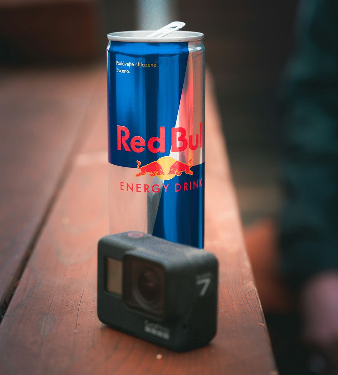
Movement guides the viewer's eye through the design by creating a visual path or flow.
Example: Red Bull cans use diagonal lines and vibrant colours that guide the viewer’s eye across the packaging, enhancing the sense of energy and dynamism associated with the brand.
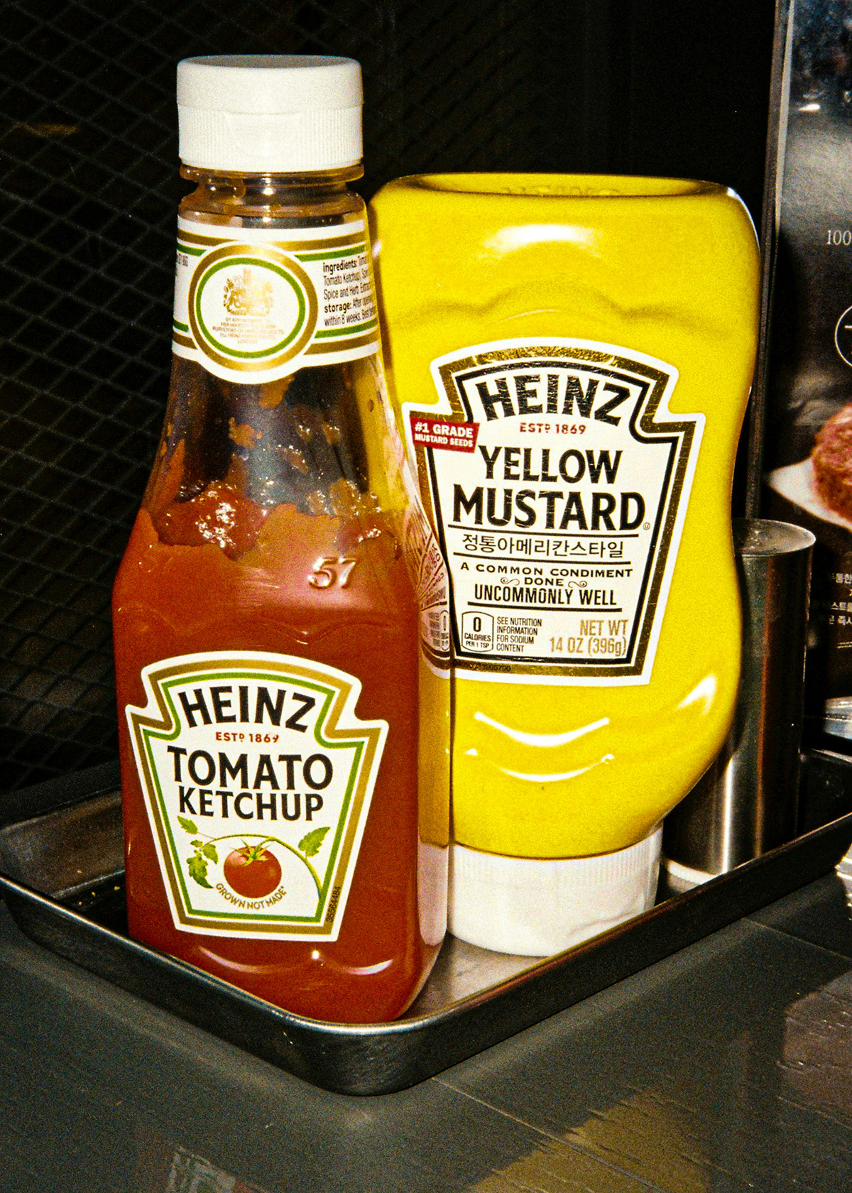
Pattern and repetition use repeating elements to create a cohesive and unified look, reinforcing the design's identity.
Example: Heinz ketchup bottles feature a consistent pattern of stripes and shapes, along with repeated use of the logo, which reinforces brand identity and creates visual cohesion.
Rhythm repeats certain elements to establish a visual tempo, guiding the viewer's eye through the design in a dynamic and organised manner.
Example: Apple’s iPhone packaging uses rhythmic placement of product images and text, creating a clean and organised visual flow that enhances the unboxing experience.

Proportion refers to the relative size and scale of elements within a design to create harmony or emphasis.
Example: Chanel No. 5 uses proportion to emphasise the elegance of the bottle design, with a larger, distinctive cap and a sleek, slender bottle that conveys luxury and sophistication.

Variety incorporates different design elements to maintain interest and guide the viewer's eye.
Example: Ben & Jerry’s ice cream containers use a variety of colours, playful illustrations, and fonts to create a visually engaging packaging that attracts attention and reflects the fun nature of the brand.

Unity ensures all elements work together to create a cohesive and harmonious design.
Example: Nike’s shoe boxes use consistent branding elements, colours, and logo placement across different products to create a unified brand experience and reinforce brand identity.

Practice
Task 13: Check your knowledge – Principles of design
Take the following quiz to reinforce your understanding of how design principles function in visual composition. It will test your knowledge of how these principles guide the arrangement of design elements, helping you better understand their role in creating visually compelling compositions.
What steps should you take to complete this task?
Set aside 5 minutes to complete this knowledge check.
- This quiz has eight questions. Read each question carefully. Make sure you understand what is being asked before attempting an answer.
- Provide the most accurate and complete answers you can. If a question stumps you, make an educated guess based on your knowledge.
- Don't let difficult questions discourage you. Stay confident and do your best. Remember, it's a learning opportunity, and not a formal assessment!
- Once you've reviewed your answer and are satisfied, click the ‘Check button’ to see if you chose the correct answer. You can also retry questions and show solutions.
What should you do after completing this task?
Now that you’ve explored the design principles and their impact on creating visually compelling compositions, it’s time to turn your attention to the crucial role of colour management. Understanding colour management will further enhance your ability to produce graphic designs that are aesthetically striking and functionally effective across different media. This knowledge will empower you to refine your ideas for both 2-D and 3-D work, ensuring your designs resonate with your audience and meet professional standards.
Using visual representation types
Each iteration of a design benefits from exploring and applying different methods of representation, which can uncover new ways to communicate ideas and solve design challenges. By iterating —adjusting, testing, and refining— on these visual elements, you can elevate your work to better meet the project’s objectives.
The four visual representation types covered in this section are:
- Text and typography
- Illustrations and drawings
- Information visualisation
- Symbolic correspondence.
Text and typography
Text and typography focus on organising and presenting written information:
- Text represents language and ideas through written characters and symbols
- Typography transforms text into a visual form that affects its perception and interpretation.
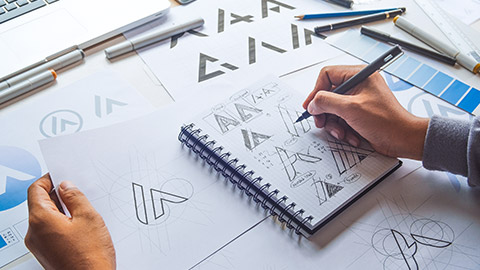
Contrasting text sizes to create a visual hierarchy.
The role of text and typography layout influences readability, visual hierarchy, and overall aesthetic appeal. Properly structured text can enhance communication and ensure that key information stands out.
Techniques used with text and typography
The following table outlines common techniques used with text and typography and how these techniques can be applied in graphic design work:
| Technique | Description | Application to graphic design |
|---|---|---|
| Using grids | Organises text into a structured layout, making complex information easier to read. Gridded text helps create consistent and readable layouts. | Designing a 2-D product brochure, where text and images are aligned to a grid for a clean and professional layout. In 3-D signage, text and symbols align along structural elements for clarity. |
| Contrasting text sizes | Creates visual hierarchy by differentiating headings from body text. Larger text for headings and smaller text for body copy guides readers' attention. | A 2-D packaging design for a product, with the brand name in large text and smaller product details below. In a 3-D display design, oversized labels guide viewers’ attention to key areas. |
| Adequate spacing and paragraphing | Improves readability and appearance by avoiding clutter. Ensures the text is easy to read and follow. | Designing text for an exhibition banner in 3-D where spacing is key to allow the viewer to read from a distance. In a 2-D poster, ample line spacing enhances readability of long-form text. |
| Balanced image-to-text ratios | Creates engaging layouts by integrating images with text effectively. | A 2-D print ad where product visuals complement the messaging, or a 3-D interactive digital kiosk where icons and text are equally balanced for user interaction. |
Illustrations and drawings
Illustrations and drawings enhance visual clarity and creativity. They provide a creative way to convey ideas, often simplifying complex concepts and adding visual interest.
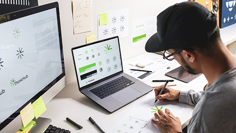
Sketching an abstract representation, i.e. a logo design.
Illustrations can clarify and enhance understanding, while drawings can provide precision and clarity for technical or complex information, in addition to artistic touches.
Techniques used with illustrations and drawings
The following table outlines common techniques used with illustrations and drawings and how these techniques can be applied in graphic design work:
| Technique | Description | Application to graphic design |
|---|---|---|
| Abstract representation | Uses simplified, non-realistic illustrations to convey messages without unnecessary details. | In a 2-D logo design, using abstract shapes to represent a brand’s identity, such as a geometric icon for a tech company. In 3-D product packaging, abstract illustrations are used to represent ingredients or product features without direct representation. |
| Detailed drawings | Offers clear, intricate visual representations to aid comprehension and communication of complex ideas. | For 2-D instructional manuals, using precise drawings to explain product assembly or processes. In 3-D architectural rendering, detailed sketches of building designs show the specifics of materials and structures. |
Information visualisation
Information visualisation transforms complex data into accessible graphical formats.
It helps users understand complex data quickly and interactively, making it easier to interpret and act on information.
Techniques used with information visualisation
The following table outlines common techniques used with information visualisation and how these techniques can be applied in graphic design work:
| Technique | Description | Application to graphic design |
|---|---|---|
| Data charts, graphs, infographics | Converts raw numerical data into graphical formats to present information clearly and concisely. | Using bar graphs to compare sales figures for different products in a marketing brochure. Creating infographics to showcase project timelines in a presentation. |
| Interactive elements | Allow users to explore and understand complex data sets dynamically. | Designing interactive dashboards for client websites where users can filter and view project metrics. Incorporating clickable charts in a digital portfolio to display design processes. |
| Layered information | Combines multiple data types in a single visual, integrating various data layers to offer a comprehensive view. | Creating a 3-D model that overlays different layers of information, such as material properties, colour variations, and lighting effects for a product design presentation. Using heat maps to show user engagement across various sections of a website design. |
Symbolic correspondence
Symbolic correspondence uses universally recognised symbols to convey information efficiently.
Symbols provide immediate understanding and streamline communication by removing the need for text explanations.
Techniques used with symbolic correspondence
The following table outlines common techniques used with symbolic correspondence and how these techniques can be applied in graphic design work:
| Technique | Description | Application to graphic design |
|---|---|---|
| Recognisable icons | Represent functions or actions with universally understood symbols, such as the magnifying glass icon for searching. This technique is commonly used in user interfaces to simplify navigation. | Designing icons for a mobile app that guide users through different features, such as a shopping cart icon for purchases or a home icon for navigation. |
| Standardised signs | Convey specific information, like restroom symbols, which clearly and efficiently guide users without additional text. | Implementing standardised symbols in signage design for an exhibition layout to direct attendees efficiently to various sections. |
Practice
Task 14: Check your knowledge – Visual representation types
This quiz will help you check your understanding of types of visual representation. Each question will challenge you to consider the techniques and principles that enhance communication and effectiveness in your designs.
What steps should you take to complete this task?
Set aside 5 minutes to complete this knowledge check.
- This quiz has ten questions. Read each question carefully. Make sure you understand what is being asked before attempting an answer.
- Provide the most accurate and complete answers you can. If a question stumps you, make an educated guess based on your knowledge.
- Don't let difficult questions discourage you. Stay confident and do your best. Remember, it's a learning opportunity, and not a formal assessment!
- Once you've reviewed your answer and are satisfied, click the ‘Check button’ to see if you chose the correct answer. You can also retry questions and show solutions.
Examining the role of colour management in design
Colour is more than just a visual element in design; it’s a powerful tool that influences perception, communicates brand identity, and evokes emotional responses. Understanding colour management is crucial for creating designs that are not only visually appealing but also effective in conveying your intended message throughout the design workflow.
To illustrate the profound impact of colour on graphic design, dive into a practical example through a video (5:32 mins) from Satori Graphics that explores how different colour choices can completely transform designs for a coffee bag and a cosmetic.
By watching this video, you'll gain insights into how colour choices can make a design stand out and connect with its audience, setting the stage for a deeper understanding of the importance of using colour management in design to ensure that:
- colours are consistently reproduced from the initial concept to the final output, enhancing the clarity and impact of your design proposals
- your final designs’ colour choices resonate with clients and meet project objectives.
What is colour management and why is it important?
Colour management is the process of controlling how colours are displayed and reproduced throughout your design workflow.
This process ensures that the colours you envision in your 2-D or 3-D designs are faithfully represented from digital screens to printed outputs – different devices reproduce colours differently as do the different monitors used in the process. The colour you see is not always the same during each stage of the graphic design workflow!
Effective colour management is therefore crucial for maintaining the integrity of your designs, avoiding discrepancies, and achieving the desired visual impact.
The effect of colour inconsistency on your design projects
Inconsistent colour reproduction can undermine the strength of your design concepts, leading to miscommunications and a disconnect between your creative vision and the final output. For example, a branding project might lose its intended impact if colours appear differently in print than on a digital screen.
What techniques are used to ensure accurate colour representation?
You can use three key techniques to ensure accurate colour reproduction:
- Colour profiles: Implementing standardised colour profiles to maintain consistency across devices.
- Calibration: Regularly adjusting your monitors and printers to maintain accurate colour representation.
1. Implementing standardised colour profiles to maintain consistency
Colour profiles are essential in the design process for ensuring that colours are consistently represented across different devices and media. They act as a standardised reference for how colours should appear, enabling different devices (such as monitors, printers, and scanners) to communicate colour information accurately.
What are colour profiles?
Colour profiles are data files that describe the colour attributes of a device or colour space. They define how colours should be interpreted and displayed based on the characteristics of the device or medium. The primary purpose of colour profiles is to maintain colour consistency across various devices and ensure that colours look the same regardless of where they are viewed or printed.
There are three common colour profiles:
| Colour profile | Description |
|---|---|
|
sRGB (Standard Red Green Blue)
|
This is the most common colour space used for digital screens and web content. It represents a range of colours that are suitable for typical displays and is often used as a default profile for many devices. |
|
Adobe RGB (1998) |
This profile has a wider colour gamut than sRGB, especially in the green and cyan areas. It’s commonly used for high-quality printing and professional photography, as it can represent more vibrant colours. |
|
CMYK (Cyan, Magenta, Yellow, Black)
|
This colour profile is used for colour printing. It describes how colours are mixed using these four ink colours, which is crucial for ensuring that printed colours match the intended design. |
Below is a Colour Gamut diagram that illustrates the different colour spaces represented by these three colour profiles. The diagram shows how Adobe RGB (orange triangle) encompasses a wider colour gamut compared to sRGB, particularly in the green and cyan regions:
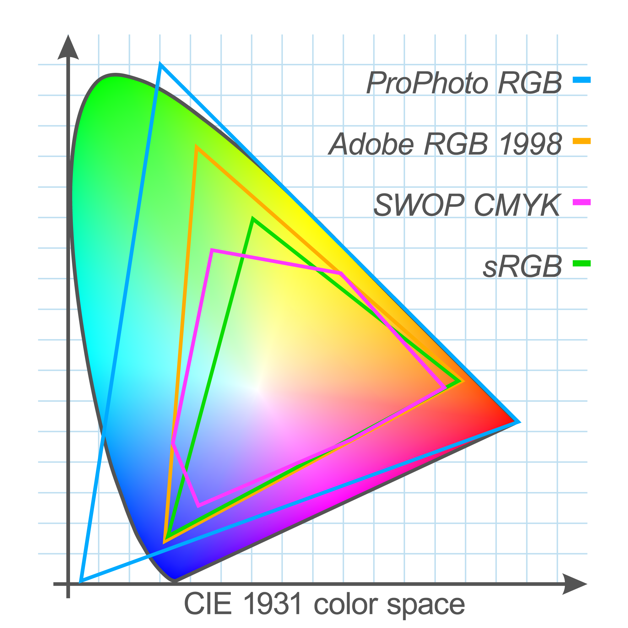
Colour Gamut Diagram highlighting the colour ranges of sRGB, Adobe RGB (1998), and CMYK profiles.
Why do colour profiles matter?
Consistency: Using the appropriate colour profile ensures that the colours you see on your monitor are accurately represented in your printed materials. For example, a design created in Adobe RGB might look different if viewed on a device using sRGB, due to the difference in colour gamut.
Precision: Colour profiles help achieve precise colour matching, especially in professional settings where accurate colour reproduction is critical. For instance, designers working on brand materials must ensure that the brand colours remain consistent across all marketing materials, from digital ads to printed brochures.
How do you implement colour profiles in your workflow?
Follow these four steps to implement colour profiles in your workflow:
| Step | Action |
|---|---|
| 1. Choose the right profile |
|
| 2. Profile embedding |
|
| 3. Profile conversion |
|
| 4. Profile management |
|
By selecting the appropriate profile for your projects and ensuring proper calibration and conversion, you can achieve accurate colour reproduction and effectively communicate your design vision across various media.
2. Calibrating your monitor for consistent colour display
Proper calibration ensures that your monitor displays colours accurately, which is essential for designing graphics that will be reproduced in print or on other screens. Without calibration, you might make design decisions based on colours that do not match the final output, leading to discrepancies and potential rework.
Why does periodic calibration matter?
Monitors can change in colour accuracy due to various factors such as aging, temperature changes, and prolonged use.
Regular calibration (monthly or quarterly recalibration is recommended) helps ensure that any shifts in colour accuracy are corrected, maintaining the integrity of your design work. This is particularly important for professional environments where colour precision is critical for delivering consistent and high-quality results.
How can software and hardware enhance monitor calibration?
To achieve accurate colour representation, using the right tools for monitor calibration is crucial. Both software and hardware play important roles in this process, ensuring that your monitor displays colours as consistently and accurately as possible.
Select + to find out more about calibration tools.
Calibration software is designed to guide you through the calibration process. These programmes provide step-by-step instructions, adjust monitor settings, and use test patterns to help achieve accurate colour reproduction. Key features often include:
- Interactive Instructions: Guides you through the calibration process, offering visual and step-by-step instructions.
- Profile Creation: Generates and saves custom colour profiles for your monitor, ensuring consistency in colour display.
- Regular Reminders: Many software tools offer reminders for periodic recalibration to maintain accuracy over time.
Hardware tools, such as colourimeters and spectrophotometers, are used to measure and adjust the colour output of your monitor. These devices ensure precise colour accuracy by:
- Measuring Colour Accuracy: Devices like colourimeters measure the colour output of your monitor and compare it to standardised colour profiles.
- Adjusting Monitor Settings: Hardware calibration tools can adjust brightness, contrast, and colour balance automatically.
- Providing Detailed Reports: They offer detailed reports on colour accuracy and consistency, helping you fine-tune settings for optimal results.
To further explore the practical aspects of monitor calibration, watch the following video from Vashi Nedomansky (11:45 mins). It provides a step-by-step guide on how to colour calibrate your monitors using both software and hardware tools and provides an overview of colour management in design.
Reflection
As you transition from examining colour management to exploring how typography enhances design, consider how these elements interact to enhance your 2-D and 3-D design projects:
- Colour and typography synergy: How will consistent colour reproduction support the effectiveness and legibility of your typefaces across different media?
- Consistency and clarity: How does maintaining accurate colour representation impact the readability and visual hierarchy of your typography? How do well-managed colours ensure that text remains clear and impactful, whether viewed on a screen or in print?
- Design cohesion: How can integrating colour with typographic choices contribute to a cohesive design presentation? How does harmonising colour and typography enhance the overall visual appeal and communicate your design concepts more effectively?
Considering these aspects will help you better understand how to manage colour and use typography to develop and present your design ideas with greater precision and impact.
Using typography to enhance design solutions
Typography is not just about arranging text—it's a key design element shaping how audiences experience and interpret written content. Beyond its basic function of making text readable, typography adds depth, personality, and clarity to a design. It involves carefully choosing and arranging fonts, sizes, and spacing to create text that resonates with the intended objective and audience.
The power of typography
In graphic design, typography is vital for setting your work's tone, mood, and ‘visual voice’. The right typographic choices can transform a simple message into something powerful and memorable, enhancing the design's overall effectiveness. Conversely, poor typography can diminish a design’s impact, making it difficult to read or visually unappealing.
Swipe through the six typefaces below, and how observe how each typeface affects the readability, mood, and overall aesthetic of the sample text (i.e. the typeface name). Consider how the different fonts might be used in different design contexts to achieve specific effects or align with brand identities.
How did each typeface – i.e. the tone or mood of the text – make you feel? Which typefaces enhances readability and accessibility, and which might hinder these aspects? How would you apply these typefaces in real-life design projects?
In this section, you'll explore key considerations when choosing typefaces and applying typography in various design contexts. These aspects are crucial for crafting visually engaging and cohesive designs and effectively presenting the ideas you've generated during your projects' brainstorming and concept development phases, whether you're working on 2-D or 3-D work.
What are key considerations to address when making typographical choices?
The key considerations to address when selecting a typeface include:
- Readability and accessibility
- Consistency and brand identity.
Readability and accessibility
When selecting a typeface, ensuring readability and accessibility is paramount. This involves considering how the typeface performs across different formats and sizes, and making sure it caters to diverse audiences.
Important aspects include:
| Key aspect | Description | Example |
|---|---|---|
| Font size and scaling | Choose typefaces that remain legible at various sizes. Consider testing the typeface at smaller sizes to ensure it remains clear and easy to read. | 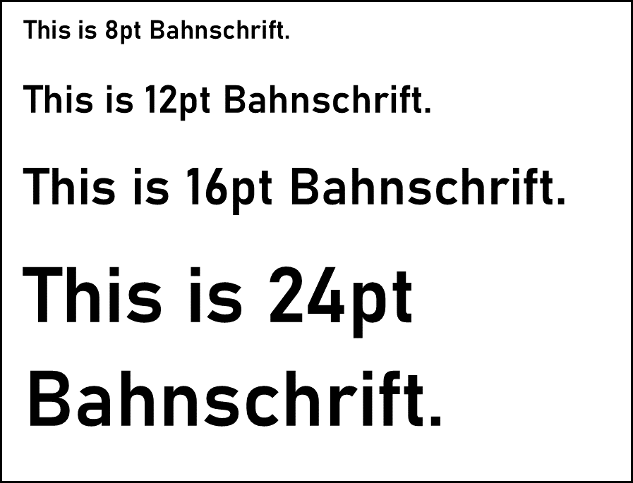 |
| Line spacing (or Leading) | Adequate line spacing improves readability. Adjust leading to prevent lines from appearing too cramped or too loose. | 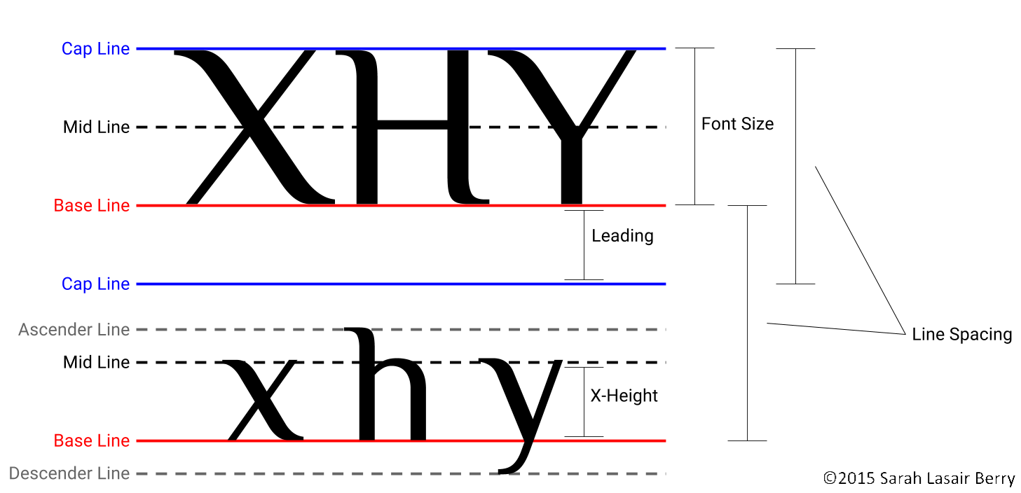 |
| Contrast and colour | Ensure there is sufficient contrast between the text and its background. This is especially important for users with visual impairments. |  |
| Font weight and style | Use font weights and styles (like bold or italics) judiciously to maintain readability without overwhelming the reader. |  |
Consistency and brand identity
In addition to readability and accessibility, typography plays a significant role in shaping and maintaining a brand's identity. The typeface you choose should align with the brand's personality and remain consistent across all design elements to create a cohesive and recognisable visual identity. This consistency reinforces the brand’s message and helps build trust with the audience.
Key aspects of consistency and brand identity include:
| Key aspect | Description | Example |
|---|---|---|
| Typeface selection | Choose a typeface that reflects the brand's personality. Whether the brand is professional, playful, modern, or traditional, the typeface should visually communicate those traits. | A law firm may use a classic serif font, while a tech company might opt for a sleek sans-serif. |
| Uniformity across platforms | Ensure that the typeface is used consistently across all design platforms, including websites, print materials, and marketing campaigns, to create a unified brand experience. | A retail brand using the same font for website headers, in-store signage, and packaging. |
| Typographic hierarchy | Establish a clear typographic hierarchy (headings, subheadings, body text) and maintain it consistently across all materials to guide the reader through the content efficiently. | A website using a bold font for headings, a medium font for subheadings, and a regular font for body text. |
| Alignment with visual identity | The typeface should complement other brand elements, such as colour schemes, logo design, and imagery, to create a harmonious and visually appealing identity. | A luxury brand combining elegant fonts with gold accents and minimalist logo design. |
Case Study
Apple’s typography

Overview
Apple’s use of typography plays a critical role in shaping its brand image, which focuses on simplicity, innovation, and elegance. Apple's product designs, packaging, advertisements, and website all feature a clean and minimalist typographic approach, often using sans-serif fonts. Their type choices convey a sense of modernity and sophistication, aligning with their high-tech product line and design philosophy.
Key aspects
- Typeface selection and brand identity: Apple primarily uses the San Francisco typeface, a sleek and minimalist sans-serif font created in-house. It reflects Apple’s modern, forward-thinking brand identity. The simplicity of the typeface aligns with Apple’s minimalist product design, ensuring a seamless and elegant brand experience across all touchpoints.
- Readability and accessibility: Apple emphasises readability in all its communications. The San Francisco typeface was designed to perform well across various screen sizes and resolutions, from the Apple Watch to the largest Mac displays. The attention to typography ensures clarity and legibility on all devices, an essential feature for digital accessibility. Apple's website and product interfaces also carefully consider line spacing, font size, and contrast to ensure users can easily read content.
- Consistency across platforms: The San Francisco typeface is consistently used across Apple’s ecosystem, from iOS interfaces to product packaging, websites, and marketing materials. This consistency ensures a unified brand experience, making the user interface and overall visual communication feel cohesive and polished.
Consider your designs
- How can typographic choices enhance the communication of your design proposals for 2-D and 3-D work?
- In what ways can typography influence how your design ideas are perceived by clients or stakeholders?
- How can you integrate consistent typography into your visual representation techniques to ensure your designs resonate with the project’s objectives?
Typography in different design contexts
Typography can play diverse roles depending on the context in which it is applied. Whether working on 2-D or 3-D design projects (or both), understanding how typography interacts with space, layout, and physical elements is crucial for creating cohesive and impactful designs.
2-D contexts: Typography for print and digital layouts
In 2-D design, typography must balance aesthetics with functionality. Whether it's a brochure, poster, website, or app interface, type should guide the viewer’s focus and communicate information clearly. Effective typography in 2-D design can enhance readability, create visual hierarchy, and establish mood or tone.
Key considerations for 2-D design
- Readability and legibility: Typefaces must be easy to read across various formats, from printed materials to digital screens.
- Hierarchy and structure: Use different font sizes, weights, and styles to establish a clear typographic hierarchy that directs the reader's eye.
- Alignment and spacing: Proper use of line spacing (leading), letter spacing (tracking), and alignment can ensure that the layout feels balanced and cohesive.
Swipe the following five print and digital layouts. As you examine each design, consider how typography directs your focus and enhances the overall composition. What roles do hierarchy, font choice, and alignment play in guiding the viewer's attention?
3-D contexts: Typography in spatial environments
In 3-D contexts, such as packaging, environmental graphics, or signage, typography interacts with physical elements to create a cohesive visual experience. Designers must consider the impact of lighting, perspective, and physical placement on the readability and effectiveness of type.
Key considerations for 3-D design
- Interaction with physical space: Typography in 3-D design must account for how viewers will move around and interact with the space or object.
- Legibility from different angles and distances: Type should be easily readable from various angles and distances, ensuring it maintains impact whether viewed up close or from afar.
- Material and surface: Consider how different materials and surfaces (e.g., cardboard, glass, fabric, metal) can affect the visibility and perception of type.
Explore the following examples of 3-D typography used in packaging, signage, or installations. Consider how the type interacts with the physical environment, and how these considerations could influence your own 3-D design work.
Explore
Align typography with purpose, audience, and readability.
Selecting the right typography involves more than just choosing fonts; it’s about how text is used and arranged to enhance the design's purpose. Here’s how to approach it:
- Understand the design's purpose: Consider the target audience and the medium of display—whether it’s a billboard or a food package. The typography should align with your project’s objectives and resonate with the intended audience.
- Ensure scalability: Make sure the typeface remains readable across various sizes and formats. Start with simple, universally legible fonts and then experiment with styling options (such as bold or italic) as needed.
To explore this further, watch the following video (8:14 mins) by Will Paterson for a step-by-step guide on selecting fonts and aligning them with your design’s purpose and audience.
Reflect on the following to integrate the video's key messages into your work:
- Audience consideration: How does understanding the target audience influence your choice of typography? Consider how the emotions and characteristics you want your typography to convey impact the design’s effectiveness for different audiences (e.g., a playful font for a preschool flyer vs. a serious font for a lawyer’s business card).
- Font selection: How does the choice of typography align with the purpose of your design? Reflect on how different types of fonts—serif, sans-serif, and script—can communicate various moods and expectations. How will you select fonts that resonate with your design’s intent and audience’s expectations?
- Function and legibility: How do you ensure that your chosen typography is both functional and legible? Reflect on how the readability of the typography impacts the overall design and consider the context in which the typography will be used (e.g., print vs. digital formats). What steps will you take to ensure the typography meets these functional requirements?
- Pairing fonts: How will you approach pairing fonts to create visual harmony in your designs? Reflect on strategies for combining fonts effectively, such as using contrasting styles or fonts from the same family. How can you apply these techniques to enhance the cohesiveness of your design?
In Exploring Design Foundations, you’ve dived into key design principles, elements, colour management, and typography. With these insights, you’re ready to move to the next subtopic – Generating and Developing Ideas – where you’ll apply this knowledge to generate and develop creative concepts.
In the next subtopic, where you’ll generate and develop your design ideas, reflect on the following:
- How can the design principles and elements you’ve learned help you in brainstorming and concept development? Consider how you can apply these concepts to generate creative and relevant design ideas.
- In what ways can you use critical and creative thinking techniques to evaluate and refine your design options? Think about how you can assess your ideas against the design brief and make informed decisions during the development process.
- What techniques and media might you experiment with to explore new possibilities for your design? Reflect on how trying different methods can help you visualise and refine your concepts effectively.
- How can considering innovative approaches influence the development and iteration of your design concepts? Consider how fresh perspectives and new ideas can enhance your design and align with the project’s goals.
By integrating your foundational knowledge with your creativity, you'll be well-prepared to develop comprehensive and compelling design solutions.
This subtopic will guide you through key aspects of generating and developing design ideas. It includes the following sections:
- Exploring critical and creative thinking techniques
- Exploring sources for inspiration
- Translating ideas and iterations into visual formats
- Considering different approaches
- Experimenting with techniques, tools, and media
- Evaluating ideas and options.
Stage 4 of graphic design workflow: Brainstorm and concept development.
Exploring critical and creative thinking techniques
Creating a successful design involves blending critical and creative thinking to thoroughly explore, analyse, and refine your ideas. This section will guide you through techniques to generate and develop design concepts, fostering a comprehensive and innovative approach to concept design.
BARILLA DESIGN PROJECT

Igniting creativity: Barilla's packaging brainstorm
In the effort to modernise Barilla’s packaging while preserving its classic Italian heritage, Kelley and Lee engage in a dynamic brainstorming session. They combine critical and creative thinking techniques to guide their process:
- Exploring design philosophies: Kelley and Lee critically evaluate contrasting design approaches, such as minimalism versus ornate styles, to determine how each aligns with Barilla's brand identity. They carefully consider the potential impact of these styles on brand perception and market appeal.
- Creative ideation: Using ideation tools like mind mapping, brainstorming, and SCAMPER, they explore a range of design possibilities. This process allows them to blend traditional elements with contemporary aesthetics, generating innovative ideas that honour Barilla’s heritage while introducing fresh, modern elements.
- Critical evaluation: Kelley and Lee apply critical thinking by assessing the feasibility and effectiveness of each design concept. They analyse the credibility of their sources, identify potential biases, and consider broader implications to ensure the final design supports Barilla’s strategic objectives.
By integrating both critical and creative thinking, Kelley and Lee develop a packaging solution that not only respects Barilla’s legacy but also appeals to modern consumers—a process you can explore further below.
How can you apply critical thinking to solve design problems?
In graphic design, critical thinking involves more than just evaluating visual elements; it requires assessing information, questioning assumptions, and understanding the broader context of design decisions.
To enhance your knowledge of critical thinking skills, watch the video from Macat below (2:29 mins). It covers essential techniques for questioning, evaluating, and making informed design decisions.
Critical thinking techniques in graphic design
Consider how the following critical thinking techniques can be used to evaluate design briefs, assess client feedback, and make strategic design choices:
| Technique | What is this technique? | Why use it? |
|---|---|---|
| Collecting necessary information | Gathering detailed information about client objectives, target audience, and market trends to make informed design decisions. | Comprehensive research provides a solid foundation for design decisions, ensuring that the final product meets the client's needs and aligns with market expectations. |
| Questioning assumptions and biases | Assessing initial assumptions and biases to ensure the design aligns with the target audience’s preferences. | By challenging preconceptions, designers can create more relevant and user-centred designs that resonate with the intended audience. |
| Evaluating sources for credibility and accuracy | Analysing the methods used to collect data and evaluating the reliability of sources to ensure accuracy and avoid flawed information. | Ensures that the information used is trustworthy and relevant, preventing the incorporation of incorrect or biased data into the design process. |
| Understanding design assumptions and biases | Identifying and addressing biases or assumptions that could affect the design to ensure objectivity and alignment with client needs. | Helps to create designs that are objective and based on a thorough understanding of the client's requirements, rather than preconceived notions. |
| Looking at the bigger picture | Considering the broader context and long-term implications of design decisions to ensure they fit into the overall brand strategy. | Ensures that design decisions are consistent with the brand's long-term goals and strategies, contributing to a cohesive brand identity. |
| Examining causes and effects | Analysing the potential outcomes of design choices to understand their impact on user experience and engagement. | Helps in anticipating how design elements will affect users, leading to more effective and engaging design solutions. |
Reflection
Collaborate to innovate: Leveraging collective critical thinking in graphic design
In graphic design, effective problem-solving often involves collaboration. Working with others allows you to pool diverse insights and perspectives, which can lead to more robust and innovative design solutions. Engaging in collaborative critical thinking helps ensure that your design work is comprehensive, user-cantered, and strategically aligned.
Take a few minutes to think about how applying critical thinking techniques collaboratively can enhance your design projects:
- How can gathering detailed information together with your contributors help ensure that all perspectives are considered, leading to a more comprehensive design solution?
- In what ways can questioning each other's assumptions and biases foster a more creative and user-centred design process?
- How can evaluating the credibility of sources as a team help ensure that all information used in the design process is reliable and accurate?
- Why is it important to discuss and address design assumptions and biases collectively to ensure your design is objective and aligned with client needs?
- How does considering the broader context and long-term implications of design decisions as a team contribute to a more cohesive and strategic brand identity?
- What benefits can come from collaboratively examining the causes and effects of design choices to enhance viewer experience and engagement?
Reflect on these aspects to understand how collaborative critical thinking can improve your design practice and lead to more successful outcomes.
How can you use creative thinking to generate innovative design ideas?

Creative thinking fuels innovation by allowing designers to push boundaries and explore new possibilities. In graphic design, creativity is essential for developing compelling and original concepts.
Creative thinking techniques in graphic design
Think about how the following creative thinking techniques can be used to stimulate your creativity in the brainstorming and concept development stage of the graphic design workflow.
| Technique | What is this technique? | Why use it? |
|---|---|---|
| Gathering inspiration | Exploring various sources such as art, nature, and technology to spark creativity and generate new ideas. | Provides a diverse range of influences that can lead to innovative design solutions and unique visual concepts. |
| Interpreting the design brief | Analysing the design brief to ensure creative ideas align with project goals, target audience, and desired outcomes. | Ensures that creative ideas are relevant and targeted, meeting the project’s objectives and resonating with the audience. |
| Ideation and conceptualisation | Brainstorming and generating a range of ideas, using SCAMPER (see below), or creating mood board, and sketching concepts to explore different design possibilities. | Facilitates the exploration of various creative solutions and visual styles, allowing designers to choose the most promising concepts for further development. |
| Refinement and selection | Evaluating and refining a range of ideas, creating mood boards, and sketching concepts to select the most effective solutions. | Involves iterating on ideas to improve their quality and feasibility, ensuring that the final concept is polished and practical. |
| Execution and craftsmanship | Applying technical skills and artistic abilities to execute the final design with attention to detail and precision. | Ensures that the final design is well-crafted, visually appealing, and technically proficient, reflecting the designer’s skill and attention to detail. |
Explore
SCAMPER: a tool to help you ideate and conceptualise
Explore an ideation tool called SCAMPER to help you generate innovative ideas. Watch the video below (6:31 mins), where Michael from Bizarre Design Lab demonstrates SCAMPER using an example with a peanut butter product. This technique is valuable for graphic designers looking to break free from conventional approaches and explore new possibilities.
SCAMPER in graphic design
- Substitute: Consider what elements of your design can be replaced with something else. For example, replacing traditional fonts with unique ones or swapping colour schemes to create a fresh look.
- Combine: Look for ways to merge different design elements. Combining various graphic styles, colours, or patterns can result in innovative and engaging designs.
- Adapt: Think about how you can modify your design to fit different contexts or needs. This could involve adjusting the layout for different media or adapting the design for various audience segments.
- Modify: Change aspects of your design, such as size, shape, or colour intensity. Modifying these elements can lead to new and interesting outcomes.
- Put to Another Use: Explore alternative uses for your design elements. For instance, a graphic meant for a website could be adapted for print materials or social media.
- Eliminate: Identify elements that can be removed without affecting the design’s effectiveness. Simplifying your design can often lead to a stronger and more focused visual impact.
- Reverse: Flip or rearrange elements of your design to view them from a different perspective. This might involve reversing the order of visual elements or exploring unconventional layouts.
Using SCAMPER in your design process
Incorporate SCAMPER into your design process to enhance creativity and innovation. By systematically applying each step of SCAMPER, you can uncover new ideas and approaches that might not be immediately obvious. Whether you’re working on a branding project, a marketing campaign, or any other design challenge, SCAMPER can help you push the boundaries of conventional thinking and create standout designs.
Practice
Task 15: Generate initial Barilla design ideas
Use creative thinking techniques to address the Barilla design brief, focusing on brainstorming and concept design. By using techniques such as SCAMPER or mood boards and sketching concepts, generate a diverse range of ideas to tackle the design challenge presented by Barilla. This task is aimed at helping you enhance your ability to think creatively, ensuring that your eventual finalised designs are innovative and polished.
What tools or resources do you need for this task?
- Barilla design brief.
- Documentation tool (e.g., Word, Google Docs) for recording ideas, sketches and reflections.
- Design software (e.g., Adobe Illustrator, Adobe XD) for creating and organising digital mood boards and sketching concepts
- Pencil and paper if sketching concepts
What steps should you take to complete this task?
Set aside up to three to four hours to complete steps 1-5 below. Remember to save your work as you go.
- Review the Barilla design brief (15 minutes): Revisit the Barilla design brief to ensure a clear understanding of the project requirements and objectives. Recall the goals, target audience, and key specifications that have been previously documented and evaluated.
- Choose your creative thinking technique (10 minutes): Decide whether to use the SCAMPER technique, create a mood board, or sketch concepts to explore your design ideas. You may use one or a combination of these methods based on what best suits your approach.
- Apply the chosen technique(s) (45 minutes):
- SCAMPER: Use the SCAMPER technique to brainstorm and generate ideas by substituting, combining, adapting, modifying, putting to another use, eliminating, or reversing elements related to the Barilla design brief.
- Mood Board: Create a mood board to visually represent ideas, colour schemes, and design elements that align with the brief. Include images, textures, and other inspirational materials.
- Sketching: Develop sketches to explore various design concepts and visual approaches. Focus on different layouts, compositions, and visual styles.
- Compile and review your concepts (30 minutes): Organise and review the ideas generated through SCAMPER, mood boards, or sketches. and discuss them with others to gain diverse perspectives. Select the most promising concepts, considering how well they address the Barilla design brief and incorporating feedback received during collaboration.
- Save your design concepts (20 minutes): Prepare a brief report summarising your creative process, chosen concepts, and how they address the Barilla design brief. Include your SCAMPER analysis, mood board images, and/or sketches, along with a summary of collaborative feedback.
What should you do after completing this task?
- How would integrating critical thinking techniques into your use of SCAMPER, mood boards, or sketches alter your approach to generating ideas? In what ways can combining critical thinking techniques with your creative process enhance the brainstorming process?
- Share your design concepts to forum:
- Select your forum thread in the Coursework Forum.
- Select Reply to your first Forum post.
- Enter the words ‘Task 15: Ideas’ in your new post.
- Select the Post your response button, then select Edit in your reply when it shows up.
- Upload your coursework in the Attachment field.
- Select Save changes to share your coursework to your forum thread.
- Post constructive feedback on other students’ coursework and receive feedback on your coursework from your tutor and other students.
- In the next section, explore how to gather and consider a diverse range of sources for inspiration. This step is crucial for broadening your creative perspective and ensuring that your design concepts are not only innovative but also aligned with current trends and client expectations. By incorporating varied sources of inspiration, you can apply the insights gained from critical thinking to refine and enrich your design solutions, ultimately leading to more impactful and well-informed design outcomes.
Exploring sources for inspiration
Enhance your skills in gathering and evaluating diverse sources to inform your design concepts during the concept development phase.
This section will guide you in identifying various sources of design inspiration and understanding the implications of intellectual property. By exploring a broad spectrum of visual references and trends, you'll enrich your design process, ensuring that your ideas are innovative and ethically sound.
BARILLA DESIGN PROJECT

Translating ideas: Visual formats for Barilla's packaging
To ensure that their designs are innovative and aligned with contemporary market trends, Kelley encourages Lee to explore a broad range of visual references and packaging design trends. This exploration serves as a foundation for their creative process, ensuring that the final designs are both fresh and ethically sound.
- Exploring sources: The team gathers inspiration from various packaging styles, including eco-friendly designs, minimalist aesthetics, and vibrant modern patterns. By looking beyond their immediate project, Lee and Kelley gain valuable insights into how current trends can influence consumer perception while remaining true to Barilla’s identity.
- Initial concept sketches: Lee creates hand-drawn sketches to quickly experiment with different packaging layouts. He explores variations in logo placements, text arrangements, and illustrations, striving to achieve a balance between modern and classic design elements.
- Low-fidelity digital mock-ups: Using Adobe Illustrator, Lee transfers his sketches into digital form, producing clean, low-fidelity mock-ups. This approach allows Kelley and Lee to present polished yet flexible visual representations of their ideas to stakeholders, facilitating early feedback.
- Feedback and refinement: After reviewing the mock-ups with Barilla’s marketing team, Lee incorporates their feedback into the design, refining elements such as font styles and visual hierarchy. This iterative process of developing and refining mock-ups ensures that the final design will resonate with both modern consumers and those loyal to Barilla's traditional identity.
This comprehensive exploration and iterative feedback loop empower Kelley and Lee to create a packaging solution that harmoniously integrates contemporary design with Barilla's rich heritage.
What are key sources for design inspiration?
Sources that enrich your concept development
To develop a well-rounded concept, it’s crucial to explore a diverse range of sources for inspiration.
Select + to find out about four different types of sources that can provide unique insights and enrich your creative process:
Websites such as Behance, Dribbble, and DeviantArt offer a wealth of visual examples and current design trends. These platforms allow you to view portfolios from a variety of graphic designers, giving you insight into innovative techniques and styles.
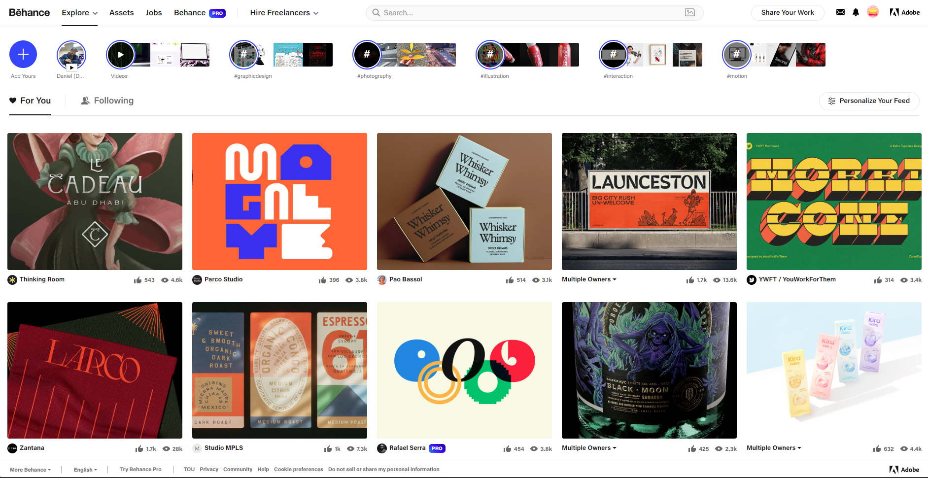
Behance, a social media platform owned by Adobe that showcases and discovers creative work.
Published design books provide a deep dive into historical and contemporary design principles. These resources are valuable for understanding different design movements, methodologies, and the evolution of design aesthetics over time.
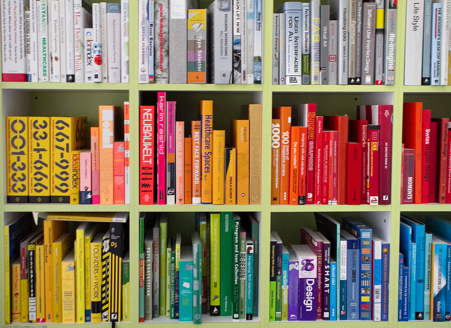
Dive into books that unveil the evolution of aesthetics and the methodologies shaping graphic design, from classic movements to modern trends.
Investigating different periods of art history can offer a broader perspective on design. Understanding movements such as Impressionism, Cubism, and Modernism can inspire new approaches and add depth to your design thinking.
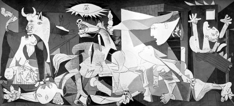
Picasso’s ‘Guernica’ (1937). Cubism’s use of abstraction and fragmentation shows how graphic designers can break down and reassemble visual elements to create impactful and innovative designs.
Keeping up with current trends helps ensure that your designs are relevant and contemporary. Following design blogs, industry magazines, and social media can keep you informed about the latest developments and emerging styles in the design world.

Leverage social media platforms wisely to capture the pulse of current graphic design trends and emerging styles.
Organising and documenting your sources
Organising and documenting your sources is essential for keeping track of your inspiration, maintaining workflow efficiency, and ensuring that all relevant materials are easily accessible during the design process.
By implementing effective methods for managing both digital and physical resources, you can streamline your creative process and avoid losing valuable ideas.
Digital tools
Select + to find out about three recommended digital tools that offer powerful solutions for organising your design inspiration and references.
Create custom boards in Pinterest to categorise different types of inspiration, such as colour schemes, typography, or visual styles. Pinterest’s intuitive design makes it easy to add notes, descriptions, and links for future reference. For collaborative projects, you can share boards with team members to keep everyone aligned.
OneNote, part of the Microsoft Office Suite, allows you to store images, articles, and design notes all in one place. You can tag each entry with specific keywords related to your project, making it easy to filter and find the references you need at different stages of the design process. OneNote syncs across devices, allowing you to access your materials anywhere, whether on your desktop or mobile.
Adobe’s Creative Cloud libraries and platforms like Figma are ideal for storing assets related to your design work. You can upload images, colours, and design elements into libraries that can be accessed directly within your design projects, ensuring seamless integration and organisation of your inspiration.
Physical documentation
In addition to digital tools, many designers still work with physical materials like printed books, samples, and design mock-ups.
Select + to find out about three organisational systems to help you efficiently manage these physical resources.
For physical references like printouts, magazine clippings, or sketches, creating well-labelled folders or binders allows you to neatly store and categorise items by project, theme, or source. Consider adding dividers to further organise sections, such as separating inspirational images from technical resources or sketches.
If you’re working with many physical materials, consider creating a catalogue or index where you document the location of each reference. A simple numbering system or spreadsheet can keep track of physical items, enabling quick retrieval when needed.
Dedicate a specific area of your workspace to store physical materials. Organise by project or material type and use labelled storage bins or shelves to keep everything accessible. Keeping an orderly space helps maintain a smooth creative process and ensures that nothing gets lost in the shuffle.
Translating ideas into visual formats
This section helps you explore how to translate your design concepts into visual formats that communicate your ideas clearly and facilitate client feedback throughout the design process.
How do you translate ideas into visual formats?
Translating your ideas into visual formats is a fundamental step in the graphic design workflow. This involves using various techniques to communicate your concepts effectively and to test their viability.
Translating abstract ideas into visual formats is a crucial skill in the graphic design workflow. It involves transforming your initial concepts into tangible designs that can be clearly communicated to clients, stakeholders, and team members.
Here are the key steps and actions to help you translate your ideas into effective visual formats, followed by more information for each step:
| Step | Action |
|---|---|
| 1. Start with sketches or low-fidelity mock-ups | Create rough hand-drawn sketches or simple digital mock-ups to outline key design elements and communicate early ideas. |
| 2. Develop digital mock-ups and prototypes | Use tools like Adobe Illustrator or Adobe XD to refine your ideas into a more detailed mock-up or interactive prototype. |
| 3. Explore visual references and trends | Research industry trends and gather visual references from platforms like Behance or Dribbble to enrich your design. |
| 4. Iterate and refine | Collect and apply feedback from stakeholders to improve the design concept, refining it through at least one iteration. |
1. Start with sketches or low-fidelity mock-ups
One of the first steps in bringing an idea to life is creating sketches or low-fidelity mock-ups. These quick, rough representations allow you to outline key design elements, experiment with layout, and communicate the general direction of your project. This stage is especially helpful for early-stage feedback and iteration.
- Sketches: Hand-drawn sketches are an excellent starting point for exploring visual concepts. They offer flexibility and speed, allowing you to rapidly explore different options for typography, colour schemes, and layouts.
- Low-fidelity mock-ups: Once the sketches are refined, you can create low-fidelity digital mock-ups using design software like Adobe Illustrator or Adobe XD. These are simplified digital representations that help communicate ideas without overwhelming stakeholders with too much detail early on.
2. Develop digital mock-ups and prototypes
As your design progresses, the next step is to develop detailed digital mock-ups or interactive prototypes. These provide a more realistic representation of the final product and allow for testing and feedback on specific aspects like functionality, usability, and user experience.
- Digital mock-ups: Mock-ups are highly detailed and resemble the final design in terms of colour, typography, and layout. Tools such as Adobe Photoshop or Adobe InDesign are commonly used to create digital mock-ups that can be shared with clients or teams for feedback.
- Prototypes: For more interactive designs, such as websites or apps, creating prototypes that simulate user interaction is key. Adobe XD is used to develop prototypes that allow users to navigate through different elements of the design, helping you test functionality before moving into production.
3. Explore visual references and trends
Remember that a vital part of translating ideas into visuals is the use of visual references and industry trends. By studying relevant design works, such as modern packaging, digital layouts, or typographical treatments, you enrich your designs with fresh ideas and ensure they stay contemporary. It’s also essential to incorporate intellectual property and ethical considerations into your design process.
- Visual references: Collect inspiration from industry design trends, historical works, or market leaders. Platforms like Pinterest, Behance, or Dribbble are great sources for visual inspiration.
- Trend analysis: Keep your designs modern by staying updated on industry trends in typography, colour theory, and layout design. This not only ensures your work remains competitive but also allows your design to connect with the target audience effectively.
4. Iterate and refine
The process of translating ideas into visual formats is iterative. Each iteration refines the design based on feedback, whether it’s from clients, teammates, or usability tests. This is where designs are fine-tuned, ensuring they align with the project’s objectives and meet user needs.
- Feedback integration: Incorporating constructive feedback at each stage is essential for refining your work. Always remain open to changes and suggestions, as they can lead to more effective design solutions.
By following these steps, you’ll be able to turn abstract ideas into visually engaging and well-structured designs that effectively communicate your concepts, meet client needs, and adhere to industry standards.
Considering different approaches
When generating and developing design ideas, it's essential to embrace new and unconventional approaches. Exploring innovative formats, experimenting with alternative visual styles, and considering emerging trends will enhance your design work, helping you stay adaptable and relevant in an ever-changing industry.
This section encourages you to think outside the box and push the boundaries of your designs by trying out new concepts. Being open to different approaches fosters flexibility and creativity—two key attributes that elevate your designs and expand your creative process.
BARILLA DESIGN PROJECT

Designing for tomorrow: Infusing fresh trends into Barilla
Kelley and Lee reflect on the effectiveness of their current concepts while considering new and unconventional approaches. They explore innovative design trends and technologies that could enhance the packaging, using this stage to think outside the box and ensure the final design remains fresh and relevant.
Lee suggests incorporating emerging design trends, such as sustainable packaging materials and simple, clean icons that highlight ingredient information. He believes these modern elements can elevate the traditional packaging, making it more appealing to a younger audience while aligning with current consumer preferences for sustainability and transparency.
What about different formats and layouts?
Exploring different formats and layouts can spark innovative design solutions that stand out and engage users more effectively. As you push the boundaries of traditional design structures, your work can evolve into something that is not only visually appealing but also functional and memorable.
The following table outlines different types of formats to experiment with, providing descriptions and practical examples to inspire your creative process:
| Format | Description | Example |
|---|---|---|
| Unconventional layouts | Breaking away from traditional grid structures to create dynamic presentations. Uses asymmetry, layering, or free-form arrangements to offer a more artistic or organic feel. | A magazine spread with overlapping text and images in irregular shapes for a more immersive experience. |
| Fold-out brochures and interactive layouts | Designs that unfold or expand to reveal additional information, or web layouts that include interactive elements. Encourages user engagement through unexpected reveals or interactions. | A restaurant brochure that unfolds into a full menu experience; an interactive portfolio website with click-triggered animations. |
| Innovative product packaging | Packaging designs that include multifunctional or reusable elements, providing additional value and functionality beyond simple containment. Focuses on sustainability and practicality. | Coffee packaging that folds into a reusable coaster or container. |
| Mixed media designs | Designs that blend physical and digital elements, such as integrating QR codes or AR features, to create immersive user experiences. | A clothing brand package with AR features that allow customers to view the garment in different colours through a mobile app. |
Pushing boundaries through interactive formats
Using formats that invite interaction adds value to both the user and the product. When designing packaging, for instance, think about how it could serve a secondary purpose once the product is removed. This makes the packaging more sustainable, adds a surprise element for the consumer, and makes the brand memorable.
For example, a tea box could transform into a decorative storage container once the tea bags are finished, or a skincare package could be reused as a holder for small bathroom items like cotton pads or soaps.
Important
Keeping it real
Experimenting with new formats is not about mastering complex tools like 3-D software right away, but about finding creative ways to improve your designs within your skill set. Even small changes in layout or format can make a significant impact on the effectiveness of your design.
Don’t feel pressured to create overly ambitious designs that require advanced 3-D software skills. The focus is on experimenting within your current capabilities. You can achieve fresh and innovative designs by working with 2-D elements or basic mock-ups to communicate your ideas.
If you feel inspired to explore more complex formats, you can still visualise your concepts using simple tools like mock-up templates or prototyping apps. For instance, if you're designing packaging, you could experiment with:
- Simple reusable elements, such as labels that can be repurposed.
- Foldable packaging designs that can be sketched or represented through simple 2-D mock-ups instead of requiring complex 3-D visualisations.
This approach ensures your design remains accessible while still pushing the boundaries of traditional formats.
Breaking design norms for innovation
Understanding and strategically breaking traditional design rules can lead to innovative outcomes.
For a visual guide on breaking these norms effectively, watch the video from Satori Graphics below (7:47 mins).
Important
Caveat: Know the Rules Before You Break Them
It’s crucial to understand the foundational rules and principles of design before you attempt to break them. Mastering the basics provides the context needed to innovate effectively. Knowledge of and practising traditional design elements helps you apply rule-breaking techniques purposefully and ensures that your experiments enhance rather than undermine your design goals.
The following table summarises key points from the video on how to challenge traditional design approaches:
| Design element | Traditional approach | Breaking the rule |
|---|---|---|
| Colour choices | Use harmonious colours suited to specific industries (e.g., blue for finance, green for organic products). | Experiment with contrasting or unexpected colour combinations to create striking visuals and evoke strong reactions. This can make your design more memorable and impactful. |
| Grid systems | Adhere to grid systems for alignment and visual harmony. | Manipulate or disregard grid structures to create emphasis and visual interest. Techniques such as overlapping imagery or misaligned text can highlight key features and add dynamism to your design. |
| Design trends | Follow current design trends to ensure relevance and appeal. | Deviate from trends to foster creativity and originality. Design beyond the latest trends to develop unique and innovative work that reflects your personal style. |
| Design norms | Use colours and design elements that align with industry standards (e.g., using colours linked to specific sectors). | Challenge conventional design norms to stand out and differentiate your work. Assess if non-traditional approaches could better communicate your message. |
Applying these approaches to your work
To effectively integrate these unconventional approaches into your design process:
- Experiment with colours: Test contrasting or unconventional colour schemes to create unique visual effects. Evaluate their impact on your design’s message and effectiveness.
- Play with grids: Break or manipulate traditional grid systems to enhance emphasis and visual interest. Use techniques like overlapping elements or misaligned text to add creativity to your design.
- Balance trends and originality: Decide when to follow trends and when to innovate beyond them. Use trends to inform some aspects of your design while ensuring your work remains original and aligned with project goals.
- Challenge design norms: Use unconventional design choices to make your work stand out. Evaluate if breaking from traditional norms can enhance the communication and impact of your design.
- Start small: Begin experimenting with rule-breaking techniques within your current skill set. Use basic tools and mock-ups to test new ideas before advancing to more complex designs.
Balancing innovation with practicality
While it’s important to think creatively and push boundaries, keep in mind the practical side of design, such as cost-effectiveness and functionality. As you experiment with new approaches, ensure they align with the project's overall objectives and remain user-friendly.
Experimenting with techniques, tools, and media
Iterating your design concepts is a vital part of the creative process. Experimentation with various techniques, tools, and media allows you to explore new possibilities and make informed decisions about your final designs. Experimentation allows you to test ideas, evaluate their effectiveness, and enhance your design outcomes.
Digital techniques
Experimenting with different design techniques enables you to discover how various methods can enhance your creative process. By engaging with digital techniques, you can test and adapt your ideas, leading to more effective and polished designs.
For example, digital techniques like vector art and digital manipulation allow you to create precise, scalable designs and to enhance photographic elements. Additionally, 3-D modelling can add depth and realism to your concepts, providing a more immersive experience for your audience.
The table below outlines three key digital techniques and how these techniques can be applied in graphic design work:
| Technique | Description | Application to graphic design |
|---|---|---|
| Vector art | This technique uses mathematical equations to create images that can be resized without losing quality, making it perfect for designs requiring scalability. | Use software like Adobe Illustrator to create logos, icons, and geometric shapes that maintain clarity across various sizes and formats. Vector art is essential for branding and marketing materials that require versatility. |
| Digital manipulation | This technique involves altering or enhancing images digitally, allowing for creative freedom and precise adjustments to achieve desired aesthetics. | Use Adobe Photoshop to combine textures, add visual effects, and manipulate photographs to create compelling visuals. This technique is crucial for enhancing product images or creating intricate designs for advertisements. |
| 3-D modelling | This technique creates a three-dimensional representation of an object or scene, providing a realistic preview that aids in visualising how designs will look in real-world applications. | Use software like Adobe Dimension to develop 3D models of product designs or architectural concepts, allowing for exploration of depth, lighting, and texture before finalising designs for production or presentation. |
Explore
Maximise your design potential
Remember to use the Software module as a resource to get a head start with your 2-D graphic design software skills. This module includes a library of video tutorials designed to help you succeed in this current module.
For 3-D design, refer to the Introduction topic of this module for tutorials on Adobe Dimension. Adobe Dimension is a powerful tool for creating high-quality, photorealistic 3-D visuals by integrating 2-D assets into 3-D environments. It also integrates seamlessly with other Adobe Creative Cloud applications. Find additional Adobe Dimension tutorials and resources in the Introduction topic to help you get started.
Digital tools and media
The choice of tools and materials can significantly impact how your designs are realised. Experimenting with different digital tools and physical materials allows you to see how various resources can bring your design ideas to life.
The table below outlines three key digital tools you should consider experimenting with:
| Tool/media | Description | Application to graphic design |
|---|---|---|
| Adobe Illustrator | A vector graphics editor that allows for creating scalable and precise designs using vector-based graphics. | Ideal for crafting logos, icons, and geometric shapes, ensuring crisp quality at any size. Use it for branding and print materials where scalability is crucial. |
| Adobe Photoshop | A raster graphics editor specialising in photo editing, image manipulation, and texture blending. | Perfect for enhancing images, adding effects, and combining multiple textures. Essential for advertising, web design, and digital art projects where visual impact is key. |
| Adobe Dimension | A 3-D design tool that enables the creation and visualisation of 3-D models, integrating 2-D assets into a 3-D environment. | Useful for developing product mock-ups and visualisations, allowing designers to see how their concepts will look in a real-world context, enhancing presentation quality. |
Explore
Play with your software!
Experiment with different vector effects and gradients in Adobe Illustrator to create various styles and impacts. Try using the Pen Tool to create intricate shapes and explore the Pathfinder panel to combine or cut paths for unique designs.
Use layering techniques, blending modes, and custom brushes in Adobe Photoshop to develop unique visual styles. Experiment with adjustment layers to fine-tune colours and contrast and try out different filters and effects to enhance your images.
Integrate 2-D assets into 3-D environments using Adobe Dimension to see how they translate into real-world scenarios. Explore different lighting setups and camera angles to find the most effective way to present your designs.
Hybrid approaches: Integrating traditional and digital methods
Combining traditional and digital methods involves a process that capitalises on the strengths of traditional (i.e. sketching, painting, collage, printmaking) and digital methods to enhance your design outcomes. This process allows for a dynamic fusion of tactile and digital elements, resulting in more nuanced and distinctive designs.
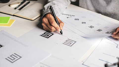
Graphic designer sketching a logo concept before digital transfer.
The table below outlines three key steps in this process:
| Step | Description | Application to graphic design |
|---|---|---|
| 1. Initial sketching | Begin with hand-drawn sketches to capture the raw, creative essence of your ideas. Traditional sketching fosters a free-flowing, intuitive exploration that can be challenging to replicate digitally. | Use initial sketches for brainstorming logo concepts, layout ideas, or character designs to establish a solid foundation for further development. |
| 2. Digital refinement | Transfer hand-drawn sketches into a digital format using software such as Adobe Illustrator or Photoshop. This stage allows for precise lines, detailed adjustments, and the addition of rich textures. | Refine sketches to create polished illustrations or vector graphics that can be used in marketing materials, websites, or product packaging. |
| 3. Combining elements | Use digital tools to integrate and manipulate various visual components. Incorporate hand-drawn textures, adjust colours, and apply effects to blend traditional and digital elements seamlessly. This step adds depth, personality, and a unique touch to your final design. | Create a cohesive design by mixing digital graphics with hand-painted textures for branding projects, social media graphics, or print advertisements. |
Experimenting with different design techniques, tools, and materials is essential for developing and refining your ideas. By integrating various methods—both digital and traditional—you can uncover new creative possibilities and enhance your final designs.
Evaluating ideas and options
Evaluating ideas and options is another vital part of the Concept Development stage, ensuring that the final work is effective, relevant, and aligned with the project brief. This stage involves using critical thinking techniques to assess the viability of concepts, allowing you to determine which designs best meet project objectives.
BARILLA DESIGN PROJECT

Navigating design choices: Aligning with brand objectives
Kelley and Lee review the various design concepts generated during their brainstorming sessions. They evaluate each idea against the design brief and Barilla’s brand values, assessing how well each concept meets the brief’s objectives, such as appealing to a younger audience while maintaining the brand’s premium image.
Kelley establishes evaluation criteria for assessing their design options, focusing on alignment with brand identity, visual appeal, and practicality. Using these criteria, Kelley and Lee select the most promising design concepts for further development, ensuring a balance between modern appeal and traditional elements.
This structured evaluation process not only clarifies their design direction but also reinforces the integrity of Barilla's brand throughout the project.
How do you evaluate your design ideas?
When working on a graphic design project, it is essential to review various design concepts generated during your previous brainstorming sessions.
Each concept should be assessed against the project brief, focusing on how well it meets the project objectives and appeals to the target audience.
Consider the following factors:
- Alignment with project objectives: Does the design concept address the key goals outlined in the brief? Is the target audience clearly defined, and does the concept cater to their needs?
- Visual appeal: Is the design aesthetically engaging? Does it capture the audience's attention effectively? Consider aspects like colour schemes, typography, and overall composition.
- Practicality: Can the design be realistically executed within the available timeframe and resources? Have you considered technical requirements for production, such as file formats and dimensions?
Evaluation checklist for design ideas
As you evaluate your design ideas, it helps to use an actual evaluation checklist. Consider the following five evaluation criteria and their checklist questions as a guide.
Note: Any evaluation checklist used during concept development should be tailored to the unique project requirements and design business processes.
| Evaluation criteria | Checklist questions |
|---|---|
| 1. Alignment with brief |
|
| 2. Aesthetic appeal |
|
| 3. Practicality and feasibility |
|
| 4. Innovativeness |
|
| 5. Feedback techniques |
|
Tip
Reflect on the process to refine your approach
To ensure continuous improvement in your design projects, evaluating how effectively feedback has been integrated into your design is essential. Follow these steps:
- Evaluate feedback integration: Assess how well the feedback was incorporated into the final design concept. Determine if the changes made based on feedback improved the overall quality and effectiveness of the design.
- Reflect on outcomes: Consider the results of the feedback integration. Does the final design concept meet the project goals and client expectations? Analyse whether the design enhancements addressed the feedback and contributed to the project’s success.
- Identify improvement areas: Identify areas where feedback integration could be improved in future projects. Reflect on what worked well and what could be done differently to enhance the design process and outcomes.
By regularly reflecting on how feedback has influenced your graphic designs, you can refine your approach and achieve better results in future projects.
Practice
Task 16: Expand one of your Barilla design concepts
Enhance your design process by exploring a diverse range of sources for inspiration. Revisiting your previous design concepts (including your mood boards and/or sketches) will allow you to build on existing ideas while integrating new perspectives and trends. By the end of this task, you will have updated one of your concepts with fresh insights and documented your sources, ensuring a robust foundation for your creative concepts.
What tools or resources do you need for this task?
- Your design concepts
- Documentation tool – continue using Word or Google Docs to record your ideas, document your updated concepts, and reflect on your process. You could try using MS OneNote to organise your research notes, images, and design ideas effectively.
- Design software (e.g., Adobe Illustrator, Adobe XD) to create low-fidelity digital mock-ups.
- Sources – refer to online galleries, design books and social media for current trends and design examples. Ensure you take into account IP considerations to respect the rights of others.
What steps should you take to complete this task?
Set aside up to two hours to complete steps 1-5 below. Remember to save your work as you go.
- Review and reflect on your previous design concepts (15 minutes)
- Revisit the design concepts you created in Task 15.
- Reflect on the sources and inspirations that were included in your design concepts. Consider how these sources influenced your initial ideas and identify any gaps or areas for further exploration.
- Explore additional sources (45 minutes)
- Research: Use a variety of resources such as online galleries (e.g., Behance, Dribbble), design books (if accessible), and contemporary design trends to find new sources of inspiration.
- Document: Make notes on these additional sources and their potential impact on your design ideas. Pay attention to how these sources can enhance or refine your existing concepts.
- Compile findings (30 minutes)
- Update one of your design concepts: Incorporate the new inspirations and insights into one of your existing design concepts.
- ocument sources: Prepare a summary document detailing the sources you explored and how they influenced your design.
- Update your work (30 minutes)
- Integrate any new inspirations into your design concept. Ensure that your updated design concept represent a well-rounded collection of design elements.
- Write a brief summary explaining the sources used and their impact on your design.
What should you do after completing this task?
- How did exploring additional sources alter or enhance your design concept? In what ways did the process of documenting and organising diverse sources influence your approach to updating your design concept?
- Share your expanded design concept and summary of sources you used to forum:
- Select your forum thread in the Coursework Forum.
- Select Reply to your first Forum post.
- Enter the words ‘Task 16: Expand ideas’ in your new post.
- Select the Post your response button, then select Edit in your reply when it shows up.
- Upload your expanded design concepts in the Attachment field.
- Select Save changes to share your coursework to your forum thread.
- Post constructive feedback on other students’ coursework and receive feedback on your coursework from your tutor and other students.
In this topic's final subtopic subtopic, find out how to create compelling visual presentations of your design proposals and develop clear, explanatory information to support them. This will ensure that your ideas are communicated effectively and professionally, helping you to present your work in the best possible light. But first, learn about developing production specifications.
This subtopic will guide you through key aspects of developing production specifications. It includes the following sections:
- Role of production specifications
- Key components of production specifications
- Clarifying production specifications.
Role of production specifications

Bridging conceptual ideas to execution through production specifications.
Production specifications play a crucial role in the design process, serving as a bridge between conceptual ideas and their practical execution. By detailing the requirements and standards necessary for production, a production specification ensures that the creative vision is effectively realised while maintaining consistency and quality.
A well-crafted production specification plays a vital role in:
- clarifying project objectives, ensuring all team members share a common understanding.
- helping stakeholders comprehend their roles and responsibilities.
- providing a comprehensive overview of product needs, aiding stakeholders in making informed choices.
- helping ensure that the product meets necessary quality benchmarks.
How do production specifications and design specifications interrelate?
Production specifications and design specifications serve distinct but complementary roles in the design process.
- Design specifications focus on the aesthetic and conceptual aspects of a project, detailing elements such as dimensions, colour schemes, typography, and layout that align with the creative vision.
- In contrast, production specifications concentrate on the technical and practical requirements necessary for bringing that vision to life, including file formats, resolution, and production methods.
Together, these specifications ensure a cohesive transition from design to production; the design specs inform the production specifications, while the production specifications provide the guidelines needed to execute the design effectively, ensuring that the final product meets both creative and technical standards.
Key components of production specifications
A product specification provides a comprehensive overview of what is required to bring a design concept to life. It ensures that all stakeholders, including clients and production teams, are aligned on project requirements from the outset.
The following table outlines the essential components typically included in a production specification:
| Component | Description | Purpose |
|---|---|---|
| Project overview | A concise summary outlining the project's objectives and intended audience, providing context for the design process. | To give all stakeholders a clear understanding of the project's objectives. |
| Design specifications | Aesthetic and conceptual guidelines interpreted from the design brief such as dimensions and layout, colour schemes, typography, and creative guidelines. | Outlines specific design elements that must be adhered to, ensuring consistency and alignment with brand identity. |
| Production requirements | Technical details necessary for production, including file formats, resolution, print setup, and production methods (also known as ‘performance specifications’). | Specifies the technical details needed for production, ensuring that the final design is suitable for various mediums and quality standards. |
| Visual documentation | Supporting sketches, diagrams, photographs, and reference materials illustrating design concepts, aiding in understanding and guiding production. | Provides visual context and inspiration for the design, facilitating communication among stakeholders and guiding production. |
Clarifying production specifications
After initial concept development, specific details related to the design and execution are fleshed out. This can lead to revisions in the original project plan, particularly in the areas of timeline, budget, and quality control.
As production details are clarified, timelines may need adjustments based on realistic production capabilities. More accurate cost estimates may reveal the need to adjust the budget or seek additional resources. As production specifications become clearer, quality measures may be updated to ensure they align with the project's evolving needs.
BARILLA DESIGN PROJECT

Production specifications: Bridging creativity and consistency
To create specifications that align with Barilla's brand identity and current market trends, Lee collaborates with Kelley to develop a comprehensive production specification, detailed in the table below.
| Component | Production specification type | Example |
|---|---|---|
| Project overview | Objective | “Create packaging that resonates with younger consumers while maintaining Barilla’s classic and premium essence, reflecting its Italian heritage.” |
| Design specifications | Dimensions | 7 inches x 4 inches x 2 inches; must fit standard pasta box size. |
| Colour schemes | Use iconic Barilla blue with modern accents; reflect brand identity. | |
| Typography | Clean, sans-serif fonts for legibility; maintain brand consistency. | |
| Layout | Layout variations for product name, nutritional info, and logo placement. | |
| Production requirements | File formats | AI for vector graphics; PDF for print-ready files; PNG for web use. |
| Resolution | Minimum 300 DPI for print quality; ensure high-resolution outputs. | |
| Print set-up | CMYK colour mode for print; bleed and margin specifications. | |
| Visual documentation | Initial sketches | Hand-drawn sketches illustrating initial design concepts. |
| Reference materials | Photographs of existing Barilla products; competitive packaging examples. |
By detailing these requirements and standards necessary for production, the production specification ensures that the creative vision is effectively realised while maintaining consistency and quality. This specification plays a vital role in clarifying project objectives, offering Barilla a comprehensive overview of product needs, and ensuring that the final product meets essential quality benchmarks.
With the production specification in place, Kelley and Lee can efficiently navigate potential challenges, making informed decisions that keep the project on track. This foundation is crucial for the successful launch of the refreshed packaging, enabling Barilla to effectively appeal to its target audience while honouring its rich Italian heritage.
Ultimately, this meticulous preparation lays the groundwork for seamless project execution, ensuring the final product embodies both innovation and tradition.
What are some best practices for developing production specifications?
To enhance the effectiveness of production specifications, consider these best practices:
- Clarity in language: Use straightforward language that avoids jargon, ensuring accessibility for all stakeholders.
- Striking a balance: Include all pertinent information while remaining concise. Use bullet points and tables for clarity.
- Logical structure: Organise the document with distinct headings and subheadings to facilitate navigation through the content.
- Incorporation of visuals: Where applicable, use diagrams or illustrations to clarify complex ideas and enhance understanding.
By developing a well-crafted production specification, you ensure that all stakeholders involved in the project are aligned and informed. Such clarity reduces confusion and miscommunication, paving the way for a smoother and more efficient product development process from concept to final design.
With this strong foundation in place, you are also well-equipped to move forward into presenting your design ideas effectively.
This subtopic will guide you through key aspects of presenting design ideas. It includes the following sections:
- Communicating your visual proposals
- Writing effective explanatory text
- Integrating visuals and text for a cohesive presentation
- Presenting visual proposals with confidence.
Presenting visual proposals for your designs occurs during the concept development, design iteration feedback sessions, and final review and approval stages of the graphic design workflow.
Communicating your visual proposals
Communicating your visual proposals of your ideas using presentations is crucial in graphic design.
It’s not just about showcasing ideas; it’s about doing so in a way that enhances client perspectives and engagement while maximising the persuasive power of the proposal. It’s also a great way to take in feedback to integrate back into your designs
Practice
Task 17: Check your knowledge – Visual proposals
This quiz will help you check your current understanding of the importance of visual proposals when presenting your ideas and iterations to clients for feedback. You'll be prompted to consider the key steps and considerations necessary to ensure your visual proposals increase alignment with client needs and project objectives.
What steps should you take to complete this task?
Set aside 5 minutes to complete this knowledge check.
- This quiz has eight questions. Read each question carefully. Make sure you understand what is being asked before attempting an answer.
- Provide the most accurate and complete answers you can. If a question stumps you, make an educated guess based on your knowledge.
- Don't let difficult questions discourage you. Stay confident and do your best. Remember, it's a learning opportunity, and not a formal assessment!
- Once you've reviewed your answer and are satisfied, click the ‘Check button’ to see if you chose the correct answer. You can also retry questions and show solutions.
What should you do after completing this task?
Take some time to continue learning about crafting effective visual proposals to update your current knowledge on the importance of communicating your design ideas.
At which stages should visual proposals be presented?
Presenting graphic design ideas is essential at different stages of the graphic design workflow.
The table below outlines the focus, purpose, and techniques for presenting your work clearly and professionally during concept development, design iteration feedback sessions, and final review and approval.
| Stage | Communication focus | Purpose | Content |
|---|---|---|---|
| Concept Development | Presenting initial design ideas, concepts, and inspiration. | To establish a foundation for the project and ensure alignment with the client’s objectives and vision. |
|
| Design Iteration and Refinement | Sharing updated versions of designs based on client feedback, addressing specific revisions and improvements. | To receive input on iterations, highlight changes made, and seek further direction. |
|
| Review and Approval | Presenting the polished, completed design proposal for final sign-off. | To gain approval for the final design and ensure that all objectives and requirements have been met. |
|
Writing effective explanatory text
Clear and effective explanatory text is crucial for communicating the reasoning behind your design choices. It enhances your visual proposals by providing context, guiding the audience, and creating a cohesive narrative aligned with your design objectives.
BARILLA DESIGN PROJECT

Presenting design ideas: Engaging Barilla with clarity
Kelley and Lee present their low-fidelity mock-ups to Barilla during the design iteration phase, ensuring the designs align with the brand’s identity and the project brief. Each visual is accompanied by concise, clear explanatory text that enhances understanding without overwhelming the design.
Clear and focused explanations: Lee uses succinct text alongside his mock-ups to explain essential design choices. This includes the rationale behind colour schemes, font selections, and the incorporation of eco-friendly materials, allowing Barilla’s team to quickly grasp the reasoning behind each design decision.
Aligning with Barilla’s brand: Kelley articulates how the designs reflect modern trends while remaining true to Barilla’s core values. The accompanying text emphasises key choices such as eco-friendly materials and thoughtful layout decisions, reinforcing the alignment with the brand’s identity.
Gathering feedback: Kelley proactively invites input from Barilla’s marketing team, focusing on crucial elements like logo placement, text readability, and overall consumer appeal. Lee diligently notes down the feedback, ensuring that all suggestions are captured for further refinement.
By combining strong visuals with well-written, informative text, Kelley and Lee effectively communicate their design process and rationale. This approach not only makes the feedback session more productive but also ensures alignment with Barilla’s goals, setting the stage for successful collaboration and project outcomes.
The importance of clear design descriptions
Explanatory text plays a crucial role in helping your audience understand the ‘why’ behind your visual decisions. Rather than leaving your viewers guessing, well-written descriptions offer valuable insights into your creative process.
Supporting the visuals
Descriptive text enhances your visuals by explaining design choices such as colour, typography, and layout. This contextual information allows viewers to understand the reasoning behind your decisions, strengthening the impact of your overall proposal.
For example, detailing how a colour palette conveys a mood helps clarify your intent:
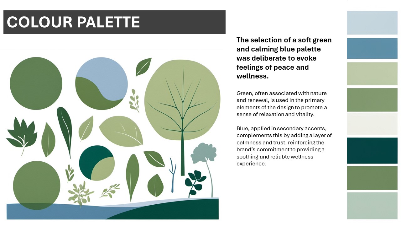
People reviewing your iterations need to understand your reasoning behind your decisions.
Guiding the audience
Explanatory text should provide a logical flow, making it easier for the audience to follow your thought process step-by-step. Clear descriptions help guide them through your proposal, highlighting key areas and making it easier to comprehend the design’s purpose.
This structure not only increases engagement but also boosts the professionalism of your presentation.
Writing effective explanatory text
When writing design descriptions, it’s important to go beyond simply labelling elements. Thoughtfully articulating your design choices helps the audience understand your rationale.
Explaining design choices
Be specific about elements such as colour, typography, and layout. Describe why you selected these elements in the context of the project’s goals or the target audience’s needs:
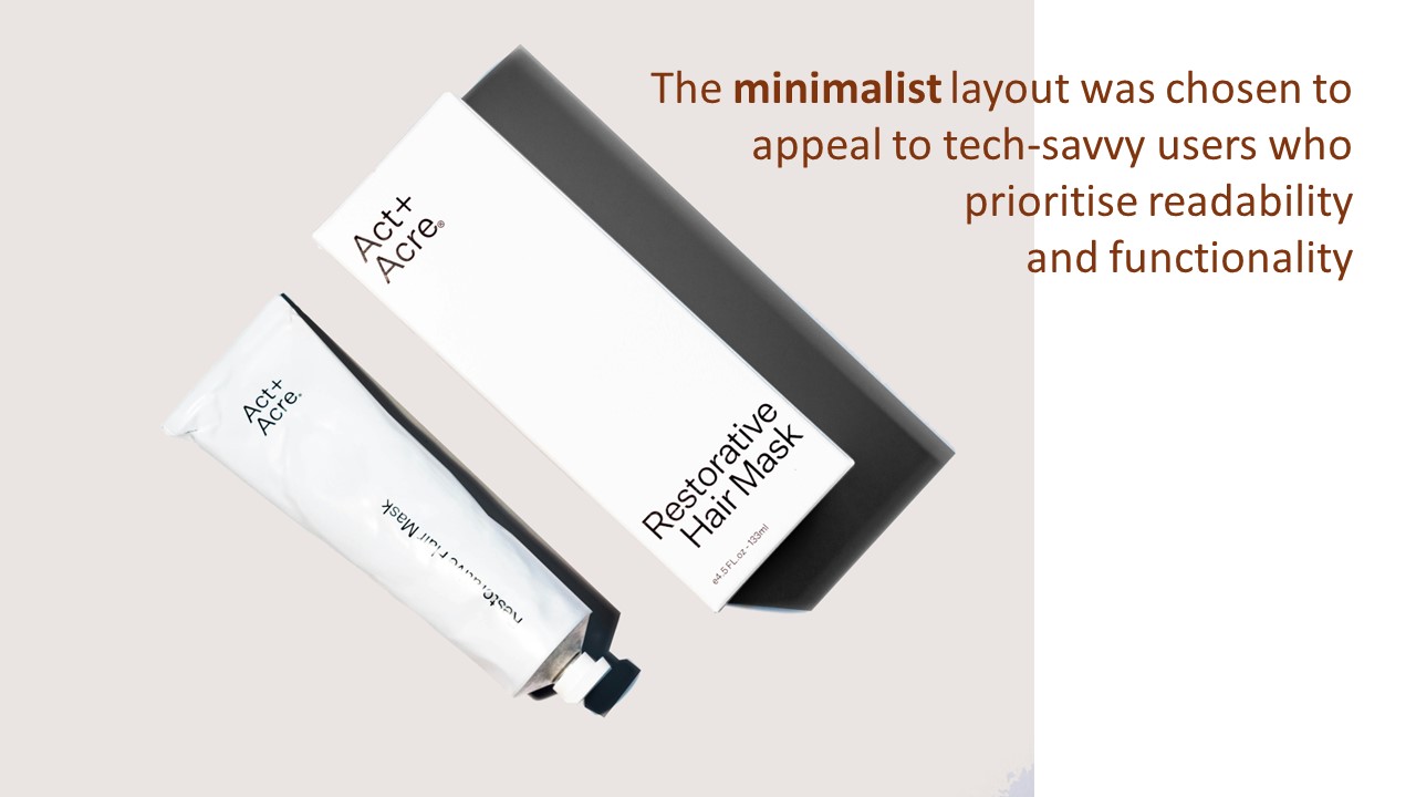
A specific explanation connects the design to its intended purpose.
Case Study
Brand Identity design proposal for Regenerate Rwanda
This Regenerate Rwanda brand identity design proposal on Behance offers a great example of how to explain design choices in a professional and clear manner. Key aspects of the proposal include:
- Typography: The designers provide their choice of typefaces and its reflection of the brand’s personality, conveying sophistication and modernity.
- Colour palette: A breakdown of the colour choices explains how the selected tones communicate the brand’s identity, focusing on evoking feelings of trust and reliability.
- Layout decisions: The design proposal outlines how the layout is visualised for maximum readability and visual balance, ensuring that the brand's message is effectively communicated.
Use this example – especially the Colour Palette slide – to inspire you to create clear, well-structured explanations to support thoughtful design decisions, ensuring that your visual proposals effectively communicate the intended message and align with the project's objectives
Providing context
Context is essential in design descriptions. Explain how your design fits within the broader goals of the project and aligns with the client’s or brand’s identity
Case Study
Proposal for redesigned 2024 Paris Olympics logo

This 2024 Paris Olympics logo proposal demonstrates how effective explanatory text and visuals can work together to create a compelling design presentation. This example highlights several key elements, including:
- Explaining design choices: The designer specifically addresses why they selected certain typography and shapes, making a clear connection between these choices and the values of the Olympics.
- Providing context: The designer provides a context by explaining how the logo reflects both the spirit of the global event and the culture of Paris, aligning the design with the event’s goals.
- Clarity and precision: The proposal uses simple, accessible language, ensuring that its reasoning is clear to both design experts and non-experts.
- Visual/Text synergy: The explanatory text complements the visuals, with descriptions positioned to naturally guide the viewer through the design elements.
By integrating these elements, your visual proposals will be clearer, engaging, and professionally presented, making a strong impact on your audience.
Maintaining clarity and precision
Clarity is key. Avoid jargon or overly technical language that could confuse non-expert audiences.
Ensure that your explanations are accessible and easily understood by clients or stakeholders who may not be familiar with design terminology.
Integrating visuals and text for a cohesive presentation
Integrating visuals and text is essential for creating a cohesive presentation that effectively communicates your design narrative. By ensuring that both elements complement each other, you can enhance clarity and engagement when presenting, making it easier for your audience to understand the reasoning behind design choices.
Why is integrating visuals and text important?
Integrating your visuals and text helps you create a cohesive design story and synergy between the ideas represented by the visuals and text.
Creating a cohesive design story
Combining visuals and text creates a cohesive story that allows your audience to grasp the reasoning behind your design choices. A well-integrated presentation not only showcases your design but also articulates how each element contributes to the overall narrative.

Integrate visuals and text to create a clear and engaging design narrative.
Text should enhance and clarify visuals without overshadowing them. Good explanatory text provides context and details that help the audience understand your design decisions and how they contribute to the overall narrative. Both text and visuals should work in harmony, ensuring that the message is consistent and clear.
Creating synergy between visuals and text
- Your text should complement, not compete with, your visuals.
- Keep descriptions brief yet informative, making sure they enhance the viewer’s understanding of the image.
- Avoid overloading your design with excessive text; instead, let the visuals and descriptions work together to tell a cohesive story.
What are effective techniques for aligning visuals and text in presentations?
Focussing on layout and consistency, and creating a narrative flow, will help you align visuals and text effectively in your presentations to enhance audience engagement and understanding.
Layout and consistency
Using layout tools to maintain a clean structure helps in presenting a unified visual identity. Consistent formatting and alignment make it easier for the audience to follow and understand your design proposal.
Tool: Presentation template
To achieve a unified visual identity using a presentation layout, feel free to use and tailor this final presentation template (PowerPoint).
Final presentations typically occur at the Review and Approval stage when you present your completed work to clients or stakeholders, seeking feedback, approval, or next steps for launching the design. You can, however, adapt the template to present your design concepts and iterations in earlier stages of your graphic design work (see the table below for more information).
Using a layout similar to that of the final presentation template helps you ensure that visuals and text are integrated seamlessly to support the overall narrative of a presentation. Importantly, elements of the template can be used and re-adapted at various stages of the graphic design workflow, from conceptual development through to iteration and refinement.
The table below outlines key sections of the final presentation template that helps link visuals with explanatory text, and each slide’s applicability to earlier stages of the graphic design workflow.
| Slide | Details | Contribution to design narrative | Applicability to earlier stages |
|---|---|---|---|
| Introduction |
|
Sets the tone for the proposal, establishing the project’s identity and purpose. Introduces the project as framed by the design brief, making clear connections to the client's objectives. | Highly applicable to all phases when framing the project context and clarifying objectives. |
| Executive summary |
|
Provides a high-level overview, linking back to the key objectives outlined in the design brief. This section connects the proposal directly to the client's goals, ensuring alignment between the vision and brief requirements. | Highly applicable to Concept Development phase when summarising early design ideas and aligning them with client goals, ensuring clarity in direction early in the design process. |
| Project background |
|
Explains the background and context, highlighting the challenges defined in the brief. This section justifies the design approach by addressing the client's needs and challenges, helping the audience understand the rationale behind the proposal. | Moderately applicable to earlier stages, when outlining initial research findings and defining the project scope early in the design process. |
| Design concept |
|
Explains the core ideas of the design in response to the brief. The concept statement articulates how the design addresses the objectives and constraints from the brief, while visuals illustrate how these ideas take form. This anchors the proposal within the scope set by the client. | Highly applicable to Concept Development phase when presenting initial design concepts and exploring how they meet client objectives. |
| Visual presentation |
|
Presents visuals that reflect the design outlined in the brief. This section visually communicates the design’s alignment with the brief’s requirements, showing how it meets both aesthetic and functional goals. The visuals illustrate solutions to the challenges specified in the brief. | Highly applicable to Design Iteration and Refinement phase when showcasing progress through different design iterations and highlighting improvements. |
| Textual content |
|
Provides explanations that directly reference the brief, justifying design decisions. The rationale ties back to the brief’s objectives, explaining how the design solves the problem or challenge identified in the brief. Technical details support how the design can be realised practically, adhering to the project scope. | Moderately applicable to Design Iteration and Refinement phase when detailing technical specifications and considerations relevant to early design discussions. |
| Brand integration |
|
Demonstrates how the design fits the client’s brand, as outlined in the brief. This section ensures the proposal maintains visual consistency with the brand identity mentioned in the brief, showing how the design strengthens or complements the brand. | Moderately applicable to Concept Development and Design Iteration and Refinement phases. when presenting how initial ideas align with the client's branding to ensure consistency throughout the design process. |
| Conclusion |
|
Summarises the key takeaways from the proposal and highlights how it addresses the brief's objectives. The call to action invites the client to proceed with the design, reinforcing that the proposal aligns with the brief’s expectations and needs. | Moderately applicable to Review and Approvals phase, when summarising key insights and recommendations to guide decision-making. |
| References |
|
Lists sources and inspirations that align with the brief’s needs. These references support the design decisions by showing how research, trends, and influences were used to solve the problem defined in the brief. | Highly applicable to Research phase, when presenting sources and references that inform early design concepts for credibility. |
Creating a narrative flow
Effectively communicating your design ideas requires not only compelling visuals but also a clear narrative flow that links these elements cohesively. So how do you establish a logical sequence in your design proposal, enhancing the audience's understanding and engagement?
Use the template as a tool
The final presentation template serves as a practical framework that guides you as the presenter through a logical sequence of the proposal. Each section of the template is strategically designed to facilitate the integration of visuals and text, ensuring they complement one another and contribute to a coherent narrative.
Select + to read about three key points that explain how to effectively use the final presentation template to enhance your narrative flow.
Each entry in the template corresponds to a specific aspect of your design proposal, such as the Introduction, Executive Summary, or Design Concept. By following this structured approach, you can ensure that every visual element presented is accompanied by relevant explanatory text.
For instance, the Visual Presentation section should feature impactful images that illustrate the design's evolution, supported by Textual Content that provides context and elaborates on these visuals. This alignment helps clarify how each design decision relates to the project's overall objectives.
By using a slide sequence like the template’s, you can create a clear pathway for your audience to follow. This logical sequence helps enhance understanding and flow, allowing your audience to grasp the connections between different elements of your design. For example, presenting the Project Background followed by the Design Concept allows the audience to first understand the context and needs before diving into how your design addresses these challenges.
Think of your presentation as a journey for your audience. Each slide should build upon the previous one, guiding the audience logically from introduction to conclusion. Use transitional phrases to help your audience navigate through your proposal, making explicit connections between visuals and accompanying text.
A well-structured narrative flow strengthens your proposal by ensuring that all components work together to support your design objectives. By presenting information in a cohesive manner, you empower your audience to appreciate the rationale behind your design decisions. This clarity fosters trust and engagement, making it easier for them to follow your vision and objectives.
Watch the following video (11:14 mins) by Will Paterson who discusses essential strategies for presenting a cohesive visual proposal in the context of a logo design project. Key strategies covered include crafting a compelling narrative, using visual hierarchy, integrating visuals and text, and inviting feedback. Consider how the insights from this video align with what has been covered in this subtopic so far.
Other tools and methods to use when presenting visual proposals
Knowing about other presentation tools and methods, including formats and expected content, is useful for design presentations in industry.
The final presentation template in the previous section reflects best practice by ensuring that both visual and textual content is integrated to meet professional standards. But what about other templates and platforms?
Explore
Presentation tools
Looking at other presentation tools, templates, and platforms can be highly beneficial when crafting your own design presentations. These tools can help ensure your text covers all key areas—such as design choices, context, and clarity—while maintaining a professional tone.
Explore these free resources to find examples that will assist you in creating clear and effective explanatory text for your visual proposals:
- Canva: Offers a free tier with a variety of templates for creating professional proposals.
- Google Slides: Provides free access to numerous presentation templates for visual proposals.
- Adobe Express: Previously Adobe Spark, Adobe Express offers a free version with basic features for creating engaging visual content.
- Behance: Free to browse, showcasing examples of well-designed proposals for inspiration (such as in the two case studies above).
- Pitch: Provides a free version with essential templates and tools for creating professional presentations and proposals.
Important: Regardless of the presentation tool you choose, it is crucial that your visual proposal remain professional and clear. Ensure that the tool supports the effective use of visual hierarchy and information flow, highlighting the most important elements and making them easy to follow.
How do you ensure your visual proposals are professional and clear?
Regardless of the stage at which you are presenting your work, or your visual proposal needs to be professional and clear.
Select + to read about three key techniques to use for great visual proposals:
Striking a balance between detail and simplicity is crucial when presenting design ideas. Include only essential elements that convey your key messages clearly while avoiding unnecessary clutter.
A clean, straightforward design allows viewers to quickly grasp core concepts and understand the intent behind your design.
Maintaining consistency throughout your visual proposals reinforces their effectiveness. Align typography, colour schemes, and design motifs with client or brand guidelines to create a cohesive visual experience.
This consistency enhances the professional appearance of your proposals and strengthens alignment with client expectations.
Effectively guide viewer attention by employing visual hierarchy principles. Use spacing, alignment, and contrasting elements to emphasise the most important information.
A well-structured hierarchy helps viewers navigate through the proposal smoothly, focusing on key areas and clearly understanding the message.
Visual hierarchy and information flow
When creating visual proposals, the strategic use of design elements and principles is important for conveying your ideas and ensuring your visual proposal resonates with your audience.
Visual hierarchy plays a significant role in guiding the viewer’s focus, helping them quickly identify the most important aspects of your proposal. By organising your presentation content thoughtfully, you can enhance clarity and ensure that your key messages are easily understood.
Applying a visual hierarchy
- Size and scale: Use larger elements to highlight crucial information, such as project titles, key visuals, or calls to action. For instance, a prominent header can immediately capture attention, signalling the proposal's main focus.
- Colour and contrast: Leverage contrasting colours to emphasise critical points within your proposal. High-contrast sections can help distinguish between different parts of the proposal, making it easier for viewers to navigate and identify essential information at a glance.
- Typography: Employ varying font sizes and styles to establish an order of importance. Use bold or larger fonts for headings and key ideas, while keeping body text smaller for supporting details. This hierarchy in typography aids in guiding the viewer's reading experience, ensuring they grasp the proposal's structure.
- Spacing and proximity: Group related information together using appropriate spacing. Ample white space can prevent clutter and create a visual break, allowing viewers to digest the content more comfortably. Proper spacing helps maintain a smooth flow from one section to the next, enhancing the overall reading experience.
Ensuring effective information flow
- Logical arrangement: Present information in a logical sequence that aligns with your proposal's narrative. This helps the viewer follow the storyline and grasp the progression of your ideas seamlessly.
- Visual cues: Use arrows, lines, or other graphic elements to guide the viewer's eye through the proposal. These cues can direct attention to important connections or transitions between sections.
By applying these visual hierarchy and information flow elements in your visual proposals, you can create compelling presentations that not only highlight key information but also facilitate understanding and engagement.
The result is a proposal that effectively communicates your vision and encourages stakeholders to act on your ideas.
Practice
Task 18: Create a visual proposal for Barilla
Create a visual proposal that communicates your vision and enhances client perspectives and engagement during the design iteration and refinement phase. Building on the expanded design concepts developed in Task 17, practise integrating visuals and text to craft a visual proposal that resonates with your audience and effectively conveys your ideas! Note: This task focuses solely on creating your visual proposal and does not require a formal presentation.
What tools or resources do you need for this task?
- Your design concepts: Use the expanded design concepts you developed in Task 16 as the foundation for your proposal.
- Presentation template: Adapt the final presentation template from the previous section to guide your integration of visuals and text within the context of the Design Iteration and Refinement stage.
- Documentation tool and visual diary/sketchbook: Use a digital or physical visual diary/sketchbook alongside Word (or similar) to refine your ideas and concepts. This will help you organise your ideas, draft proposal text, and reflect on your design.
- Barilla design brief: Review the design brief to ensure your proposal aligns with project objectives and client expectations.
What steps should you take to complete this task?
Set aside up to three hours to complete steps 1-5 below. Remember to save your work as you go.
- Review your expanded design concepts (15 minutes)
- Revisit the design concepts you expanded upon in Task 16.
- Reflect on how the insights and inspirations from Task 16 can inform and enhance your visual proposal.
- Outline your proposal (30 minutes)
- Draft a clear outline for your visual proposal, identifying key sections such as objectives, design choices, and any relevant context.
- Determine the visuals you want to include, ensuring they complement and enhance your textual content.
- Create visual elements (60 minutes)
- Use design software (e.g., Adobe Illustrator or Adobe XD) to create visual elements that effectively represent your design concepts.
- Incorporate elements such as mock-ups, sketches, or mood boards to illustrate your ideas.
- Integrate text and visuals (30 minutes)
- Using the presentation template, integrate your visuals with clear, explanatory text that supports your design concepts.
- Ensure that your proposal flows logically, guiding the viewer through your ideas and insights.
- Finalise your visual proposal (30 minutes)
- Revise your proposal: Ensure that your proposal effectively communicates your vision and enhances client perspectives.
- Document your process: Use your visual diary or sketchbook to refine ideas and concepts. Write a brief summary explaining the key visual and textual elements used in your proposal and how they contribute to the overall effectiveness of your presentation.
What should you do after completing this task?
- How did integrating visuals and text in your proposal enhance the clarity and effectiveness of your design concepts? In what ways did you prioritise visual hierarchy and information flow in your proposal, and what specific adjustments did you make to improve clarity and enhance viewer engagement?
- Share your visual proposal to forum:
- Select your forum thread in the Coursework Forum.
- Select Reply to your first Forum post.
- Enter the words ‘Task 18: Visual proposal’ in your new post.
- Select the Post your response button, then select Edit in your reply when it shows up.
- Upload your expanded design concepts in the Attachment field.
- Select Save changes to share your coursework to your forum thread.
- Post constructive feedback on other students’ coursework and receive feedback on your coursework from your tutor and other students.
In the upcoming section, discover essential techniques for presenting visual proposals with confidence. Learn how to effectively engage your audience and articulate your design concepts, ensuring your ideas are conveyed with clarity and professionalism. You’ll also find out how to gather and integrate feedback to enhance your proposal, ensuring it reflects iterative improvements. This preparation will empower you to showcase your design work in a compelling manner, leaving a lasting impression.
Presenting visual proposals with confidence
Confidence is a key ingredient when presenting design proposals. It shapes how clients perceive you as a graphic designer and significantly boosts the persuasive power of your proposal.
A confident presentation not only demonstrates trust in your design decisions but also makes clients more inclined to embrace your vision.
What is the impact of a confident presentation?
A confident presentation leaves a strong impression, enhancing your credibility as a graphic designer.
When you communicate your ideas with conviction, clients are more likely to trust your expertise and appreciate the thought behind your decisions. This trust transforms your visual proposal from just another concept into a compelling solution, increasing the likelihood of client approval.
Here’s two brief scenarios to consider:
| Scenario | Confident approach | Impact |
|---|---|---|
| Presenting a logo design | Confidently explain the use of minimalistic shapes to reflect the company’s focus on simplicity and innovation. | The client feels reassured by your expertise and trusts that the design aligns with their vision and audience. |
| Presenting a product packaging re-design | Confidently highlight how the re-design reflects the product’s unique selling points, using colours and textures that appeal to the target demographic. | The client understands that the packaging not only looks appealing but also communicates the brand's values and resonates with the target audience. |
What strategies can help you present confidently?
Here are three practical strategies (with examples) for delivering your design proposal confidently:
| Strategy | How to apply it | Example |
|---|---|---|
| Organise your presentation | Structure your content logically, guiding the client through your design journey. | When presenting a product packaging design, start by outlining the current packaging challenges, then systematically showcase your design solutions. For instance, first present the initial concept, followed by mock-ups illustrating how the design addresses each challenge, concluding with a visual comparison of the new packaging against the old. This approach allows the client to follow your thought process and see the progression of your design journey. |
| Prepare for questions | Anticipate client concerns and be ready to defend your choices with research and data. | During a product packaging presentation, foresee questions regarding material choice. Prepare to explain how your selected materials enhance durability and sustainability, using data and examples to back up your claims. This preparedness helps reassure the client about your design decisions and fosters trust. |
| Defend design decisions | Back up your choices with design principles, research, or alignment with project objectives. | In your product packaging presentation, confidently present the design elements—such as colour and typography—by linking them to brand identity. For example, explain how the colour palette aligns with the target audience's preferences and how the typography enhances readability, using research insights to reinforce your arguments. This will help the client see the thought and research that informed your design choices. |
Tip
Communicate and connect
To make your presentation more effective, use both verbal and visual communication:
- Verbal techniques: Speak clearly, maintain a strong tone, and pace your delivery to maintain engagement.
- Body language: Use positive body language, such as eye contact and gestures, to emphasise key points and demonstrate confidence.
- Leveraging technology: Use presentation tools like slides, mock-ups, or prototypes to visually support your ideas and create a more compelling narrative.
How can you collect and integrate feedback to improve your design?
Collecting feedback during your presentation
In graphic design, presenting your work effectively is just as important as the design itself, especially when it comes to collecting valuable feedback.
To explore various strategies for engaging your audience and handling questions during your design presentations, discover various approaches to engage your audience and articulate your design process, watch this video chapter from Flux Academy below (from 11.51 mins). This segment delves into best practices for managing feedback interactions, ensuring clarity, collaboration, and successful project outcomes.
Focus on using these three techniques to gather and respond to feedback effectively during your presentation:
| Technique | How to use it | Example |
|---|---|---|
| Ask specific questions | Encourage targeted feedback by asking about specific elements rather than general preferences. | Instead of "Do you like it?" ask, "How do you feel the use of imagery aligns with your brand's tone?" |
| Foster open dialogue | Create a two-way conversation by inviting clients to express their thoughts on the design freely. | "Let’s discuss how these product packaging designs reflect your brand identity. Are there elements you feel work particularly well or need adjustment?" |
| Active listening | Clarify feedback to ensure you understand the client’s needs before making changes. | Paraphrase the client's feedback: "So you’d prefer a bolder colour scheme for the ingredients section to make them more prominent, correct?" |
Integrating feedback into your design
After gathering feedback, begin the process of refining your design to address client suggestions. While it's important to integrate this feedback, make sure that the core elements of your design remain intact:
| Step | Action | Example |
|---|---|---|
| Refine with purpose | Adjust your design based on client feedback while maintaining the core concept. | After feedback on colour preferences, make subtle changes that enhance brightness while keeping the minimalist feel intact. |
| Polish the final proposal | Incorporate revisions and prepare a clear, refined presentation that reflects feedback. | Show before-and-after visuals demonstrating how the design evolved after incorporating client feedback, ensuring all concerns have been addressed. |
Reflection
How will you present your visual proposals to captivate and convince your audience?
Reflecting on your presentation strategies is essential for enhancing your effectiveness as a graphic designer. Consider the following questions to help you evaluate your approach and identify areas for improvement:
- Reflect on a past presentation experience where you felt confident or lacked confidence. What strategies did you employ that contributed to your confidence, or what challenges did you face that hindered it? How can you apply the techniques discussed in this section to improve your future presentations?
- Consider a design proposal you are currently working on or have completed. How can you integrate the strategies for presenting visual proposals with confidence into your presentation plan? Identify specific elements from the section that you will implement to enhance your delivery and engage your audience effectively.
Engaging with these questions will not only deepen your understanding of effective presentation techniques but also empower you to create compelling design proposals that resonate with clients and enhance your professional credibility.

